How to make a radio button look like a toggle button
HtmlCssRadio ButtonRadiobuttonlistTogglebuttonHtml Problem Overview
I want a group of radio buttons to look like a group of toggle buttons (but still function like radio buttons). It's not necessary that they look exactly like toggle buttons.
How can I do this only with CSS and HTML?
EDIT: I will be satisfied making the little circle disappear and changing the style when the button is checked/unchecked.
Html Solutions
Solution 1 - Html
Depending on which browsers you aim to support, you could use the :checked pseudo-class selector in addition to hiding the radio buttons.
Using this HTML:
<input type="radio" id="toggle-on" name="toggle" checked
><label for="toggle-on">On</label
><input type="radio" id="toggle-off" name="toggle"
><label for="toggle-off">Off</label>
You could use something like the following CSS:
input[type="radio"].toggle {
  display: none;
}

input[type="radio"].toggle:checked + label {
  /* Do something special with the selected state */
}
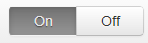
For instance, (to keep the custom CSS brief) if you were using Bootstrap, you might add class="btn" to your <label> elements and style them appropriately to create a toggle that looks like:
...which just requires the following additional CSS:
input[type="radio"].toggle:checked + label {
  background-image: linear-gradient(to top,#969696,#727272);
  box-shadow: inset 0 1px 6px rgba(41, 41, 41, 0.2),
                    0 1px 2px rgba(0, 0, 0, 0.05);
  cursor: default;
  color: #E6E6E6;
  border-color: transparent;
  text-shadow: 0 1px 1px rgba(40, 40, 40, 0.75);
}

input[type="radio"].toggle + label {
  width: 3em;
}

input[type="radio"].toggle:checked + label.btn:hover {
  background-color: inherit;
  background-position: 0 0;
  transition: none;
}

input[type="radio"].toggle-left + label {
  border-right: 0;
  border-top-right-radius: 0;
  border-bottom-right-radius: 0;
}

input[type="radio"].toggle-right + label {
  border-top-left-radius: 0;
  border-bottom-left-radius: 0;
}
I've included this as well as the extra fallback styles in a radio button toggle jsFiddle demo. Note that :checked is only supported in IE 9, so this approach is limited to newer browsers.
However, if you need to support IE 8 and are willing to fall back on JavaScript*, you can hack in pseudo-support for :checked without too much difficulty (although you can just as easily set classes directly on the label at that point).
Using some quick and dirty jQuery code as an example of the workaround:
$('.no-checkedselector').on('change', 'input[type="radio"].toggle', function () {
    if (this.checked) {
        $('input[name="' + this.name + '"].checked').removeClass('checked');
        $(this).addClass('checked');
        // Force IE 8 to update the sibling selector immediately by
        // toggling a class on a parent element
        $('.toggle-container').addClass('xyz').removeClass('xyz');
    }
});
$('.no-checkedselector input[type="radio"].toggle:checked').addClass('checked');
You can then make a few changes to the CSS to complete things:
input[type="radio"].toggle {
  /* IE 8 doesn't seem to like to update radio buttons that are display:none */
  position: absolute;
  left: -99em;
}

input[type="radio"].toggle:checked + label,
input[type="radio"].toggle.checked + label {
  /* Do something special with the selected state */
}
*If you're using Modernizr, you can use the :selector test to help determine if you need the fallback. I called my test "checkedselector" in the example code, and the jQuery event handler is subsequently only set up when the test fails.
Solution 2 - Html
Here's my version of that nice CSS solution JS Fiddle example posted above.
HTML
<div id="donate">
    <label class="blue"><input type="radio" name="toggle"><span>$20</span></label>
    <label class="green"><input type="radio" name="toggle"><span>$50</span></label>
    <label class="yellow"><input type="radio" name="toggle"><span>$100</span></label>
    <label class="pink"><input type="radio" name="toggle"><span>$500</span></label>
    <label class="purple"><input type="radio" name="toggle"><span>$1000</span></label>
</div>
CSS
body {
    font-family:sans-serif;
}

#donate {
    margin:4px;

    float:left;
}

#donate label {
    float:left;
    width:170px;
    margin:4px;
    background-color:#EFEFEF;
    border-radius:4px;
    border:1px solid #D0D0D0;
    overflow:auto;

}

#donate label span {
    text-align:center;
    font-size: 32px;
    padding:13px 0px;
    display:block;
}

#donate label input {
    position:absolute;
    top:-20px;
}

#donate input:checked + span {
    background-color:#404040;
    color:#F7F7F7;
}

#donate .yellow {
    background-color:#FFCC00;
    color:#333;
}

#donate .blue {
    background-color:#00BFFF;
    color:#333;
}

#donate .pink {
    background-color:#FF99FF;
    color:#333;
}

#donate .green {
    background-color:#A3D900;
    color:#333;
}
#donate .purple {
    background-color:#B399FF;
    color:#333;
}
Styled with coloured buttons :)
Solution 3 - Html
PURE CSS AND HTML (as asked) with ANIMATIONS! (and Checkboxes TOO!)
Example Image (you can run the code below):
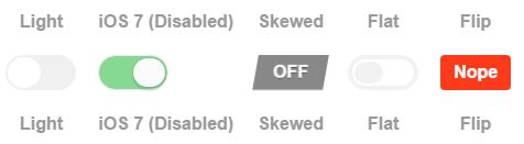
After looking for something really clean and straight forward, I ended up building this with ONE simple change from another code that was built only thinking on checkboxes, so I tryed the funcionality for RADIOS and it worked too(!).
The CSS (SCSS) is fully from @mallendeo (as established on the JS credits), what I did was simply change the type of the input to RADIO, and gave the same name to all the radio switches.... and VOILA!! They deactivate automatically one to the other!!
Very clean, and as you asked it's only CSS and HTML!!
It is exactly what I was looking for since 3 days after trying and editing more than a dozen of options (which mostly requiered jQuery, or didn't allow labels, or even wheren't really compatible with current browsers). This one's got it all!
I'm obligated to include the code in here to allow you to see a working example, so:
/** Toggle buttons
 * @mallendeo
 * forked @davidtaubmann
 * from https://codepen.io/mallendeo/pen/eLIiG
 */
html, body {
  display: -webkit-box;
  display: -webkit-flex;
  display: -ms-flexbox;
  display: flex;
  min-height: 100%;
  -webkit-box-pack: center;
  -webkit-justify-content: center;
      -ms-flex-pack: center;
          justify-content: center;
  -webkit-box-align: center;
  -webkit-align-items: center;
      -ms-flex-align: center;
          align-items: center;
  -webkit-box-orient: vertical;
  -webkit-box-direction: normal;
  -webkit-flex-direction: column;
      -ms-flex-direction: column;
          flex-direction: column;
  font-family: sans-serif;
}

ul, li {
  list-style: none;
  margin: 0;
  padding: 0;
}

.tg-list {
  text-align: center;
  display: -webkit-box;
  display: -webkit-flex;
  display: -ms-flexbox;
  display: flex;
  -webkit-box-align: center;
  -webkit-align-items: center;
      -ms-flex-align: center;
          align-items: center;
}

.tg-list-item {
  margin: 0 10px;;
}

h2 {
  color: #777;
}

h4 {
  color: #999;
}

.tgl {
  display: none;
}
.tgl, .tgl:after, .tgl:before, .tgl *, .tgl *:after, .tgl *:before, .tgl + .tgl-btn {
  box-sizing: border-box;
}
.tgl::-moz-selection, .tgl:after::-moz-selection, .tgl:before::-moz-selection, .tgl *::-moz-selection, .tgl *:after::-moz-selection, .tgl *:before::-moz-selection, .tgl + .tgl-btn::-moz-selection {
  background: none;
}
.tgl::selection, .tgl:after::selection, .tgl:before::selection, .tgl *::selection, .tgl *:after::selection, .tgl *:before::selection, .tgl + .tgl-btn::selection {
  background: none;
}
.tgl + .tgl-btn {
  outline: 0;
  display: block;
  width: 4em;
  height: 2em;
  position: relative;
  cursor: pointer;
  -webkit-user-select: none;
     -moz-user-select: none;
      -ms-user-select: none;
          user-select: none;
}
.tgl + .tgl-btn:after, .tgl + .tgl-btn:before {
  position: relative;
  display: block;
  content: "";
  width: 50%;
  height: 100%;
}
.tgl + .tgl-btn:after {
  left: 0;
}
.tgl + .tgl-btn:before {
  display: none;
}
.tgl:checked + .tgl-btn:after {
  left: 50%;
}

.tgl-light + .tgl-btn {
  background: #f0f0f0;
  border-radius: 2em;
  padding: 2px;
  -webkit-transition: all .4s ease;
  transition: all .4s ease;
}
.tgl-light + .tgl-btn:after {
  border-radius: 50%;
  background: #fff;
  -webkit-transition: all .2s ease;
  transition: all .2s ease;
}
.tgl-light:checked + .tgl-btn {
  background: #9FD6AE;
}

.tgl-ios + .tgl-btn {
  background: #fbfbfb;
  border-radius: 2em;
  padding: 2px;
  -webkit-transition: all .4s ease;
  transition: all .4s ease;
  border: 1px solid #e8eae9;
}
.tgl-ios + .tgl-btn:after {
  border-radius: 2em;
  background: #fbfbfb;
  -webkit-transition: left 0.3s cubic-bezier(0.175, 0.885, 0.32, 1.275), padding 0.3s ease, margin 0.3s ease;
  transition: left 0.3s cubic-bezier(0.175, 0.885, 0.32, 1.275), padding 0.3s ease, margin 0.3s ease;
  box-shadow: 0 0 0 1px rgba(0, 0, 0, 0.1), 0 4px 0 rgba(0, 0, 0, 0.08);
}
.tgl-ios + .tgl-btn:hover:after {
  will-change: padding;
}
.tgl-ios + .tgl-btn:active {
  box-shadow: inset 0 0 0 2em #e8eae9;
}
.tgl-ios + .tgl-btn:active:after {
  padding-right: .8em;
}
.tgl-ios:checked + .tgl-btn {
  background: #86d993;
}
.tgl-ios:checked + .tgl-btn:active {
  box-shadow: none;
}
.tgl-ios:checked + .tgl-btn:active:after {
  margin-left: -.8em;
}

.tgl-skewed + .tgl-btn {
  overflow: hidden;
  -webkit-transform: skew(-10deg);
          transform: skew(-10deg);
  -webkit-backface-visibility: hidden;
          backface-visibility: hidden;
  -webkit-transition: all .2s ease;
  transition: all .2s ease;
  font-family: sans-serif;
  background: #888;
}
.tgl-skewed + .tgl-btn:after, .tgl-skewed + .tgl-btn:before {
  -webkit-transform: skew(10deg);
          transform: skew(10deg);
  display: inline-block;
  -webkit-transition: all .2s ease;
  transition: all .2s ease;
  width: 100%;
  text-align: center;
  position: absolute;
  line-height: 2em;
  font-weight: bold;
  color: #fff;
  text-shadow: 0 1px 0 rgba(0, 0, 0, 0.4);
}
.tgl-skewed + .tgl-btn:after {
  left: 100%;
  content: attr(data-tg-on);
}
.tgl-skewed + .tgl-btn:before {
  left: 0;
  content: attr(data-tg-off);
}
.tgl-skewed + .tgl-btn:active {
  background: #888;
}
.tgl-skewed + .tgl-btn:active:before {
  left: -10%;
}
.tgl-skewed:checked + .tgl-btn {
  background: #86d993;
}
.tgl-skewed:checked + .tgl-btn:before {
  left: -100%;
}
.tgl-skewed:checked + .tgl-btn:after {
  left: 0;
}
.tgl-skewed:checked + .tgl-btn:active:after {
  left: 10%;
}

.tgl-flat + .tgl-btn {
  padding: 2px;
  -webkit-transition: all .2s ease;
  transition: all .2s ease;
  background: #fff;
  border: 4px solid #f2f2f2;
  border-radius: 2em;
}
.tgl-flat + .tgl-btn:after {
  -webkit-transition: all .2s ease;
  transition: all .2s ease;
  background: #f2f2f2;
  content: "";
  border-radius: 1em;
}
.tgl-flat:checked + .tgl-btn {
  border: 4px solid #7FC6A6;
}
.tgl-flat:checked + .tgl-btn:after {
  left: 50%;
  background: #7FC6A6;
}

.tgl-flip + .tgl-btn {
  padding: 2px;
  -webkit-transition: all .2s ease;
  transition: all .2s ease;
  font-family: sans-serif;
  -webkit-perspective: 100px;
          perspective: 100px;
}
.tgl-flip + .tgl-btn:after, .tgl-flip + .tgl-btn:before {
  display: inline-block;
  -webkit-transition: all .4s ease;
  transition: all .4s ease;
  width: 100%;
  text-align: center;
  position: absolute;
  line-height: 2em;
  font-weight: bold;
  color: #fff;
  position: absolute;
  top: 0;
  left: 0;
  -webkit-backface-visibility: hidden;
          backface-visibility: hidden;
  border-radius: 4px;
}
.tgl-flip + .tgl-btn:after {
  content: attr(data-tg-on);
  background: #02C66F;
  -webkit-transform: rotateY(-180deg);
          transform: rotateY(-180deg);
}
.tgl-flip + .tgl-btn:before {
  background: #FF3A19;
  content: attr(data-tg-off);
}
.tgl-flip + .tgl-btn:active:before {
  -webkit-transform: rotateY(-20deg);
          transform: rotateY(-20deg);
}
.tgl-flip:checked + .tgl-btn:before {
  -webkit-transform: rotateY(180deg);
          transform: rotateY(180deg);
}
.tgl-flip:checked + .tgl-btn:after {
  -webkit-transform: rotateY(0);
          transform: rotateY(0);
  left: 0;
  background: #7FC6A6;
}
.tgl-flip:checked + .tgl-btn:active:after {
  -webkit-transform: rotateY(20deg);
          transform: rotateY(20deg);
}
<h2>Toggle 'em</h2>
<ul class='tg-list'>
  <li class='tg-list-item'>
    <h3>Radios:</h3>
  </li>
  <li class='tg-list-item'>
    <label class='tgl-btn' for='rd1'>
      <h4>Light</h4>
    </label>
    <input class='tgl tgl-light' id='rd1' name='group' type='radio'>
    <label class='tgl-btn' for='rd1'></label>
    <label class='tgl-btn' for='rd1'>
      <h4>Light</h4>
    </label>
  </li>
  <li class='tg-list-item'>
    <label class='tgl-btn' for='rd2'>
      <h4>iOS 7 (Disabled)</h4>
    </label>
    <input checked class='tgl tgl-ios' disabled id='rd2' name='group' type='radio'>
    <label class='tgl-btn' for='rd2'></label>
    <label class='tgl-btn' for='rd2'>
      <h4>iOS 7 (Disabled)</h4>
    </label>
  </li>
  <li class='tg-list-item'>
    <label class='tgl-btn' for='rd3'>
      <h4>Skewed</h4>
    </label>
    <input class='tgl tgl-skewed' id='rd3' name='group' type='radio'>
    <label class='tgl-btn' data-tg-off='OFF' data-tg-on='ON' for='rd3'></label>
    <label class='tgl-btn' for='rd3'>
      <h4>Skewed</h4>
    </label>
  </li>
  <li class='tg-list-item'>
    <label class='tgl-btn' for='rd4'>
      <h4>Flat</h4>
    </label>
    <input class='tgl tgl-flat' id='rd4' name='group' type='radio'>
    <label class='tgl-btn' for='rd4'></label>
    <label class='tgl-btn' for='rd4'>
      <h4>Flat</h4>
    </label>
  </li>
  <li class='tg-list-item'>
    <label class='tgl-btn' for='rd5'>
      <h4>Flip</h4>
    </label>
    <input class='tgl tgl-flip' id='rd5' name='group' type='radio'>
    <label class='tgl-btn' data-tg-off='Nope' data-tg-on='Yeah!' for='rd5'></label>
    <label class='tgl-btn' for='rd5'>
      <h4>Flip</h4>
    </label>
  </li>
</ul>
<ul class='tg-list'>
  <li class='tg-list-item'>
    <h3>Checkboxes:</h3>
  </li>
  <li class='tg-list-item'>
    <label class='tgl-btn' for='cb1'>
      <h4>Light</h4>
    </label>
    <input class='tgl tgl-light' id='cb1' type='checkbox'>
    <label class='tgl-btn' for='cb1'></label>
    <label class='tgl-btn' for='cb1'>
      <h4>Light</h4>
    </label>
  </li>
  <li class='tg-list-item'>
    <label class='tgl-btn' for='cb2'>
      <h4>iOS 7</h4>
    </label>
    <input class='tgl tgl-ios' id='cb2' type='checkbox'>
    <label class='tgl-btn' for='cb2'></label>
    <label class='tgl-btn' for='cb2'>
      <h4>iOS 7</h4>
    </label>
  </li>
  <li class='tg-list-item'>
    <label class='tgl-btn' for='cb3'>
      <h4>Skewed</h4>
    </label>
    <input class='tgl tgl-skewed' id='cb3' type='checkbox'>
    <label class='tgl-btn' data-tg-off='OFF' data-tg-on='ON' for='cb3'></label>
    <label class='tgl-btn' for='cb3'>
      <h4>Skewed</h4>
    </label>
  </li>
  <li class='tg-list-item'>
    <label class='tgl-btn' for='cb4'>
      <h4>Flat</h4>
    </label>
    <input class='tgl tgl-flat' id='cb4' type='checkbox'>
    <label class='tgl-btn' for='cb4'></label>
    <label class='tgl-btn' for='cb4'>
      <h4>Flat</h4>
    </label>
  </li>
  <li class='tg-list-item'>
    <label class='tgl-btn' for='cb5'>
      <h4>Flip</h4>
    </label>
    <input class='tgl tgl-flip' id='cb5' type='checkbox'>
    <label class='tgl-btn' data-tg-off='Nope' data-tg-on='Yeah!' for='cb5'></label>
    <label class='tgl-btn' for='cb5'>
      <h4>Flip</h4>
    </label>
  </li>
</ul>
If you run the snippet, you'll see I leave the iOS radio checked and disabled, so you can watch how it is also affected when activating another one. I also included 2 labels for each radio, one before and one after. The copy of the original code to show the working checkboxes in the same window is also included.
Solution 4 - Html
Here is the solution that works for all browsers (also IE7 and IE8; didn't check for IE6):
http://jsfiddle.net/RkvAP/230/
HTML
<div class="toggle">
    <label><input type="radio" name="toggle"><span>On</span></label>
</div>
<div class="toggle">
    <label><input type="radio" name="toggle"><span>Off</span></label>
</div>
JS
$('label').click(function(){
    $(this).children('span').addClass('input-checked');
    $(this).parent('.toggle').siblings('.toggle').children('label').children('span').removeClass('input-checked');
});
CSS
body {
    font-family:sans-serif;
}

.toggle {
    margin:4px;
    background-color:#EFEFEF;
    border-radius:4px;
    border:1px solid #D0D0D0;
    overflow:auto;
    float:left;
}

.toggle label {
    float:left;
    width:2.0em;
}

.toggle label span {
    text-align:center;
    padding:3px 0px;
    display:block;
    cursor: pointer;
}

.toggle label input {
    position:absolute;
    top:-20px;
}

.toggle .input-checked /*, .bounds input:checked + span works for firefox and ie9 but breaks js for ie8(ONLY) */ {
    background-color:#404040;
    color:#F7F7F7;
}
Makes use of minimal JS (jQuery, two lines).
Solution 5 - Html
Inspired by Michal B. answer. If you use bootstrap..
label.btn {
  padding: 0;
}

label.btn input {
  opacity: 0;
  position: absolute;
}

label.btn span {
  text-align: center;
  padding: 6px 12px;
  display: block;
}

label.btn input:checked+span {
  background-color: rgb(80, 110, 228);
  color: #fff;
}
<link href="https://stackpath.bootstrapcdn.com/bootstrap/4.4.1/css/bootstrap.min.css" rel="stylesheet" integrity="sha384-Vkoo8x4CGsO3+Hhxv8T/Q5PaXtkKtu6ug5TOeNV6gBiFeWPGFN9MuhOf23Q9Ifjh" crossorigin="anonymous">
<div>
  <label class="btn btn-outline-primary"><input type="radio" name="toggle"><span>One</span></label>
  <label class="btn btn-outline-primary"><input type="radio" name="toggle"><span>Two</span></label>
  <label class="btn btn-outline-primary"><input type="radio" name="toggle"><span>Three</span></label>
</div>
Solution 6 - Html
I usually hide the real radio buttons with CSS (or make them into individual hidden inputs), put in the imagery I want (you could use an unordered list and apply your styles to the li element) and then use click events to toggle the inputs. That approach also means you can keep things accessible for users who aren't on a normal web browser-- just hide your ul by default and show the radio buttons.
Solution 7 - Html
I know this is an old question, but since I was just looking to do this, I thought I would post what I ended up with. Because I am using Bootstrap, I went with a Bootstrap option.
HTML
<div class="col-xs-12">
	<div class="form-group">
		<asp:HiddenField ID="hidType" runat="server" />
		<div class="btn-group" role="group" aria-label="Selection type" id="divType">
			<button type="button" class="btn btn-default BtnType" data-value="1">Food</button>
			<button type="button" class="btn btn-default BtnType" data-value="2">Drink</button>
		</div>
	</div>
</div>
jQuery
$(document).ready(function () {
	$('#divType button').click(function () {
		$(this).addClass('active').siblings().removeClass('active');
		$('#<%= hidType.ClientID%>').val($(this).data('value'));
		//alert($(this).data('value'));
	});
});
I chose to store the value in a hidden field so that it would be easy for me to get the value server-side.
Solution 8 - Html
$(document).ready(function () {
    $('#divType button').click(function () {
        $(this).addClass('active').siblings().removeClass('active');
        $('#<%= hidType.ClientID%>').val($(this).data('value'));
        //alert($(this).data('value'));
    });
});
<div class="col-xs-12">
    <div class="form-group">
        <asp:HiddenField ID="hidType" runat="server" />
        <div class="btn-group" role="group" aria-label="Selection type" id="divType">
            <button type="button" class="btn btn-default BtnType" data-value="1">Food</button>
            <button type="button" class="btn btn-default BtnType" data-value="2">Drink</button>
        </div>
    </div>
</div>
Solution 9 - Html
HTML:
<div>
    <label> <input type="radio" name="toggle"> On </label>
    <label> Off <input type="radio" name="toggle"> </label>
</div>
CSS:
div { overflow:auto; border:1px solid #ccc; width:100px; }
label { float:left; padding:3px 0; width:50px; text-align:center; }
input { vertical-align:-2px; }
Live demo: http://jsfiddle.net/scymE/1/