Android: Create a toggle button with image and no text
AndroidCustomizationTogglebuttonAndroid Problem Overview
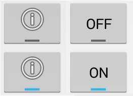
is it possible to create a toggle button in Android that has an image but no text? Ideally it would look like this:

Ive seen similar posts where the answer was to change the background but i want to preserve the Holo Light layout and just swap the text with an image.
I need to be able to programaticallly change the image source,
Any ideas how i would make this?
If this cant be done, is there a way i can make a normal button toggle on and off?
Android Solutions
Solution 1 - Android
- Can I replace the toggle text with an image
No, we can not, although we can hide the text by overiding the default style of the toggle button, but still that won't give us a toggle button you want as we can't replace the text with an image.
- How can I make a normal toggle button
Create a file ic_toggle in your res/drawable folder
 <?xml version="1.0" encoding="utf-8"?>

    <selector xmlns:android="http://schemas.android.com/apk/res/android">

        <item android:state_checked="false"
              android:drawable="@drawable/ic_slide_switch_off" />

        <item android:state_checked="true"
              android:drawable="@drawable/ic_slide_switch_on" />

    </selector>
Here @drawable/ic_slide_switch_on & @drawable/ic_slide_switch_off are images you create.
Then create another file in the same folder, name it ic_toggle_bg
    <?xml version="1.0" encoding="utf-8"?>
    <layer-list xmlns:android="http://schemas.android.com/apk/res/android">

        <item android:id="@+android:id/background"
              android:drawable="@android:color/transparent" />

        <item android:id="@+android:id/toggle"
              android:drawable="@drawable/ic_toggle" />

    </layer-list>
Now add to your custom theme, (if you do not have one create a styles.xml file in your res/values/folder)
    <style name="Widget.Button.Toggle" parent="android:Widget">
       <item name="android:background">@drawable/ic_toggle_bg</item>
       <item name="android:disabledAlpha">?android:attr/disabledAlpha</item>
	</style>

	<style name="toggleButton"  parent="@android:Theme.Black">
       <item name="android:buttonStyleToggle">@style/Widget.Button.Toggle</item>
       <item name="android:textOn"></item>
       <item name="android:textOff"></item>
    </style>
This creates a custom toggle button for you.
-
How to use it
Use the custom style and background in your view.

   <ToggleButton
         android:id="@+id/toggleButton"
         android:layout_width="wrap_content"
         android:layout_height="match_parent"
         android:layout_gravity="right"
         style="@style/toggleButton"
         android:background="@drawable/ic_toggle_bg"/>
Solution 2 - Android
ToggleButton inherits from TextView so you can set drawables to be displayed at the 4 borders of the text. You can use that to display the icon you want on top of the text and hide the actual text
<ToggleButton
    android:id="@+id/toggleButton1"
    android:layout_width="wrap_content"
    android:layout_height="wrap_content"
    android:drawableTop="@android:drawable/ic_menu_info_details"
    android:gravity="center"
    android:textOff=""
    android:textOn=""
    android:textSize="0dp" />
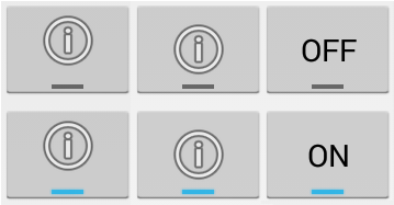
The result compared to regular ToggleButton looks like
The seconds option is to use an ImageSpan to actually replace the text with an image. Looks slightly better since the icon is at the correct position but can't be done with layout xml directly.
You create a plain ToggleButton
<ToggleButton
    android:id="@+id/toggleButton3"
    android:layout_width="wrap_content"
    android:layout_height="wrap_content"
    android:checked="false" />
Then set the "text" programmatially
ToggleButton button = (ToggleButton) findViewById(R.id.toggleButton3);
ImageSpan imageSpan = new ImageSpan(this, android.R.drawable.ic_menu_info_details);
SpannableString content = new SpannableString("X");
content.setSpan(imageSpan, 0, 1, Spanned.SPAN_EXCLUSIVE_EXCLUSIVE);
button.setText(content);
button.setTextOn(content);
button.setTextOff(content);
The result here in the middle - icon is placed slightly lower since it takes the place of the text.
Solution 3 - Android
create toggle_selector.xml in res/drawable
<?xml version="1.0" encoding="utf-8"?>
<selector xmlns:android="http://schemas.android.com/apk/res/android">
  <item android:drawable="@drawable/toggle_on" android:state_checked="true"/>
  <item android:drawable="@drawable/toggle_off" android:state_checked="false"/>
</selector>
apply the selector to your toggle button
<ToggleButton
            android:id="@+id/chkState"
            android:layout_width="wrap_content"
            android:layout_height="wrap_content"
            android:background="@drawable/toggle_selector"
            android:textOff=""
            android:textOn=""/>
Note: for removing the text i used following in above code
textOff=""
textOn=""
Solution 4 - Android
I know this is a little late, however for anyone interested, I've created a custom component that is basically a toggle image button, the drawable can have states as well as the background