WPF ListView Inactive Selection Color
WpfListviewSelectionWpf Problem Overview
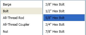
I'm creating a WPF application where several ListView selections are made in a row (similar to the iTunes browser). The problem is that the default inactive selection color is too light. (see below)
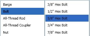
How can I change this color so my inactive listview looks like this? (see below)
Solution
Override the default SystemColor with a Style like so:
<Style TargetType="ListViewItem">
    <Style.Resources>
        <SolidColorBrush x:Key="{x:Static SystemColors.ControlBrushKey}" Color="{x:Static SystemColors.HighlightColor}"/>
    </Style.Resources>
</Style>
Wpf Solutions
Solution 1 - Wpf
Changing SystemColors.ControlBrushKey did not work for me, I had to change
SystemColors.InactiveSelectionHighlightBrushKey
So instead of:
<SolidColorBrush x:Key="{x:Static SystemColors.ControlBrushKey}" Color="Red" />
I had to use:
<SolidColorBrush x:Key="{x:Static SystemColors.InactiveSelectionHighlightBrushKey}" Color="Red"/>
Solution 2 - Wpf
The ListBox template uses a system color called ControlBrush to set the inactive highlight color. Therefore, you can just override that color:
<ListBox>
	<ListBox.Resources>
		<SolidColorBrush x:Key="{x:Static SystemColors.ControlBrushKey}">Red</SolidColorBrush>
	</ListBox.Resources>
</ListBox>
Solution 3 - Wpf
The answer will in some cases solve the problem, but is not ideal as it breaks when the control is disabled/readonly and it also overrides the color schemes, rather than taking advantage of them. My suggestion is to add the following in the ListBox tags instead:
<ListBox....>
    <ListBox.Resources>
            <Style TargetType="ListBoxItem">
                <Setter Property="Template">
                    <Setter.Value>
                        <ControlTemplate TargetType="ListBoxItem">
                            <Border Name="Border" Padding="2" SnapsToDevicePixels="true">
                                <ContentPresenter />
                            </Border>
                            <ControlTemplate.Triggers>
                                <Trigger Property="IsSelected" Value="true">
                                    <Setter TargetName="Border" Property="Background"
                                            Value="{DynamicResource {x:Static SystemColors.HighlightBrushKey}}"/>
                                </Trigger>
                            </ControlTemplate.Triggers>
                        </ControlTemplate>
                    </Setter.Value>
                </Setter>
        </Style>
    </ListBox.Resources>
</ListBox>
What this will do is set the Highlight background color on the list box item whenever it is selected (regardless of the control state).
My answer is based on help from the answer already given, along with the following blog: http://blogs.vbcity.com/xtab/archive/2009/06/29/9344.aspx
Solution 4 - Wpf
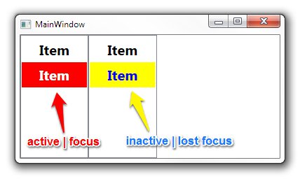
You have to override some properties of SystemColors. Take a look at SystemColors Class (MSDN). There are more properties than InactiveSelectionHighlightBrushKey, e.g. InactiveSelectionHighlightTextBrushKey which affects the color of text.
<Window x:Class="WpfApplication1.MainWindow"
        xmlns="http://schemas.microsoft.com/winfx/2006/xaml/presentation"
        xmlns:x="http://schemas.microsoft.com/winfx/2006/xaml"
        Title="MainWindow" Height="350" Width="525">
    <Window.Resources>
        <SolidColorBrush x:Key="{x:Static SystemColors.HighlightBrushKey}" Color="Red"/>
        <SolidColorBrush x:Key="{x:Static SystemColors.HighlightTextBrushKey}" Color="White"/>
        <SolidColorBrush x:Key="{x:Static SystemColors.InactiveSelectionHighlightBrushKey}" Color="Yellow"/>
        <SolidColorBrush x:Key="{x:Static SystemColors.InactiveSelectionHighlightTextBrushKey}" Color="Blue"/>
        <Style TargetType="ListViewItem">
            <Setter Property="FontSize" Value="20" />
            <Setter Property="FontWeight" Value="Bold" />
            <Setter Property="Padding" Value="25,5" />
        </Style>
    </Window.Resources>
    <StackPanel Orientation="Horizontal">
        <ListView>
            <ListViewItem Content="Item" />
            <ListViewItem Content="Item" />
        </ListView>
        <ListView>
            <ListViewItem Content="Item" />
            <ListViewItem Content="Item" />
        </ListView>
    </StackPanel>
</Window>
Solution 5 - Wpf
In older .NET Frameworks overriding system colors does't work. Solution that works in .NET Framework 4.0 is here.
<ListView>
<ListView.Resources>
<Style TargetType="{x:Type ListViewItem}">
    <Setter Property="Template">
        <Setter.Value>
            <ControlTemplate TargetType="{x:Type ListViewItem}">
                <Border x:Name="Bd"
                        BorderBrush="{TemplateBinding BorderBrush}"
                        BorderThickness="{TemplateBinding BorderThickness}"
                        Background="{TemplateBinding Background}"
                        Padding="{TemplateBinding Padding}"
                        SnapsToDevicePixels="true">
                    <ContentPresenter HorizontalAlignment="{TemplateBinding HorizontalContentAlignment}"
                                        SnapsToDevicePixels="{TemplateBinding SnapsToDevicePixels}"
                                        VerticalAlignment="{TemplateBinding VerticalContentAlignment}" />
                </Border>
                <ControlTemplate.Triggers>
                    <MultiTrigger>
                        <MultiTrigger.Conditions>
                            <Condition Property="Selector.IsSelectionActive"
                                        Value="False" />
                            <Condition Property="IsSelected"
                                        Value="True" />
                        </MultiTrigger.Conditions>
                        <Setter Property="Background"
                                TargetName="Bd"
                                Value="DarkOrange" />
                    </MultiTrigger>
                    <MultiTrigger>
                        <MultiTrigger.Conditions>
                            <Condition Property="Selector.IsSelectionActive"
                                        Value="True" />
                            <Condition Property="IsSelected"
                                        Value="True" />
                        </MultiTrigger.Conditions>
                        <Setter Property="Background"
                                TargetName="Bd"
                                Value="OrangeRed" />
                    </MultiTrigger>
                </ControlTemplate.Triggers>
            </ControlTemplate>
        </Setter.Value>
    </Setter>
</Style>
Works both for ListBox and ListView.
Solution 6 - Wpf
Based on this other answer I used the following to make the active & inactive colors the same without hardcoding the actual value:
<ListBox.Resources>
    <SolidColorBrush x:Key="{x:Static SystemColors.InactiveSelectionHighlightBrushKey}"
                     Color="{x:Static SystemColors.HighlightColor}"/>
    <SolidColorBrush x:Key="{x:Static SystemColors.InactiveSelectionHighlightTextBrushKey}"
                     Color="{x:Static SystemColors.HighlightTextColor}"/>
</ListBox.Resources>
Having the same colors for both active & inactive may not be ideal, but the default colors were so faint it was hard to tell which item was selected when it was inactive; this is a definite improvement.
Solution 7 - Wpf
Overriding the SystemColors, as most of the other answers advise, did not work for me. I ended up just editing the default style for ListBoxItem and setting ItemContainerStyle on the specific ListBox to the edited style. It's relatively painless compared to editing default styles for other controls. All you have to do is change the Item.SelectedInactive.Background and the Item.SelectedInactive.Border to the colors you want.
   <SolidColorBrush x:Key="Item.Static.Background" Color="#FFFCFCFC" />
    <SolidColorBrush x:Key="Item.Static.Border" Color="#FFFCFCFC" />
    <SolidColorBrush x:Key="Item.MouseOver.Background" Color="#1F26A0DA" />
    <SolidColorBrush x:Key="Item.MouseOver.Border" Color="#a826A0Da" />
    <SolidColorBrush x:Key="Item.SelectedActive.Background" Color="#3D26A0DA" />
    <SolidColorBrush x:Key="Item.SelectedActive.Border" Color="#FF26A0DA" />
    <SolidColorBrush x:Key="Item.SelectedInactive.Background" Color="#3DDADADA" />
    <SolidColorBrush x:Key="Item.SelectedInactive.Border" Color="#FFDADADA" />
    <Style x:Key="ModifiedColorListBox" TargetType="{x:Type ListBoxItem}">
        <Setter Property="SnapsToDevicePixels" Value="True" />
        <Setter Property="Padding" Value="4,1" />
        <Setter Property="HorizontalContentAlignment" Value="{Binding HorizontalContentAlignment, RelativeSource={RelativeSource AncestorType={x:Type ItemsControl}}}"/>
        <Setter Property="VerticalContentAlignment" Value="{Binding VerticalContentAlignment, RelativeSource={RelativeSource AncestorType={x:Type ItemsControl}}}"/>
        <Setter Property="Background" Value="Transparent" />
        <Setter Property="BorderBrush" Value="Transparent" />
        <Setter Property="BorderThickness" Value="1" />
        <Setter Property="FocusVisualStyle" Value="{StaticResource FocusVisual}" />
        <Setter Property="Template">
            <Setter.Value>
                <ControlTemplate TargetType="{x:Type ListBoxItem}">
                    <Border x:Name="Bd"
                        BorderBrush="{TemplateBinding BorderBrush}"
                        BorderThickness="{TemplateBinding BorderThickness}"
                        Background="{TemplateBinding Background}"
                        Padding="{TemplateBinding Padding}"
                        SnapsToDevicePixels="true">
                        <ContentPresenter
                            HorizontalAlignment="{TemplateBinding HorizontalContentAlignment}"
                            VerticalAlignment="{TemplateBinding VerticalContentAlignment}"
                            SnapsToDevicePixels="{TemplateBinding SnapsToDevicePixels}" />
                    </Border>
                    <ControlTemplate.Triggers>
                        <MultiTrigger>
                            <MultiTrigger.Conditions>
                                <Condition Property="IsMouseOver" Value="True" />
                            </MultiTrigger.Conditions>
                            <Setter TargetName="Bd" Property="Background" Value="{StaticResource Item.MouseOver.Background}" />
                            <Setter TargetName="Bd" Property="BorderBrush" Value="{StaticResource Item.MouseOver.Border}" />
                        </MultiTrigger>
                        <MultiTrigger>
                            <MultiTrigger.Conditions>
                                <Condition Property="Selector.IsSelectionActive" Value="False" />
                                <Condition Property="IsSelected" Value="True" />
                            </MultiTrigger.Conditions>
                            <Setter TargetName="Bd" Property="Background" Value="{StaticResource Item.SelectedInactive.Background}" />
                            <Setter TargetName="Bd" Property="BorderBrush" Value="{StaticResource Item.SelectedInactive.Border}" />
                        </MultiTrigger>
                        <MultiTrigger>
                            <MultiTrigger.Conditions>
                                <Condition Property="Selector.IsSelectionActive" Value="True" />
                                <Condition Property="IsSelected" Value="True" />
                            </MultiTrigger.Conditions>
                            <Setter TargetName="Bd" Property="Background" Value="{StaticResource Item.SelectedActive.Background}" />
                            <Setter TargetName="Bd" Property="BorderBrush" Value="{StaticResource Item.SelectedActive.Border}" />
                        </MultiTrigger>
                        <Trigger Property="IsEnabled" Value="False">
                            <Setter TargetName="Bd" Property="TextElement.Foreground" Value="{DynamicResource {x:Static SystemColors.GrayTextBrushKey}}"/>
                        </Trigger>
                    </ControlTemplate.Triggers>
                </ControlTemplate>
            </Setter.Value>
        </Setter>
    </Style>
And then usage from xaml:
<ListBox
	Name="SomeListBox"
	ItemContainerStyle="{StaticResource ModifiedColorListBox}"
	ItemsSource="{Binding SomeCollection}"
	SelectedItem="{Binding SomeObject}">
</ListBox>
Solution 8 - Wpf
For me this did the trick:
 <ListBox HorizontalContentAlignment="Stretch">
                <ListBox.ItemTemplate>
                    <DataTemplate>
                        <Label  Margin="-5, -2,-5,-2" Content="{Binding Item}">
                            <Label.Style>
                                <Style TargetType="Label">
                                    <Style.Triggers>
                                        <MultiDataTrigger>
                                            <MultiDataTrigger.Conditions>
                                                <Condition Binding="{Binding RelativeSource={RelativeSource Mode=FindAncestor,AncestorType={x:Type ListBox}},Path=IsFocused}" Value="False"/>
                                                <Condition Binding="{Binding RelativeSource={RelativeSource Mode=FindAncestor,AncestorType={x:Type ListBoxItem}},Path=IsSelected}" Value="True"/>
                                            </MultiDataTrigger.Conditions>
                                            <Setter Property="Background" Value="CornflowerBlue"/>
                                        </MultiDataTrigger>
                                        <DataTrigger Binding="{Binding RelativeSource={RelativeSource Mode=FindAncestor,AncestorType={x:Type ListBoxItem}},Path=IsSelected}" Value="True">
                                            <Setter Property="Foreground" Value="White"/>
                                        </DataTrigger>
                                        <DataTrigger Binding="{Binding RelativeSource={RelativeSource Mode=FindAncestor,AncestorType={x:Type ListBoxItem}},Path=IsSelected}" Value="False">
                                            <Setter Property="Foreground" Value="Black"/>
                                        </DataTrigger>
                                    </Style.Triggers>
                                </Style>
                            </Label.Style>
                        </Label>
                    </DataTemplate>
                </ListBox.ItemTemplate>
            </ListBox>