WPF C# button style
WpfXamlStylesWpf Problem Overview
Would somebody know how to recreate this button style in WPF? As I do not know how to make the different compartments. As well as the 2 different texts and text styles?

Wpf Solutions
Solution 1 - Wpf
To solve your question definitely need to use the Style and Template for the Button. But how exactly does he look like? Decisions may be several. For example, Button are two texts to better define the relevant TextBlocks? Can be directly in the template, but then use the buttons will be limited, because the template can be only one ContentPresenter. I decided to do things differently, to identify one ContentPresenter with an icon in the form of a Path, and the content is set using the buttons on the side.
The style:
<Style TargetType="{x:Type Button}">
    <Setter Property="Background" Value="#373737" />
    <Setter Property="Foreground" Value="White" />
    <Setter Property="FontSize" Value="15" />
    <Setter Property="SnapsToDevicePixels" Value="True" />

    <Setter Property="Template">
        <Setter.Value>
            <ControlTemplate TargetType="{x:Type Button}">
                <Border CornerRadius="4" Background="{TemplateBinding Background}">
                    <Grid>
                        <Path x:Name="PathIcon" Width="15" Height="25" Stretch="Fill" Fill="#4C87B3" HorizontalAlignment="Left" Margin="17,0,0,0" Data="F1 M 30.0833,22.1667L 50.6665,37.6043L 50.6665,38.7918L 30.0833,53.8333L 30.0833,22.1667 Z "/>
                        <ContentPresenter x:Name="MyContentPresenter" Content="{TemplateBinding Content}" HorizontalAlignment="Center" VerticalAlignment="Center" Margin="0,0,0,0" />
                    </Grid>
                </Border>

                <ControlTemplate.Triggers>
                    <Trigger Property="IsMouseOver" Value="True">
                        <Setter Property="Background" Value="#E59400" />
                        <Setter Property="Foreground" Value="White" />
                        <Setter TargetName="PathIcon" Property="Fill" Value="Black" />
                    </Trigger>

                    <Trigger Property="IsPressed" Value="True">
                        <Setter Property="Background" Value="OrangeRed" />
                        <Setter Property="Foreground" Value="White" />
                    </Trigger>
                </ControlTemplate.Triggers>
            </ControlTemplate>
        </Setter.Value>
    </Setter>
</Style>
Sample of using:
<Button Width="200" Height="50" VerticalAlignment="Top" Margin="0,20,0,0" />
    <Button.Content>
        <StackPanel>
            <TextBlock Text="Watch Now" FontSize="20" />
            <TextBlock Text="Duration: 50m" FontSize="12" Foreground="Gainsboro" />
        </StackPanel>
    </Button.Content>
</Button>
Output

It is best to StackPanel determine the Resources and set the Button so:
<Window.Resources>
    <StackPanel x:Key="MyStackPanel">
        <TextBlock Name="MainContent" Text="Watch Now" FontSize="20" />
        <TextBlock Name="DurationValue" Text="Duration: 50m" FontSize="12" Foreground="Gainsboro" />
    </StackPanel>
</Window.Resources>

<Button Width="200" Height="50" Content="{StaticResource MyStackPanel}" VerticalAlignment="Top" Margin="0,20,0,0" />
The question remains with setting the value for TextBlock Duration, because this value must be dynamic. I implemented it using attached DependencyProperty. Set it to the window, like that:
<Window Name="MyWindow" local:MyDependencyClass.CurrentDuration="Duration: 50m" ... />
Using in TextBlock:
<TextBlock Name="DurationValue" Text="{Binding ElementName=MyWindow, Path=(local:MyDependencyClass.CurrentDuration)}" FontSize="12" Foreground="Gainsboro" />
In fact, there is no difference for anyone to determine the attached DependencyProperty, because it is the predominant feature.
Example of set value:
private void Button_Click(object sender, RoutedEventArgs e)
{
    MyDependencyClass.SetCurrentDuration(MyWindow, "Duration: 101m");
}
A complete listing of examples:
XAML
<Window x:Class="ButtonHelp.MainWindow"
    xmlns="http://schemas.microsoft.com/winfx/2006/xaml/presentation"
    xmlns:x="http://schemas.microsoft.com/winfx/2006/xaml"
    xmlns:local="clr-namespace:ButtonHelp"
    Name="MyWindow"
    Title="MainWindow" Height="350" Width="525"
    WindowStartupLocation="CenterScreen"
    local:MyDependencyClass.CurrentDuration="Duration: 50m">

<Window.Resources>
    <Style TargetType="{x:Type Button}">
        <Setter Property="Background" Value="#373737" />
        <Setter Property="Foreground" Value="White" />
        <Setter Property="FontSize" Value="15" />
        <Setter Property="FontFamily" Value="./#Segoe UI" />
        <Setter Property="SnapsToDevicePixels" Value="True" />

        <Setter Property="Template">
            <Setter.Value>
                <ControlTemplate TargetType="{x:Type Button}">
                    <Border CornerRadius="4" Background="{TemplateBinding Background}">
                        <Grid>
                            <Path x:Name="PathIcon" Width="15" Height="25" Stretch="Fill" Fill="#4C87B3" HorizontalAlignment="Left" Margin="17,0,0,0" Data="F1 M 30.0833,22.1667L 50.6665,37.6043L 50.6665,38.7918L 30.0833,53.8333L 30.0833,22.1667 Z "/>
                            <ContentPresenter x:Name="MyContentPresenter" Content="{TemplateBinding Content}" HorizontalAlignment="Center" VerticalAlignment="Center" Margin="0,0,0,0" />
                        </Grid>
                    </Border>

                    <ControlTemplate.Triggers>
                        <Trigger Property="IsMouseOver" Value="True">
                            <Setter Property="Background" Value="#E59400" />
                            <Setter Property="Foreground" Value="White" />
                            <Setter TargetName="PathIcon" Property="Fill" Value="Black" />
                        </Trigger>

                        <Trigger Property="IsPressed" Value="True">
                            <Setter Property="Background" Value="OrangeRed" />
                            <Setter Property="Foreground" Value="White" />
                        </Trigger>
                    </ControlTemplate.Triggers>
                </ControlTemplate>
            </Setter.Value>
        </Setter>
    </Style>

    <StackPanel x:Key="MyStackPanel">
        <TextBlock Name="MainContent" Text="Watch Now" FontSize="20" />
        <TextBlock Name="DurationValue" Text="{Binding ElementName=MyWindow, Path=(local:MyDependencyClass.CurrentDuration)}" FontSize="12" Foreground="Gainsboro" />
    </StackPanel>
</Window.Resources>

<Grid>
    <Button Width="200" Height="50" Content="{StaticResource MyStackPanel}" VerticalAlignment="Top" Margin="0,20,0,0" />

    <Button Content="Set some duration" Style="{x:Null}" Width="140" Height="30" VerticalAlignment="Top" HorizontalAlignment="Left" Click="Button_Click" />
</Grid>
Code behind
public partial class MainWindow : Window
{
    public MainWindow()
    {
        InitializeComponent();
    }

    private void Button_Click(object sender, RoutedEventArgs e)
    {
        MyDependencyClass.SetCurrentDuration(MyWindow, "Duration: 101m");
    }
}

public class MyDependencyClass : DependencyObject
{
    public static readonly DependencyProperty CurrentDurationProperty;

    public static void SetCurrentDuration(DependencyObject DepObject, string value)
    {
        DepObject.SetValue(CurrentDurationProperty, value);
    }

    public static string GetCurrentDuration(DependencyObject DepObject)
    {
        return (string)DepObject.GetValue(CurrentDurationProperty);
    }

    static MyDependencyClass()
    {
        PropertyMetadata MyPropertyMetadata = new PropertyMetadata("Duration: 0m");

        CurrentDurationProperty = DependencyProperty.RegisterAttached("CurrentDuration",
                                                            typeof(string),
                                                            typeof(MyDependencyClass),
                                                            MyPropertyMetadata);
    }
}
Solution 2 - Wpf
Here's my attempt. Looks more similar to the OP's sample and provides settable properties for icon (FrameworkElement), title (string) and subtitle (string). The output looks like this:

Here's XAML:
<Button x:Class="Controls.FancyButton"
             xmlns="http://schemas.microsoft.com/winfx/2006/xaml/presentation"
             xmlns:x="http://schemas.microsoft.com/winfx/2006/xaml"
             xmlns:mc="http://schemas.openxmlformats.org/markup-compatibility/2006"
             xmlns:d="http://schemas.microsoft.com/expression/blend/2008"
             xmlns:local="clr-namespace:Controls"
             mc:Ignorable="d"
             d:DesignHeight="300" d:DesignWidth="300" Width="300" Height="80"
          BorderBrush="{x:Null}" BorderThickness="0">
  <Button.Effect>
    <DropShadowEffect BlurRadius="12" Color="Gray" Direction="270" Opacity=".8" ShadowDepth="3" />
  </Button.Effect>

  <Button.Template>
    <ControlTemplate TargetType="Button">
      <Grid Width="{Binding RelativeSource={RelativeSource AncestorType=Button}, Path=ActualWidth}"
        Height="{Binding RelativeSource={RelativeSource AncestorType=Button}, Path=ActualHeight}">

        <Border x:Name="MainBorder" CornerRadius="3" Grid.ColumnSpan="2" Margin="0,0,4,4" BorderBrush="Black" BorderThickness="1">
          <Border.Background>
            <LinearGradientBrush StartPoint="0.5,0" EndPoint="0.5,1">
              <GradientStop Color="#FF5E5E5E" Offset="0" />
              <GradientStop Color="#FF040404" Offset="1" />
            </LinearGradientBrush>
          </Border.Background>

          <Grid >
            <Grid.ColumnDefinitions>
              <ColumnDefinition Width="1.2*"/>
              <ColumnDefinition Width="3*"/>
            </Grid.ColumnDefinitions>

            <Border CornerRadius="2" Margin="0" BorderBrush="LightGray" BorderThickness="0,1,0,0" Grid.ColumnSpan="2" Grid.RowSpan="2" />

            <Line X1="10" Y1="0" X2="10" Y2="10" Stretch="Fill" Grid.Column="0" HorizontalAlignment="Right" Stroke="#0C0C0C" Grid.RowSpan="2" />
            <Line X1="10" Y1="0" X2="10" Y2="10" Stretch="Fill" Grid.Column="1" HorizontalAlignment="Left" Grid.RowSpan="2">
              <Line.Stroke>
                <LinearGradientBrush StartPoint="0,0" EndPoint="0,1">
                  <GradientStop Color="#4D4D4D" Offset="0" />
                  <GradientStop Color="#2C2C2C" Offset="1" />
                </LinearGradientBrush>
              </Line.Stroke>
            </Line>

            <ContentControl HorizontalAlignment="Center" VerticalAlignment="Center" Grid.RowSpan="2">
              <ContentControl.Content>
                <Binding RelativeSource="{RelativeSource TemplatedParent}" Path="Image">
                  <Binding.FallbackValue>
                    <Path Data="M0,0 L30,15 L0,30Z">
                      <Path.Effect>
                        <DropShadowEffect Direction="50" ShadowDepth="2" />
                      </Path.Effect>
                      <Path.Fill>
                        <LinearGradientBrush StartPoint="0,0.5" EndPoint="1,0.5">
                          <GradientStop Color="#4B86B2" Offset="0" />
                          <GradientStop Color="#477FA8" Offset="1" />
                        </LinearGradientBrush>
                      </Path.Fill>
                    </Path>
                  </Binding.FallbackValue>
                </Binding>
              </ContentControl.Content>
            </ContentControl>


            <Grid Grid.Column="1" HorizontalAlignment="Left" VerticalAlignment="Center">
              <Grid.RowDefinitions>
                <RowDefinition Height="Auto" />
                <RowDefinition Height="Auto" />
              </Grid.RowDefinitions>

              <TextBlock x:Name="Title" Text="{Binding RelativeSource={RelativeSource TemplatedParent}, Path=Title, FallbackValue='Watch Now'}" Grid.Column="1" VerticalAlignment="Bottom" FontFamily="Calibri" FontWeight="Bold" FontSize="28" Foreground="White" Margin="20,0,0,0" />
              <TextBlock x:Name="SubTitle" Text="{Binding RelativeSource={RelativeSource TemplatedParent}, Path=SubTitle, FallbackValue='Duration: 50 min'}" Grid.Column="1" Grid.Row="1" VerticalAlignment="top" FontFamily="Calibri" FontSize="14" Foreground="White" Margin="20,0,0,0" />
            </Grid>
          </Grid>
        </Border>
      </Grid>

      <ControlTemplate.Triggers>
        <Trigger Property="IsMouseOver" Value="True">
          <Setter TargetName="Title" Property="TextDecorations" Value="Underline" />
          <Setter TargetName="SubTitle" Property="TextDecorations" Value="Underline" />
        </Trigger>
        <Trigger Property="IsPressed" Value="True">
          <Setter TargetName="MainBorder" Property="Background">
            <Setter.Value>
              <LinearGradientBrush StartPoint="0.5,0" EndPoint="0.5,1">
                <GradientStop Color="#FF5E5E5E" Offset="0" />
                <GradientStop Color="#FFA4A4A4" Offset="1" />
              </LinearGradientBrush>
            </Setter.Value>
          </Setter>
        </Trigger>
      </ControlTemplate.Triggers>
    </ControlTemplate>
  </Button.Template>
</Button>
Here's the code-behind:
using System.Windows;
using System.Windows.Controls;

namespace Controls
{
  public partial class FancyButton : Button
  {
    public FancyButton()
    {
      InitializeComponent();
    }

    public string Title
    {
      get { return (string)GetValue(TitleProperty); }
      set { SetValue(TitleProperty, value); }
    }

    public static readonly DependencyProperty TitleProperty =
        DependencyProperty.Register("Title", typeof(string), typeof(FancyButton), new FrameworkPropertyMetadata("Title", FrameworkPropertyMetadataOptions.AffectsRender));

    public string SubTitle
    {
      get { return (string)GetValue(SubTitleProperty); }
      set { SetValue(SubTitleProperty, value); }
    }

    public static readonly DependencyProperty SubTitleProperty =
        DependencyProperty.Register("SubTitle", typeof(string), typeof(FancyButton), new FrameworkPropertyMetadata("SubTitle", FrameworkPropertyMetadataOptions.AffectsRender));

    public FrameworkElement Image
    {
      get { return (FrameworkElement)GetValue(ImageProperty); }
      set { SetValue(ImageProperty, value); }
    }

    public static readonly DependencyProperty ImageProperty =
        DependencyProperty.Register("Image", typeof(FrameworkElement), typeof(FancyButton), new FrameworkPropertyMetadata(null, FrameworkPropertyMetadataOptions.AffectsRender));
  }
}
Here is how to use it:
<controls:FancyButton Grid.Row="1" HorizontalAlignment="Right" Margin="3" Title="Watch Now" SubTitle="Duration: 50 min">
  <controls:FancyButton.Image>
    <Path Data="M0,0 L30,15 L0,30Z">
      <Path.Effect>
        <DropShadowEffect Direction="50" ShadowDepth="2" />
      </Path.Effect>
      <Path.Fill>
        <LinearGradientBrush StartPoint="0,0.5" EndPoint="1,0.5">
          <GradientStop Color="#4B86B2" Offset="0" />
          <GradientStop Color="#477FA8" Offset="1" />
        </LinearGradientBrush>
      </Path.Fill>
    </Path>
  </controls:FancyButton.Image>
</controls:FancyButton>
Solution 3 - Wpf
<!--Customize button -->

<LinearGradientBrush x:Key="Buttongradient" StartPoint="0.500023,0.999996" EndPoint="0.500023,4.37507e-006">
    <GradientStop Color="#5e5e5e" Offset="1" />
    <GradientStop Color="#0b0b0b" Offset="0" />
</LinearGradientBrush>

<Style x:Key="hhh" TargetType="{x:Type Button}">
    <Setter Property="Background" Value="{DynamicResource Buttongradient}"/>
    <Setter Property="Foreground" Value="White" />
    <Setter Property="FontSize" Value="15" />
    <Setter Property="SnapsToDevicePixels" Value="True" />
    <Setter Property="Template">
        <Setter.Value>
            <ControlTemplate TargetType="{x:Type Button}">
                <Border CornerRadius="4" Background="{TemplateBinding Background}" BorderBrush="Black" BorderThickness="0.5">
                    <Border.Effect>
                        <DropShadowEffect ShadowDepth="0" BlurRadius="2"></DropShadowEffect>
                    </Border.Effect>

                    <Grid>

                        <Path Width="9" Height="16.5" Stretch="Fill" Fill="#000"  HorizontalAlignment="Left" Margin="16.5,0,0,0" Data="F1 M 30.0833,22.1667L 50.6665,37.6043L 50.6665,38.7918L 30.0833,53.8333L 30.0833,22.1667 Z " Opacity="0.2">

                        </Path>
                        <Path x:Name="PathIcon" Width="8" Height="15"  Stretch="Fill" Fill="#4C87B3" HorizontalAlignment="Left" Margin="17,0,0,0" Data="F1 M 30.0833,22.1667L 50.6665,37.6043L 50.6665,38.7918L 30.0833,53.8333L 30.0833,22.1667 Z ">
                            <Path.Effect>
                                <DropShadowEffect ShadowDepth="0" BlurRadius="5"></DropShadowEffect>
                            </Path.Effect>
                        </Path>


                        <Line  HorizontalAlignment="Left" Margin="40,0,0,0" Name="line4" Stroke="Black" VerticalAlignment="Top" Width="2" Y1="0" Y2="640" Opacity="0.5" />
                        <ContentPresenter x:Name="MyContentPresenter" Content="{TemplateBinding Content}" HorizontalAlignment="Center" VerticalAlignment="Center" Margin="0,0,0,0" />
                    </Grid>
                </Border>

                <ControlTemplate.Triggers>
                    <Trigger Property="IsMouseOver" Value="True">
                        <Setter Property="Background" Value="#E59400" />
                        <Setter Property="Foreground" Value="White" />
                        <Setter TargetName="PathIcon" Property="Fill" Value="Black" />
                    </Trigger>

                    <Trigger Property="IsPressed" Value="True">
                        <Setter Property="Background" Value="OrangeRed" />
                        <Setter Property="Foreground" Value="White" />
                    </Trigger>
                </ControlTemplate.Triggers>
            </ControlTemplate>
        </Setter.Value>
    </Setter>
</Style>
Solution 4 - Wpf
In this day and age of mouse driven computers and tablets with touch screens etc, it is often forgotten to cater for input via keyboard only. A button should support a focus rectangle (the dotted rectangle when the button has focus) or another shape matching the button shape.
To add a focus rectangle to the button, use this XAML (from this site). Focus rectangle style:
<Style x:Key="ButtonFocusVisual">
  <Setter Property="Control.Template">
    <Setter.Value>
      <ControlTemplate>
        <Border>
          <Rectangle Margin="2" StrokeThickness="1" Stroke="#60000000" StrokeDashArray="1 2" />
        </Border>
      </ControlTemplate>
    </Setter.Value>
  </Setter>
</Style>
Applying the style to the button:
<Style TargetType="Button">
  <Setter Property="FocusVisualStyle" Value="{StaticResource ButtonFocusVisual}" />
  ...
Solution 5 - Wpf
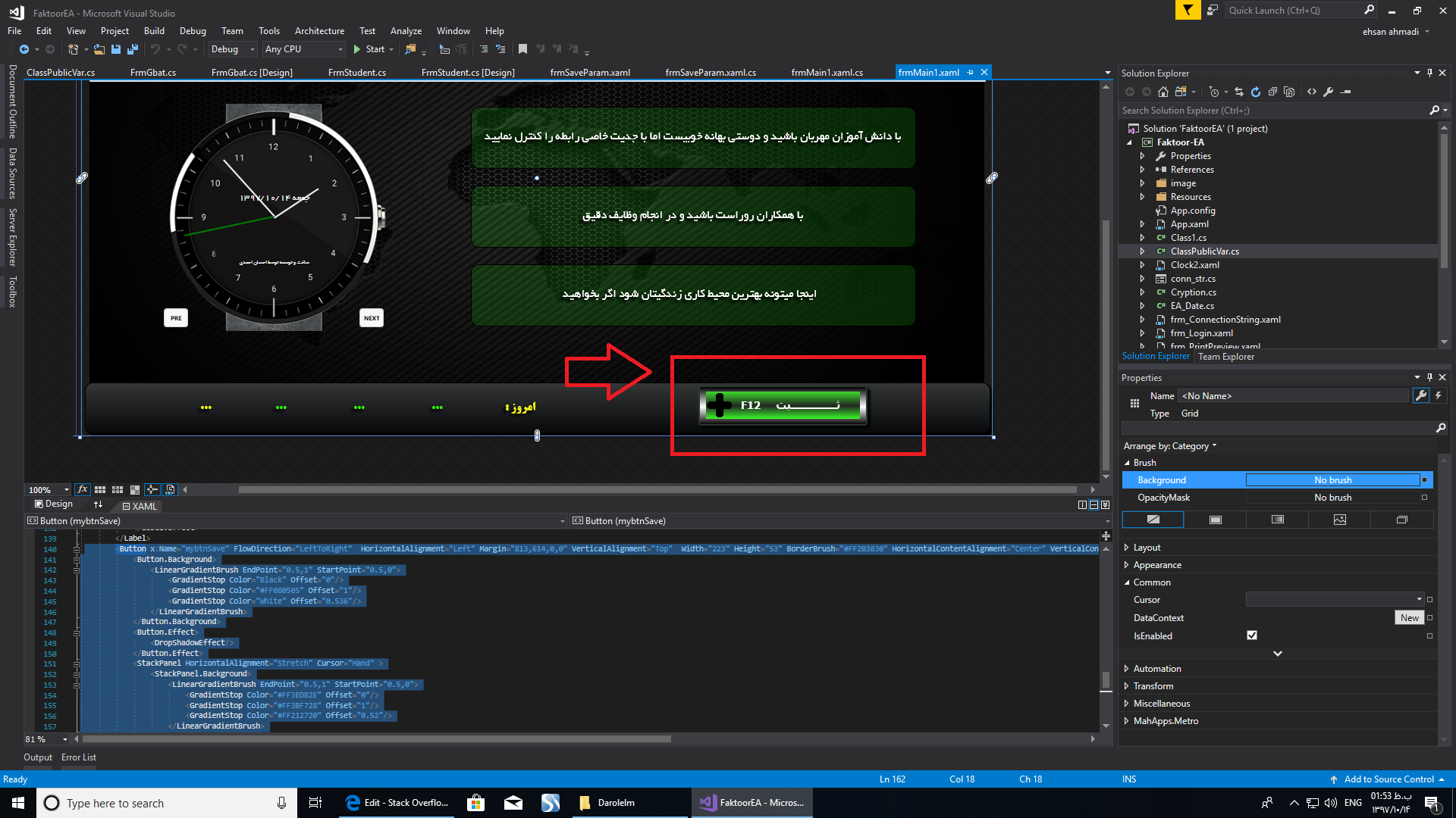
   <Button x:Name="mybtnSave" FlowDirection="LeftToRight"  HorizontalAlignment="Left" Margin="813,614,0,0" VerticalAlignment="Top"  Width="223" Height="53" BorderBrush="#FF2B3830" HorizontalContentAlignment="Center" VerticalContentAlignment="Center" FontFamily="B Titr" FontSize="15" FontWeight="Bold" BorderThickness="2" TabIndex="107" Click="mybtnSave_Click" >
        <Button.Background>
            <LinearGradientBrush EndPoint="0.5,1" StartPoint="0.5,0">
                <GradientStop Color="Black" Offset="0"/>
                <GradientStop Color="#FF080505" Offset="1"/>
                <GradientStop Color="White" Offset="0.536"/>
            </LinearGradientBrush>
        </Button.Background>
        <Button.Effect>
            <DropShadowEffect/>
        </Button.Effect>
        <StackPanel HorizontalAlignment="Stretch" Cursor="Hand" >
            <StackPanel.Background>
                <LinearGradientBrush EndPoint="0.5,1" StartPoint="0.5,0">
                    <GradientStop Color="#FF3ED82E" Offset="0"/>
                    <GradientStop Color="#FF3BF728" Offset="1"/>
                    <GradientStop Color="#FF212720" Offset="0.52"/>
                </LinearGradientBrush>
            </StackPanel.Background>
            <Image HorizontalAlignment="Left"  Source="image/Append Or Save 3.png" Height="36" Width="203" />
            <TextBlock HorizontalAlignment="Center" Width="145" Height="22" VerticalAlignment="Top" Margin="0,-31,-35,0" Text="Save Com F12" FontFamily="Tahoma" FontSize="14" Padding="0,4,0,0" Foreground="White" />
        </StackPanel>
    </Button>