Set CornerRadius on button template
C#WpfSilverlightXamlC# Problem Overview
I want to have a Button that defines no CornerRadius and two others that do, how can I achieve this?
<Style TargetType="Button" x:Key="TabButton">
    <Setter Property="Background" Value="White" />
    <Setter Property="TextBlock.TextAlignment" Value="Center" />
    <Setter Property="Template">
        <Setter.Value>
            <ControlTemplate TargetType="Button">
                <Border CornerRadius="0" Background="White" BorderBrush="#ccc" BorderThickness="0,1,1,0" >
                    <ContentPresenter x:Name="contentPresenter" ContentTemplate="{TemplateBinding ContentTemplate}" Content="{TemplateBinding Content}" HorizontalAlignment="{TemplateBinding HorizontalContentAlignment}" Margin="{TemplateBinding Padding}" VerticalAlignment="{TemplateBinding VerticalContentAlignment}"/>
                </Border>
            </ControlTemplate>
        </Setter.Value>
    </Setter>
</Style>

<Style TargetType="Button" x:Key="TabButtonFirst" BasedOn="{StaticResource TabButton}">
    <Setter Property="CornerRadius" Value="3,0,0,0" />
</Style>

<Style TargetType="Button" x:Key="TabButtonLast" BasedOn="{StaticResource TabButton}">
    <Setter Property="CornerRadius" Value="0,0,0,3" />
</Style>
C# Solutions
Solution 1 - C#
You're not limited to the dependency properties of the control you're templating. In this case, while Button does not have a CornerRadius property, Border does, so you can use Border.CornerRadius instead:
<Style TargetType="Button" x:Key="TabButton">
    <Setter Property="Background" Value="White" />
    <Setter Property="TextBlock.TextAlignment" Value="Center" />
    <Setter Property="Template">
        <Setter.Value>
            <ControlTemplate TargetType="Button">
                <Border CornerRadius="{TemplateBinding Border.CornerRadius}"
                        Background="White" BorderBrush="#ccc"
                        BorderThickness="0,1,1,0" >
                    <ContentPresenter x:Name="contentPresenter"
                                      ContentTemplate="{TemplateBinding ContentTemplate}"
                                      Content="{TemplateBinding Content}"
                                      HorizontalAlignment="{TemplateBinding HorizontalContentAlignment}"
                                      Margin="{TemplateBinding Padding}"
                                      VerticalAlignment="{TemplateBinding VerticalContentAlignment}"/>
                </Border>
            </ControlTemplate>
        </Setter.Value>
    </Setter>
</Style>

<Style TargetType="Button" x:Key="TabButtonFirst" BasedOn="{StaticResource TabButton}">
    <Setter Property="Border.CornerRadius" Value="3,0,0,0" />
</Style>

<Style TargetType="Button" x:Key="TabButtonLast" BasedOn="{StaticResource TabButton}">
    <Setter Property="Border.CornerRadius" Value="0,0,0,3" />
</Style>
With this approach, you no longer need to maintain multiple copies of your control template.
Solution 2 - C#
Just create a new Button like this:
<!--Button-->
            <Button
               Name="myButton"
               Content="OK"
               FontFamily="Century Gothic"
               Foreground="white"
               Background="CornflowerBlue"
               BorderThickness="0"
               Padding="10"
               Margin="10,5">

                <Button.Resources>
                    <Style TargetType="{x:Type Border}">
                        <Setter Property="CornerRadius" Value="7"/>
                    </Style>
                </Button.Resources>

            </Button>
Solution 3 - C#
As Nitesh has said you do not have a CornerRadius Property on the Button, it is a property of the Border as you have shown in your first style, just duplicate your first Style and change the CornerRadius, then assign it to the Style of the appropriate Button.
<Window x:Class="WpfApplication1.MainWindow"
xmlns="http://schemas.microsoft.com/winfx/2006/xaml/presentation"
xmlns:x="http://schemas.microsoft.com/winfx/2006/xaml"
Title="MainWindow" Height="350" Width="525">
<Window.Resources>
<Style TargetType="Button" x:Key="TabButton">
<Setter Property="Background" Value="White" />
<Setter Property="TextBlock.TextAlignment" Value="Center" />
<Setter Property="Template">
<Setter.Value>
<ControlTemplate TargetType="Button">
<Border CornerRadius="0" Background="White" BorderBrush="#ccc" BorderThickness="0,1,1,0" >
<ContentPresenter x:Name="contentPresenter" ContentTemplate="{TemplateBinding ContentTemplate}" Content="{TemplateBinding Content}" HorizontalAlignment="{TemplateBinding HorizontalContentAlignment}" Margin="{TemplateBinding Padding}" VerticalAlignment="{TemplateBinding VerticalContentAlignment}"/>
</Border>
</ControlTemplate>
</Setter.Value>
</Setter>
</Style>
<Style TargetType="Button" x:Key="TabButtonFirst">
<Setter Property="Background" Value="White" />
<Setter Property="TextBlock.TextAlignment" Value="Center" />
<Setter Property="Template">
<Setter.Value>
<ControlTemplate TargetType="Button">
<Border CornerRadius="3,0,0,0" Background="White" BorderBrush="#ccc" BorderThickness="0,1,1,0" >
<ContentPresenter x:Name="contentPresenter" ContentTemplate="{TemplateBinding ContentTemplate}" Content="{TemplateBinding Content}" HorizontalAlignment="{TemplateBinding HorizontalContentAlignment}" Margin="{TemplateBinding Padding}" VerticalAlignment="{TemplateBinding VerticalContentAlignment}"/>
</Border>
</ControlTemplate>
</Setter.Value>
</Setter>
</Style>
<Style TargetType="Button" x:Key="TabButtonLast">
<Setter Property="Background" Value="White" />
<Setter Property="TextBlock.TextAlignment" Value="Center" />
<Setter Property="Template">
<Setter.Value>
<ControlTemplate TargetType="Button">
<Border CornerRadius="0,0,0,3" Background="White" BorderBrush="#ccc" BorderThickness="0,1,1,0" >
<ContentPresenter x:Name="contentPresenter" ContentTemplate="{TemplateBinding ContentTemplate}" Content="{TemplateBinding Content}" HorizontalAlignment="{TemplateBinding HorizontalContentAlignment}" Margin="{TemplateBinding Padding}" VerticalAlignment="{TemplateBinding VerticalContentAlignment}"/>
</Border>
</ControlTemplate>
</Setter.Value>
</Setter>
</Style>
</Window.Resources>
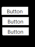
<Grid Background="Black">
<Button Style="{StaticResource TabButton}" Content="Button" Height="23" HorizontalAlignment="Left" Margin="12,72,0,0" Name="button1" VerticalAlignment="Top" Width="75" />
<Button Style="{StaticResource TabButtonFirst}" Content="Button" Height="23" HorizontalAlignment="Left" Margin="10,43,0,0" Name="button2" VerticalAlignment="Top" Width="75" />
<Button Style="{StaticResource TabButtonLast}" Content="Button" Height="23" HorizontalAlignment="Left" Margin="12,101,0,0" Name="button3" VerticalAlignment="Top" Width="75" />
</Grid>
</Window>
Solution 4 - C#
Instead of using ControlTemplate you can simply use Style.Resources and target the border:
<Style TargetType="Button" x:Key="TabButton">
  <Setter Property="Background" Value="White" />
  <Setter Property="TextBlock.TextAlignment" Value="Center" />
  <Style.Resources>
    <Style TargetType="Border">
      <Setter Property="CornerRadius" Value="3,0,0,0" />
    </Style>
  </Style.Resources>
</Style>
Solution 5 - C#
You can use attached properties for setting button border radius (also the same will work for textboxes).
Create class for attached property
public class CornerRadiusSetter
{
    public static CornerRadius GetCornerRadius(DependencyObject obj) => (CornerRadius)obj.GetValue(CornerRadiusProperty);

    public static void SetCornerRadius(DependencyObject obj, CornerRadius value) => obj.SetValue(CornerRadiusProperty, value);

    public static readonly DependencyProperty CornerRadiusProperty =
        DependencyProperty.RegisterAttached(nameof(Border.CornerRadius), typeof(CornerRadius),
            typeof(CornerRadiusSetter), new UIPropertyMetadata(new CornerRadius(), CornerRadiusChangedCallback));

    public static void CornerRadiusChangedCallback(object sender, DependencyPropertyChangedEventArgs e)
    {
        Control control = sender as Control;

        if (control == null) return;

        control.Loaded += Control_Loaded;
    }

    private static void Control_Loaded(object sender, EventArgs e)
    {
        Control control = sender as Control;

        if (control == null || control.Template == null) return;

        control.ApplyTemplate();

        Border border = control.Template.FindName("border", control) as Border;

        if (border == null) return;

        border.CornerRadius = GetCornerRadius(control);
    }
}
Then you can use attached property syntax to style multiple buttons without style duplicates:
<Button local:CornerRadiusSetter.CornerRadius="3,0,0,0">Click me!</Button>

<Button local:CornerRadiusSetter.CornerRadius="0,0,0,3">Click me!</Button>
Solution 6 - C#
I would make my own custom button class (inherited from Button) that includes a CornerRadius dependency property. And then the target type of your style becomes this new class and you can use template binding to set the corner radius.
With this approach not only do you not need to maintain multiple copies of your control template, but you don't need to create a new style for each time you want to modify your corner radius. You can just set or bind directly to your CornerRadius dependency property.
So your code for the control could look something like this:
public class MyCustomButton : Button
{
    public static readonly DependencyProperty CornerRadiusProperty =
        DependencyProperty.Register("CornerRadius", typeof(CornerRadius), typeof(MyCustomButton), new FrameworkPropertyMetadata(new CornerRadius(0)));

    public CornerRadius CornerRadius
    {
        get { return (CornerRadius)GetValue(CornerRadiusProperty); }
        set { SetValue(CornerRadiusProperty, value); }
    }
}
And the XAML:
<Style TargetType="MyCustomButton" x:Key="TabButton">
    <Setter Property="Background" Value="White" />
    <Setter Property="TextBlock.TextAlignment" Value="Center" />
    <Setter Property="Template">
        <Setter.Value>
            <ControlTemplate TargetType="MyCustomButton">
                <Border CornerRadius="{TemplateBinding CornerRadius}" Background="White" BorderBrush="#ccc" BorderThickness="0,1,1,0" >
                    <ContentPresenter x:Name="contentPresenter" ContentTemplate="{TemplateBinding ContentTemplate}" Content="{TemplateBinding Content}" HorizontalAlignment="{TemplateBinding HorizontalContentAlignment}" Margin="{TemplateBinding Padding}" VerticalAlignment="{TemplateBinding VerticalContentAlignment}"/>
                </Border>
            </ControlTemplate>
        </Setter.Value>
    </Setter>
</Style>
So for your buttons that need no corner radius, since the dependency property defaults it to 0, you don't need to do anything. For the ones that have a corner radius, you just set the dependency property to the appropriate value as you would the CornerRadius property for a normal Border.
Solution 7 - C#
 private Button [] Buttonsd() // Select all buttons on page
        {

            /// casting the content into panel
            Panel mainContainer = (Panel)this.Content;

            /// GetAll UIElement
            UIElementCollection element = mainContainer.Children;

            /// casting the UIElementCollection into List
            ///
            List<DependencyObject> lstElement = element.Cast<DependencyObject>().ToList();

            /// Geting all Control from list
            ///
            Button [] btns =  lstElement.OfType<Button>().ToArray();


            return btns;

            //maingrid.Children.Add(new Button() { Content = "HELLOMOTO" }); added new controls


        }


private void RadiusButtons(int radiusvalue,Button btn)
            {
                ControlTemplate template = btn.Template;
                Border Border = (Border)template.FindName("border", btn);
                CornerRadius radius = new CornerRadius(radiusvalue);
                Border.CornerRadius = radius;

              }

                private void AllButtonsSettings()
            {
                Button[] buttons = Buttonsd(); // create buttons collection

                foreach(Button btn in Buttonsd())
                {
                    RadiusButtons(21, btn);
                }


            }