Setting a max character length in CSS
HtmlCssTextHtml Problem Overview
I am making responsive website for school and my question is:
How do I set a max character length of the sentences (with CSS) on my website (like 75 characters) that when I have a very large screen, the sentences wont go further than 75 characters.
I have tried a max width but that messes up my layout. I am using flexbox and media queries to make it responsive.
Html Solutions
Solution 1 - Html
You could always use a truncate method by setting a max-width and overflow ellipsis like this
p {
  white-space: nowrap;
  overflow: hidden;
  text-overflow: ellipsis;
  max-width: 200px;
}
An example:
.wrapper {
  padding: 20px;
  background: #eaeaea;
  max-width: 400px;
  margin: 50px auto;
}

.demo-1 {
  overflow: hidden;
  display: -webkit-box;
  -webkit-line-clamp: 3;
  -webkit-box-orient: vertical;
}

.demo-2 {
  overflow: hidden;
  white-space: nowrap;
  text-overflow: ellipsis;
  max-width: 150px;
}
<div class="wrapper">
  <p class="demo-1">Lorem ipsum dolor sit amet, consectetur adipisicing elit. Ut odio temporibus voluptas error distinctio hic quae corrupti vero doloribus optio! Inventore ex quaerat modi blanditiis soluta maiores illum, ab velit.</p>
</div>

<div class="wrapper">
  <p class="demo-2">Lorem ipsum dolor sit amet, consectetur adipisicing elit. Ut odio temporibus voluptas error distinctio hic quae corrupti vero doloribus optio! Inventore ex quaerat modi blanditiis soluta maiores illum, ab velit.</p>
</div>
For a multi-line truncation have a look at a flex solution.
An example with truncation on 3 rows.
p {
  overflow: hidden;
  display: -webkit-box;
  -webkit-line-clamp: 3;
  -webkit-box-orient: vertical;
}
An example:
p {
  white-space: nowrap;
  overflow: hidden;
  text-overflow: ellipsis;
  max-width: 200px;
}
<p>Lorem ipsum dolor sit amet, consectetur adipisicing elit. Deserunt rem odit quis quaerat. In dolorem praesentium velit ea esse consequuntur cum fugit sequi voluptas ut possimus voluptatibus deserunt nisi eveniet!</p>
Solution 2 - Html
There is a CSS 'length value' of ch.
> This unit represents the width, or more precisely the advance measure, > of the glyph '0' (zero, the Unicode character U+0030) in the element's > font.
This may approximate what you are after.
p {
  overflow: hidden;
  max-width: 75ch;
}
<p>Lorem ipsum dolor sit amet, consectetur adipisicing elit. Deserunt rem odit quis quaerat. In dolorem praesentium velit ea esse consequuntur cum fugit sequi voluptas ut possimus voluptatibus deserunt nisi eveniet!Lorem ipsum dolor sit amet, consectetur
  adipisicing elit. Dolorem voluptates vel dolorum autem ex repudiandae iste quasi. Minima explicabo qui necessitatibus porro nihil aliquid deleniti ullam repudiandae dolores corrupti eaque.</p>
Solution 3 - Html
Try this for truncating characters after setting it to max-width. I have used 75ch in this case
p {
    white-space: nowrap;
    overflow: hidden;
    text-overflow: ellipsis;
    max-width: 75ch;
}
<p>Lorem ipsum dolor sit amet, consectetur adipiscing elit. Proin nisi ligula, dapibus a volutpat sit amet, mattis etc. Lorem ipsum dolor sit amet, consectetur adipiscing elit. Proin nisi ligula, dapibus a volutpat sit amet, mattis etc.</p>
For multiline truncating, please follow the link.
An example: https://codepen.io/srekoble/pen/EgmyxV
We will be using webkit css for this. In short WebKit is a HTML/CSS web browser rendering engine for Safari/Chrome. This may be brower specific as every browser is backed by a rendering engine to draw the HTML/CSS web page.
Solution 4 - Html
example code:
.limited-text{
    white-space: nowrap;
    width: 400px;
    overflow: hidden;
    text-overflow: ellipsis;
}
<p class="limited-text">Lorem ipsum dolor sit amet, consectetur adipisicing elit. Ut odio temporibus voluptas error distinctio hic quae corrupti vero doloribus optio! Inventore ex quaerat modi blanditiis soluta maiores illum, ab velit.</p>
Solution 5 - Html
With Chrome you can set the number of lines displayed with "-webkit-line-clamp" :
     display: -webkit-box;
    -webkit-box-orient: vertical;
    -webkit-line-clamp: 3;  /* Number of lines displayed before it truncate */
     overflow: hidden;
So for me it is to use in an extension so it is perfect, more information here: https://medium.com/mofed/css-line-clamp-the-good-the-bad-and-the-straight-up-broken-865413f16e5
Solution 6 - Html
That's not possible with CSS, you will have to use the Javascript for that. Although you can set the width of the p to as much as 30 characters and next letters will automatically come down but again this won't be that accurate and will vary if the characters are in capital.
Solution 7 - Html
HTML
<div id="dash">
<p>Lorem ipsum dolor sit amet, consectetur adipiscing elit. Proin nisi ligula, dapibus a volutpat sit amet, mattis et dui. Nunc porttitor accumsan orci id luctus. Phasellus ipsum metus, tincidunt non rhoncus id, dictum a lectus. Nam sed ipsum a urna ac
quam.</p>
</div>
jQuery
var p = $('#dash p');
var ks = $('#dash').height();
while ($(p).outerHeight() > ks) {
  $(p).text(function(index, text) {
    return text.replace(/\W*\s(\S)*$/, '...');
  });
}
CSS
#dash {
  width: 400px;
  height: 60px;
  overflow: hidden;
}

#dash p {
  padding: 10px;
  margin: 0;
}
RESULT
> Lorem ipsum dolor sit amet, consectetur adipiscing elit. Proin nisi > ligula, dapibus a volutpat sit amet, mattis et...
https://jsfiddle.net/kingtaherkings/am0wsdu6/2/">Jsfiddle</a>
Solution 8 - Html
This post is for a CSS solution, but the post is quite old, so just in case others stumble on this and are using a modern JS framework such as Angular 4+, there is a simple way to do this through Angular Pipes without having to mess around with CSS.
There are probably "React" or "Vue" ways of doing this as well. This is just to showcase how it could be done within a framework.
truncate-text.pipe.ts
/**
 * Helper to truncate text using JS in view only.
 *
 * This is pretty difficult to do reliably with CSS, especially when there are
 * multiple lines.
 *
 * Example: {{ value | truncateText:maxLength }} or {{ value | truncateText:45 }}
 *
 * If maxLength is not provided, the value will be returned without any truncating. If the
 * text is shorter than the maxLength, the text will be returned untouched. If the text is greater
 * than the maxLength, the text will be returned with 3 characters less than the max length plus
 * some ellipsis at the end to indicate truncation.
 *
 * For example: some really long text I won't bother writing it all ha...
 */
@Pipe({ name: 'truncateText' })
export class TruncateTextPipe implements PipeTransform {
  transform(value: string, ...args: any[]): any {
    const maxLength = args[0]
    const maxLengthNotProvided = !maxLength
    const isShorterThanMaximumLength = value.length < maxLength
    if (maxLengthNotProvided || isShorterThanMaximumLength) {
      return value
    }
    const shortenedString = value.substr(0, maxLength - 3)
    return `${shortenedString}...`
  }
}
app.component.html
<h1>{{ application.name | truncateText:45 }}</h1>
Solution 9 - Html
Modern CSS Grid Answer
View the fully working code on CodePen. Given the following HTML:
<div class="container">
    <p>Several paragraphs of text...</p>
</div>
You can use CSS Grid to create three columns and tell the container to take a maximum width of 70 characters for the middle column which contains our paragraph.
.container
{
  display: grid;
  grid-template-columns: 1fr, 70ch 1fr;
}

p {
  grid-column: 2 / 3;
}
This is what it looks like (Checkout CodePen for a fully working example):

Here is another example where you can use minmax to set a range of values. On small screens the width will be set to 50 characters wide and on large screens it will be 70 characters wide.
.container
{
  display: grid;
  grid-template-columns: 1fr minmax(50ch, 70ch) 1fr;
}

p {
  grid-column: 2 / 3;
}
Solution 10 - Html
Pure CSS solution to truncating multi line characters
I had a similar problem and found this excellent css only solution from Hackingui.com. You can read the article for information but below is the main code.
I tested it and it works perfectly. Hopefully someone finds it useful before opting for JS or server side options
  /* styles for '...' */
.block-with-text {
  /* hide text if it more than N lines  */
  overflow: hidden;
  /* for set '...' in absolute position */
  position: relative;
  /* use this value to count block height */
  line-height: 1.2em;
  /* max-height = line-height (1.2) * lines max number (3) */
  max-height: 3.6em;
  /* fix problem when last visible word doesn't adjoin right side  */
  text-align: justify;
  /* place for '...' */
  margin-right: -1em;
  padding-right: 1em;
}

/* create the ... */
.block-with-text:before {
  /* points in the end */
  content: '...';
  /* absolute position */
  position: absolute;
  /* set position to right bottom corner of block */
  right: 0;
  bottom: 0;
}

/* hide ... if we have text, which is less than or equal to max lines */
.block-with-text:after {
  /* points in the end */
  content: '';
  /* absolute position */
  position: absolute;
  /* set position to right bottom corner of text */
  right: 0;
  /* set width and height */
  width: 1em;
  height: 1em;
  margin-top: 0.2em;
  /* bg color = bg color under block */
  background: white;
}
Solution 11 - Html
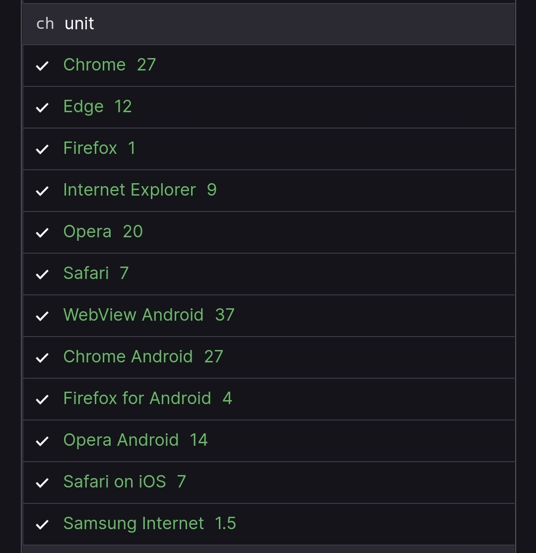
Fully supported in all browsers.
Solution 12 - Html
Try my solution with 2 different ways.
<div class="wrapper">
      <p class="demo-1">Lorem ipsum dolor sit amet, consectetur adipisicing elit. Ut odio temporibus voluptas error distinctio hic quae corrupti vero doloribus optio! Inventore ex quaerat modi blanditiis soluta maiores illum, ab velit.</p>
</div>

<div class="wrapper">
  <p class="demo-2">Lorem ipsum dolor sit amet, consectetur adipisicing elit. Ut odio temporibus voluptas error distinctio hic quae corrupti vero doloribus optio! Inventore ex quaerat modi blanditiis soluta maiores illum, ab velit.</p>
</div>

.wrapper {
  padding: 20px;
  background: #eaeaea;
  max-width: 400px;
  margin: 50px auto;
}

.demo-1 {
  overflow: hidden;
  display: -webkit-box;
  -webkit-line-clamp: 3;
  -webkit-box-orient: vertical;
}

.demo-2 {
  overflow: hidden;
  white-space: nowrap;
  text-overflow: ellipsis;
  max-width: 150px;
}
Solution 13 - Html
You can always look at how wide your font is and take the average character pixel size. Then just multiply that by the number of characters you want. It's a bit tacky but it works as a quick fix.