Nested rows with bootstrap grid system?
CssHtmlTwitter BootstrapGridGrid SystemCss Problem Overview
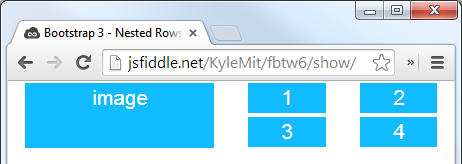
I want 1 larger image with 4 smaller images in a 2x2 format like this:

My initial thought was to house everything in one row. Then create two columns, and, in the second column, create two rows and two columns to create the 1x1 and 2x2 effect.
However, this doesn't seem to be possible, or I am just not doing it correctly?
Css Solutions
Solution 1 - Css
Bootstrap Version 3.x
As always, read Bootstrap's great documentation:
3.x Docs: https://getbootstrap.com/docs/3.3/css/#grid-nesting
Make sure the parent level row is inside of a .container element. Whenever you'd like to nest rows, just open up a new .row inside of your column.
Here's a simple layout to work from:
<div class="container">
    <div class="row">
        <div class="col-xs-6">
            <div class="big-box">image</div>
        </div>
        <div class="col-xs-6">
            <div class="row">
                <div class="col-xs-6"><div class="mini-box">1</div></div>
                <div class="col-xs-6"><div class="mini-box">2</div></div>
                <div class="col-xs-6"><div class="mini-box">3</div></div>
                <div class="col-xs-6"><div class="mini-box">4</div></div>
            </div>
        </div>
    </div>
</div>
Bootstrap Version 4.0
4.0 Docs: http://getbootstrap.com/docs/4.0/layout/grid/#nesting
Here's an updated version for 4.0, but you should really read the entire docs section on the grid so you understand how to leverage this powerful feature
<div class="container">
  <div class="row">
    <div class="col big-box">
      image
    </div>

    <div class="col">
      <div class="row">
        <div class="col mini-box">1</div>
        <div class="col mini-box">2</div>
      </div>
      <div class="row">
        <div class="col mini-box">3</div>
        <div class="col mini-box">4</div>
      </div>
    </div>

  </div>
</div>
Demo in Fiddle jsFiddle 3.x | jsFiddle 4.0
Which will look like this (with a little bit of added styling):
Solution 2 - Css
Adding to what @KyleMit said, consider using:
col-md-*classes for the larger outer columnscol-xs-*classes for the smaller inner columns
This will be useful when you view the page on different screen sizes.
On a small screen, the wrapping of larger outer columns will then happen while maintaining the smaller inner columns, if possible