How to create EditText with rounded corners?
AndroidViewAndroid EdittextRounded CornersAndroid ShapedrawableAndroid Problem Overview
How to create an EditText that has rounded corners instead of the default rectangular-shaped corners?
Android Solutions
Solution 1 - Android
There is an easier way than the one written by CommonsWare. Just create a drawable resource that specifies the way the EditText will be drawn:
<?xml version="1.0" encoding="utf-8"?>
<!--  res/drawable/rounded_edittext.xml -->
<shape xmlns:android="http://schemas.android.com/apk/res/android"
    android:shape="rectangle"
    android:padding="10dp">

    <solid android:color="#FFFFFF" />
    <corners
        android:bottomRightRadius="15dp"
        android:bottomLeftRadius="15dp"
        android:topLeftRadius="15dp"
        android:topRightRadius="15dp" />
</shape>
Then, just reference this drawable in your layout:
<?xml version="1.0" encoding="utf-8"?>
<LinearLayout xmlns:android="http://schemas.android.com/apk/res/android"
    android:orientation="vertical"
    android:layout_width="fill_parent"
    android:layout_height="fill_parent">

    <EditText
        android:layout_width="fill_parent"
        android:layout_height="wrap_content"
        android:padding="5dip"
        android:background="@drawable/rounded_edittext" />
</LinearLayout>
You will get something like:
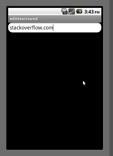
Edit
Based on Mark's comment, I want to add the way you can create different states for your EditText:
<?xml version="1.0" encoding="utf-8"?>
<!-- res/drawable/rounded_edittext_states.xml -->
<selector xmlns:android="http://schemas.android.com/apk/res/android">
    <item
        android:state_pressed="true"
        android:state_enabled="true"
        android:drawable="@drawable/rounded_focused" />
    <item
        android:state_focused="true"
        android:state_enabled="true"
        android:drawable="@drawable/rounded_focused" />
    <item
        android:state_enabled="true"
        android:drawable="@drawable/rounded_edittext" />
</selector>
These are the states:
<?xml version="1.0" encoding="utf-8"?>
<!-- res/drawable/rounded_edittext_focused.xml -->
<shape xmlns:android="http://schemas.android.com/apk/res/android"
    android:shape="rectangle" android:padding="10dp">

    <solid android:color="#FFFFFF"/>
    <stroke android:width="2dp" android:color="#FF0000" />
    <corners
        android:bottomRightRadius="15dp"
        android:bottomLeftRadius="15dp"
        android:topLeftRadius="15dp"
        android:topRightRadius="15dp" />
</shape>
And... now, the EditText should look like:
<?xml version="1.0" encoding="utf-8"?>
<LinearLayout xmlns:android="http://schemas.android.com/apk/res/android"
    android:orientation="vertical"
    android:layout_width="fill_parent"
    android:layout_height="fill_parent">

    <EditText
        android:layout_width="fill_parent"
        android:layout_height="wrap_content"
        android:text="@string/hello"
        android:background="@drawable/rounded_edittext_states"
        android:padding="5dip" />
</LinearLayout>
Solution 2 - Android
Here is the same solution (with some extra bonus code) in just one XML file:
<?xml version="1.0" encoding="utf-8"?>
<!--  res/drawable/edittext_rounded_corners.xml -->
<selector xmlns:android="http://schemas.android.com/apk/res/android">

<item android:state_pressed="true" android:state_focused="true">
    <shape>
    	<solid android:color="#FF8000"/>
        <stroke
            android:width="2.3dp"
            android:color="#FF8000" />
         <corners
            android:radius="15dp" />
    </shape>
</item>

<item android:state_pressed="true" android:state_focused="false">
    <shape>
    	<solid android:color="#FF8000"/>
        <stroke
            android:width="2.3dp"
            android:color="#FF8000" />
        <corners
            android:radius="15dp" />
    </shape>
</item>

<item android:state_pressed="false" android:state_focused="true">
    <shape>
    	<solid android:color="#FFFFFF"/>
        <stroke
            android:width="2.3dp"
            android:color="#FF8000" />
        <corners
            android:radius="15dp" />
    </shape>
</item>

<item android:state_pressed="false" android:state_focused="false">
    <shape>
    	<gradient
    		android:startColor="#F2F2F2"
    		android:centerColor="#FFFFFF"
    		android:endColor="#FFFFFF"
    		android:angle="270"
    	/>
        <stroke
            android:width="0.7dp"
            android:color="#BDBDBD" />
        <corners
            android:radius="15dp" />
    </shape>
</item>

<item android:state_enabled="true">
	<shape>
    	<padding
            	android:left="4dp"
            	android:top="4dp"
            	android:right="4dp"
            	android:bottom="4dp"
            />
    </shape>
</item>

</selector>
You then just set the background attribute to edittext_rounded_corners.xml file:
<EditText  android:id="@+id/editText_name"
      android:background="@drawable/edittext_rounded_corners"/>
Solution 3 - Android
Try this one,
-
Create
rounded_edittext.xmlfile in your Drawable<?xml version="1.0" encoding="utf-8"?> <shape xmlns:android="http://schemas.android.com/apk/res/android" android:shape="rectangle" android:padding="15dp"> <solid android:color="#FFFFFF" /> <corners android:bottomRightRadius="0dp" android:bottomLeftRadius="0dp" android:topLeftRadius="0dp" android:topRightRadius="0dp" /> <stroke android:width="1dip" android:color="#f06060" /> </shape> -
Apply background for your
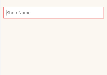
EditTextin xml file<EditText android:id="@+id/edit_expiry_date" android:layout_width="match_parent" android:layout_height="wrap_content" android:padding="10dip" android:background="@drawable/rounded_edittext" android:hint="@string/shop_name" android:inputType="text" /> -
You will get output like this
Solution 4 - Android
Thanks for Norfeldt's answer. I slightly changed its gradient for a better inner shadow effect.
<item android:state_pressed="false" android:state_focused="false">
    <shape>
        <gradient
            android:centerY="0.2"
            android:startColor="#D3D3D3"
            android:centerColor="#65FFFFFF"
            android:endColor="#00FFFFFF"
            android:angle="270"
            />
        <stroke
            android:width="0.7dp"
            android:color="#BDBDBD" />
        <corners
            android:radius="15dp" />
    </shape>
</item>
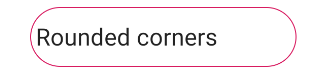
Looks great in a light backgrounded layout..
Solution 5 - Android
By my way of thinking, it already has rounded corners.
In case you want them more rounded, you will need to:
- Clone all of the nine-patch PNG images that make up an
EditTextbackground (found in your SDK) - Modify each to have more rounded corners
- Clone the XML
StateListDrawableresource that combines thoseEditTextbackgrounds into a singleDrawable, and modify it to point to your more-rounded nine-patch PNG files - Use that new
StateListDrawableas the background for yourEditTextwidget
Solution 6 - Android
Just to add to the other answers, I found that the simplest solution to achieve the rounded corners was to set the following as a background to your Edittext.
<?xml version="1.0" encoding="utf-8"?>
<shape xmlns:android="http://schemas.android.com/apk/res/android">

    <solid android:color="@android:color/white"/>
    <corners android:radius="8dp"/>

</shape>
Solution 7 - Android
With the Material Components Library you can use the MaterialShapeDrawable to draw custom shapes.
With a EditText you can do:
    <EditText
        android:id="@+id/edittext"
        ../>
Then create a MaterialShapeDrawable:
float radius = getResources().getDimension(R.dimen.default_corner_radius);

EditText editText = findViewById(R.id.edittext);
//Apply the rounded corners
ShapeAppearanceModel shapeAppearanceModel = new ShapeAppearanceModel()
                .toBuilder()
                .setAllCorners(CornerFamily.ROUNDED,radius)
                .build();

MaterialShapeDrawable shapeDrawable =
            new MaterialShapeDrawable(shapeAppearanceModel);
//Apply a background color
shapeDrawable.setFillColor(ContextCompat.getColorStateList(this,R.color.white));
//Apply a stroke
shapeDrawable.setStroke(2.0f, ContextCompat.getColor(this,R.color.colorAccent));

ViewCompat.setBackground(editText,shapeDrawable);
It requires the version 1.1.0 of the library.
Solution 8 - Android
If you want only corner should curve not whole end, then use below code.
<?xml version="1.0" encoding="utf-8"?>
<shape xmlns:android="http://schemas.android.com/apk/res/android" >

    <corners android:radius="10dp" />

    <padding
        android:bottom="3dp"
        android:left="0dp"
        android:right="0dp"
        android:top="3dp" />

    <gradient
        android:angle="90"
        android:endColor="@color/White"
        android:startColor="@color/White" />

    <stroke
        android:width="1dp"
        android:color="@color/Gray" />

</shape>
It will only curve the four angle of EditText.