How to make layout with rounded corners..?
AndroidXmlImageLayoutAndroid ShapedrawableAndroid Problem Overview
How can I make a layout with rounded corners? I want to apply rounded corners to my LinearLayout.
Android Solutions
Solution 1 - Android
1: Define layout_bg.xml in drawables:
<?xml version="1.0" encoding="UTF-8"?>
<shape xmlns:android="http://schemas.android.com/apk/res/android">
    <solid android:color="#FFFFFF"/>
    <stroke android:width="3dp" android:color="#B1BCBE" />
    <corners android:radius="10dp"/>
    <padding android:left="0dp" android:top="0dp" android:right="0dp" android:bottom="0dp" />
</shape>
2: Add layout_bg.xml as background to your layout
android:background="@drawable/layout_bg"
Solution 2 - Android
For API 21+, Use Clip Views
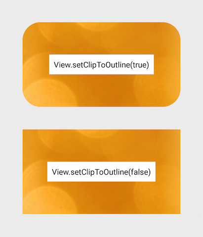
Rounded outline clipping was added to the View class in API 21. See this training doc or this reference for more info.
This in-built feature makes rounded corners very easy to implement. It works on any view or layout and supports proper clipping.
Here's What To Do:
- Create a rounded shape drawable and set it as your view's background:
android:background="@drawable/round_outline" - Clip to outline in code:
setClipToOutline(true)
The documentation used to say that you can set android:clipToOutline="true" the XML, but this bug is now finally resolved and the documentation now correctly states that you can only do this in code.
What It Looks Like:
Special Note About ImageViews
setClipToOutline() only works when the View's background is set to a shape drawable. If this background shape exists, View treats the background's outline as the borders for clipping and shadowing purposes.
This means that if you want to round the corners on an ImageView with setClipToOutline(), your image must come from android:src instead of android:background (since background is used for the rounded shape). If you MUST use background to set your image instead of src, you can use this nested views workaround:
- Create an outer layout with its background set to your shape drawable
- Wrap that layout around your ImageView (with no padding)
- The ImageView (including anything else in the layout) will now be clipped to the outer layout's rounded shape.
Solution 3 - Android
Here's a copy of a XML file to create a drawable with a white background, black border and rounded corners:
 <?xml version="1.0" encoding="UTF-8"?>
    <shape xmlns:android="http://schemas.android.com/apk/res/android">
        <solid android:color="#ffffffff"/>

        <stroke android:width="3dp"
                android:color="#ff000000"
                />

        <padding android:left="1dp"
                 android:top="1dp"
                 android:right="1dp"
                 android:bottom="1dp"
                 />

        <corners android:bottomRightRadius="7dp" android:bottomLeftRadius="7dp"
         android:topLeftRadius="7dp" android:topRightRadius="7dp"/>
    </shape>
save it as a xml file in the drawable directory, Use it like you would use any drawable background(icon or resource file) using its resource name (R.drawable.your_xml_name)
Solution 4 - Android
Use CardView in android v7 support library. Though it's a bit heavy, it solves all problem, and easy enough. Not like the set drawable background method, it could clip subviews successfully.
<?xml version="1.0" encoding="utf-8"?>
<android.support.v7.widget.CardView xmlns:android="http://schemas.android.com/apk/res/android"
    xmlns:card_view="http://schemas.android.com/apk/res-auto"
    xmlns:tools="http://schemas.android.com/tools"
    android:layout_width="match_parent"
    android:layout_height="wrap_content"
    card_view:cardBackgroundColor="@android:color/transparent"
    card_view:cardCornerRadius="5dp"
    card_view:cardElevation="0dp"
    card_view:contentPadding="0dp">
    <YOUR_LINEARLAYOUT_HERE>
</android.support.v7.widget.CardView>
Solution 5 - Android
I have done this way:
Check Screenshot:
Create drawable file named with custom_rectangle.xml in drawable folder:
<?xml version="1.0" encoding="utf-8"?>
<shape xmlns:android="http://schemas.android.com/apk/res/android"
    android:shape="rectangle" >

    <solid android:color="@android:color/white" />

    <corners android:radius="10dip" />

    <stroke
        android:width="1dp"
        android:color="@android:color/white" />

</shape>
Now apply Rectangle background on View:
mView.setBackground(R.drawlable.custom_rectangle);
Done
Solution 6 - Android
I think a better way to do it is to merge 2 things:
-
make a bitmap of the layout, as shown here.
-
make a rounded drawable from the bitmap, as shown here
-
set the drawable on an imageView.
This will handle cases that other solutions have failed to solve, such as having content that has corners.
I think it's also a bit more GPU-friendly, as it shows a single layer instead of 2 .
The only better way is to make a totally customized view, but that's a lot of code and might take a lot of time. I think that what I suggested here is the best of both worlds.
Here's a snippet of how it can be done:
RoundedCornersDrawable.java
/**
 * shows a bitmap as if it had rounded corners. based on :
 * http://rahulswackyworld.blogspot.co.il/2013/04/android-drawables-with-rounded_7.html
 * easy alternative from support library: RoundedBitmapDrawableFactory.create( ...) ;
 */
public class RoundedCornersDrawable extends BitmapDrawable {

	private final BitmapShader bitmapShader;
	private final Paint p;
	private final RectF rect;
	private final float borderRadius;

	public RoundedCornersDrawable(final Resources resources, final Bitmap bitmap, final float borderRadius) {
		super(resources, bitmap);
		bitmapShader = new BitmapShader(getBitmap(), Shader.TileMode.CLAMP, Shader.TileMode.CLAMP);
		final Bitmap b = getBitmap();
		p = getPaint();
		p.setAntiAlias(true);
		p.setShader(bitmapShader);
		final int w = b.getWidth(), h = b.getHeight();
		rect = new RectF(0, 0, w, h);
		this.borderRadius = borderRadius < 0 ? 0.15f * Math.min(w, h) : borderRadius;
	}

	@Override
	public void draw(final Canvas canvas) {
		canvas.drawRoundRect(rect, borderRadius, borderRadius, p);
	}
}
CustomView.java
public class CustomView extends ImageView {
	private View mMainContainer;
    private boolean mIsDirty=false;

    // TODO for each change of views/content, set mIsDirty to true and call invalidate

	@Override
	protected void onDraw(final Canvas canvas) {
		if (mIsDirty) {
			mIsDirty = false;
			drawContent();
			return;
		}
		super.onDraw(canvas);
	}

	/**
	 * draws the view's content to a bitmap. code based on :
	 * http://nadavfima.com/android-snippet-inflate-a-layout-draw-to-a-bitmap/
	 */
	public static Bitmap drawToBitmap(final View viewToDrawFrom, final int width, final int height) {
		// Create a new bitmap and a new canvas using that bitmap
		final Bitmap bmp = Bitmap.createBitmap(width, height, Bitmap.Config.ARGB_8888);
		final Canvas canvas = new Canvas(bmp);
		viewToDrawFrom.setDrawingCacheEnabled(true);
		// Supply measurements
		viewToDrawFrom.measure(MeasureSpec.makeMeasureSpec(canvas.getWidth(), MeasureSpec.EXACTLY),
				MeasureSpec.makeMeasureSpec(canvas.getHeight(), MeasureSpec.EXACTLY));
		// Apply the measures so the layout would resize before drawing.
		viewToDrawFrom.layout(0, 0, viewToDrawFrom.getMeasuredWidth(), viewToDrawFrom.getMeasuredHeight());
		// and now the bmp object will actually contain the requested layout
		canvas.drawBitmap(viewToDrawFrom.getDrawingCache(), 0, 0, new Paint());
		return bmp;
	}

	private void drawContent() {
		if (getMeasuredWidth() <= 0 || getMeasuredHeight() <= 0)
			return;
		final Bitmap bitmap = drawToBitmap(mMainContainer, getMeasuredWidth(), getMeasuredHeight());
		final RoundedCornersDrawable drawable = new RoundedCornersDrawable(getResources(), bitmap, 15);
		setImageDrawable(drawable);
	}

}
EDIT: found a nice alternative, based on "RoundKornersLayouts" library. Have a class that will be used for all of the layout classes you wish to extend, to be rounded:
//based on https://github.com/JcMinarro/RoundKornerLayouts
class CanvasRounder(cornerRadius: Float, cornerStrokeColor: Int = 0, cornerStrokeWidth: Float = 0F) {
    private val path = android.graphics.Path()
    private lateinit var rectF: RectF
    private var strokePaint: Paint?
    var cornerRadius: Float = cornerRadius
        set(value) {
            field = value
            resetPath()
        }

    init {
        if (cornerStrokeWidth <= 0)
            strokePaint = null
        else {
            strokePaint = Paint()
            strokePaint!!.style = Paint.Style.STROKE
            strokePaint!!.isAntiAlias = true
            strokePaint!!.color = cornerStrokeColor
            strokePaint!!.strokeWidth = cornerStrokeWidth
        }
    }

    fun round(canvas: Canvas, drawFunction: (Canvas) -> Unit) {
        val save = canvas.save()
        canvas.clipPath(path)
        drawFunction(canvas)
        if (strokePaint != null)
            canvas.drawRoundRect(rectF, cornerRadius, cornerRadius, strokePaint)
        canvas.restoreToCount(save)
    }

    fun updateSize(currentWidth: Int, currentHeight: Int) {
        rectF = android.graphics.RectF(0f, 0f, currentWidth.toFloat(), currentHeight.toFloat())
        resetPath()
    }

    private fun resetPath() {
        path.reset()
        path.addRoundRect(rectF, cornerRadius, cornerRadius, Path.Direction.CW)
        path.close()
    }

}
Then, in each of your customized layout classes, add code similar to this one:
class RoundedConstraintLayout : ConstraintLayout {
    private lateinit var canvasRounder: CanvasRounder

    constructor(context: Context) : super(context) {
        init(context, null, 0)
    }

    constructor(context: Context, attrs: AttributeSet) : super(context, attrs) {
        init(context, attrs, 0)
    }

    constructor(context: Context, attrs: AttributeSet, defStyle: Int) : super(context, attrs, defStyle) {
        init(context, attrs, defStyle)
    }

    private fun init(context: Context, attrs: AttributeSet?, defStyle: Int) {
        val array = context.obtainStyledAttributes(attrs, R.styleable.RoundedCornersView, 0, 0)
        val cornerRadius = array.getDimension(R.styleable.RoundedCornersView_corner_radius, 0f)
        val cornerStrokeColor = array.getColor(R.styleable.RoundedCornersView_corner_stroke_color, 0)
        val cornerStrokeWidth = array.getDimension(R.styleable.RoundedCornersView_corner_stroke_width, 0f)
        array.recycle()
        canvasRounder = CanvasRounder(cornerRadius,cornerStrokeColor,cornerStrokeWidth)
        if (Build.VERSION.SDK_INT < Build.VERSION_CODES.JELLY_BEAN_MR2) {
            setLayerType(FrameLayout.LAYER_TYPE_SOFTWARE, null)
        }
    }

    override fun onSizeChanged(currentWidth: Int, currentHeight: Int, oldWidth: Int, oldheight: Int) {
        super.onSizeChanged(currentWidth, currentHeight, oldWidth, oldheight)
        canvasRounder.updateSize(currentWidth, currentHeight)
    }

    override fun draw(canvas: Canvas) = canvasRounder.round(canvas) { super.draw(canvas) }

    override fun dispatchDraw(canvas: Canvas) = canvasRounder.round(canvas) { super.dispatchDraw(canvas) }

}
If you wish to support attributes, use this as written on the library:
<resources>
  <declare-styleable name="RoundedCornersView">
      <attr name="corner_radius" format="dimension"/>
      <attr name="corner_stroke_width" format="dimension"/>
      <attr name="corner_stroke_color" format="color"/>
  </declare-styleable>
</resources>
Another alternative, which might be easier for most uses: use MaterialCardView . It allows customizing the rounded corners, stroke color and width, and elevation.
Example:
<FrameLayout
    xmlns:android="http://schemas.android.com/apk/res/android" xmlns:app="http://schemas.android.com/apk/res-auto"
    xmlns:tools="http://schemas.android.com/tools" android:layout_width="match_parent"
    android:layout_height="match_parent" android:clipChildren="false" android:clipToPadding="false"
    tools:context=".MainActivity">

    <com.google.android.material.card.MaterialCardView
        android:layout_width="100dp" android:layout_height="100dp" android:layout_gravity="center"
        app:cardCornerRadius="8dp" app:cardElevation="8dp" app:strokeColor="#f00" app:strokeWidth="2dp">

        <ImageView
            android:layout_width="match_parent" android:layout_height="match_parent" android:background="#0f0"/>

    </com.google.android.material.card.MaterialCardView>

</FrameLayout>
And the result:
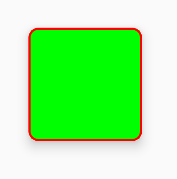
Do note that there is a slight artifacts issue at the edges of the stroke (leaves some pixels of the content there), if you use it. You can notice it if you zoom in. I've reported about this issue here.
EDIT: seems to be fixed, but not on the IDE. Reported here.
Solution 7 - Android
If you would like to make your layout rounded, it is best to use the CardView, it provided many features to make the design beautiful.
<android.support.v7.widget.CardView
    android:layout_width="match_parent"
    android:layout_height="wrap_content"
    card_view:cardCornerRadius="5dp">
      <LinearLayout
            android:layout_width="match_parent"
            android:layout_height="wrap_content">

            <TextView
                android:layout_width="0dp"
                android:layout_height="wrap_content"
                android:layout_weight=".3"
                android:text="@string/quote_code"
                android:textColor="@color/white"
                android:textSize="@dimen/text_head_size" />
      </LinearLayout>
</android.support.v7.widget.CardView>
With this card_view:cardCornerRadius="5dp", you can change the radius.
Solution 8 - Android
Try this...
1.create drawable xml(custom_layout.xml):
<?xml version="1.0" encoding="utf-8"?>
<shape xmlns:android="http://schemas.android.com/apk/res/android" >

<solid android:color="#FFFFFF" />

<stroke
    android:width="2dp"
    android:color="#FF785C" />

<corners android:radius="10dp" />

</shape>
2.add your view background
android:background="@drawable/custom_layout"
Solution 9 - Android
Step 1: Define bg_layout.xml in drawables folder, and put the below code in it.
Step 2: Add that bg_layout.xml as background to your layout, Done.
    <?xml version="1.0" encoding="UTF-8"?>
<shape xmlns:android="http://schemas.android.com/apk/res/android">
    <solid
        android:color="#EEEEEE"/> <!--your desired colour for solid-->

    <stroke
        android:width="3dp"
        android:color="#EEEEEE" /> <!--your desired colour for border-->

    <corners
        android:radius="50dp"/> <!--shape rounded value-->

</shape>
Solution 10 - Android
With the Material Components Library you can use the MaterialShapeDrawable to draw custom shapes.
Just put the LinearLayout in your xml layout:
<LinearLayout
    android:id="@+id/linear_rounded"
    android:layout_width="match_parent"
    android:layout_height="wrap_content"
    ..>

    <!-- content ..... -->

</LinearLayout>
Then in your code you can apply a ShapeAppearanceModel. Something like:
float radius = getResources().getDimension(R.dimen.default_corner_radius);

LinearLayout linearLayout= findViewById(R.id.linear_rounded);
ShapeAppearanceModel shapeAppearanceModel = new ShapeAppearanceModel()
    .toBuilder()
    .setAllCorners(CornerFamily.ROUNDED,radius)
    .build();

MaterialShapeDrawable shapeDrawable = new MaterialShapeDrawable(shapeAppearanceModel);
//Fill the LinearLayout with your color
shapeDrawable.setFillColor(ContextCompat.getColorStateList(this,R.color.secondaryLightColor));


ViewCompat.setBackground(linearLayout,shapeDrawable);
Note:: it requires the version 1.1.0 of the material components library.
Solution 11 - Android
The best and simplest method would be to make use of card_background drawable in your layout. This also follows Google's material design guidelines. Just include this in you LinearLayout:
android:background="@drawable/card_background"
Add this to your drawable directory and name it card_background.xml:
<?xml version="1.0" encoding="utf-8"?>
<layer-list xmlns:android="http://schemas.android.com/apk/res/android">

    <item>
        <shape android:shape="rectangle">
            <solid android:color="#BDBDBD"/>
            <corners android:radius="5dp"/>
        </shape>
    </item>

    <item
        android:left="0dp"
        android:right="0dp"
        android:top="0dp"
        android:bottom="2dp">
        <shape android:shape="rectangle">
            <solid android:color="#ffffff"/>
            <corners android:radius="5dp"/>
        </shape>
    </item>
</layer-list>
Solution 12 - Android
Function for set corner radius programmatically
static void setCornerRadius(GradientDrawable drawable, float topLeft,
        float topRight, float bottomRight, float bottomLeft) {
    drawable.setCornerRadii(new float[] { topLeft, topLeft, topRight, topRight,
            bottomRight, bottomRight, bottomLeft, bottomLeft });
}

static void setCornerRadius(GradientDrawable drawable, float radius) {
    drawable.setCornerRadius(radius);
}
Using
GradientDrawable gradientDrawable = new GradientDrawable();
gradientDrawable.setColor(Color.GREEN);
setCornerRadius(gradientDrawable, 20f);
//or setCornerRadius(gradientDrawable, 20f, 40f, 60f, 80f);

view.setBackground(gradientDrawable);
Solution 13 - Android
Use CardView to get rounded edges for any layouts. Use card_view:cardCornerRadius="5dp" for cardview to get rounded layout edges.
<LinearLayout xmlns:android="http://schemas.android.com/apk/res/android"
  xmlns:card_view="http://schemas.android.com/apk/res-auto"
  android:layout_width="match_parent"
  android:layout_height="match_parent"
  android:orientation="vertical">

      <android.support.v7.widget.CardView
        android:layout_width="match_parent"
        android:layout_height="wrap_content"
        card_view:cardCornerRadius="5dp">
          <LinearLayout
                android:layout_width="match_parent"
                android:layout_height="wrap_content"
                android:orientation="horizontal"
                android:padding="15dp"
                android:weightSum="1">

                <TextView
                    android:layout_width="0dp"
                    android:layout_height="wrap_content"
                    android:layout_weight=".3"
                    android:text="@string/quote_code"
                    android:textColor="@color/white"
                    android:textSize="@dimen/text_head_size" />

                <TextView
                    android:layout_width="0dp"
                    android:layout_height="wrap_content"
                    android:layout_weight=".7"
                    android:text="@string/quote_details"
                    android:textColor="@color/white"
                    android:textSize="@dimen/text_head_size" />
            </LinearLayout>
       </android.support.v7.widget.CardView>
   </LinearLayout>
Solution 14 - Android
A better way to do it would be:
background_activity.xml
<?xml version="1.0" encoding="UTF-8"?>
<layer-list xmlns:android="http://schemas.android.com/apk/res/android">
    <item android:gravity="fill">
        <color android:color="@color/black"/>
    </item>
    <item>
        <shape android:gravity="fill">
            <solid android:color="@color/white"/>
            <corners android:radius="10dip"/>
            <padding android:left="0dip" android:top="0dip" android:right="0dip" android:bottom="0dip" />
        </shape>
    </item>
</layer-list>
This will work below API 21 also, and give you something like this:

If you are willing to make a little more effort more better control, then use android.support.v7.widget.CardView with its cardCornerRadius attribute (and set elevation attribute to 0dp to get rid of any accompanying drop shadow with the cardView). Also, this will work from API level as low as 15.
Solution 15 - Android
<?xml version="1.0" encoding="UTF-8"?>
<shape xmlns:android="http://schemas.android.com/apk/res/android">
    <solid android:color="#FFFFFF"/>
    <stroke android:width="3dip" android:color="#B1BCBE" />
    <corners android:radius="10dip"/>
    <padding android:left="3dip" android:top="3dip" android:right="3dip" android:bottom="3dip" />
</shape>
@David, just put padding same value as stroke, so border can be visible, regardeless image size
Solution 16 - Android
Create your xml in drawable, layout_background.xml
 <?xml version="1.0" encoding="utf-8"?>
    <shape xmlns:android="http://schemas.android.com/apk/res/android" >
      <solid android:color="@color/your_colour" />
      <stroke
            android:width="2dp"
            android:color="@color/your_colour" />
      <corners android:radius="10dp" />
    </shape>
 <--width, color, radius should be as per your requirement-->
and then, add this in your layout.xml
android:background="@drawable/layout_background"
Solution 17 - Android
I've taken @gauravsapiens answer with my comments inside to give you a reasonable apprehension of what the parameters will effect.
<?xml version="1.0" encoding="utf-8"?>
<shape xmlns:android="http://schemas.android.com/apk/res/android">

    <!-- Background color -->
    <solid android:color="@color/white" />

    <!-- Stroke around the background, width and color -->
    <stroke android:width="4dp" android:color="@color/drop_shadow"/>

    <!-- The corners of the shape -->
    <corners android:radius="4dp"/>

    <!-- Padding for the background, e.g the Text inside a TextView will be
    located differently -->
    <padding android:left="10dp" android:right="10dp"
             android:bottom="10dp" android:top="10dp" />

</shape>
If you're just looking to create a shape that rounds the corners, removing the padding and the stroke will do. If you remove the solid as well you will, in effect, have created rounded corners on a transparent background.
For the sake of being lazy I have created a shape underneath, which is just a solid white background with rounded corners - enjoy! :)
<?xml version="1.0" encoding="utf-8"?>
<shape xmlns:android="http://schemas.android.com/apk/res/android">

    <!-- Background color -->
    <solid android:color="@color/white" />

    <!-- The corners of the shape -->
    <corners android:radius="4dp"/>

</shape>
Solution 18 - Android
 <shape xmlns:android="http://schemas.android.com/apk/res/android"
android:padding="@dimen/_10sdp"
android:shape="rectangle">

<solid android:color="@color/header" />

<corners
    android:bottomLeftRadius="@dimen/_5sdp"
    android:bottomRightRadius="@dimen/_5sdp"
    android:topLeftRadius="@dimen/_5sdp"
    android:topRightRadius="@dimen/_5sdp" />
Solution 19 - Android
If what you want is just a simple rounded rectangle, cut the long story short.
float r=8;
ShapeDrawable shape =
   new ShapeDrawable (new RoundRectShape(new float[] { r, r, r, r, r, r, r, r },null,null));
shape.getPaint().setColor(Color.RED);
view.setBackground(shape);
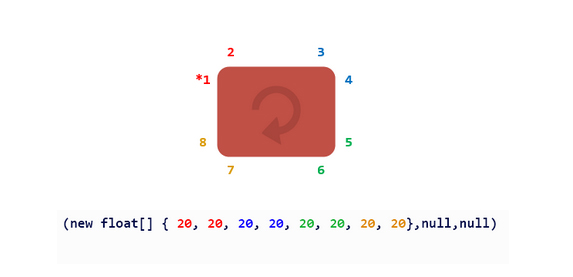
- The first two floats are for the top-left corner (remaining pairs correspond clockwise).
for more details read this answer
Solution 20 - Android
You can do it with a custom view, like this RoundAppBar and RoundBottomAppBar.
Here a path is used to clipPath the canvas.

Solution 21 - Android
I'm a bit late to the party, but this is still a problem. So I wrote a set of OutlineProviders and BindingAdapters for data binding that enables you to clip corners from xml.
> NOTE: Clipping with outline does not support corners to be different sizes!
I wrote a detailed response with code on this stackoverflow post
What you will get with code + binding adapter:
<androidx.constraintlayout.widget.ConstraintLayout
    clipRadius="@{@dimen/some_radius}"
    clipBottomLeft="@{@dimen/some_radius}"
    clipBottomRight="@{@dimen/some_radius}"
    clipTopLeft="@{@dimen/some_radius}"
    clipTopRight="@{@dimen/some_radius}"
    clipCircle="@{@bool/clip}"
This enables you to clip the view to a circle, round all corners, round corners in one direction (left, top, right, bottom) or single corners.