Android - styling seek bar
AndroidAndroid SeekbarCustom SelectorsAndroid SliderAndroid Problem Overview
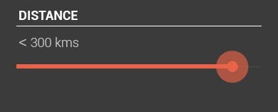
I wanted to style a seek bar which looks like the one in the image below.
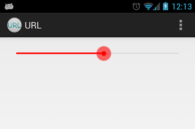
By using default seekbar I will get something like this:

So what I need is to only change the color. I need no extra styles. Is there any straight forward approach to do this or should I build my custom drawable.?
I tried building custom one, but I could not get the exact one as shown above. After using custom drawable, what I get is as shown below:

If I need to build the custom one, then please suggest how to reduce the width of the progress line and also the shape.
my custom implementation:
background_fill.xml:
<?xml version="1.0" encoding="UTF-8"?>
<shape xmlns:android="http://schemas.android.com/apk/res/android" >

    <gradient
        android:angle="90"
        android:centerColor="#FF555555"
        android:endColor="#FF555555"
        android:startColor="#FF555555" />

    <corners android:radius="1dp" />

    <stroke
        android:width="1dp"
        android:color="#50999999" />
    <stroke
        android:width="1dp"
        android:color="#70555555" />

</shape>
progress_fill.xml
<?xml version="1.0" encoding="UTF-8"?>
<shape xmlns:android="http://schemas.android.com/apk/res/android" >

    <gradient
        android:angle="90"
        android:centerColor="#FFB80000"
        android:endColor="#FFFF4400"
        android:startColor="#FF470000" />

    <corners android:radius="1dp" />

    <stroke
        android:width="1dp"
        android:color="#50999999" />
    <stroke
        android:width="1dp"
        android:color="#70555555" />

</shape>
progress.xml
<?xml version="1.0" encoding="utf-8"?>
<layer-list xmlns:android="http://schemas.android.com/apk/res/android" >

    <item
        android:id="@android:id/background"
        android:drawable="@drawable/background_fill"/>
    <item android:id="@android:id/progress">
        <clip android:drawable="@drawable/progress_fill" />
    </item>

</layer-list>
thumb.xml
<?xml version="1.0" encoding="UTF-8"?>
<shape xmlns:android="http://schemas.android.com/apk/res/android"
    android:shape="oval" >

    <gradient
        android:angle="270"
        android:endColor="#E5492A"
        android:startColor="#E5492A" />

    <size
        android:height="20dp"
        android:width="20dp" />

</shape>
seekbar:
<SeekBar
        android:id="@+id/seekBarDistance"
        android:layout_width="match_parent"
        android:layout_height="wrap_content"
        android:layout_alignParentLeft="true"
        android:layout_alignParentTop="true"
        android:layout_marginTop="88dp"
        android:progressDrawable="@drawable/progress"
        android:thumb="@drawable/thumb" >
    </SeekBar>
Android Solutions
Solution 1 - Android
I would extract drawables and xml from Android source code and change its color to red. Here is example how I completed this for mdpi drawables:
Custom red_scrubber_control.xml (add to res/drawable):
<selector xmlns:android="http://schemas.android.com/apk/res/android">

    <item android:drawable="@drawable/red_scrubber_control_disabled_holo" android:state_enabled="false"/>
    <item android:drawable="@drawable/red_scrubber_control_pressed_holo" android:state_pressed="true"/>
    <item android:drawable="@drawable/red_scrubber_control_focused_holo" android:state_selected="true"/>
    <item android:drawable="@drawable/red_scrubber_control_normal_holo"/>
</selector>
Custom: red_scrubber_progress.xml
<layer-list xmlns:android="http://schemas.android.com/apk/res/android" >

    <item
        android:id="@android:id/background"
        android:drawable="@drawable/red_scrubber_track_holo_light"/>
    <item android:id="@android:id/secondaryProgress">
        <scale
            android:drawable="@drawable/red_scrubber_secondary_holo"
            android:scaleWidth="100%" />
    </item>
    <item android:id="@android:id/progress">
        <scale
            android:drawable="@drawable/red_scrubber_primary_holo"
            android:scaleWidth="100%" />
    </item>

</layer-list>
Then copy required drawables from Android source code, I took from this link
It is good to copy these drawables for each hdpi, mdpi, xhdpi. For example I use only mdpi:
Then using Photoshop change color from blue to red:
red_scrubber_control_disabled_holo.png:

red_scrubber_control_focused_holo.png:

red_scrubber_control_normal_holo.png:

red_scrubber_control_pressed_holo.png:

red_scrubber_primary_holo.9.png:

red_scrubber_secondary_holo.9.png:

red_scrubber_track_holo_light.9.png:

Add SeekBar to layout:
<SeekBar
    android:id="@+id/seekBar1"
    android:layout_width="match_parent"
    android:layout_height="wrap_content"
    android:progressDrawable="@drawable/red_scrubber_progress"
    android:thumb="@drawable/red_scrubber_control" />
Result:
Solution 2 - Android
Android seekbar custom material style, for other seekbar customizations http://www.zoftino.com/android-seekbar-and-custom-seekbar-examples
<style name="MySeekBar" parent="Widget.AppCompat.SeekBar">
    <item name="android:progressBackgroundTint">#f4511e</item>
    <item name="android:progressTint">#388e3c</item>
    <item name="android:thumbTint">#c51162</item>
</style>
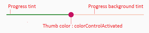
Upd: colorControlActivated is thumbTint now.
Solution 3 - Android
My answer is inspired from Andras Balázs Lajtha answer it allow to work without xml file
seekBar.getProgressDrawable().setColorFilter(Color.RED, PorterDuff.Mode.SRC_IN);
seekBar.getThumb().setColorFilter(Color.RED, PorterDuff.Mode.SRC_IN);
Solution 4 - Android
If you want exactly the same bar but in red, you can add a PorterDuff color filter programatically. You can get each drawable that you want to colorize through the methods of the ProgressBar base class. Then set a color filter for it.
mySeekBar.getProgressDrawable().setColorFilter(new PorterDuffColorFilter(srcColor, PorterDuff.Mode.MULTIPLY));
If the wanted color adjustment can't be made through a Porter Duff filter, you can specify your own color filter.
Solution 5 - Android
Google have made this easier in SDK 21. Now we have attributes for specifying the thumb tint colors:
android:thumbTint
android:thumbTintMode
android:progressTint
http://developer.android.com/reference/android/widget/AbsSeekBar.html#attr_android:thumbTint http://developer.android.com/reference/android/widget/AbsSeekBar.html#attr_android:thumbTintMode
Solution 6 - Android
Just replace color atributtes with your color
background.xml
<shape xmlns:android="http://schemas.android.com/apk/res/android"
    android:shape="line">

    <stroke android:width="1dp"	android:color="#D9D9D9"/>
    <corners android:radius="1dp" />

</shape>
progress.xml
<shape xmlns:android="http://schemas.android.com/apk/res/android"
     android:shape="line">

    <stroke android:width="1dp"	android:color="#2EA5DE"/>
    <corners android:radius="1dp" />

</shape>
style.xml
<layer-list xmlns:android="http://schemas.android.com/apk/res/android" >

    <item
        android:id="@android:id/background"
        android:drawable="@drawable/seekbar_background"/>
    <item android:id="@android:id/progress">
        <clip android:drawable="@drawable/seekbar_progress" />
    </item>

</layer-list>
thumb.xml
<shape xmlns:android="http://schemas.android.com/apk/res/android"
    android:shape="oval">

    <size android:height="30dp" android:width="30dp"/>
    <stroke android:width="18dp" android:color="#882EA5DE"/>
    <solid android:color="#2EA5DE" />
    <corners android:radius="1dp" />

</shape>
Solution 7 - Android
All those answers are deprecated.
In 2019 it's easier to style your seekbar to your preferred color by changing your ProgressBar to this
<SeekBar
            android:id="@+id/seekBar"
            android:layout_width="match_parent"
            android:layout_height="wrap_content"
            android:progressTint="#36970f"
            android:thumbTint="#36970f"
            />
Styling your seekbar color programmatically try the following code
        seekBar.getProgressDrawable().setColorFilter(Color.RED, PorterDuff.Mode.SRC_IN);
        seekBar.getThumb().setColorFilter(Color.RED, PorterDuff.Mode.SRC_IN);
Solution 8 - Android
For APIs < 21 (and >= 21) you can use the answer of @Ahamadullah Saikat or https://www.lvguowei.me/post/customize-android-seekbar-color/.

<SeekBar
    android:id="@+id/seekBar"
    android:layout_width="match_parent"
    android:layout_height="wrap_content"
    android:maxHeight="3dp"
    android:minHeight="3dp"
    android:progress="50"
    android:progressDrawable="@drawable/seek_bar_ruler"
    android:thumb="@drawable/seek_bar_slider"
    />
drawable/seek_bar_ruler.xml:
<?xml version="1.0" encoding="utf-8"?>
<layer-list xmlns:android="http://schemas.android.com/apk/res/android">
    <item android:id="@android:id/background">
        <shape android:shape="rectangle">
            <solid
                android:color="#94A3B3" />
            <corners android:radius="2dp" />
        </shape>
    </item>
    <item android:id="@android:id/progress">
        <clip>
            <shape android:shape="rectangle">
                <solid
                    android:color="#18244D" />
                <corners android:radius="2dp" />
            </shape>
        </clip>
    </item>
</layer-list>
drawable/seek_bar_slider.xml:
<?xml version="1.0" encoding="utf-8"?>
<shape xmlns:android="http://schemas.android.com/apk/res/android"
    android:shape="oval"
    >

    <solid android:color="#FFFFFF" />
    <stroke
        android:width="4dp"
        android:color="#18244D"
        />
    <size
        android:width="25dp"
        android:height="25dp"
        />
</shape>
Solution 9 - Android
Just set
android:maxHeight="3dp"
android:minHeight="3dp"
That's all
Solution 10 - Android
output:
Change Progress Color:
int normalColor = ContextCompat.getColor(context, R.color.normal_color);
int selectedColor = ContextCompat.getColor(context, R.color.selected_color);
Drawable normalDrawable = new ColorDrawable(normalColor);
Drawable selectedDrawable = new ColorDrawable(selectedColor);
ClipDrawable clipDrawable = new ClipDrawable(selectedDrawable, Gravity.LEFT, ClipDrawable.HORIZONTAL);
Drawable[] layers = {normalDrawable, clipDrawable, clipDrawable};
LayerDrawable seekbarDrawable = new LayerDrawable(layers);
seekBar.setProgressDrawable(seekbarDrawable);
Change Thumb Color:
int thumbColor = ContextCompat.getColor(context, R.color.thumb_color);
Drawable unwrappedDrawable = AppCompatResources.getDrawable(context, R.drawable.ic_seekbar_thumb);
assert unwrappedDrawable != null;
Drawable wrappedDrawable = DrawableCompat.wrap(unwrappedDrawable);
DrawableCompat.setTint(wrappedDrawable, thumbColor);
seekBar.setThumb(wrappedDrawable);
Solution 11 - Android
<SeekBar
android:id="@+id/seekBar1"
android:layout_width="match_parent"
android:layout_height="wrap_content"
android:layout_gravity="center"
android:progressTint="@color/red"
android:thumbTint="@color/red" />
works Like same the answer selected. no need to make any drawable file or else.(IN 5.0 only) Regards
Solution 12 - Android
As mention one above (@andrew) , creating custom SeekBar is super Easy with this site - http://android-holo-colors.com/
Just enable SeekBar there, choose color, and receive all resources and copy to project. Then apply them in xml, for example:
  android:thumb="@drawable/apptheme_scrubber_control_selector_holo_light"
  android:progressDrawable="@drawable/apptheme_scrubber_progress_horizontal_holo_light"
Solution 13 - Android
LayerDrawable progressDrawable = (LayerDrawable) mSeekBar.getProgressDrawable();

// progress bar line *progress* color
Drawable processDrawable = progressDrawable.findDrawableByLayerId(android.R.id.progress);

// progress bar line *background* color
Drawable backgroundDrawable = progressDrawable.findDrawableByLayerId(android.R.id.background);

// progress bar line *secondaryProgress* color
Drawable secondaryProgressDrawable = progressDrawable.findDrawableByLayerId(android.R.id.secondaryProgress);
processDrawable.setColorFilter(Color.RED, PorterDuff.Mode.SRC_IN);

// progress bar line all color
mSeekBar.getProgressDrawable().setColorFilter(Color.BLUE, PorterDuff.Mode.SRC_IN);

// progress circle color
mSeekBar.getThumb().setColorFilter(Color.GREEN, PorterDuff.Mode.SRC_IN);
Solution 14 - Android
By default, android will match the progress color of your slider to
`<item name="colorAccent">`
value in your styles.xml. Then, to set a custom slider thumb image, just use this code in your SeekBar xml layout's block:
android:thumb="@drawable/slider"
Solution 15 - Android
If you are using default SeekBar provided by android Sdk then their is a simple way to change the color of that . just go to color.xml inside /res/values/colors.xml and change the colorAccent.
<resources>
    <color name="colorPrimary">#212121</color>
    <color name="colorPrimaryDark">#1e1d1d</color>
     <!-- change below line -->
    <color name="colorAccent">#FF4081</color>
</resources>
Solution 16 - Android
Simple Way to change the seek bar color ...
 <ProgressBar
            android:id="@+id/progress"
            android:layout_width="wrap_content"
            android:layout_height="wrap_content"
            android:layout_gravity="center"
            android:theme="@style/Progress_color"/>
Style : Progress_color
 <style name="Progress_color">
    <item name="colorAccent">@color/white</item> <!-- Whatever color you want-->
</style>
java class change ProgressDrawable()
seek_bar.getProgressDrawable().setColorFilter(getResources().getColor(R.color.white), PorterDuff.Mode.MULTIPLY);
Solution 17 - Android
I change the background_fill.xml
<?xml version="1.0" encoding="UTF-8"?>
  <shape xmlns:android="http://schemas.android.com/apk/res/android"
android:shape="line" >
<size android:height="1dp" />
<gradient
    android:angle="0"
    android:centerColor="#616161"
    android:endColor="#616161"
    android:startColor="#616161" />
<corners android:radius="0dp" />
<stroke
    android:width="1dp"
    android:color="#616161" />
<stroke
    android:width="1dp"
    android:color="#616161" />
</shape>
and the progress_fill.xml
<?xml version="1.0" encoding="UTF-8"?>
<shape xmlns:android="http://schemas.android.com/apk/res/android"
android:shape="line" >
<size android:height="1dp" />
<gradient
    android:angle="0"
    android:centerColor="#fafafa"
    android:endColor="#fafafa"
    android:startColor="#fafafa" />
<corners android:radius="1dp" />
<stroke
    android:width="1dp"
    android:color="#cccccc" />
<stroke
    android:width="1dp"
    android:color="#cccccc" />
 </shape>
to make the background & progress 1dp height.
Solution 18 - Android
If you look at the Android resources, the seek bar actually use images.
You have to make a drawable which is transparent on top and bottom for say 10px and the center 5px line is visible.
Refer attached image. You need to convert it into a NinePatch.

Solution 19 - Android
With the Material Component Library version 1.2.0 you can use the new Slider component.
 <com.google.android.material.slider.Slider
       android:valueFrom="0"
       android:valueTo="300"
       android:value="200"
       android:theme="@style/slider_red"
       />
You can override the default color using something like:
  <style name="slider_red">
    <item name="colorPrimary">#......</item>
  </style>

Otherwise you can use these attribute in the layout to define a color or a color selector:
   <com.google.android.material.slider.Slider
       app:activeTrackColor="@color/...."
       app:inactiveTrackColor="@color/...."
       app:thumbColor="@color/...."
       />
or you can use a custom style:
 <style name="customSlider" parent="Widget.MaterialComponents.Slider">
    <item name="activeTrackColor">@color/....</item>
    <item name="inactiveTrackColor">@color/....</item>
    <item name="thumbColor">@color/....</item>
  </style>
Solution 20 - Android
Now a days it becomes very easy, use material slider and use this to customize the color:
   app:thumbColor="@color/colorPrimary"
   app:trackColorInactive="@color/grey"
   app:trackColorActive="@color/colorPrimary"
Solution 21 - Android
First Create A Drawble file using these steps
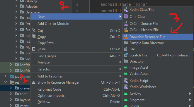
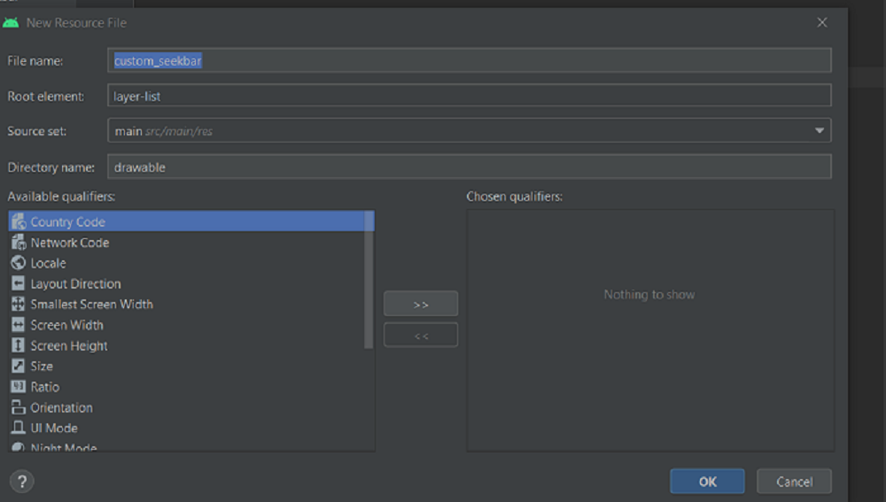
and name the drawble and specify Root element as layer-list -> click on OK. a new file custom_seekbar.xml will be created
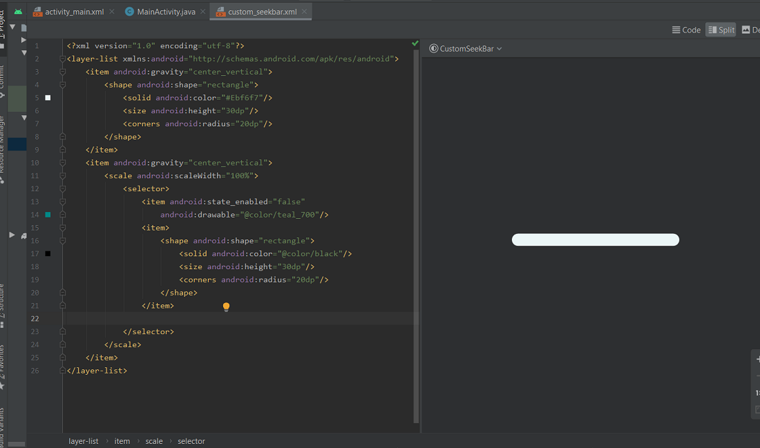
Now in custom_seekbar.xml inside the layer-list add an item and give a shape to it. specify the color, height, corners of the SeekBar. Also, add another item of the same shape and size but you can change the color, left part of SeekBar’s thumb will be of this color.
Now again click on drawable -> new -> drawable resource file, name the file as thumb.xml and specify Root element as shape -> click on OK. a new file thumb.xml will be created. Inside this file give the height, radius, and color of the thumb. these things can be changed. It totally depends upon how you want to design.

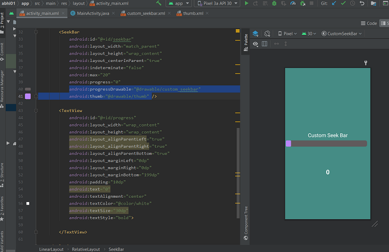
Now go to the activity_main.xml create a layout and inside the layout add a SeekBar. Specify the height width of SeekBar and the max progress that you want to use set progress to 0.
android:progressDrawable="@drawable/custom_seekbar"
android:thumb="@drawable/thumb"
android:max="50"
android:progress="0"
This will create a customized Seekbar inside activity_main.xml.
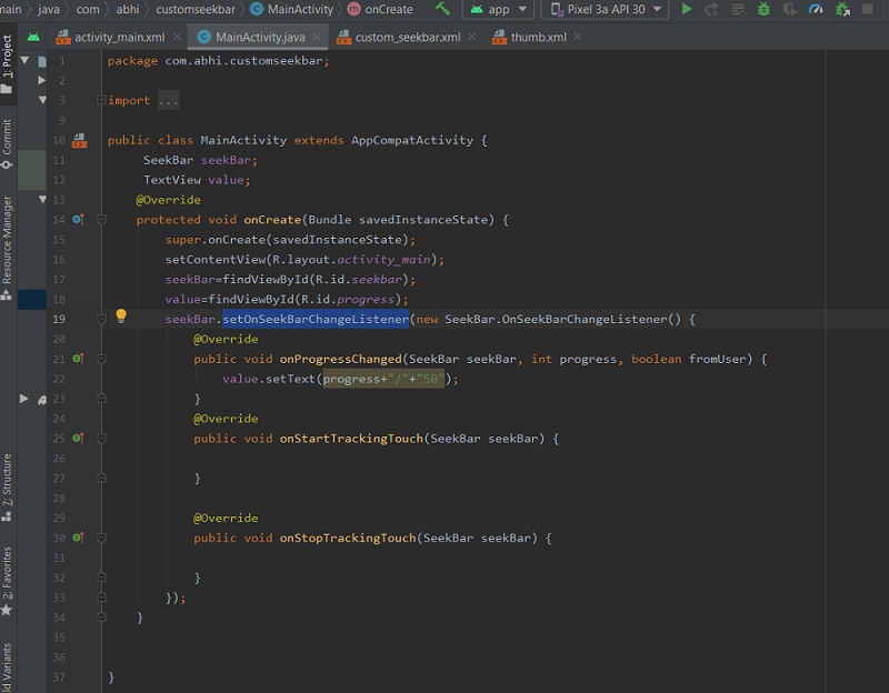
Now open MainActivity.java class Declare objects of SeekBar and TextView, inside onCreate method initialize both objects using findViewById() method. Perform an event of SeekBar change listener that will hold progress value, and by using this event set the progress value inside TextView.
   seekBar.setOnSeekBarChangeListener(new SeekBar.OnSeekBarChangeListener() {
            @Override
            // increment or decrement on process changed
            // increase the textsize
            // with the value of progress
            public void onProgressChanged(SeekBar seekBar, int progress, boolean fromUser) {
                value.setText(progress+"/"+"50");


            }..
Build and run the app. Put the thumb on Seekbar and move it either forward or backward it will display the process.
Code for the above implementation is given below:
Below is the code for the MainActivity.java file. Comments are added inside the code to understand the code in more detail.
    package com.abhi.customseekbar;

import androidx.appcompat.app.AppCompatActivity;

import android.os.Bundle;
import android.view.View;
import android.widget.SeekBar;
import android.widget.TextView;

public class MainActivity extends AppCompatActivity {
	SeekBar seekBar;
	TextView value;
	@Override
	protected void onCreate(Bundle savedInstanceState) {
		super.onCreate(savedInstanceState);
		setContentView(R.layout.activity_main);
		// initialize the seekBar object
		seekBar=findViewById(R.id.seekbar);
		value=findViewById(R.id.progress);
		// calling the seekbar event change listener
		seekBar.setOnSeekBarChangeListener(new SeekBar.OnSeekBarChangeListener() {
			@Override
			// increment or decrement on process changed
			// increase the textsize
			// with the value of progress
			public void onProgressChanged(SeekBar seekBar, int progress, boolean fromUser) {
				value.setText(progress+"/"+"50");
			}
			@Override
			public void onStartTrackingTouch(SeekBar seekBar) {
				// This method will automatically
				// called when the user touches the SeekBar
			}

			@Override
			public void onStopTrackingTouch(SeekBar seekBar) {
				// This method will automatically
				// called when the user
				// stops touching the SeekBar
			}
		});
	}
}
Below is the code for the activity_main.xml file.
<?xml version="1.0" encoding="utf-8"?>
<LinearLayout
	xmlns:android="http://schemas.android.com/apk/res/android"
	xmlns:app="http://schemas.android.com/apk/res-auto"
	xmlns:tools="http://schemas.android.com/tools"
	android:layout_width="match_parent"
	android:layout_height="match_parent"
	android:orientation="vertical"
	android:background="#458C85"
	tools:context=".MainActivity">

	<RelativeLayout
		android:id="@+id/Relative_1"
		android:layout_width="match_parent"
		android:layout_height="350dp"
		android:layout_weight="2">

		<TextView
			android:id="@+id/textViewSelectSizeOfArray"
			android:layout_width="273dp"
			android:layout_height="wrap_content"
			android:layout_above="@+id/seekbar"
			android:layout_alignParentStart="true"
			android:layout_alignParentEnd="true"

			android:layout_marginBottom="9dp"
			android:text="Custom Seek Bar"
			android:textAlignment="center"
			android:textColor="@color/white"
			android:textSize="25dp" />

		<SeekBar
			android:id="@+id/seekbar"
			android:layout_width="match_parent"
			android:layout_height="wrap_content"
			android:layout_centerInParent="true"
			android:indeterminate="false"
			android:max="50"
			android:progress="0"
			android:progressDrawable="@drawable/custom_seekbar"
			android:thumb="@drawable/thumb" />

		<TextView
			android:id="@+id/progress"
			android:layout_width="wrap_content"
			android:layout_height="wrap_content"
			android:layout_alignParentLeft="true"
			android:layout_alignParentRight="true"
			android:layout_alignParentBottom="true"
			android:layout_marginLeft="0dp"
			android:layout_marginRight="0dp"
			android:layout_marginBottom="199dp"
			android:padding="10dp"
			android:text="0"
			android:textAlignment="center"
			android:textColor="@color/white"
			android:textSize="30dp"
			android:textStyle="bold">

		</TextView>

	</RelativeLayout>

</LinearLayout>
Below is the code for the custom_seekbar.xml file.
<?xml version="1.0" encoding="utf-8"?>
<layer-list xmlns:android="http://schemas.android.com/apk/res/android">
	<!-- color, size, shape height of seekbar -->
	<item android:gravity="center_vertical">
		<shape android:shape="rectangle">
			<solid android:color="#605A5C"/>
			<size android:height="30dp"/>
			<corners android:radius="9dp"/>
		</shape>
	</item>
	<!-- color, size, shape height of seekbar when u drag it-->
	<item android:gravity="center_vertical">
		<scale android:scaleWidth="100%">
			<selector>
				<item android:state_enabled="false"
					android:drawable="@color/purple_200"/>
				<item>
					<shape android:shape="rectangle">
						<solid android:color="@color/black"/>
						<size android:height="30dp"/>
						<corners android:radius="9dp"/>
					</shape>
				</item>
			</selector>
		</scale>
	</item>
</layer-list>
Below is the code for the thumb.xml file.
<?xml version="1.0" encoding="utf-8"?>
<shape xmlns:android="http://schemas.android.com/apk/res/android">
	<solid android:color="@color/purple_200"/>
	<size android:height="30dp" android:width="25dp"/>
	<corners android:radius="5dp"/>
</shape>
Solution 22 - Android
For those who use Data Binding:
-
Add the following static method to any class
@BindingAdapter("app:thumbTintCompat") public static void setThumbTint(SeekBar seekBar, @ColorInt int color) { seekBar.getThumb().setColorFilter(color, PorterDuff.Mode.SRC_IN); } -
Add
app:thumbTintCompatattribute to your SeekBar<SeekBar android:id="@+id/seek_bar" style="@style/Widget.AppCompat.SeekBar" android:layout_width="wrap_content" android:layout_height="wrap_content" app:thumbTintCompat="@{@android:color/white}" />
That's it. Now you can use app:thumbTintCompat with any SeekBar. The progress tint can be configured in the same way.
Note: this method is also compatble with pre-lollipop devices.
Solution 23 - Android
Small correction to the answer by @arnav-rao:
to make sure that the thumb is colored properly, use:
<style name="MySeekBar" parent="Widget.AppCompat.SeekBar">
    <item name="android:progressBackgroundTint">@color/colorBgTint</item>
    <item name="android:progressTint">@color/colorProgressTint</item>
    <item name="android:thumbTint">@color/colorThumbTint</item>
</style>
here android:thumbTint actually colors the "thumb"
Solution 24 - Android
check this tutorial very good
https://www.lvguowei.me/post/customize-android-seekbar-color/
simple :
<SeekBar
                android:id="@+id/seekBar"
                android:layout_width="match_parent"
                android:layout_height="wrap_content"
                android:max="100"
                android:maxHeight="3dp"
                android:minHeight="3dp"
                android:progressDrawable="@drawable/seekbar_style"
                android:thumbTint="@color/positive_color"/>
then a style file:
<?xml version="1.0" encoding="utf-8"?>
<layer-list xmlns:android="http://schemas.android.com/apk/res/android" >
    <item android:id="@android:id/background">
        <shape android:shape="rectangle" >
            <solid
                android:color="@color/positive_color" />
        </shape>
    </item>
    <item android:id="@android:id/progress">
        <clip>
            <shape android:shape="rectangle" >
                <solid
                    android:color="@color/positive_color" />
            </shape>
        </clip>
    </item>
</layer-list>
Solution 25 - Android
I wanted to create a style for the seekbar and then add the style to a theme so that I could have it applied to an entire theme while still allowing a substyle to override it. Here is what I did:
<!-- Blue App Theme -->
    <style name="AppTheme.Blue" parent="BaseTheme.Blue">
        <item name="android:seekBarStyle">@style/SeekbarStyle.Blue</item>
        <item name="seekBarStyle">@style/SeekbarStyle.Blue</item> <!--This is essential for some devices, e.g. Samsung-->
</style>

<!-- Slider Styles -->
<style name="SeekbarStyle.Blue" parent="Widget.AppCompat.SeekBar">
        <item name="android:progressBackgroundTint">@color/material_blue_a700_pct_30</item>
        <item name="android:thumbTint">@color/material_blue_a700</item>
        <item name="android:thumbTintMode">src_in</item>
        <item name="android:progressTint">@color/material_blue_a700</item>
</style>

<style name="SeekbarStyle.Green" parent="Widget.AppCompat.SeekBar">
        <item name="android:progressBackgroundTint">@color/material_green_a700_pct_30</item>
        <item name="android:thumbTint">@color/material_green_a700</item>
        <item name="android:thumbTintMode">src_in</item>
        <item name="android:progressTint">@color/material_green_a700</item>
</style>
The above sets the Theme seekbar style to blue for all devices 21+ including Samsung (which need the seekBarStyle applied in addition to android:seekBarStyle; not sure why but I saw this issue firsthand). If you want all seekbars to keep the theme style and only apply the green seekbar style to a few widgets then add the following to the widget you want:
<SeekBar
            android:layout_width="match_parent"
            android:layout_height="wrap_content"
            android:theme="@style/AppTheme.Green"/>
Solution 26 - Android
You can also make it this way :
<SeekBar
    android:id="@+id/redSeekBar"
    android:layout_width="match_parent"
    android:layout_height="wrap_content"
    android:progressDrawable="@color/red"
    android:maxHeight="3dip"/>
Hope it will help!