Custom seekbar (thumb size, color and background)
AndroidSeekbarAndroid SliderAndroid Problem Overview
I would like to have this seekbar in my Android project :
This is my seekbar :
<SeekBar
        android:id="@+id/seekBar_luminosite"
        android:layout_width="@dimen/seekbar_width"
        android:layout_height="@dimen/seekbar_height"
        android:minHeight="15dp"
        android:minWidth="15dp"
        android:maxHeight="15dp"
        android:maxWidth="15dp"
        android:progress="@integer/luminosite_defaut"
        android:progressDrawable="@drawable/custom_seekbar"
        android:thumb="@drawable/custom_thumb" />
This is my custom_thumb.xml :
<shape xmlns:android="http://schemas.android.com/apk/res/android"
    android:shape="oval" >

    <gradient
        android:angle="270"
        android:endColor="@color/colorDekraOrange"
        android:startColor="@color/colorDekraOrange" />

    <size
        android:height="35dp"
        android:width="35dp" />

</shape>
This is my custom_seekbar.xml :
<layer-list xmlns:android="http://schemas.android.com/apk/res/android" >

    <item
        android:id="@android:id/background"
        android:drawable="@drawable/seekbar"/>
    <item android:id="@android:id/progress">
        <clip android:drawable="@color/colorDekraYellow" />
    </item>

</layer-list>
This is my seekbar.png (background) :

And this is the result :

No shadow and no rounded borders in the bar...
I really not understand how I can do.
Android Solutions
Solution 1 - Android
All done in XML (no .png images). The clever bit is border_shadow.xml.
All about the vectors these days...
Screenshot:

This is your SeekBar (res/layout/???.xml):
SeekBar
<SeekBar
	android:id="@+id/seekBar_luminosite"
	android:layout_width="300dp"
	android:layout_height="wrap_content"
	android:progress="@integer/luminosite_defaut"
	android:progressDrawable="@drawable/seekbar_style"
	android:thumb="@drawable/custom_thumb"/>
Let's make it stylish (so you can easily customize it later): style
res/drawable/seekbar_style.xml:
<?xml version="1.0" encoding="utf-8"?>
<layer-list xmlns:android="http://schemas.android.com/apk/res/android" >
    <item
        android:id="@android:id/background"
        android:drawable="@drawable/border_shadow" >
    </item>

    <item
        android:id="@android:id/progress" >
        <clip
            android:drawable="@drawable/seekbar_progress" />
    </item>
</layer-list>
thumb
res/drawable/custom_thumb.xml:
<?xml version="1.0" encoding="utf-8"?>
<layer-list xmlns:android="http://schemas.android.com/apk/res/android">
    <item>
    	<shape android:shape="oval">
    		<solid android:color="@color/colorDekraOrange"/>
    		<size
    			android:width="35dp"
    			android:height="35dp"/>
    	</shape>
    </item>
</layer-list>
progress
res/drawable/seekbar_progress.xml:
<?xml version="1.0" encoding="utf-8"?>
<layer-list
    xmlns:android="http://schemas.android.com/apk/res/android" >
    <item
        android:id="@+id/progressshape" >
        <clip>
            <shape
                android:shape="rectangle" >
    			<size android:height="5dp"/>
                <corners
                    android:radius="5dp" />
     			<solid android:color="@color/colorDekraYellow"/>
            </shape>
        </clip>
    </item>
</layer-list>
shadow
res/drawable/border_shadow.xml:
<?xml version="1.0" encoding="utf-8"?>
<layer-list xmlns:android="http://schemas.android.com/apk/res/android">
	<item>
		<shape>
			<corners
				android:radius="5dp" />
			<gradient
				android:angle="270"
				android:startColor="#33000000"
				android:centerColor="#11000000"
				android:endColor="#11000000"
				android:centerY="0.2"
				android:type="linear"
			/>
		</shape>
	</item>
</layer-list>
Solution 2 - Android
-
First at all, use
android:splitTrack="false"for the transparency problem of your thumb. -
For the seekbar.png, you have to use a 9 patch. It would be good for the rounded border and the shadow of your image.
Solution 3 - Android
> No shadow and no rounded borders in the bar
You are using an image so the easiest solution is row your boat with the flow,
You cannot give heights manually,yes you can but make sure it gets enough space to show your full image view there
- easiest way is use
android:layout_height="wrap_content"forSeekBar - To get more clear rounded borders you can easily use the same image that you have used with another color.
I am no good with Photoshop but I managed to edit a background one for a test
 seekbar_brown_to_show_progress.png
<SeekBar
    android:splitTrack="false"   // for unwanted white space in thumb
    android:id="@+id/seekBar_luminosite"
    android:layout_width="250dp"   // use your own size
    android:layout_height="wrap_content"
    android:minHeight="10dp"
    android:minWidth="15dp"
    android:maxHeight="15dp"
    android:maxWidth="15dp"
    android:progress="50"
    android:progressDrawable="@drawable/custom_seekbar_progress"
    android:thumb="@drawable/custom_thumb" />
custom_seekbar_progress.xml
<layer-list xmlns:android="http://schemas.android.com/apk/res/android">
    <item
        android:id="@android:id/background"
        android:drawable="@drawable/seekbar" />
    <item android:id="@android:id/progress">
        <clip android:drawable="@drawable/seekbar_brown_to_show_progress" />
    </item>
</layer-list>
custom_thumb.xml is same as yours
Finally android:splitTrack="false" will remove the unwanted white space in your thumb
Let's have a look at the output :
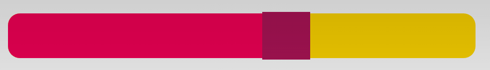
Solution 4 - Android
Android custom SeekBar - custom track or progress, shape, size, background and thumb and for other seekbar customization see http://www.zoftino.com/android-seekbar-and-custom-seekbar-examples
Custom Track drawable
<?xml version="1.0" encoding="utf-8"?>
<layer-list xmlns:android="http://schemas.android.com/apk/res/android">
    <item android:id="@android:id/background"
        android:gravity="center_vertical|fill_horizontal">
        <shape android:shape="rectangle"
            android:tint="#ffd600">
            <corners android:radius="8dp"/>
            <size android:height="30dp" />
            <solid android:color="#ffd600" />
        </shape>
    </item>
    <item android:id="@android:id/progress"
        android:gravity="center_vertical|fill_horizontal">
        <scale android:scaleWidth="100%">
            <selector>
                <item android:state_enabled="false"
                    android:drawable="@android:color/transparent" />
                <item>
                    <shape android:shape="rectangle"
                        android:tint="#f50057">
                        <corners android:radius="8dp"/>
                        <size android:height="30dp" />
                        <solid android:color="#f50057" />
                    </shape>
                </item>
            </selector>
        </scale>
    </item>
</layer-list>
Custom thumb drawable
?xml version="1.0" encoding="utf-8"?>
<shape
    xmlns:android="http://schemas.android.com/apk/res/android"
    android:shape="rectangle"
    android:thickness="4dp"
    android:useLevel="false"
    android:tint="#ad1457">
    <solid
        android:color="#ad1457" />
    <size
        android:width="32dp"
        android:height="32dp" />
</shape>
Output
Solution 5 - Android
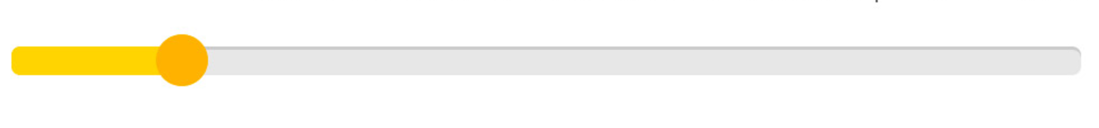
You can use the official Slider in the Material Components Library.
Use the app:trackHeight="xxdp" (default value is 4dp) to change the height of the track bar.
Also use these attributes to customize the colors:
app:activeTrackColor: the active track colorapp:inactiveTrackColor: the inactive track colorapp:thumbColor: to fill the thumb
Something like:
    <com.google.android.material.slider.Slider
        android:id="@+id/slider"
        android:layout_width="wrap_content"
        android:layout_height="wrap_content"
        app:activeTrackColor="#ffd400"
        app:inactiveTrackColor="#e7e7e7"
        app:thumbColor="#ffb300"
        app:trackHeight="12dp"
        .../>

It requires the version 1.2.0 of the library.
Solution 6 - Android
At first courtesy goes to @Charuka .
DO
You can use android:progressDrawable="@drawable/seekbar" instead of android:background="@drawable/seekbar" .
progressDrawable used for the progress mode.
You should try with
> Defines the minimum height of the view. It is not guaranteed the view > will be able to achieve this minimum height (for example, if its > parent layout constrains it with less available height).
> Defines the minimum width of the view. It is not guaranteed the view > will be able to achieve this minimum width (for example, if its parent > layout constrains it with less available width)
    android:minHeight="25p"
    android:maxHeight="25dp"
FYI:
Using android:minHeight and android:maxHeight is not good solutions .Need to rectify your Custom Seekbar (From Class Level) .
Solution 7 - Android
Use tints ;)
<SeekBar
        android:layout_width="match_parent"
        android:layout_height="wrap_content"
        android:minHeight="15dp"
        android:minWidth="15dp"
        android:maxHeight="15dp"
        android:maxWidth="15dp"
        android:progress="20"
        android:thumbTint="@color/colorPrimaryDark"
        android:progressTint="@color/colorPrimary"/>
use the color you need in thumbTint and progressTint. It is much faster! :)
Edit ofc you can use in combination with android:progressDrawable="@drawable/seekbar"
Solution 8 - Android
android:minHeight android:maxHeight is important for that.
<SeekBar
    android:id="@+id/pb"
    android:layout_width="match_parent"
    android:layout_height="wrap_content"
    android:maxHeight="2dp"
    android:minHeight="2dp"
    android:progressDrawable="@drawable/seekbar_bg"
    android:thumb="@drawable/seekbar_thumb"
    android:max="100"
    android:progress="50"/>
seekbar_bg.xml
<?xml version="1.0" encoding="utf-8"?>
<layer-list
    xmlns:android="http://schemas.android.com/apk/res/android">
    <item android:id="@android:id/background">
        <shape>
            <corners android:radius="3dp" />
            <solid android:color="#ECF0F1" />
        </shape>
    </item>
    <item android:id="@android:id/secondaryProgress">
        <clip>
            <shape>
                <corners android:radius="3dp" />
                <solid android:color="#C6CACE" />
            </shape>
        </clip>
    </item>
    <item android:id="@android:id/progress">
        <clip>
            <shape>
                <corners android:radius="3dp" />
                <solid android:color="#16BC5C" />
            </shape>
        </clip>
    </item>
</layer-list>
seekbar_thumb.xml
<?xml version="1.0" encoding="utf-8"?>
<shape xmlns:android="http://schemas.android.com/apk/res/android"
    android:shape="oval">
    <solid android:color="#16BC5C" />
    <stroke
        android:width="1dp"
        android:color="#16BC5C" />
    <size
        android:height="20dp"
        android:width="20dp" />
</shape>
Solution 9 - Android
For future readers!
Starting from material-components-android 1.2.0-alpha01, you can use new slider component
ex:
Modify thumbSize, thumbColor, trackColor accordingly.
<com.google.android.material.slider.Slider
        android:id="@+id/slider"
        android:layout_width="match_parent"
        android:layout_height="match_parent"
        android:valueFrom="20f"
        android:valueTo="70f"
        android:stepSize="10"
        app:thumbRadius="20dp"
        app:thumbColor="@color/colorAccent"
        app:trackColor="@android:color/darker_gray"
        />
Note: Track corners are not round.
Solution 10 - Android
Very simple way to change color of bar and thumb:
SeekBar slider;
ColorStateList sl = ColorStateList.valueOf( Color.YELLOW );
slider.setThumbTintList(sl);
slider.setProgressTintList(sl);
Solution 11 - Android
You can try progress bar instead of seek bar
<ProgressBar
    android:id="@+id/progressBar"
    style="?android:attr/progressBarStyleHorizontal"
    android:layout_width="fill_parent"
    android:layout_height="50dp"
    android:layout_marginBottom="35dp"
    />