Rounded table corners CSS only
HtmlCssHtml TableRounded CornersHtml Problem Overview
I have searched and searched, but haven't been able to find a solution for my requirement.
I have a plain ol' HTML table. I want round corners for it, without using images or JS, i.e. pure CSS only. Like this:

Rounded corners for corner cells, and 1px thick border for the cells.
So far I have this:
table {
  -moz-border-radius: 5px !important;
  border-collapse: collapse !important;
  border: none !important;
}
table th,
table td {
  border: none !important
}
table th:first-child {
  -moz-border-radius: 5px 0 0 0 !important;
}
table th:last-child {
  -moz-border-radius: 0 5px 0 0 !important;
}
table tr:last-child td:first-child {
  -moz-border-radius: 0 0 0 5px !important;
}
table tr:last-child td:last-child {
  -moz-border-radius: 0 0 5px 0 !important;
}
table tr:hover td {
  background-color: #ddd !important
}
But that leaves me without any borders for the cells. If I add borders, they aren't rounded!
Any solutions?
Html Solutions
Solution 1 - Html
Seems to work fine in FF and Chrome (haven't tested any others) with separate borders: http://jsfiddle.net/7veZQ/3/
Edit: Here's a relatively clean implementation of your sketch:
<table>
    <thead>
    <tr>
        <th>blah</th>
        <th>fwee</th>
        <th>spoon</th>
    </tr>
    </thead>
    <tr>
        <td>blah</td>
        <td>fwee</td>
        <td>spoon</td>
    </tr>
    <tr>
        <td>blah</td>
        <td>fwee</td>
        <td>spoon</td>
    </tr>
</table>
table {
    border-collapse:separate;
    border:solid black 1px;
    border-radius:6px;
}

td, th {
    border-left:solid black 1px;
    border-top:solid black 1px;
}

th {
    background-color: blue;
    border-top: none;
}

td:first-child, th:first-child {
     border-left: none;
}
Solution 2 - Html
For me, the Twitter Bootstrap Solution looks good. It excludes IE < 9 (no round corners in IE 8 and lower), but that's O.K. I think, if you develop prospective Web-Apps.
CSS/HTML:
<table>
  <thead>
    <tr><th>xxx</th><th>xxx</th><th>xxx</th></tr>
  </thead>
  <tbody>
    <tr><td>xxx</td><td>xxx</td><td>xxx</td></tr>
    <tr><td>xxx</td><td>xxx</td><td>xxx</td></tr>
    <tr><td>xxx</td><td>xxx</td><td>xxx</td></tr>
    <tr><td>xxx</td><td>xxx</td><td>xxx</td></tr>
    <tr><td>xxx</td><td>xxx</td><td>xxx</td></tr>
  </tbody>
</table>
table {
    border: 1px solid #ddd;
    border-collapse: separate;
    border-left: 0;
    border-radius: 4px;
    border-spacing: 0px;
}
thead {
    display: table-header-group;
    vertical-align: middle;
    border-color: inherit;
    border-collapse: separate;
}
tr {
    display: table-row;
    vertical-align: inherit;
    border-color: inherit;
}
th, td {
    padding: 5px 4px 6px 4px;
    text-align: left;
    vertical-align: top;
    border-left: 1px solid #ddd;
}
td {
    border-top: 1px solid #ddd;
}
thead:first-child tr:first-child th:first-child, tbody:first-child tr:first-child td:first-child {
    border-radius: 4px 0 0 0;
}
thead:last-child tr:last-child th:first-child, tbody:last-child tr:last-child td:first-child {
    border-radius: 0 0 0 4px;
}
You can play with that here (on jsFiddle)
Solution 3 - Html
The selected answer is terrible. I would implement this by targeting the corner table cells and applying the corresponding border radius.
To get the top corners, set the border radius on the first and last of type of the th elements, then finish by setting the border radius on the last and first of td type on the last of type tr to get the bottom corners.
th:first-of-type {
  border-top-left-radius: 10px;
}
th:last-of-type {
  border-top-right-radius: 10px;
}
tr:last-of-type td:first-of-type {
  border-bottom-left-radius: 10px;
}
tr:last-of-type td:last-of-type {
  border-bottom-right-radius: 10px;
}
Solution 4 - Html
Firstly, you'll need more than just -moz-border-radius if you want to support all browsers. You should specify all variants, including plain border-radius, as follows:
-moz-border-radius: 5px;
-webkit-border-radius: 5px;
border-radius: 5px;
Secondly, to directly answer your question, border-radius doesn't actually display a border; it just sets how the corners look of the border, if there is one.
To turn on the border, and thus get your rounded corners, you also need the border attribute on your td and th elements.
td, th {
   border:solid black 1px;
}
You will also see the rounded corners if you have a background colour (or graphic), although of course it would need to be a different background colour to the surrounding element in order for the rounded corners to be visible without a border.
It's worth noting that some older browsers don't like putting border-radius on tables/table cells. It may be worth putting a <div> inside each cell and styling that instead. However this shouldn't affect current versions of any browsers (except IE, that doesn't support rounded corners at all - see below)
Finally, not that IE doesn't support border-radius at all (IE9 beta does, but most IE users will be on IE8 or less). If you want to hack IE to support border-radius, look at http://css3pie.com/
[EDIT]
Okay, this was bugging me, so I've done some testing.
Here's a JSFiddle example I've been playing with
It seems like the critical thing you were missing was border-collapse:separate; on the table element. This stops the cells from linking their borders together, which allows them to pick up the border radius.
Hope that helps.
Solution 5 - Html
The best solution I've found for rounded corners and other CSS3 behavior for IE<9 can be found here: http://css3pie.com/
Download the plug-in, copy to a directory in your solution structure. Then in your stylesheet make sure to have the behavior tag so that it pulls in the plug-in.
Simple example from my project which gives me rounded corners, color gradient, and box shadow for my table:
.table-canvas
{
    -webkit-border-radius: 8px;
    -moz-border-radius: 8px;
    overflow:hidden;
    border-radius: 10px;
    -pie-background: linear-gradient(#ece9d8, #E5ECD8);
    box-shadow: #666 0px 2px 3px;
    behavior: url(Include/PIE.htc);
    overflow: hidden;
}
Don't worry if your Visual Studio CSS intellisense gives you the green underline for unknown properites, it still works when you run it. Some of the elements are not very clearly documented, but the examples are pretty good, especially on the front page.
Solution 6 - Html
It is a little rough, but here is something I put together that is comprised entirely of CSS and HTML.
- Outer corners rounded
- Header row
- Multiple data rows
This example also makes use of the :hover pseudo class for each data cell <td>. Elements can be easily updated to meet your needs, and the hover can quickly be disabled.
(However, I have not yet gotten the :hover to properly work for full rows <tr>. The last hovered row does not display with rounded corners on the bottom. I'm sure there is something simple that is getting overlooked.)
table.dltrc {
  width: 95%;
  border-collapse: separate;
  border-spacing: 0px;
  border: solid black 2px;
  border-radius: 8px;
}

tr.dlheader {
  text-align: center;
  font-weight: bold;
  border-left: solid black 1px;
  padding: 2px
}

td.dlheader {
  background: #d9d9d9;
  text-align: center;
  font-weight: bold;
  border-left: solid black 1px;
  border-radius: 0px;
  padding: 2px
}

tr.dlinfo,
td.dlinfo {
  text-align: center;
  border-left: solid black 1px;
  border-top: solid black 1px;
  padding: 2px
}

td.dlinfo:first-child,
td.dlheader:first-child {
  border-left: none;
}

td.dlheader:first-child {
  border-radius: 5px 0 0 0;
}

td.dlheader:last-child {
  border-radius: 0 5px 0 0;
}


/*===== hover effects =====*/


/*tr.hover01:hover,
tr.hover02:hover {
  background-color: #dde6ee;
}*/


/* === ROW HOVER === */


/*tr.hover02:hover:last-child {
  background-color: #dde6ee;
  border-radius: 0 0 6px 6px;
  }*/


/* === CELL HOVER === */

td.hover01:hover {
  background-color: #dde6ee;
}

td.hover02:hover {
  background-color: #dde6ee;
}

td.hover02:first-child {
  border-radius: 0 0 0 6px;
}

td.hover02:last-child {
  border-radius: 0 0 6px 0;
}
<body style="background:white">
  <br>
  <center>
    <table class="dltrc" style="background:none">
      <tbody>
        <tr class="dlheader">
          <td class="dlheader">Subject</td>
          <td class="dlheader">Title</td>
          <td class="dlheader">Format</td>
        </tr>
        <tr class="dlinfo hover01">
          <td class="dlinfo hover01">One</td>
          <td class="dlinfo hover01">Two</td>
          <td class="dlinfo hover01">Three</td>
        </tr>
        <tr class="dlinfo hover01">
          <td class="dlinfo hover01">Four</td>
          <td class="dlinfo hover01">Five</td>
          <td class="dlinfo hover01">Six</td>
        </tr>
        <tr class="dlinfo hover01">
          <td class="dlinfo hover01">Seven</td>
          <td class="dlinfo hover01">Eight</td>
          <td class="dlinfo hover01">Nine</td>
        </tr>
        <tr class="dlinfo2 hover02">
          <td class="dlinfo hover02">Ten</td>
          <td class="dlinfo hover01">Eleven</td>
          <td class="dlinfo hover02">Twelve</td>
        </tr>
      </tbody>
    </table>
  </center>
</body>
Solution 7 - Html
Add a <div> wrapper around the table, and apply the following CSS
border-radius: x px;
overflow: hidden;
display: inline-block;
to this wrapper.
Solution 8 - Html
To adapt @luke flournoy's brilliant answer - and if you're not using th in your table, here's all the CSS you need to make a rounded table:
.my_table{
border-collapse: separate;
border-spacing: 0;
border: 1px solid grey;
border-radius: 10px;
-moz-border-radius: 10px;
-webkit-border-radius: 10px;
}

.my_table tr:first-of-type {
  border-top-left-radius: 10px;
}

.my_table tr:first-of-type td:last-of-type {
  border-top-right-radius: 10px;
}

.my_table tr:last-of-type td:first-of-type {
  border-bottom-left-radius: 10px;
}

.my_table tr:last-of-type td:last-of-type {
  border-bottom-right-radius: 10px;
}
Solution 9 - Html
2020+ solution
- Use CSS variable to pass the border radius of the table to the border radius of the corner cells, so you can change the radius on a single place (like
<table class="rounded" style="--radius: 10px">) border-collapsedrops the border radius settings and without it the border-width is doubled. To make the borders 1px wide, I'd suggest box shadows of the cells (likebox-shadow: -1px -1px black)
/* rounded corners */
.rounded {
    --radius: 5px;
    --border-color: black;
    border: 1px solid var(--border-color);
    border-radius: var(--radius);
    border-spacing: 0;
}
.rounded tr:first-child>:first-child { border-top-left-radius: var(--radius); }
.rounded tr:first-child>:last-child { border-top-right-radius: var(--radius); }
.rounded tr:last-child>:first-child { border-bottom-left-radius: var(--radius); }
.rounded tr:last-child>:last-child { border-bottom-right-radius: var(--radius); }

/* design */
.rounded th, .rounded td {
    padding: .2rem;
    /* border: 1px solid var(--border-color); */
    box-shadow: -1px -1px var(--border-color);
}
.rounded th {
    background: hsl(240deg, 100%, 80%);
}
<table class="rounded">
  <tr>
    <th>Name
    <th>Note
  <tr>
    <td>Bill Gates
    <td>Plagiator
  <tr>
    <td>Steve Jobs
    <td>Hipster
</table>
Solution 10 - Html
The following is something I used that worked for me across browsers so I hope it helps someone in the future:
#contentblock th:first-child {
	-moz-border-radius: 6px 0 0 0;
    -webkit-border-radius: 6px 0 0 0;
    border-radius: 6px 0 0 0;
	behavior: url(/images/border-radius.htc);
    border-radius: 6px 0 0 0;
}

#contentblock th:last-child {
    -moz-border-radius: 0 6px 0 0;
    -webkit-border-radius: 0 6px 0 0;
    border-radius: 0 6px 0 0;
	behavior: url(/images/border-radius.htc);
    border-radius: 0 6px 0 0;
}
#contentblock tr:last-child td:last-child {
	 border-radius: 0 0 6px 0;
	-moz-border-radius: 0 0 6px 0;
    -webkit-border-radius: 0 0 6px 0;
	behavior: url(/images/border-radius.htc);
    border-radius: 0 0 6px 0;
 }

#contentblock tr:last-child td:first-child {
    -moz-border-radius: 0 0 0 6px;
    -webkit-border-radius: 0 0 0 6px;
    border-radius: 0 0 0 6px;
	behavior: url(/images/border-radius.htc);
    border-radius: 0 0 0 6px;
}
Obviously the #contentblock portion can be replaced/edited as needed and you can find the border-radius.htc file by doing a search in Google or your favorite web browser.
Solution 11 - Html
For a bordered and scrollable table, use this (replace variables, $ starting texts)
If you use thead, tfoot or th, just replace tr:first-child and tr-last-child and td with them.
#table-wrap {
  border: $border solid $color-border;
  border-radius: $border-radius;
}
table {
  border-collapse: collapse;
  border-spacing: 0;
}
table td { border: $border solid $color-border; }
table td:first-child { border-left: none; }
table td:last-child { border-right: none; }
table tr:first-child td { border-top: none; }
table tr:last-child td { border-bottom: none; }
table tr:first-child td:first-child { border-top-left-radius: $border-radius; }
table tr:first-child td:last-child { border-top-right-radius: $border-radius; }
table tr:last-child td:first-child { border-bottom-left-radius: $border-radius; }
table tr:last-child td:last-child { border-bottom-right-radius: $border-radius; }
HTML:
<div id=table-wrap>
  <table>
    <tr>
       <td>1</td>
       <td>2</td>
    </tr>
    <tr>
       <td>3</td>
       <td>4</td>
    </tr>
  </table>
</div>
Solution 12 - Html
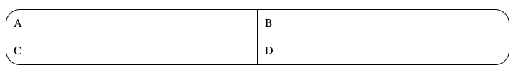
You can try this if you want the rounded corners on each side of the table without touching the cells : http://jsfiddle.net/7veZQ/3983/
<table>
    <tr class="first-line"><td>A</td><td>B</td></tr>
    <tr class="last-line"><td>C</td><td>D</td></tr>
</table>
Solution 13 - Html
Sample HTML
<table class="round-corner" aria-describedby="caption">
    <caption id="caption">Table with rounded corners</caption>
    <thead>
        <tr>
            <th scope="col">Head1</th>
            <th scope="col">Head2</th>
            <th scope="col">Head3</th>
        </tr>
    </thead>
    <tbody>
        <tr>
            <td scope="rowgroup">tbody1 row1</td>
            <td scope="rowgroup">tbody1 row1</td>
            <td scope="rowgroup">tbody1 row1</td>
        </tr>
        <tr>
            <td scope="rowgroup">tbody1 row2</td>
            <td scope="rowgroup">tbody1 row2</td>
            <td scope="rowgroup">tbody1 row2</td>
        </tr>
    </tbody>
    <tbody>
        <tr>
            <td scope="rowgroup">tbody2 row1</td>
            <td scope="rowgroup">tbody2 row1</td>
            <td scope="rowgroup">tbody2 row1</td>
        </tr>
        <tr>
            <td scope="rowgroup">tbody2 row2</td>
            <td scope="rowgroup">tbody2 row2</td>
            <td scope="rowgroup">tbody2 row2</td>
        </tr>
    </tbody>
    <tbody>
        <tr>
            <td scope="rowgroup">tbody3 row1</td>
            <td scope="rowgroup">tbody3 row1</td>
            <td scope="rowgroup">tbody3 row1</td>
        </tr>
        <tr>
            <td scope="rowgroup">tbody3 row2</td>
            <td scope="rowgroup">tbody3 row2</td>
            <td scope="rowgroup">tbody3 row2</td>
        </tr>
    </tbody>
    <tfoot>
        <tr>
            <td scope="col">Foot</td>
            <td scope="col">Foot</td>
            <td scope="col">Foot</td>
        </tr>
    </tfoot>
</table>
SCSS, easily converted to CSS, use sassmeister.com
// General CSS
table,
th,
td {
    border: 1px solid #000;
    padding: 8px 12px;
}

.round-corner {
    border-collapse: collapse;
    border-style: hidden;
    box-shadow: 0 0 0 1px #000; // fake "border"
    border-radius: 4px;

    // Maybe there's no THEAD after the caption?
    caption + tbody {
        tr:first-child {
            td:first-child,
            th:first-child {
                border-top-left-radius: 4px;
            }

            td:last-child,
            th:last-child {
                border-top-right-radius: 4px;
                border-right: none;
            }
        }
    }

    tbody:first-child {
        tr:first-child {
            td:first-child,
            th:first-child {
                border-top-left-radius: 4px;
            }

            td:last-child,
            th:last-child {
                border-top-right-radius: 4px;
                border-right: none;
            }
        }
    }

    tbody:last-child {
        tr:last-child {
            td:first-child,
            th:first-child {
                border-bottom-left-radius: 4px;
            }

            td:last-child,
            th:last-child {
                border-bottom-right-radius: 4px;
                border-right: none;
            }
        }
    }

    thead {
        tr:last-child {
            td:first-child,
            th:first-child {
                border-top-left-radius: 4px;
            }

            td:last-child,
            th:last-child {
                border-top-right-radius: 4px;
                border-right: none;
            }
        }
    }

    tfoot {
        tr:last-child {
            td:first-child,
            th:first-child {
                border-bottom-left-radius: 4px;
            }

            td:last-child,
            th:last-child {
                border-bottom-right-radius: 4px;
                border-right: none;
            }
        }
    }

    // Reset tables inside table
    table tr th,
    table tr td {
        border-radius: 0;
    }
}
Solution 14 - Html
Add between <head> tags:
<style>
  td {background: #ffddaa; width: 20%;}
</style>
and in the body:
<div style="background: black; border-radius: 12px;">
<table width="100%" style="cell-spacing: 1px;">
<tr>
<td style="border-top-left-radius: 10px;">
Noordwest
</td>
<td> </td>
<td>Noord</td>
<td> </td>
<td style="border-top-right-radius: 10px;">
Noordoost
</td>
</tr>
<tr>
<td> </td>
<td> </td>
<td> </td>
<td> </td>
<td> </td>
</tr>
<tr>
<td>West</td>
<td> </td>
<td>Centrum</td>
<td> </td>
<td>Oost</td>
</tr>
<tr>
<td> </td>
<td> </td>
<td> </td>
<td> </td>
<td> </td>
</tr>
<tr>
<td style="border-bottom-left-radius: 10px;">
Zuidwest
</td>
<td> </td>
<td>Zuid</td>
<td> </td>
<td style="border-bottom-right-radius: 10px;">
Zuidoost
</td>
</tr>
</table>
</div>
The cell color, contents and formatting are of course for example;
it's about spacing color-filled cells within a div.
Doing so, the black cell borders/table border are actually the div background color.
Note that you'll need to set the div-border-radius about 2 values greater than the separate cell corner border radii, to take a smooth rounded corner effect.
Solution 15 - Html
Since none of the higher rated solutions worked for me, as I am working with a table, that has an alternating color scheme, I tried a lot and finally got my solution based on the solution, @[luke flournoy] provided.
Basically the solution with putting a rounded border on the table works - but when you apply a background color on a table row or work with a designated table head, it overwrites the overall table setting and will be displayed as a rectangle.
Luke's solutions targets only the specific corner cells, that got me to the idea, that I should maybe also apply the alternating background color to the cells of that row and not the row itself. Adding td to the tr:nth-child did the trick. Same goes if you want to use a third color on the table head. You can check this out in the code snippet below.
I didn't see any other solution actually working with background colors and especially not with different colors in one table so I hope this one helps those, who need more than just a plain mono-colored table. Rate this up if it helped you, so it moves to the top. There are a lot of very fussy and not quite helpful answers here, so.
Here's a look at my result https://i.stack.imgur.com/XHOEN.png
And here's the code for it:
    .LezzonPrize{
    	text-align: center;
    	line-height: 1.8rem;
        border-collapse: collapse;
        border-radius: 36px;
    	-moz-border-radius: 36px;
    	-webkit-border-radius: 36px;
    	background-color: #FCF3C6;
    }

    .LezzonPrize thead th{
    	background-color:#FFCF5A;
    }

    .LezzonPrize thead th:first-child{
    	border-radius: 36px 0 0 0;
    }

    .LezzonPrize thead th:last-child{
    	border-radius: 0 36px 0 0;
    }

    .LezzonPrize th{
    	text-align: center;
    	vertical-align: middle;
    	line-height: 1.8rem;
    	font-weight: 700;
    	text-transform: none;
    	border-bottom:
    		2px solid #3F5A1B;
    }

    .LezzonPrize td:first-child{
    	text-align:left;
    }

    .LezzonPrize td{
    	font-size:18px;
    }

    .LezzonPrize tr:nth-child(2n-1) td{
    	background-color: #F3CF87;
    }

    .LezzonPrize tr:last-child td:first-child{
    	border-radius: 0 0 0 36px;
    	-moz-border-radius: 0 0 0 36px;
    	-webkit-border-radius: 0 0 0 36px;
    }

    .LezzonPrize tr:last-child td:last-child{
    	border-radius: 0 0 36px 0;
    	-moz-border-radius: 0 0 36px 0;
    	-webkit-border-radius: 0 0 36px 0;
    }
	<table class="LezzonPrize" width="100%">
		<thead>
			<tr>
				<th width="32%">
					Head
				</th>
				<th width="17%">
					Head
				</th>
				<th width="17%">
					Head
				</th>
				<th width="17%">
					Head
				</th>
				<th width="17%">
					Head
				</th>
			</tr>
		</thead>
		<tbody>
			<tr>
				<td>
					Content
				</td>
				<td>
					Content
				</td>
				<td>
					Content
				</td>
				<td>
					Content
				</td>
				<td>
					Content
				</td>
			</tr>
			<tr>
				<td>
					Content
				</td>
				<td>
					Content
				</td>
				<td>
					Content
				</td>
				<td>
					Content
				</td>
				<td>
					Content
				</td>
			</tr>
			<tr>
				<td>
					Content
				</td>
				<td>
					Content
				</td>
				<td>
					Content
				</td>
				<td>
					Content
				</td>
				<td>
					Content
				</td>
			</tr>
			<tr>
				<td colspan="5">Try deleting this to confirm that the round corners also work on the 2nth-child table rows</td>
			</tr>
		</tbody>
	</table>
Solution 16 - Html
Alternative solution would be to use a wrapper for table
http://jsfiddle.net/0fmweahc/15/
<div class="table-wrapper">
 <table>
    <tr class="first-line"><td>A</td><td>B</td></tr>
    <tr class="last-line"><td>C</td><td>D</td></tr>
 </table>
</div>

<style>
  .table-wrapper {
    border: 1px solid black;
    border-radius: 20px;
    margin: 10%;
  }

  table, td, th {
    border: 1px solid black;
    padding: 10px;
  }

  table {
    width: 100%;
    border-collapse: collapse;
    border-style: hidden;
  }
</style>
Solution 17 - Html
CSS:
table {
  border: 1px solid black;
  border-radius: 10px;
  border-collapse: collapse;
  overflow: hidden;
}

td {
  padding: 0.5em 1em;
  border: 1px solid black;
}
Solution 18 - Html
Lesson in Table Borders...##
NOTE: The HTML/CSS code below should be viewed in IE only. The code will not be rendered correctly in Chrome!
We need to remember that:
-
A table has a border: its outer boundary (which can also have a border-radius.)
-
The cells themselves ALSO have borders (which too, can also have a border-radius.)
-
The table and cell borders can interfere with each other:
The cell border can pierce through the table border (ie: table boundary).
To see this effect, amend the CSS style rules in the code below as follows:
i. table {border-collapse: separate;}
ii. Delete the style rules which round the corner cells of the table.
iii. Then play with border-spacing so you can see the interference.
-
However, the table border and cell borders can be COLLAPSED (using: border-collapse: collapse;).
-
When they are collapsed, the cell and table borders interfere in a different way:
i. If the table border is rounded but cell borders remain square, then the cell's shape takes precedence and the table loses its curved corners.
ii. Conversely, if the corner cell's are curved but the table boundary is square, then you will see an ugly square corner bordering the curvature of the corner cells.
-
Given that cell's attribute takes precedence, the way to round the table's four corner's then, is by:
i. Collapsing borders on the table (using: border-collapse: collapse;).
ii. Setting your desired curvature on the corner cells of the table.
iii. It does not matter if the table's corner's are rounded (ie: Its border-radius can be zero).
			.zui-table-rounded {
				border: 2px solid blue;
				/*border-radius: 20px;*/

				border-collapse: collapse;
				border-spacing: 0px;
			}

			.zui-table-rounded thead th:first-child {
				border-radius: 30px 0 0 0;
			}

			.zui-table-rounded thead th:last-child {
				border-radius: 0 10px 0 0;
			}

			.zui-table-rounded tbody tr:last-child td:first-child {
				border-radius: 0 0 0 10px;
			}

			.zui-table-rounded tbody tr:last-child td:last-child {
				border-radius: 0 0 10px 0;
			}


			.zui-table-rounded thead th {
				background-color: #CFAD70;
			}

			.zui-table-rounded tbody td {
				border-top: solid 1px #957030;
				background-color: #EED592;
			}
			<table class="zui-table-rounded">
			<thead>
				<tr>
					<th>Name</th>
					<th>Position</th>
					<th>Height</th>
					<th>Born</th>
					<th>Salary</th>
				</tr>
			</thead>
			<tbody>
				<tr>
					<td>DeMarcus Cousins</td>
					<td>C</td>
					<td>6'11"</td>
					<td>08-13-1990</td>
					<td>$4,917,000</td>
				</tr>
				<tr>
					<td>Isaiah Thomas</td>
					<td>PG</td>
					<td>5'9"</td>
					<td>02-07-1989</td>
					<td>$473,604</td>
				</tr>
				<tr>
					<td>Ben McLemore</td>
					<td>SG</td>
					<td>6'5"</td>
					<td>02-11-1993</td>
					<td>$2,895,960</td>
				</tr>
				<tr>
					<td>Marcus Thornton</td>
					<td>SG</td>
					<td>6'4"</td>
					<td>05-05-1987</td>
					<td>$7,000,000</td>
				</tr>
				<tr>
					<td>Jason Thompson</td>
					<td>PF</td>
					<td>6'11"</td>
					<td>06-21-1986</td>
					<td>$3,001,000</td>
				</tr>
			</tbody>
		</table>