How can I truncate table cells, but fit as much as content possible?
HtmlCssHtml TableOverflowHtml Problem Overview
Meet Fred. He's a table:
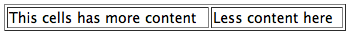
<table border="1" style="width: 100%;">
	<tr>
		<td>This cells has more content</td>
		<td>Less content here</td>
	</tr>
</table>
Fred's apartment has a bizarre habit of changing size, so he's learned to hide some of his content so as not to push all the other units over and shove Mrs. Whitford's living room off into oblivion:
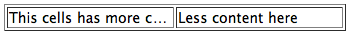
<table border="1" style="width: 100%; white-space: nowrap; table-layout: fixed;">
	<tr>
		<td style="overflow: hidden; text-overflow: ellipsis">This cells has more content</td>
		<td style="overflow: hidden; text-overflow: ellipsis">Less content here</td>
	</tr>
</table>
This works, but Fred has a nagging feeling that if his right cell (which he's nicknamed Celldito) gave up a little space, his left cell wouldn't be truncated quite as much of the time. Can you save his sanity?
In summary: How can a table's cells overflow evenly, and only when they've all given up all their whitespace?
Html Solutions
Solution 1 - Html
<table border="1" style="width: 100%;">
    <colgroup>
        <col width="100%" />
        <col width="0%" />
    </colgroup>
    <tr>
        <td style="white-space: nowrap; text-overflow:ellipsis; overflow: hidden; max-width:1px;">This cell has more content.This cell has more content.This cell has more content.This cell has more content.This cell has more content.This cell has more content.</td>
        <td style="white-space: nowrap;">Less content here.</td>
    </tr>
</table>
Solution 2 - Html
I believe I have a non-JavaScript solution! I didn't want to settle for a JavaScript fix because I find the slight jitter of things moving around after the page is loaded to be unacceptable.
Features:
- No JavaScript
- No fixed-layout
- No weighting or percentage-width tricks
- Works with any number of columns
- Simple server-side generation and client-side updating (no calculation necessary)
- Cross-browser compatible
How it works: Inside the table cell place two copies of the content in two different elements within a relatively-positioned container element. The spacer element is statically-positioned and as such will affect the width of the table cells. By allowing the contents of the spacer cell to wrap we can get the "best-fit" width of the table cells that we are looking for. This also allows us to use the absolutely-positioned element to restrict the width of the visible content to that of the relatively-positioned parent.
Tested and working in: IE8, IE9, IE10, Chrome, Firefox, Safari, Opera
Result Images:


JSFiddle: http://jsfiddle.net/zAeA2/
Sample HTML/CSS:
<td>
<!--Relative-positioned container-->
<div class="container">
<!--Visible-->
<div class="content"><!--Content here--></div>
<!--Hidden spacer-->
<div class="spacer"><!--Content here--></div>
<!--Keeps the container from collapsing without
having to specify a height-->
<span> </span>
</div>
</td>
.container {
position: relative;
}
.content {
position: absolute;
max-width: 100%;
white-space: nowrap;
overflow: hidden;
text-overflow: ellipsis;
}
.spacer {
height: 0;
overflow: hidden;
}
Solution 3 - Html
I've been faced the same challenge few days ago. It seems Lucifer Sam found the best solution.
But I noticed you should duplicate content at spacer element. Thought it's not so bad, but I'd like also to apply title popup for clipped text. And it means long text will appear third time in my code.
Here I propose to access title attribute from :after pseudo-element to generate spacer and keep HTML clean.
Works on IE8+, FF, Chrome, Safari, Opera
<table border="1">
  <tr>
    <td class="ellipsis_cell">
      <div title="This cells has more content">
        <span>This cells has more content</span>
      </div>
    </td>
    <td class="nowrap">Less content here</td>
  </tr>
</table>
.ellipsis_cell > div {
    position: relative;
    overflow: hidden;
    height: 1em;
}

/* visible content */
.ellipsis_cell > div > span {
    display: block;
    position: absolute;
    max-width: 100%;
    white-space: nowrap;
    overflow: hidden;
    text-overflow: ellipsis;
    line-height: 1em;
}

/* spacer content */
.ellipsis_cell > div:after {
    content: attr(title);
    overflow: hidden;
    height: 0;
    display: block;
}
Solution 4 - Html
Simply add the following rules to your td:
overflow: hidden;
text-overflow: ellipsis;
white-space: nowrap;
// These ones do the trick
width: 100%;
max-width: 0;
Example:
table {
  width: 100%
}

td {
  white-space: nowrap;
}

.td-truncate {
  overflow: hidden;
  text-overflow: ellipsis;
  width: 100%;
  max-width: 0;
}
<table border="1">
  <tr>
    <td>content</td>
    <td class="td-truncate">long contenttttttt ttttttttt ttttttttttttttttttttttt tttttttttttttttttttttt ttt tttt ttttt ttttttt tttttttttttt ttttttttttttttttttttttttt</td>
    <td>other content</td>
  </tr>
</table>
PS:
If you want to set a custom width to another td use property min-width.
Solution 5 - Html
There's a much easier and more elegant solution.
Within the table-cell that you want to apply truncation, simply include a container div with css table-layout: fixed. This container takes the full width of the parent table cell, so it even acts responsive.
Make sure to apply truncation to the elements in the table.
Works from IE8+
<table>
  <tr>
    <td>
     <div class="truncate">
       <h1 class="truncated">I'm getting truncated because I'm way too long to fit</h1>
     </div>
    </td>
    <td class="some-width">
       I'm just text
    </td>
  </tr>
</table>
and css:
    .truncate {
      display: table;
      table-layout: fixed;
      width: 100%;
    }

    h1.truncated {
      overflow-x: hidden;
      text-overflow: ellipsis;
      white-space: nowrap;
    }
here's a working Fiddle https://jsfiddle.net/d0xhz8tb/
Solution 6 - Html
If Javascript is acceptable, I put together a quick routine which you could use as a starting point. It dynamically tries to adapt the cell widths using the inner width of a span, in reaction to window resize events.
Currently it assumes that each cell normally gets 50% of the row width, and it will collapse the right cell to keep the left cell at its maximum width to avoid overflowing. You could implement much more complex width balancing logic, depending on your use cases. Hope this helps:
Markup for the row I used for testing:
<tr class="row">
    <td style="overflow: hidden; text-overflow: ellipsis">
    <span>Lorem ipsum dolor sit amet, consectetur adipiscing elit.</span>
    </td>
    <td style="overflow: hidden; text-overflow: ellipsis">
    <span>Lorem ipsum dolor sit amet, consectetur adipiscing elit.</span>
    </td>
</tr>
JQuery which hooks up the resize event:
$(window).resize(function() {
    $('.row').each(function() {
        var row_width = $(this).width();
        var cols = $(this).find('td');
        var left = cols[0];
        var lcell_width = $(left).width();
        var lspan_width = $(left).find('span').width();
        var right = cols[1];
        var rcell_width = $(right).width();
        var rspan_width = $(right).find('span').width();

        if (lcell_width < lspan_width) {
            $(left).width(row_width - rcell_width);
        } else if (rcell_width > rspan_width) {
            $(left).width(row_width / 2);
        }
    });
});
Solution 7 - Html
The problem is the 'table-layout:fixed' which create evenly-spaced-fixed-width columns. But disabling this css-property will kill the text-overflow because the table will become as large as possible (and than there is noting to overflow).
I'm sorry but in this case Fred can't have his cake and eat it to.. unless the landlord gives Celldito less space to work with in the first place, Fred cannot use his..
Solution 8 - Html
You could try to "weight" certain columns, like this:
<table border="1" style="width: 100%;">
    <colgroup>
        <col width="80%" />
        <col width="20%" />
    </colgroup>
    <tr>
        <td>This cell has more content.</td>
        <td>Less content here.</td>
    </tr>
</table>
You can also try some more interesting tweaks, like using 0%-width columns and using some combination of the white-space CSS property.
<table border="1" style="width: 100%;">
    <colgroup>
        <col width="100%" />
        <col width="0%" />
    </colgroup>
    <tr>
        <td>This cell has more content.</td>
        <td style="white-space: nowrap;">Less content here.</td>
    </tr>
</table>
You get the idea.
Solution 9 - Html
Yep I would say thirtydot has it, there is no way to do it unless you use a js method. You are talking about a complex set of rendering conditions that you will have to define. e.g. what happens when both cells are getting too big for their apartments you will have to decide who has priority or simply just give them a percentage of the area and if they are overfull they will both take up that area and only if one has whitespace will you stretch your legs in the other cell, either way there is no way to do it with css. Although there are some pretty funky things people do with css that I have not thought of. I really doubt you can do this though.
Solution 10 - Html
Like samplebias answer, again if Javascript is an acceptable answer, I made a jQuery plugin specifically for this purpose: https://github.com/marcogrcr/jquery-tableoverflow
To use the plugin just type
$('selector').tableoverflow();
Full example: http://jsfiddle.net/Cw7TD/3/embedded/result/
Edits:
- Fix in jsfiddle for IE compatibility.
- Fix in jsfiddle for better browser compatibility (Chrome, Firefox, IE8+).
Solution 11 - Html
Use some css hack, it seems the display: table-column; can come to rescue:
<div class="myTable">
    <div class="flexibleCell">A very long piece of content in first cell, long enough that it would normally wrap into multiple lines.</div>
    <div class="staticCell">Less content</div>
</div>
.myTable {
    display: table;
    width: 100%;
}

.myTable:before {
    display: table-column;
    width: 100%;
    content: '';
}

.flexibleCell {
    display: table-cell;
    max-width:1px;
    white-space: nowrap;
    text-overflow:ellipsis;
    overflow: hidden;
}

.staticCell {
    white-space: nowrap;
}
JSFiddle: http://jsfiddle.net/blai/7u59asyp/
Solution 12 - Html
This question pops up top in Google, so in my case, I used the css snippet from https://css-tricks.com/snippets/css/truncate-string-with-ellipsis/ but applying it to the td did NOT give the desired result.
I had to add a div tag around the text in the td and the ellipsis finally worked.
Abbreviated HTML Code;
<table style="width:100%">
 <tr>
    <td><div class='truncate'>Some Long Text Here</div></td>
 </tr>
</table>
Abbreviated CSS;
.truncate { width: 300px; white-space:nowrap; overflow:hidden; text-overflow:ellipsis; }
Solution 13 - Html
Check if "nowrap" solve the issue to an extent. Note: nowrap is not supported in HTML5
<table border="1" style="width: 100%; white-space: nowrap; table-layout: fixed;">
<tr>
    <td style="overflow: hidden; text-overflow: ellipsis;" nowrap >This cells has more content  </td>
    <td style="overflow: hidden; text-overflow: ellipsis;" nowrap >Less content here has more content</td>
</tr>
Solution 14 - Html
<table style="table-layout: fixed; max-width: 100%;">
    <tr>
        <td>
             <div style="overflow: hidden; text-overflow: ellipsis; white-space: nowrap">This cells has more content</div>
        </td>
        <td>Less content here</td>
    </tr>
</table>
Solution 15 - Html
I've been recently working on it. Check out this jsFiddle test, try it yourself changing the width of the base table to check the behavior).
The solution is to embedded a table into another:
<table style="width: 200px;border:0;border-collapse:collapse">
<tbody>
<tr>
<td style="width: 100%;">
<table style="width: 100%;border:0;border-collapse:collapse">
<tbody>
<tr>
<td>
<div style="position: relative;overflow:hidden">
<p> </p>
<p style="overflow:hidden;text-overflow: ellipsis;position: absolute; top: 0pt; left: 0pt;width:100%">This cells has more content</p>
</div>
</td>
</tr>
</tbody>
</table>
</td>
<td style="white-space:nowrap">Less content here</td>
</tr>
</tbody>
</table>
Is Fred now happy with Celldito's expansion?
Solution 16 - Html
you can set the width of right cell to minimum of required width, then apply overflow-hidden+text-overflow to the
although, seems, flexbox can help
Solution 17 - Html
Don't know if this will help anyone, but I solved a similar problem by specifying specific width sizes in percentage for each column. Obviously, this would work best if each column has content with width that doesn't vary too widely.
Solution 18 - Html
I had the same issue, but I needed to display multiple lines (where text-overflow: ellipsis; fails). I solve it using a textarea inside a TD and then style it to behave like a table cell.
	textarea {
		margin: 0;
		padding: 0;
		width: 100%;
		border: none;
		resize: none;

		/* Remove blinking cursor (text caret) */
		color: transparent;
		display: inline-block;
		text-shadow: 0 0 0 black; /* text color is set to transparent so use text shadow to draw the text */
		&:focus {
			outline: none;
		}
	}
Solution 19 - Html
Given that 'table-layout:fixed' is the essential layout requirement, that this creates evenly spaced non-adjustable columns, but that you need to make cells of different percentage widths, perhaps set the 'colspan' of your cells to a multiple?
For example, using a total width of 100 for easy percentage calculations, and saying that you need one cell of 80% and another of 20%, consider:
<TABLE width=100% style="table-layout:fixed;white-space:nowrap;overflow:hidden;">
     <tr>
          <td colspan=100>
               text across entire width of table
          </td>
     <tr>
          <td colspan=80>
               text in lefthand bigger cell
          </td>
          <td colspan=20>
               text in righthand smaller cell
          </td>
</TABLE>
Of course, for columns of 80% and 20%, you could just set the 100% width cell colspan to 5, the 80% to 4, and the 20% to 1.