draw diagonal lines in div background with CSS
CssBackgroundLineCss ShapesDiagonalCss Problem Overview
I have a div for a preview box:
HTML:
<div class="preview-content">PREVIEW</div>
CSS:
.preview-content {
    background: url(data:image/png;base64,iVBORw0KGgoAAAANSUhEUgAAAAQAAAAECAYAAACp8Z5+AAAAGklEQVQIW2NkYGD4D8SMQAwGcAY2AbBKDBUAVuYCBQPd34sAAAAASUVORK5CYII=) repeat;
    width: 100%;
    min-height: 300px;
    max-height: 300px;
    line-height: 300px;
    text-align: center;
    vertical-align: middle;
     font-size: 2em;
}
Question: how to add diagonal lines to div background like in the picture?
note: with CSS only if possible

Thank you in advance.
Css Solutions
Solution 1 - Css
Solution that automatically scales to dimensions of an element would be usage of CSS3 linear-gradient connected with calc() as shown below. (There were some issues with Chrome in times of v30+ versions that this answer originally described but looks like they got resolved in the meantime and in v90+ it works as expected).
.crossed {
     background:
         linear-gradient(to top left,
             rgba(0,0,0,0) 0%,
             rgba(0,0,0,0) calc(50% - 0.8px),
             rgba(0,0,0,1) 50%,
             rgba(0,0,0,0) calc(50% + 0.8px),
             rgba(0,0,0,0) 100%),
         linear-gradient(to top right,
             rgba(0,0,0,0) 0%,
             rgba(0,0,0,0) calc(50% - 0.8px),
             rgba(0,0,0,1) 50%,
             rgba(0,0,0,0) calc(50% + 0.8px),
             rgba(0,0,0,0) 100%);
}
<textarea class="crossed"></textarea>
Solution 2 - Css
You can do it something like this:
<style>
    .background {
        background-color: #BCBCBC;
        width: 100px;
        height: 50px;
        padding: 0;
        margin: 0
    }
    .line1 {
        width: 112px;
        height: 47px;
        border-bottom: 1px solid red;
        -webkit-transform:
            translateY(-20px)
            translateX(5px)
            rotate(27deg);
        position: absolute;
        /* top: -20px; */
    }
    .line2 {
        width: 112px;
        height: 47px;
        border-bottom: 1px solid green;
        -webkit-transform:
            translateY(20px)
            translateX(5px)
            rotate(-26deg);
        position: absolute;
        top: -33px;
        left: -13px;
    }
</style>
<div class="background">
    <div class="line1"></div>
    <div class="line2"></div>
</div>
Here is a jsfiddle.
Improved version of answer for your purpose.
Solution 3 - Css
You can use SVG to draw the lines.
.diag {
    background: url("data:image/svg+xml;utf8,<svg xmlns='http://www.w3.org/2000/svg' version='1.1' preserveAspectRatio='none' viewBox='0 0 100 100'><path d='M1 0 L0 1 L99 100 L100 99' fill='black' /><path d='M0 99 L99 0 L100 1 L1 100' fill='black' /></svg>");
    background-repeat:no-repeat;
    background-position:center center;
    background-size: 100% 100%, auto;
}
<div class="diag" style="width: 300px; height: 100px;"></div>
Have a play here: http://jsfiddle.net/tyw7vkvm
Solution 4 - Css
All other answers to this 3-year old question require CSS3 (or SVG). However, it can also be done with nothing but lame old CSS2:
.crossed {
    position: relative;
    width: 300px;
    height: 300px;
}

.crossed:before {
    content: '';
    position: absolute;
    left: 0;
    right: 0;
    top: 1px;
    bottom: 1px;
    border-width: 149px;
    border-style: solid;
    border-color: black white;
}

.crossed:after {
    content: '';
    position: absolute;
    left: 1px;
    right: 1px;
    top: 0;
    bottom: 0;
    border-width: 149px;
    border-style: solid;
    border-color: white transparent;
}
<div class='crossed'></div>
Explanation, as requested:
Rather than actually drawing diagonal lines, it occurred to me we can instead color the so-called negative space triangles adjacent to where we want to see these lines. The trick I came up with to accomplish this exploits the fact that multi-colored CSS borders are bevelled diagonally:
.borders {
    width: 200px;
    height: 100px;
    background-color: black;
    border-width: 40px;
    border-style: solid;
    border-color: red blue green yellow;
}
<div class='borders'></div>
To make things fit the way we want, we choose an inner rectangle with dimensions 0 and LINE_THICKNESS pixels, and another one with those dimensions reversed:
.r1 { width: 10px;
      height: 0;
      border-width: 40px;
      border-style: solid;
      border-color: red blue;
      margin-bottom: 10px; }
.r2 { width: 0;
      height: 10px;
      border-width: 40px;
      border-style: solid;
      border-color: blue transparent; }
<div class='r1'></div><div class='r2'></div>
Finally, use the :before and :after pseudo-selectors and position relative/absolute as a neat way to insert the borders of both of the above rectangles on top of each other into your HTML element of choice, to produce a diagonal cross. Note that results probably look best with a thin LINE_THICKNESS value, such as 1px.
Solution 5 - Css
intrepidis' answer on this page using a background SVG in CSS has the advantage of scaling nicely to any size or aspect ratio, though the SVG uses <path>s with a fill that doesn't scale so well.
I've just updated the SVG code to use <line> instead of <path> and added non-scaling-stroke vector-effect to prevent the strokes scaling with the container:
<svg xmlns='http://www.w3.org/2000/svg' version='1.1' preserveAspectRatio='none' viewBox='0 0 100 100'>
  <line x1='0' y1='0' x2='100' y2='100' stroke='black' vector-effect='non-scaling-stroke'/>
  <line x1='0' y1='100' x2='100' y2='0' stroke='black' vector-effect='non-scaling-stroke'/>
</svg>
Here's that dropped into the CSS from the original answer (with HTML made resizable):
.diag {
  background: url("data:image/svg+xml;utf8,<svg xmlns='http://www.w3.org/2000/svg' version='1.1' preserveAspectRatio='none' viewBox='0 0 100 100'><line x1='0' y1='0' x2='100' y2='100' stroke='black' vector-effect='non-scaling-stroke'/><line x1='0' y1='100' x2='100' y2='0' stroke='black' vector-effect='non-scaling-stroke'/></svg>");
  background-repeat: no-repeat;
  background-position: center center;
  background-size: 100% 100%, auto;
}
<div class="diag" style="width: 200px; height: 150px; border: 1px solid; resize: both; overflow: auto"></div>
Solution 6 - Css
Please check the following.
<canvas id="myCanvas" width="200" height="100"></canvas>
<div id="mydiv"></div>
JS:
var c = document.getElementById("myCanvas");
var ctx = c.getContext("2d");
ctx.strokeStyle="red";
ctx.moveTo(0,100);
ctx.lineTo(200,0);
ctx.stroke();
ctx.moveTo(0,0);
ctx.lineTo(200,100);
ctx.stroke();
CSS:
html, body {
  margin: 0;
  padding: 0;
}

#myCanvas {
  padding: 0;
  margin: 0;
  width: 200px;
  height: 100px;
}

#mydiv {
  position: absolute;
  left: 0px;
  right: 0;
  height: 102px;
  width: 202px;
  background: rgba(255,255,255,0);
  padding: 0;
  margin: 0;
}
Solution 7 - Css
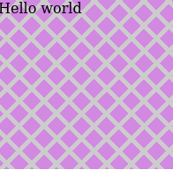
.crossed {
    width: 200px;
    height: 200px;
    border:solid 1px;
    background-color: rgb(210, 137, 226);
    background-image: repeating-linear-gradient(
      45deg,
      transparent,
      transparent 15px,
      #ccc 10px,
      #ccc 20px
        ),
      repeating-linear-gradient(
        135deg,
        transparent,
        transparent 15px,
        #ccc 10px,
        #ccc 20px
      );
}
<div class='crossed'>Hello world</div>
Solution 8 - Css
An svg dynamic solution for any screen is the following:
<svg xmlns="http://www.w3.org/2000/svg" width="100%" height="100%" stroke-width="1" stroke="#000">
  <line x1="0" y1="0" x2="100%" y2="100%"/>
  <line x1="100%" y1="0" x2="0" y2="100%"/>
</svg>
And if you want to keep it in background use the position: absolute with top and left 0.
Solution 9 - Css
you can use a CSS3 transform Property:
div
{
transform:rotate(Xdeg);
-ms-transform:rotate(Xdeg); /* IE 9 */
-webkit-transform:rotate(Xdeg); /* Safari and Chrome */
}
Xdeg = your value
For example...
You can make more div and use a z-index property. So,make a div with line, and rotate it.
Solution 10 - Css
If you'd like the cross to be partially transparent, the naive approach would be to make linear-gradient colors semi-transparent. But that doesn't work out good due to the alpha blending at the intersection, producing a differently colored diamond. The solution to this is to leave the colors solid but add transparency to the gradient container instead:
.cross {
  position: relative;
}
.cross::after {
  pointer-events: none;
  content: "";
  position: absolute;
  top: 0; bottom: 0; left: 0; right: 0;
}

.cross1::after {
  background:
    linear-gradient(to top left, transparent 45%, rgba(255,0,0,0.35) 46%, rgba(255,0,0,0.35) 54%, transparent 55%),
    linear-gradient(to top right, transparent 45%, rgba(255,0,0,0.35) 46%, rgba(255,0,0,0.35) 54%, transparent 55%);
}

.cross2::after {
  background:
    linear-gradient(to top left, transparent 45%, rgb(255,0,0) 46%, rgb(255,0,0) 54%, transparent 55%),
    linear-gradient(to top right, transparent 45%, rgb(255,0,0) 46%, rgb(255,0,0) 54%, transparent 55%);
  opacity: 0.35;
}

div { width: 180px; text-align: justify; display: inline-block; margin: 20px; }
<div class="cross cross1">Lorem ipsum dolor sit amet, consectetur adipiscing elit. Nullam et dui imperdiet, dapibus augue quis, molestie libero. Cras nisi leo, sollicitudin nec eros vel, finibus laoreet nulla. Ut sit amet leo dui. Praesent rutrum rhoncus mauris ac ornare. Donec in accumsan turpis, pharetra eleifend lorem. Ut vitae aliquet mi, id cursus purus.</div>

<div class="cross cross2">Lorem ipsum dolor sit amet, consectetur adipiscing elit. Nullam et dui imperdiet, dapibus augue quis, molestie libero. Cras nisi leo, sollicitudin nec eros vel, finibus laoreet nulla. Ut sit amet leo dui. Praesent rutrum rhoncus mauris ac ornare. Donec in accumsan turpis, pharetra eleifend lorem. Ut vitae aliquet mi, id cursus purus.</div>
Solution 11 - Css
Here is how I did this using the css clip-path property alongside relative and absolute positioning to create a more fancy cross.
.cross {
  width:150px;
  height: 150px;
  border: 2px solid #555;
  border-radius: 5px;
  position: relative;
  background: #efefef;
}

.cross .diag1{
  position: absolute;
  width:100%; height:100%;
  clip-path: polygon(90% 0, 100% 0%, 10% 100%, 0% 100%);
  background: #311B92;
}

.cross .diag2{
  position: absolute;
  width:100%; height:100%;
  clip-path: polygon(0 0, 10% 0, 100% 100%, 90% 100%);
  background: #1B5E20;
}
<div class="cross">
  <div class="diag1"></div>
  <div class="diag2"></div>
</div>
Here is a link to the code on codepen if you'd like to tweak it.
Solution 12 - Css
I needed to draw arbitrary diagonal lines inside any div. My issue with the other answers posted is that none of them allowed to draw an arbitrary line from point A to point B without doing the trigonometry yourself for the angles. With javascript & CSS you can do this. Hope it's helpful, just specify a pair of points and you're golden.
const objToStyleString = (obj) => {
  const reducer = (acc, curr) => acc += curr + ": " + obj[curr] + ";";
  return Object.keys(obj).reduce(reducer, "")
};

const lineStyle = (xy1, xy2, borderStyle) => {
  const p1 = {x: xy1[0], y: xy1[1]};
  const p2 = {x: xy2[0], y: xy2[1]};

  const a = p2.x - p1.x;
  const xOffset = p1.x;
  const b = p2.y - p1.y;
  const yOffset = p1.y;

  const c = Math.sqrt(a*a + b*b);

  const ang = Math.acos(a/c);

  const tX1 = `translateX(${-c/2 + xOffset}px) `;
  const tY1 = `translateY(${yOffset}px) `;
  const rot = `rotate(${ang}rad) `;
  const tX2 = `translateX(${c/2}px) `;
  const tY2 = `translateY(${0}px) `;

  return {
    "width": Math.floor(c) + "px",
    "height": "0px",
    "border-top": borderStyle,
    "-webkit-transform": tX1+tY1+rot+tX2+tY2,
    "position": "relative",
    "top": "0px",
    "left": "0px",
    "box-sizing": "border-box",
  };
};

function drawLine(parent, p1, p2, borderStyle) {
  const style = lineStyle(p1, p2, borderStyle);
  const line = document.createElement("div");
  line.style = objToStyleString(style);
  parent.appendChild(line);
}

drawLine(container, [100,5], [25,195], "1px dashed purple");
drawLine(container, [100,100], [190,190], "1px solid blue");
drawLine(container, [25,150], [175,150], "2px solid red");
drawLine(container, [25,10], [175,20], "5px dotted green");
#container {
  background-color: #BCBCBC;
  width: 200px;
  height: 200px;
  padding: 0;
  margin: 0;
}
<div id="container">
</div>
Solution 13 - Css
.borders {
    width: 200px;
    height: 100px;
    background-color: black;
    border-width: 40px;
    border-style: solid;
    border-color: red blue green yellow;
}
<div class='borders'></div>