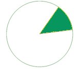
How to draw a circle sector in CSS?
CssCss ShapesCss Problem Overview
Well, drawing a circle with pure CSS is easy.
.circle {
    width: 100px;
    height: 100px;
    border-radius: 100px;
    border: 3px solid black;
    background-color: green;
}
How do I draw a sector? Given a degree X [0-360] I want to draw a X degrees sector. Can I do that with pure CSS?
For example:
Thanks + Example
Thank you Jonathan, I used the first method. If it helps someone here's an example of a JQuery function that gets percentage and draw a sector. The sector is behind the percentage circle and this example shows how to achieve an arc around a circle from a start degree.
$(function drawSector() {
  var activeBorder = $("#activeBorder");
  var prec = activeBorder.children().children().text();
  if (prec > 100)
    prec = 100;
  var deg = prec * 3.6;
  if (deg <= 180) {
    activeBorder.css('background-image', 'linear-gradient(' + (90 + deg) + 'deg, transparent 50%, #A2ECFB 50%),linear-gradient(90deg, #A2ECFB 50%, transparent 50%)');
  } else {
    activeBorder.css('background-image', 'linear-gradient(' + (deg - 90) + 'deg, transparent 50%, #39B4CC 50%),linear-gradient(90deg, #A2ECFB 50%, transparent 50%)');
  }

  var startDeg = $("#startDeg").attr("class");
  activeBorder.css('transform', 'rotate(' + startDeg + 'deg)');
  $("#circle").css('transform', 'rotate(' + (-startDeg) + 'deg)');
});
.container {
  width: 110px;
  height: 110px;
  margin: 100px auto;
}

.prec {
  top: 30px;
  position: relative;
  font-size: 30px;
}

.prec:after {
  content: '%';
}

.circle {
  position: relative;
  top: 5px;
  left: 5px;
  text-align: center;
  width: 100px;
  height: 100px;
  border-radius: 100%;
  background-color: #E6F4F7;
}

.active-border {
  position: relative;
  text-align: center;
  width: 110px;
  height: 110px;
  border-radius: 100%;
  background-color: #39B4CC;
  background-image: linear-gradient(91deg, transparent 50%, #A2ECFB 50%), linear-gradient(90deg, #A2ECFB 50%, transparent 50%);
}
<script src="https://ajax.googleapis.com/ajax/libs/jquery/1.10.1/jquery.min.js"></script>

<div class="container">
  <div id="activeBorder" class="active-border">
    <div id="circle" class="circle">
      <span class="prec">66</span>
      <span id="startDeg" class="90"></span>
    </div>
  </div>
</div>
$(function drawSector() {
    // Get degrees
    ...
    // Draw a sector
    if (deg <= 180) {
        activeBorder.css('background-image', 'linear-gradient(' + (90+deg) + 'deg, transparent 50%, #A2ECFB 50%), linear-gradient(90deg, #A2ECFB 50%, transparent 50%)');
    }
    else {
        activeBorder.css('background-image', 'linear-gradient(' + (deg-90) + 'deg, transparent 50%, #39B4CC 50%), linear-gradient(90deg, #A2ECFB 50%, transparent 50%)');
    }

    // Rotate to meet the start degree
    activeBorder.css('transform','rotate(' + startDeg + 'deg)');
});
Css Solutions
Solution 1 - Css
CSS and Multiple Background Gradients
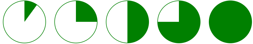
Rather than trying to draw the green portion, you could draw the white portions instead:
pie {
    border-radius: 50%;
    background-color: green;
}

.ten {
    background-image:
        /* 10% = 126deg = 90 + ( 360 * .1 ) */
        linear-gradient(126deg, transparent 50%, white 50%),
        linear-gradient(90deg, white 50%, transparent 50%);
}
pie {
  width: 5em;
  height: 5em;
  display: block;
  border-radius: 50%;
  background-color: green;
  border: 2px solid green;
  float: left;
  margin: 1em;
}

.ten {
  background-image: linear-gradient(126deg, transparent 50%, white 50%), linear-gradient(90deg, white 50%, transparent 50%);
}

.twentyfive {
  background-image: linear-gradient(180deg, transparent 50%, white 50%), linear-gradient(90deg, white 50%, transparent 50%);
}

.fifty {
  background-image: linear-gradient(90deg, white 50%, transparent 50%);
}


/* Slices greater than 50% require first gradient
   to be transparent -> green */

.seventyfive {
  background-image: linear-gradient(180deg, transparent 50%, green 50%), linear-gradient(90deg, white 50%, transparent 50%);
}

.onehundred {
  background-image: none;
}
<pie class="ten"></pie>
<pie class="twentyfive"></pie>
<pie class="fifty"></pie>
<pie class="seventyfive"></pie>
<pie class="onehundred"></pie>
Demo: http://jsfiddle.net/jonathansampson/7PtEm/
Scalable Vector Graphics
If it's an option, you can accomplish a similar effect using SVG <circle> and <path> elements. Consider the following:
<svg>
  <circle cx="115" cy="115" r="110"></circle>
  <path d="M115,115 L115,5 A110,110 1 0,1 190,35 z"></path>
</svg>
The above is fairly straight forward. We have an element containing a circle and a path. The circle's center is at 115x115 (making the SVG element 230x230). The circle has a radius of 110, making it a total of 220 wide (leaving a border of 10).
We then add a <path> element, which is the most complicated portion of this example. This element has one attribute which determines where, and how the path is drawn. It starts with the following value:
M115,115
This instructs the path to start in the center of the aforementioned circle. Next, we draw a line from this location to the next location:
L115,5
This draws a vertical line from the center of the circle up to the top of the element (well, five pixels from the top). It is at this point things get a little more complicated but still very much intelligible.
We now draw an arc from our present location (115,5):
A110,110 1 0,1 190,35 z
This creates our arc and gives it a radius matching that of our circle (110). The two values represent the x-radius and y-radius, and both are equal since we're dealing with a circle. The next set of important numbers are the last, 190,35. This tells the arc where to complete.
As for the rest of the information (1 0,1 and z) these control the curvature, direction, and terminal of the arc itself. You can learn more about them by consulting any online SVG path reference.
To accomplish a "slice" of a different size, merely change the 190,35 to reflect a larger or smaller set of coordinates. You may find that you'll need to create a second, arc if you want to span more than 180 degrees.
If you want to determine the x and y coordinates from an angle, you can use the following equations:
x = cx + r * cos(a)
y = cy + r * sin(a)
With the above example, a degree of 76 would be:
x = 115 + 110 * cos(76)
y = 115 + 110 * sin(76)
Which gives us 205.676,177.272.
With some ease, you can create the following:
circle {
  fill: #f1f1f1;
  stroke: green;
  stroke-width: 5;
}

path {
  fill: green;
}

svg.pie {
  width: 230px;
  height: 230px;
}
<svg class="pie">
  <circle cx="115" cy="115" r="110"></circle>
  <path d="M115,115 L115,5 A110,110 1 0,1 190,35 z"></path>
</svg>

<svg class="pie">
  <circle cx="115" cy="115" r="110"></circle>
  <path d="M115,115 L115,5 A110,110 1 0,1 225,115 z"></path>
</svg>

<svg class="pie">
  <circle cx="115" cy="115" r="110"></circle>
  <path d="M115,115 L115,5 A110,110 1 0,1 115,225 A110,110 1 0,1 35,190 z"></path>
</svg>
Demo: http://jsfiddle.net/jonathansampson/tYaVW/

Solution 2 - Css
That is very well possible using overflow and transform properties without any need to do complex calculations.
> Rotate transform
For angles less than 180deg
-
Add an element with aspect ratio 2:1 and
overflow: hidden; -
Add a pseudo-element with with top border radii same as the height of the element and bottom radii as 0.
-
Put
transform-origin: 50% 100%;This transforms the pseudo-element from its middle bottom. -
Transform: rotate(); the pseudo element by supplement of the required angle,
i.e.,transform: rotate(180 - rqrd. angle);
See how it works :

EG :
A 40deg sector using this method : Fiddle
div {
  ...
  overflow: hidden;
  ...
}
div:before {
  ...
  border-radius: 100px 100px 0 0;
  transform-origin: 50% 100%;
  transform: rotate(140deg);
  ...
}
div {
  height: 100px;
  width: 200px;
  overflow: hidden;
  position: relative;
}
div:before {
  height: inherit;
  width: inherit;
  position: absolute;
  content: "";
  border-radius: 100px 100px 0 0;
  background-color: crimson;
  -webkit-transform-origin: 50% 100%;
  -moz-transform-origin: 50% 100%;
  -ms-transform-origin: 50% 100%;
  transform-origin: 50% 100%;
  -webkit-transform: rotate(140deg);
  -moz-transform: rotate(140deg);
  -ms-transform: rotate(140deg);
  transform: rotate(140deg);
}
<div></div>
> Skew transform
You can also put image inside sector!
This can be done using skew transforms on parent and -ve skew on pseudoelement :
Fiddle
div {
    ...
    overflow: hidden;
    transform-origin: 0% 100%;
    transform: skew(-50deg);  /*Complement of rqrd angle*/
    ...
}
div:before {
    ...
    transform-origin: 0% 100%;
    transform: skew(50deg);
    ...
}
See how this works :

div {
  height: 200px;
  width: 200px;
  overflow: hidden;
  -webkit-transform-origin: 0% 100%;
  -moz-transform-origin: 0% 100%;
  -ms-transform-origin: 0% 100%;
  transform-origin: 0% 100%;
  -webkit-transform: skew(-50deg);
  -moz-transform: skew(-50deg);
  -ms-transform: skew(-50deg);
  transform: skew(-50deg); /*Complement of rqrd angle or (90 - angle)*/
  position: relative;
}
div:before {
  height: inherit;
  width: inherit;
  position: absolute;
  content: "";
  border-radius: 0 200px 0 0;
  background: url('http://www.placekitten.com/g/300/200/');
  -webkit-transform-origin: 0% 100%;
  -moz-transform-origin: 0% 100%;
  -ms-transform-origin: 0% 100%;
  transform-origin: 0% 100%;
  -webkit-transform: skew(50deg);
  -moz-transform: skew(50deg);
  -ms-transform: skew(50deg);
  transform: skew(50deg);
}
<div></div>
Acknowledgements : I don't want to be a self stealer, I used the ideas which I had previously used here and here.
Solution 3 - Css
Does this help?
.circle {
  width: 16em;
  height: 16em;
  border-radius: 50%;
  background: linear-gradient(36deg, #272b66 42.34%, transparent 42.34%) 0 0;
  background-repeat: no-repeat;
  background-size: 50% 50%;
}
<div class="circle"></div>
Actually, some geometry calculation is needed here. But Let me explain that in short:
Considering the 4 quarters in the circle, the angle of linear gradient can be calculated in each quarter. And the background-position determines the quarter:
Q I   =>  100% 0
Q II  =>  100% 100%
Q III =>  0    100%
Q IV  =>  0    0
The only thing that remains is where the used color-stop has came from:
Consider a 30-angled piece of circle in the 1st quarter.
As talented Ana Tudor has explained in her great article, If we take the length of the width of the square to be a, then the length of the half diagonal is going to be a*sqrt(2)/2.
If we take the gradient degree to be g the difference between two gradient and diagonal angles to be d then the length of color-stop can be calculated by:
a*sin(g) / (a*sqrt(2)/2 * cos(d))
= sin(g) / (sqrt(2)  /2 * cos(d))
So, in this case we have sin(30deg) / (sqrt(2)*cos((45-30)deg)) = 0.3660, and the % value for the color stop is 36.60%
Since our shape is in the 1st quarter, the background-position is 100% 0.
and the linear-gradient would be like this:
linear-gradient(-30deg, orange 36.60%, transparent 36.60%) 100% 0;
.circle {
  width: 16em;
  height: 16em;
  border-radius: 50%;
  background: linear-gradient(-30deg, orange 36.60%, transparent 36.60%) 100% 0;
  background-repeat: no-repeat;
  background-size: 50% 50%;
}
<div class="circle"></div>
I recommend to read the Ana's article for more details.
Solution 4 - Css
- Your need to draw a circle
- use
clip-pathto cut a sector(you need to do some math)
you can play around with clip-path here
here is a demo:
#skills {
  position: relative;
  width: 300px;
  height: 300px;
  margin: 30px auto;
}

.circle {
  width: 100%;
  height: 100%;
  border-radius: 50%;
  position: absolute;
}

.animate {
  -webkit-transition: 0.2s cubic-bezier(.74,1.13,.83,1.2);
  -moz-transition: 0.2s cubic-bezier(.74,1.13,.83,1.2);
  -o-transition: 0.2s cubic-bezier(.74,1.13,.83,1.2);
  transition: 0.2s cubic-bezier(.74,1.13,.83,1.2);
}

.animate:hover {
  transform: scale(1.1);
  transform-origin: center center;
}

#part1 {
  background-color: #E64C65;
  -webkit-clip-path: polygon(50% 0, 50% 50%, 100% 41.2%, 100% 0);
  clip-path: polygon(50% 0, 50% 50%, 100% 41.2%, 100% 0);
}

#part2 {
  background-color: #11A8AB;
  -webkit-clip-path: polygon(50% 50%, 100% 41.2%, 100% 100%, 63.4% 100%);
  clip-path: polygon(50% 50%, 100% 41.2%, 100% 100%, 63.4% 100%);
}

#part3 {
  background-color: #4FC4F6;
  -webkit-clip-path: polygon(50% 50%, 36.6% 100%, 63.4% 100%);
  clip-path: polygon(50% 50%, 36.6% 100%, 63.4% 100%);
}

#part4 {
  background-color: #FFED0D;
  -webkit-clip-path: polygon(50% 50%, 0 100%, 36.6% 100%);
  clip-path: polygon(50% 50%, 0 100%, 36.6% 100%);
}

#part5 {
  background-color: #F46FDA;
  -webkit-clip-path: polygon(50% 50%, 0 36.6%, 0 100%);
  clip-path: polygon(50% 50%, 0 36.6%, 0 100%);
}

#part6 {
  background-color: #15BFCC;
  -webkit-clip-path: polygon(50% 50%, 0 36.6%, 0 0, 50% 0);
  clip-path: polygon(50% 50%, 0 36.6%, 0 0, 50% 0);
}
<div id="skills">
  <div id="part1" class="circle animate"></div>
  <div id="part2" class="circle animate"></div>
  <div id="part3" class="circle animate"></div>
  <div id="part4" class="circle animate"></div>
  <div id="part5" class="circle animate"></div>
  <div id="part6" class="circle animate"></div>
</div>
Solution 5 - Css
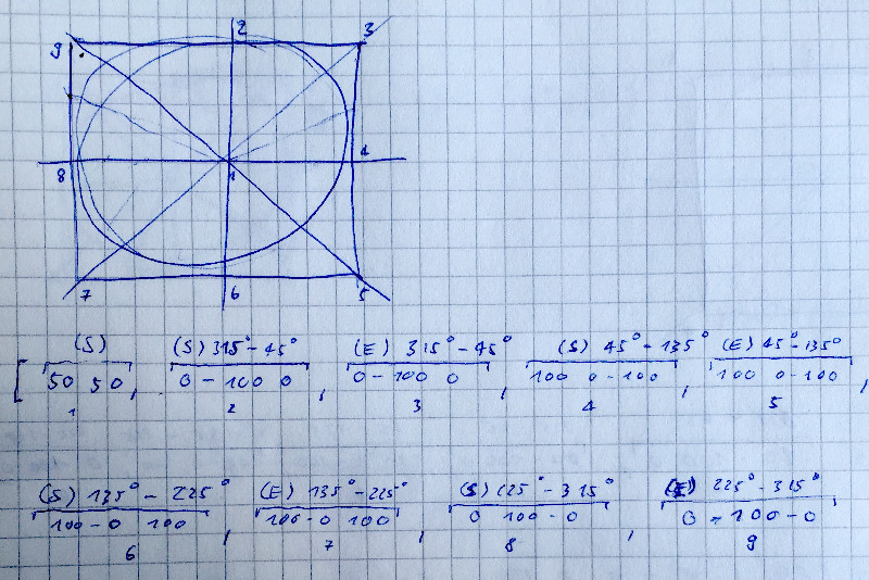
since i did not find any satisfying answer at all, i had to go down on my knees, using clip-path function and a whole sunday of css to finally get what i wanted.
you can choose a start and end angle and then the element will nicely draw just that, nothing else. you will need just the border-radius solution for drawing the base circle.
my solutions works with a grid of four polygons, each providing a possible start or end point for the values 0-90° resp. 0-100%, 90-180° resp. 0-100% and so on, sharing the center point and hence, there are two times 4 segements. you could think about the mechanics as a telescope rod with multiple segments, each doing its segmented job from 0 to N. due to the mechanics, while still maintaining some clarity in the code (0-90,90-180 ..), i had to manually rotate(-45deg) the div, so that 0° == 12''.
here is a little sketch that may illustrate how i did it:
please note that you cannot use this for any commercial purposes since i did not find any solution like that online, hence, there needs to be some value to it. please respect this.
http://creativecommons.org/licenses/by-nc-nd/4.0/"><img alt="Creative Commons Lizenzvertrag" style="border-width:0" src="https://i.creativecommons.org/l/by-nc-nd/4.0/88x31.png" />
http://purl.org/dc/terms/" property="dct:title">drawing circle segments using css von http://creativecommons.org/ns#" property="cc:attributionName">c. schaefer ist lizenziert unter einer http://creativecommons.org/licenses/by-nc-nd/4.0/">Creative Commons Namensnennung - Nicht kommerziell - Keine Bearbeitungen 4.0 International Lizenz.
			<script src="http://code.jquery.com/jquery-latest.js"></script>

<style type="text/css">
	.circle{
	    position: absolute;
		top: 100px;

	    width: 600px;
	    height: 600px;
	    border-radius: 50%;
	    background-color: #FFFF00;
		opacity: .9;

		-webkit-transform: rotate(45deg);
}
<script type="text/javaScript">

    var obj;
	var start, end;
	function rangeStart(val) {
		obj =  $("body").find(".circle");
		start = val;
		setAngle(obj, start, end);
	}

	function rangeEnd(val) {
		obj =  $("body").find(".circle");
		end = val;
		setAngle(obj, start, end);
	}

	function applyMasking(obj) {
		obj.css("-webkit-clip-path", ptsToString());
	}

	// not working for degree start to be lower than end, hence, we set the interface to automatically adapt to that exception:
	/*
	function checkForRangeExceptions() {
		if(end < start) {
			$("body").find("input[name='rangeLower']").val($("body").find("input[name='rangeUpper']").val());
			$("body").find("input[name='rangeLower']").slider('refresh');
		}
	}
	*/

	// setInterval(doit, 200);

	var angie = 0;
	function doit() {
		obj =  $("body").find(".circle");
		if(angie < 360)
			angie+=15;
		else angie = 0;
		setAngle(obj, 0, angie);
	}


	function ptsToString() {
		var str = "";
		str+="polygon(";
		for(var i=0; i < pts.length; i++) {
			str+=pts[i].x+"% ";
			if(i != pts.length-1)
				str+=pts[i].y+"% ,";
			else str+=pts[i].y+"%";
		}
		str+=")";
		return str;
	}

	/*
	gets passed an html element and sets its clip-path according to the passed angle,
	starting at 0°; note that from a clock perspective, we start at +45° and hence have
	to add that value to passed angles later on:
	*/
	var pts =
	[
	 {x: 50, y: 50}, {x: 0, y: 0}, {x: 0, y: 0},
	 {x: 0, y: 0}, {x: 0, y: 0}, {x: 0, y: 0},
	 {x: 0, y: 0}, {x: 0, y: 0}, {x: 0, y: 0}
 	];
	var lb, ub;
	var sa, ea;
	function setAngle(obj, start, end) {
		// if no start, set 0° as default:
		start = (start == undefined ? start = 0 : start);

		// find out upper and lower sector bounds:
		lb = (angleToSector(start) * 2) - 1;
		ub = angleToSector(end) * 2;

		// find start end end angles:
		sa = mapAngleToPoint(start);
		ea = mapAngleToPoint(end);

		// now set points except start point which is 0:
		for(var i=1; i < pts.length; i++) {

			// set all below lb to lb:
			if(i <= lb) { pts[i].x = sa.x; pts[i].y = sa.y; }

			// set all in between to max values:
			else if(i > lb && i < ub) {
				pts[i] = setMax(i);
			}

			// set all above ub to ub:
			else if(i >= ub) { pts[i].x = ea.x; pts[i].y = ea.y; }

		}

		// apply masking:
		applyMasking(obj);

	}

	// assuming that 100 need to map 90°:
	function angleToPerc(angle) {
		return angle * (100/90);
	}

	function lowerBound(angle) {
		return (mapAngleToSector(angle));
	}

	function uppperBound(angle){
		return (mapAngleToSector(angle));
	}

	// sectors 1-4
	function angleToSector(angle) {
			if 		(angle >= 0   && angle < 90)  return 1;
			else if (angle >= 90  && angle < 180) return 2;
			else if (angle >= 180 && angle < 270) return 3;
			else if (angle >= 270 && angle <= 360) return 4;
	}

	// this maps the passed angle to a coordinate value:
	var as;
	function mapAngleToPoint(angle) {
			var pt = {x: 0, y: 0};
			as = angleToSector(angle);
			if(as == 1) 	  {pt.x = angleToPerc(angle); pt.y = 0; }
			else if(as == 2)  {pt.x = 100; pt.y = angleToPerc(angle-90)}
			else if(as == 3)  {pt.x = 100-angleToPerc(angle-180); pt.y = 100; }
			else if(as == 4)  {pt.x = 0; pt.y = 100-angleToPerc(angle-270); }
			return pt;
	}

	// set a point to its max by index:
	function setMax(index) {
		var pt = {x: 0, y: 0};
		if      (index == 1 || index == 2) { pt.x = 100; pt.y = 0; }
		else if (index == 3 || index == 4) { pt.x = 100; pt.y = 100; }
		else if (index == 5 || index == 6) { pt.x = 0; pt.y = 100; }
		else if (index == 7 || index == 8) { pt.x = 0; pt.y = 0; }
		return pt;
	}

</script>

</head>

<body>

	<div class="circle">

	</div>

	<input type="range" name="rangeLower" value="0" min="0" max="360" onchange="rangeStart(this.value);">
	<input type="range" name="rangeUpper" value="66"min="0" max="360" onchange="rangeEnd(this.value);">


</body>
Solution 6 - Css
I have another solution.
#pie {
  position: relative;
  width: 100px;
  height: 100px;
  background-color: #76dd76;
  border-radius: 50%;
  border: 1px solid #76dd76;
}

#pie:before,
#pie:after {
  position: absolute;
  content: "";
  display: block;
  width: 50%;
  height: 50%;
  -webkit-transform-origin: right bottom;
  -moz-transform-origin: right bottom;
  -ms-transform-origin: right bottom;
  transform-origin: right bottom;
  background-color: white;
  border-top-left-radius: 100%;
}

#pie:after {
  -webkit-transform: rotate(45deg);
  -moz-transform: rotate(45deg);
  -ms-transform: rotate(45deg);
  transform: rotate(45deg);
}
<div id="pie"></div>
Solution 7 - Css
All the answers here are creative. It's amazing how people solve the same problem in so many ways. The accepted answer by Sampson is really cool, but I don't know why he decided to draw the white part instead of the green, so I thought of sharing a modified version that actually draws the green. I just find it a bit more straightforward this way, so I'm sharing it in case others find it useful too.
pie {
    width: 5em;
    height: 5em;
    display: block;
    border-radius: 50%;
    border: 2px solid green;
    float: left;
    margin: 1em;
}

.ten {
    background-image:
      linear-gradient(-54deg, white 50%, transparent 50%),
      linear-gradient(-90deg, green 50%, transparent 50%);
}

.twentyfive {
    background-image:
      linear-gradient(0deg, white 50%, transparent 50%),
      linear-gradient(-90deg, green 50%, transparent 50%);
}

.fifty {
    background-image:
      linear-gradient(-90deg, green 50%, transparent 50%);
}

/* Slices greater than 50% require first gradient to be green -> transparent */

.seventyfive {
    background-image:
      linear-gradient(0deg, green 50%, transparent 50%),
      linear-gradient(-90deg, green 50%, transparent 50%);
}

.onehundred {
    background-color: green;
}
<pie class="ten"></pie>
<pie class="twentyfive"></pie>
<pie class="fifty"></pie>
<pie class="seventyfive"></pie>
<pie class="onehundred"></pie>
Solution 8 - Css
See this to get an idea how to solve your problem.
<div class="circle"></div>

.circle{
    width: 100px;
    height: 100px;
    background-color: green;
    border-radius: 100px;
    position: relative;
}

.circle:before,
.circle:after {
    border: 50px solid white;
    border-color: transparent transparent white white;
    border-radius: 100px;
    content: '';
    height: 0;
    position: absolute;
    top: 0;
    left: 0;
    width: 0;
    /* this is to have it white from 180 to 360 degrees on the left side */
    transform:rotate(45deg);
    -ms-transform:rotate(45deg); /* IE 9 */
    -webkit-transform:rotate(45deg); /* Safari and Chrome */
}

/* the green sector is now 180 minus 45 plus 0 degree */
.circle:after {
    transform:rotate(0deg);
    -ms-transform:rotate(0deg); /* IE 9 */
    -webkit-transform:rotate(0deg); /* Safari and Chrome */
}

/* the green sector is now 180 minus 45 plus -75 degree */
/*.circle:after {
    transform:rotate(-75deg);
    -ms-transform:rotate(-75deg);
    -webkit-transform:rotate(-75deg);
}*/
Solution 9 - Css
You can use a circle with a dashed line.
<svg viewBox="-8 -8 16 16">
  <circle
    cx="0"
    cy="0"
    r="4"
    transform="rotate(270)"
    stroke-width="8"
    stroke-dasharray="4, 26"
    stroke="green"
    fill="none"
  />
</svg>
- Make the line twice as thick as the radius of the circle, so that it reaches the center of the circle.
- Play with the
stroke-dasharrayvalue to determine how big of a pie size you want to see.
Bonus: The advantage of using a circle instead of a path is that you can easily animate it when you change the pie size: Just add something like transition: stroke-dasharray .5s; to the css of the circle.
Solution 10 - Css
Since I needed this dynamically, here's a little jQuery plugin. e.g. call $('selector').pieChart(0.4, 'white' 'green') to show a 40% green segment on a white circle.
// LIBRARY FUNCTION
$.fn.pieChart = function(proportion, bg, fg) {
  var angle, grads;
  angle = Math.round(360 * (proportion % 0.5) - 90);
  grads = [
    "linear-gradient(" + angle + "deg, " + (proportion < 0.5 ? bg : fg) + " 50%, transparent 50% )",
    "linear-gradient(-90deg, " + fg + " 50%, transparent 50%)"
  ];
  return $(this).css({
    'background-color': proportion==1 ? fg : bg,
    'background-image': grads.join(','),
    'border': '1px solid '+fg
  });
};

// DEMO
for (var i=0; i <= 10; i++) {
  $('<div class="pie" />').appendTo('body').pieChart(i/10, 'white', 'green');
}
.pie {
  display: inline-block;
  margin: 10px;
  border-radius: 50%;
  width: 100px;
  height: 100px;
}
<script src="https://code.jquery.com/jquery-3.0.0.js"></script>
This is based on Racil's example here. (Note I couldn't use OP's plugin in the edited answer as it doesn't work for sectors spanning more than 180 degrees.)
Solution 11 - Css
I have a slightly different approach, and one that can be animated easily without using SVG.
It utilises very specific widths, heights and border-widths, along with rectangular clipping, so these need to be handled carefully when you need to change the dimensions. The most important point to note here is that if you want to resize the pie, you need to update all the em values PROPORTIONATELY - meaning they must all be scaled by the same factor.
Note that a full semi-circle needs to be added if the pie is more than 50% full (> 180 degs is coloured). This portion should be handled dynamically in JS if you're animating it.
<style>
.timer {
    position: relative;
    width: 4em;
    height: 4em;
    float: left;
    margin: 1px 30px 0 0;
}


.timer > #slice {
    position: absolute;
    width: 4em;
    height: 4em;
    clip: rect(0px, 4em, 4em, 2em);
}

.timer > #slice.gt50 {
    clip: rect(auto, auto, auto, auto);
}

.timer > #slice > .pie {
    border: 3.2em solid green;
    position: absolute;
    width: 3.8em;
    height: 3.8em;
    clip: rect(0em, 2em, 4em, 0em);
    -moz-border-radius: 2em;
    -webkit-border-radius: 2em;
    border-radius: 2em;
}

.timer > #slice > .pie.fill {
    -moz-transform: rotate(180deg) !important;
    -webkit-transform: rotate(180deg) !important;
    -o-transform: rotate(180deg) !important;
    transform: rotate(180deg) !important;
}

.timer.fill > #slice > .pie {
    border: transparent;
    background-color: green;
    width: 4em;
    height: 4em;
}
</style>
<div class="timer fill">
</div>
<script>
const PIE_INTERVAL_TIME = 1000; // one second interval time
const PERCENT_INTERVAL = 1.67; // 100 / 60 seconds
const stopInterval = setInterval(pieInterval(), PIE_INTERVAL_TIME);

function pieInterval() {
	let percent = 0;
	return function() {
    	percent += PERCENT_INTERVAL;
			const timer = $('.timer');
			const gt50 = percent > 50 ? 'gt50' : '';
			const pieFill = percent > 50 ? '<div class="pie fill"></div>' : '';
      let deg = (360/100) * percent;
	  timer.html(
		`<div id="slice" class="${gt50}">
			<div class="pie"></div>
			${pieFill}
		</div>`);

      if (percent >= 100) {
      	deg = 360;
		clearInterval(stopInterval);
	  }

	  $('#slice').find('.pie').css({
		'-moz-transform':'rotate('+deg+'deg)',
		'-webkit-transform':'rotate('+deg+'deg)',
		'-o-transform':'rotate('+deg+'deg)',
		'transform':'rotate('+deg+'deg)'
	   });
	};
}
</script>
Here is the fiddle to demonstrate - which is a lot simpler than explaining in writing:
Solution 12 - Css
Simple. Just follow the code below:
The HTML:
<div class="circle"></div>
<div class="pie"></div>
The CSS:
.circle {
width: 11em;
height: 11em;
border-radius: 100%;
background: linear-gradient(360deg, #FFFFFF 100%, transparent 42.34%) 0 0;
background-repeat: no-repeat;
background-size: 100% 100%;
}

.pie {
width: 11em;
height: 11em;
border-radius: 100%;
background: linear-gradient(-80deg, #1BB90D 50%, transparent 40%) 0 0;
background-repeat: no-repeat;
background-size: 100% 55%;
position: relative;
margin-top: -176px;
border: 1px solid #808D1E;
}
Solution 13 - Css
2022 update: I am writing pure CSS and easiest solution Conic Gradient
Try this short code below :
 .piechart {
            display: block;
            width: 100px;
            height: 100px;
            border-radius: 50%;

            /* add sector degree here,
               multiple colors for muptiple sectors */

            background-image: conic-gradient(
                pink 135deg,
                transparent 0);
}
<div class="piechart"></div>
Note: If you want to support it with % value then in place of 135 degree it's simple as x * 360/100 or in short (x * 3.6) degree where x is percentage
Solution 14 - Css
Just to add to answers, you can do this using clip-path as well. Add border radius 50% and clip-path with a value generated from the following function.
function calc_arc(prc) {
let str = '50% 50%, 50% 0%';
if(prc >= 45)
	str += ',100% 0%';
else
	str += ','+ (50+(prc/.45)/2) + '% 0%';

if(prc >= 135)
	str += ',100% 100%';
else {

	prc -= 45;
	if(prc > 0) {
	prc /= .9;
	str += ',100% '+prc + '%';
	}
}

if(prc >= 225)
	str += ',0% 100%';
else {
	prc -= 135;
	if(prc>0) {
	prc /= .9;
	str += ','+(100-prc) + '% 100%';
	}
}
if(prc >= 315)
	str += ',0% 0%';
else {
	prc -= 225;
	if(prc>0) {
	prc /= .9;
	str += ',0% '+(100-prc) + '%';}
}
if(prc >= 360)
	str += ',100% 0%';
else {
prc -= 315;
if(prc>0) {
	str += ','+(prc/.45)/2 + '% 0%';
	}
	}
return 'polygon('+str+')';
}
How this works is, it checks the percentage and based on some pre-calculated breakpoints it generates a polygon to cut the square. Border radius turns it into a circle's segment.