Draw an X in CSS
HtmlCssDrawCss ShapesHtml Problem Overview
I've got a div that looks like a orange square
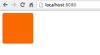
I'd like to draw a white X in this div somehow so that it looks more like

Anyway to do this in CSS or is it going to be easier to just draw this in Photoshop and use the image as the div background? The div code just looks like
div {
    height: 100px;
    width: 100px;
    background-color: #FA6900;
    border-radius: 5px;
}
Html Solutions
Solution 1 - Html
You want an entity known as a cross mark:
http://www.fileformat.info/info/unicode/char/274c/index.htm
The code for it is ❌ and it displays like ❌
If you want a perfectly centered cross mark, like this:

try the following CSS:
div {
    height: 100px;
    width: 100px;
    background-color: #FA6900;
    border-radius: 5px;
    position: relative;
}

div:after {
    position: absolute;
    top: 0;
    bottom: 0;
    left: 0;
    right: 0;
    content: "\274c"; /* use the hex value here... */
    font-size: 50px;
    color: #FFF;
    line-height: 100px;
    text-align: center;
}
Cross-Browser Issue
The cross-mark entity does not display with Safari or Chrome. However, the same entity displays well in Firefox, IE and Opera.
It is safe to use the smaller but similarly shaped multiplication sign entity, × which displays as ×.
Solution 2 - Html
single element solution: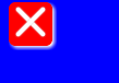
body{
    background:blue;
}

div{
    width:40px;
    height:40px;
    background-color:red;
    position:relative;
    border-radius:6px;
    box-shadow:2px 2px 4px 0 white;
}

div:before,div:after{
    content:'';
    position:absolute;
    width:36px;
    height:4px;
    background-color:white;
    border-radius:2px;
    top:16px;
    box-shadow:0 0 2px 0 #ccc;
}

div:before{
    -webkit-transform:rotate(45deg);
    -moz-transform:rotate(45deg);
    transform:rotate(45deg);
    left:2px;
}
div:after{
    -webkit-transform:rotate(-45deg);
    -moz-transform:rotate(-45deg);
    transform:rotate(-45deg);
    right:2px;
}
<div></div>
Solution 3 - Html
Yet another pure CSS solution (i.e. without the use of images, characters or additional fonts), based on @Bansoa is the answer's answer .
I've simplified it and added a bit of Flexbox magic to make it responsive.
Cross in this example automatically scales to any square container, and to change the thickness of its lines one have just to tune height: 4px; (to make a cross truly responsive, you may want to set the height in percents or other relative units).
div {
    position: relative;
    height: 150px; /* this can be anything */
    width: 150px;  /* ...but maintain 1:1 aspect ratio */
    display: flex;
    flex-direction: column;
    justify-content: center;
}

div::before,
div::after {
    position: absolute;
    content: '';
    width: 100%;
    height: 4px; /* cross thickness */
    background-color: black;
}

div::before {
    transform: rotate(45deg);
}

div::after {
    transform: rotate(-45deg);
}
<div></div>
Solution 4 - Html
You can make a pretty nice X with CSS gradients:

demo: https://codepen.io/JasonWoof/pen/rZyRKR
code:
<span class="close-x"></span>
<style>
    .close-x {
        display: inline-block;
        width: 20px;
        height: 20px;
        border: 7px solid #f56b00;
        background:
            linear-gradient(45deg, rgba(0,0,0,0) 0%,rgba(0,0,0,0) 43%,#fff 45%,#fff 55%,rgba(0,0,0,0) 57%,rgba(0,0,0,0) 100%),
            linear-gradient(135deg, #f56b00 0%,#f56b00 43%,#fff 45%,#fff 55%,#f56b00 57%,#f56b00 100%);
    }
</style>
Solution 5 - Html
You could just put the letter X in the HTML inside the div and then style it with css.
See JSFiddle: http://jsfiddle.net/uSwbN/
HTML:
<div id="orangeBox">
  <span id="x">X</span>
</div>
CSS:
#orangeBox {
  background: #f90;
  color: #fff;
  font-family: 'Helvetica', 'Arial', sans-serif;
  font-size: 2em;
  font-weight: bold;
  text-align: center;
  width: 40px;
  height: 40px;
  border-radius: 5px;
}
Solution 6 - Html
Yet another attempt... this one uses ×. A lot of the examples on this page only show for me as a box, but × works
###HTML
<div class="close"></div>
###CSS
.close {
    height: 100px;
    width: 100px;
    background-color: #FA6900;
    border-radius: 5px;
}
.close:after {
    position:relative;
    content:"\d7";
    font-size:177px;
    color:white;
    font-weight:bold;
    top:-53px;
    left:-2px
}
Solution 7 - Html
You can use the CSS property "content":
div {
    height: 100px;
    width: 100px;
    background-color: #FA6900;
    border-radius: 5px;
}

div:after {
    content: "X";
    font-size: 2em;
    color: #FFF;
}
Like this: http://jsfiddle.net/HKtFV/
Solution 8 - Html
#x{
    width: 20px;
    height: 20px;
    background-color:orange;
    position:relative;
    border-radius:2px;
}
#x::after,#x::before{
    position:absolute;
    top:9px;
    left:0px;
    content:'';
    display:block;
    width:20px;
    height:2px;
    background-color:red;

}
#x::after{
    -webkit-transform: rotate(45deg);
    -moz-transform: rotate(45deg);
    -ms-transform: rotate(45deg);
    -o-transform: rotate(45deg);
    transform: rotate(45deg);
}
#x::before{
    -webkit-transform: rotate(-45deg);
    -moz-transform: rotate(-45deg);
    -ms-transform: rotate(-45deg);
    -o-transform: rotate(-45deg);
    transform: rotate(-45deg);
}
<div id=x>
</div>
Solution 9 - Html
I love this question! You could easily adapt my code below to be a white × on an orange square:
Demo fiddle here
Here is the SCSS (which could easily be converted to CSS):
$pFontSize: 18px;
p {
  font-size: $pFontSize;
}
span{
  font-weight: bold;
}
.x-overlay,
.x-emoji-overlay {
  position: relative;
}

.x-overlay,
.x-emoji-overlay {
  &:after {
    position: absolute;
    top: 0;
    bottom: 0;
    left: 0;
    right: 0;
    color: red;
    text-align: center;
  }
}

.x-overlay:after {
  content: '\d7';
  font-size: 3 * $pFontSize;
  line-height: $pFontSize;
  opacity: 0.7;
}

.x-emoji-overlay:after {
  content: "\274c";
  padding: 3px;
  font-size: 1.5 * $pFontSize;
  line-height: $pFontSize;
  opacity: 0.5;
}

.strike {
  position: relative;
  display: inline-block;
}

.strike::before {
  content: '';
  border-bottom: 2px solid red;
  width: 110%;
  position: absolute;
  left: -2px;
  top: 46%;
}

.crossed-out {
  /*inspired by https://www.tjvantoll.com/2013/09/12/building-custom-text-strikethroughs-with-css/*/
  position: relative;
  display: inline-block;
  &::before,
  &::after {
    content: '';
    width: 110%;
    position: absolute;
    left: -2px;
    top: 45%;
    opacity: 0.7;
  }
  &::before {
    border-bottom: 2px solid red;
    -webkit-transform: skewY(-20deg);
    transform: skewY(-20deg);
  }
  &::after {
    border-bottom: 2px solid red;
    -webkit-transform: skewY(20deg);
    transform: skewY(20deg);
  }
}
Solution 10 - Html
You could do this by styling an "x"
text-align: center;
font-size: 120px;
line-height: 100px;
color: white;
font-family: monospace;
Solution 11 - Html
Here is a single div and dynamic size version without using pseudo element.
body {
  display: flex;
  gap: 30px;
}

.x {
  --color: #444;
  --l: 5px; /* line-width */
  width: 50px;
  height: 50px;
  background: linear-gradient(to top right, transparent calc(50% - var(--l) / 2), var(--color) calc(50% - var(--l) / 2) calc(50% + var(--l) / 2), transparent calc(50% + var(--l) / 2)),
              linear-gradient(to bottom right, transparent calc(50% - var(--l) / 2), var(--color) calc(50% - var(--l) / 2) calc(50% + var(--l) / 2), transparent calc(50% + var(--l) / 2));

  --clip-path: polygon(var(--l) 0%, calc(100% - var(--l)) 0%, 100% var(--l), 100% calc(100% - var(--l)), calc(100% - var(--l)) 100%, var(--l) 100%, 0% calc(100% - var(--l)), 0% var(--l));
  -webkit-clip-path: var(--clip-path);
          clip-path: var(--clip-path);
}
<div class="x"></div>

<div class="x" style="--l: 10px;"></div>

<div class="x" style="--l: 15px; --color: red"></div>

<div class="x" style="--l: 15px; --color: dodgerblue; width: 100px; height: 100px;"></div>
Solution 12 - Html
HTML
<div class="close-orange"></div>
CSS
.close-orange {
  height: 100px;
  width: 100px;
  background-color: #FA6900;
  border-radius: 5px;
}
.close-orange:before,.close-orange:after{
  content:'';
  position:absolute;
  width: 50px;
  height: 4px;
  background-color:white;
  border-radius:2px;
  top: 55px;
}
.close-orange:before{
  -webkit-transform:rotate(45deg);
  -moz-transform:rotate(45deg);
  transform:rotate(45deg);
  left: 32.5px;
}
.close-orange:after{
  -webkit-transform:rotate(-45deg);
  -moz-transform:rotate(-45deg);
  transform:rotate(-45deg);
  left: 32.5px;
}
Solution 13 - Html
This is an adaptable version of the amazing solution provided by @Gildas.Tambo elsewhere in this page. Simply change the values of the variables at the top to change the size of the "X".
Credit for the solution itself goes to Gildas. All I've done is given it adaptable math.
:root {
  /* Width and height of the box containing the "X" */
  --BUTTON_W:             40px;
  /* This is the length of either of the 2 lines which form the "X", as a
  percentage of the width of the button. */
  --CLOSE_X_W:            95%;
  /* Thickness of the lines of the "X" */
  --CLOSE_X_THICKNESS:    4px;
}


body{
    background:blue;
}

div{
    width:           var(--BUTTON_W);
    height:          var(--BUTTON_W);
    background-color:red;
    position:        relative;
    border-radius:   6px;
    box-shadow:      2px 2px 4px 0 white;
}

/* The "X" in the button. "before" and "after" each represent one of the two lines of the "X" */
div:before,div:after{
    content:         '';
    position:        absolute;
    width:           var(--CLOSE_X_W);
    height:          var(--CLOSE_X_THICKNESS);
    background-color:white;
    border-radius:   2px;
    top:             calc(50% - var(--CLOSE_X_THICKNESS) / 2);
    box-shadow:      0 0 2px 0 #ccc;
}
/* One line of the "X" */
div:before{
    -webkit-transform:rotate(45deg);
    -moz-transform:   rotate(45deg);
    transform:        rotate(45deg);
    left:             calc((100% - var(--CLOSE_X_W)) / 2);
}
/* The other line of the "X" */
div:after{
    -webkit-transform:rotate(-45deg);
    -moz-transform:   rotate(-45deg);
    transform:        rotate(-45deg);
    right:            calc((100% - var(--CLOSE_X_W)) / 2);
}
<div></div>
Solution 14 - Html
Check & and Cross:
<span class='act-html-check'></span>
<span class='act-html-cross'><span class='act-html-cross'></span></span>

<style type="text/css">
span.act-html-check {
                display: inline-block;
                width: 12px;
                height: 18px;
                border: solid limegreen;
                border-width: 0 5px 5px 0;
                transform: rotate( 45deg);
            }


            span.act-html-cross {
                display: inline-block;
                width: 10px;
                height: 10px;
                border: solid red;
                border-width: 0 5px 5px 0;
                transform: rotate( 45deg);
                position: relative;
            }

            span.act-html-cross > span { {
                transform: rotate( -180deg);
                position: absolute;
                left: 9px;
                top: 9px;
            }
</style>