Wavy shape with css
CssCss ShapesCss Problem Overview
I'm trying to recreate this image with CSS:

I would not need it to repeat. This is what I started but it just has a straight line:
#wave {
  position: absolute;
  height: 70px;
  width: 600px;
  background: #e0efe3;
}
<div id="wave"></div>
Css Solutions
Solution 1 - Css
I think this is the right way to make a shape like you want. By using the SVG possibilities, and an container to keep the shape responsive.
svg {
  display: inline-block;
  position: absolute;
  top: 0;
  left: 0;
}
.container {
  display: inline-block;
  position: relative;
  width: 100%;
  padding-bottom: 100%;
  vertical-align: middle;
  overflow: hidden;
}
<div class="container">
  <svg viewBox="0 0 500 500" preserveAspectRatio="xMinYMin meet">
    <path d="M0,100 C150,200 350,0 500,100 L500,00 L0,0 Z" style="stroke: none; fill:red;"></path>
  </svg>
</div>
Solution 2 - Css
I'm not sure it's your shape but it's close - you can play with the values:
#wave {
  position: relative;
  height: 70px;
  width: 600px;
  background: #e0efe3;
}
#wave:before {
  content: "";
  display: block;
  position: absolute;
  border-radius: 100% 50%;
  width: 340px;
  height: 80px;
  background-color: white;
  right: -5px;
  top: 40px;
}
#wave:after {
  content: "";
  display: block;
  position: absolute;
  border-radius: 100% 50%;
  width: 300px;
  height: 70px;
  background-color: #e0efe3;
  left: 0;
  top: 27px;
}
<div id="wave"></div>
Solution 3 - Css
My implementation uses the svg element in html and I also made a generator for making the wave you want:
https://smooth.ie/blogs/news/svg-wavey-transitions-between-sections
<div style="height: 150px; overflow: hidden;">
  <svg viewBox="0 0 500 150" preserveAspectRatio="none" style="height: 100%; width: 100%;">
    <path d="M0.00,92.27 C216.83,192.92 304.30,8.39 500.00,109.03 L500.00,0.00 L0.00,0.00 Z" style="stroke: none;fill: #e1efe3;"></path>
  </svg>
</div>
Solution 4 - Css
Recently an awesome tool called Get Waves was introduced where you can simply from UI create your own waves and then export this to SVG format. This is as simple as going to the https://getwaves.io/ website and enjoying it!
Edit:
Recently I've discovered also a new tool - https://shapedivider.app/
Edit2:
Yet another, this one looks advanced with the points when to break curves https://www.svgwaves.io
Solution 5 - Css
My pure CSS implementation based on above with 100% width. Hope it helps!
#wave-container {
  width: 100%;
  height: 100px;
  overflow: hidden;
}

#wave {
  display: block;
  position: relative;
  height: 40px;
  background: black;
}

#wave:before {
  content: "";
  display: block;
  position: absolute;
  border-radius: 100%;
  width: 100%;
  height: 300px;
  background-color: white;
  right: -25%;
  top: 20px
}

#wave:after {
  content: "";
  display: block;
  position: absolute;
  border-radius: 100%;
  width: 100%;
  height: 300px;
  background-color: black;
  left: -25%;
  top: -240px;
}
<div id="wave-container">
  <div id="wave">
  </div>
</div>
Solution 6 - Css
I like ThomasA's answer, but wanted a more realistic context with the wave being used to separate two divs. So I created a more complete demo where the separator SVG gets positioned perfectly between the two divs.
Now I thought it would be cool to take it further. What if we could do this all in CSS without the need for the inline SVG? The point being to avoid extra markup. Here's how I did it:
Two simple <div>:
/** CSS using pseudo-elements: **/

#A {
  background: #0074D9;
}

#B {
  background: #7FDBFF;
}

#A::after {
  content: "";
  position: relative;
  left: -3rem;
  /* padding * -1 */
  top: calc( 3rem - 4rem / 2);
  /* padding - height/2 */
  float: left;
  display: block;
  height: 4rem;
  width: 100vw;
  background: hsla(0, 0%, 100%, 0.5);
  background-image: url("data:image/svg+xml,%3Csvg xmlns='http://www.w3.org/2000/svg' viewBox='0 70 500 60' preserveAspectRatio='none'%3E%3Crect x='0' y='0' width='500' height='500' style='stroke: none; fill: %237FDBFF;' /%3E%3Cpath d='M0,100 C150,200 350,0 500,100 L500,00 L0,0 Z' style='stroke: none; fill: %230074D9;'%3E%3C/path%3E%3C/svg%3E");
  background-size: 100% 100%;
}


/** Cosmetics **/

* {
  margin: 0;
}

#A,
#B {
  padding: 3rem;
}

div {
  font-family: monospace;
  font-size: 1.2rem;
  line-height: 1.2;
}

#A {
  color: white;
}
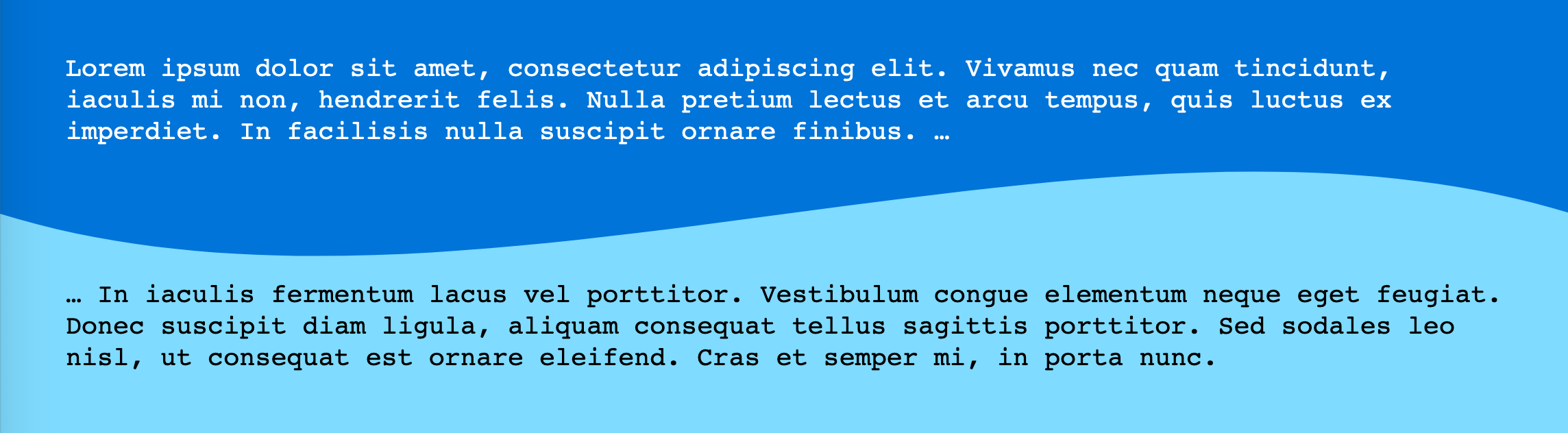
<div id="A">Lorem ipsum dolor sit amet, consectetur adipiscing elit. Vivamus nec quam tincidunt, iaculis mi non, hendrerit felis. Nulla pretium lectus et arcu tempus, quis luctus ex imperdiet. In facilisis nulla suscipit ornare finibus. …
</div>

<div id="B" class="wavy">… In iaculis fermentum lacus vel porttitor. Vestibulum congue elementum neque eget feugiat. Donec suscipit diam ligula, aliquam consequat tellus sagittis porttitor. Sed sodales leo nisl, ut consequat est ornare eleifend. Cras et semper mi, in porta nunc.</div>
Demo Wavy divider (with CSS pseudo-elements to avoid extra markup)
It was a bit trickier to position than with an inline SVG but works just as well. (Could use CSS custom properties or pre-processor variables to keep the height and padding easy to read.)
To edit the colors, you need to edit the URL-encoded SVG itself.
Pay attention (like in the first demo) to a change in the viewBox to get rid of unwanted spaces in the SVG. (Another option would be to draw a different SVG.)
Another thing to pay attention to here is the background-size set to 100% 100% to get it to stretch in both directions.
Solution 7 - Css
Here's another way to do it :) The concept is to create a clip-path polygon with the wave as one side.
This approach is fairly flexible. You can change the position (left, right, top or bottom) in which the wave appears, change the wave function to any function(t) which maps to [0,1]). The polygon can also be used for shape-outside, which lets text flow around the wave when in 'left' or 'right' orientation.
At the end, an example you can uncomment which demonstrates animating the wave.
function PolyCalc(f /*a function(t)  from [0, infinity) => [0, 1]*/,
                  s, /*a slice function(y, i) from y [0,1] => [0, 1], with slice index, i, in [0, n]*/
									w /*window size in seconds*/,
                  n /*sample size*/,
                  o /*orientation => left/right/top/bottom - the 'flat edge' of the polygon*/
                  )
{
	this.polyStart = "polygon(";
  this.polyLeft = this.polyStart + "0% 0%, "; //starts in the top left corner
  this.polyRight = this.polyStart + "100% 0%, "; //starts in the top right corner
  this.polyTop = this.polyStart + "0% 0%, "; // starts in the top left corner
  this.polyBottom = this.polyStart + "0% 100%, ";//starts in the bottom left corner

  var self = this;
  self.mapFunc = s;
  this.func = f;
  this.window = w;
  this.count = n;
  var dt = w/n;

  switch(o) {
    case "top":
      this.poly = this.polyTop; break;
    case "bottom":
      this.poly = this.polyBottom; break;
  	case "right":
    	this.poly = this.polyRight; break;
  	case "left":
  	default:
  		this.poly = this.polyLeft; break;
    }

  this.CalcPolygon = function(t) {
  	var p = this.poly;
    for (i = 0; i < this.count; i++) {
      x = 100 * i/(this.count-1.0);
      y = this.func(t + i*dt);
      if (typeof self.mapFunc !== 'undefined')
      	y=self.mapFunc(y, i);
      y*=100;
      switch(o) {
        case "top":
          p += x + "% " + y + "%, "; break;
        case "bottom":
          p += x + "% " + (100-y) + "%, "; break;
      	case "right":
        	p += (100-y) + "% " + x + "%, "; break;
      	case "left":
        default:
        	p += y + "% " + x + "%, "; break;
      }
    }

    switch(o) {
      case "top":
        p += "100% 0%)"; break;
      case "bottom":
        p += "100% 100%)";
        break;
    	case "right":
      	p += "100% 100%)"; break;
    	case "left":
      default:
      	p += "0% 100%)"; break;
    }

    return p;
  }
};

var text = document.querySelector("#text");
var divs = document.querySelectorAll(".wave");
var freq=2*Math.PI; //angular frequency in radians/sec
var windowWidth = 1; //the time domain window which determines the range from [t, t+windowWidth] that will be evaluated to create the polygon
var sampleSize = 60;
divs.forEach(function(wave) {
  var loc = wave.classList[1];

  var polyCalc = new PolyCalc(
	  function(t) { //The time domain wave function
  	  return (Math.sin(freq * t) + 1)/2; //sine is [-1, -1], so we remap to [0,1]
    },
    function(y, i) { //slice function, takes the time domain result and the slice index and returns a new value in [0, 1]
      return MapRange(y, 0.0, 1.0, 0.65, 1.0);  //Here we adjust the range of the wave to 'flatten' it out a bit.  We don't use the index in this case, since it is irrelevant
    },
    windowWidth, //1 second, which with an angular frequency of 2pi rads/sec will produce one full period.
    sampleSize, //the number of samples to make, the larger the number, the smoother the curve, but the more pionts in the final polygon
    loc //the location
  );

    var polyText = polyCalc.CalcPolygon(0);
    wave.style.clipPath = polyText;
    wave.style.shapeOutside = polyText;
    wave.addEventListener("click",function(e) {document.querySelector("#polygon").innerText = polyText;});
  });

function MapRange(value, min, max, newMin, newMax) {
  return value * (newMax - newMin)/(max-min) + newMin;
}

//Animation - animate the wave by uncommenting this section
//Also demonstrates a slice function which uses the index of the slice to alter the output for a dampening effect.
/*
var t = 0;
var speed = 1/180;

var polyTop = document.querySelector(".top");

var polyTopCalc = new PolyCalc(
	  function(t) {
  	  return (Math.sin(freq * t) + 1)/2;
    },
    function(y, i) {
      return MapRange(y, 0.0, 1.0, (sampleSize-i)/sampleSize, 1.0);
    },
    windowWidth, sampleSize, "top"
  );

function animate() {
		var polyT = polyTopCalc.CalcPolygon(t);
    t+= speed;
    polyTop.style.clipPath = polyT;
    requestAnimationFrame(animate);
}

requestAnimationFrame(animate);
*/
div div {
  padding:10px;
  /*overflow:scroll;*/
}

.left {
  height:100%;
  width:35%;
  float:left;
}

.right {
  height:200px;
  width:35%;
  float:right;
}

.top {
  width:100%;
  height: 200px;
}

.bottom {
  width:100%;
  height:200px;
}

.green {
  background:linear-gradient(to bottom, #b4ddb4 0%,#83c783 17%,#52b152 33%,#008a00 67%,#005700 83%,#002400 100%);
}

.mainContainer {
  width:100%;
  float:left;
}

#polygon {
  padding-left:20px;
  margin-left:20px;
  width:100%;
}
<div class="mainContainer">

  <div class="wave top green">
    Click to see the polygon CSS
  </div>

  <!--div class="wave left green">
  </div-->
  <!--div class="wave right green">
  </div-->
  <!--div class="wave bottom green"></div-->
</div>
<div id="polygon"></div>
Solution 8 - Css
The idea I have is to use two divs. The first div will have the svg set as a background image and the second one will have the same background color as the svg.
Below is an example:
.card {
    display: grid;

    width: 256px;
}

.card > .first {
    padding: 32px 32px 48px 32px;
    background: url("data:image/svg+xml,%3Csvg id='Layer_1' data-name='Layer 1' xmlns='http://www.w3.org/2000/svg' viewBox='0 0 512 91.61'%3E%3Cdefs%3E%3Cstyle%3E.cls-1%7Bfill:%236585c3;%7D%3C/style%3E%3C/defs%3E%3Cpath class='cls-1' d='M0,420.39a459.6,459.6,0,0,0,123.1,27c78.32,6,118.8-11.72,182.59-14.61,48.24-2.18,118.44,3.73,206.31,43.82V512H0Z' transform='translate(0 -420.39)'/%3E%3C/svg%3E") no-repeat;
    background-position: bottom;
}

.card > .second {
    padding: 0 32px 32px 32px;
    background-color: #6585C3;
    color: white;
}
<div class="card">
    <div class="first">
        Lorem ipsum dolor sit amed
    </div>
    <div class="second">
        Lorem ipsum dolor sit amet, consectetur adipiscing elit, sed do eiusmod tempor incididunt ut labore et dolore magna aliqua. Ut enim ad minim veniam, quis nostrud exercitation ullamco laboris
    </div>
</div>