Use images like checkboxes
JavascriptJqueryCssHtmlJavascript Problem Overview
I would like to have an alternative to a standard checkbox - basically I'd like to use images and when the user clicks the image, fade it out and overlay a tick box.
In essence, I want to do something like Recaptcha 2 does when it gets you to click images that meet a certain criteria. You can see a Recaptcha demo here but it might sometimes get you to solve text questions, as opposed to the image selection. So here's a screenshot:
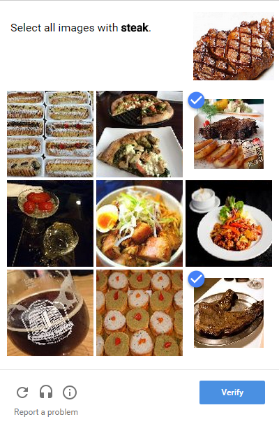
When you click one of the images (in this case, containing a picture of steak), the image you click shrinks in size and the blue tick appears, indicating that you've ticked it.
Let's say I want to reproduce this exact example.
I realise I can have 9 hidden checkboxes, and attach some jQuery so that when I click the image, it selects/deselects the hidden checkbox. But what about the shrinking of the image/overlaying the tick?
Javascript Solutions
Solution 1 - Javascript
Pure semantic HTML/CSS solution
This is easy to implement on your own, no pre-made solution necessary. Also it will teach you a lot as you don't seem too easy with CSS.
This is what you need to do:
Your checkboxes need to have distinct id attributes. This allows you to connect a <label> to it, using the label's for-attribute.
Example:
<input type="checkbox" id="myCheckbox1" />
<label for="myCheckbox1"><img src="http://someurl" /></label>
Attaching the label to the checkbox will trigger a browser behaviour: Whenever someone clicks the label (or the image inside it), the checkbox will be toggled.
Next, you hide the checkbox by applying for example display: none; to it.
Now all that is left to do is set the style you want for your label::before pseudo element (which will be used as the visual checkbox replacement elements):
label::before {
    background-image: url(../path/to/unchecked.png);
}
In a last tricky step, you make use of CSS' :checked pseudo selector to change the image when the checkbox is checked:
:checked + label::before {
    background-image: url(../path/to/checked.png);
}
The + (adjacent sibling selector) makes sure you only change labels that directly follow the hidden checkbox in the markup.
You can optimize that by putting both images in a spritemap and only applying a change in background-position instead of swapping the image.
Of course you need to position the label correctly and apply display: block; and set correct width and height.
Edit:
The codepen example and snippet, which I created after these instructions, use the same technique, but instead of using images for the checkboxes, the checkbox replacements are done purely with CSS, creating a ::before on the label that, once checked, has content: "✓";. Add some rounded borders and sweet transitions and the result is really likable!
Here is a working codepen that showcases the technique and doesn't require images for the checkbox:
> http://codepen.io/anon/pen/wadwpx
Here is the same code in a snippet:
ul {
  list-style-type: none;
}

li {
  display: inline-block;
}

input[type="checkbox"][id^="cb"] {
  display: none;
}

label {
  border: 1px solid #fff;
  padding: 10px;
  display: block;
  position: relative;
  margin: 10px;
  cursor: pointer;
  -webkit-touch-callout: none;
  -webkit-user-select: none;
  -khtml-user-select: none;
  -moz-user-select: none;
  -ms-user-select: none;
  user-select: none;
}

label::before {
  background-color: white;
  color: white;
  content: " ";
  display: block;
  border-radius: 50%;
  border: 1px solid grey;
  position: absolute;
  top: -5px;
  left: -5px;
  width: 25px;
  height: 25px;
  text-align: center;
  line-height: 28px;
  transition-duration: 0.4s;
  transform: scale(0);
}

label img {
  height: 100px;
  width: 100px;
  transition-duration: 0.2s;
  transform-origin: 50% 50%;
}

:checked+label {
  border-color: #ddd;
}

:checked+label::before {
  content: "✓";
  background-color: grey;
  transform: scale(1);
}

:checked+label img {
  transform: scale(0.9);
  box-shadow: 0 0 5px #333;
  z-index: -1;
}
<ul>
  <li><input type="checkbox" id="cb1" />
    <label for="cb1"><img src="https://picsum.photos/seed/1/100" /></label>
  </li>
  <li><input type="checkbox" id="cb2" />
    <label for="cb2"><img src="https://picsum.photos/seed/2/100" /></label>
  </li>
  <li><input type="checkbox" id="cb3" />
    <label for="cb3"><img src="https://picsum.photos/seed/3/100" /></label>
  </li>
  <li><input type="checkbox" id="cb4" />
    <label for="cb4"><img src="https://picsum.photos/seed/4/100" /></label>
  </li>
</ul>
Solution 2 - Javascript
Pure CSS Solution
There are three neat devices invoked:
label:before {
  content: url("https://cdn1.iconfinder.com/data/icons/windows8_icons_iconpharm/26/unchecked_checkbox.png");
  position: absolute;
  z-index: 100;
}
:checked+label:before {
  content: url("https://cdn1.iconfinder.com/data/icons/windows8_icons_iconpharm/26/checked_checkbox.png");
}
input[type=checkbox] {
  display: none;
}
/*pure cosmetics:*/
img {
  width: 150px;
  height: 150px;
}
label {
  margin: 10px;
}
<input type="checkbox" id="myCheckbox1" />
<label for="myCheckbox1">
  <img src="https://encrypted-tbn2.gstatic.com/images?q=tbn:ANd9GcR0LkgDZRDTgnDrzhnXGDFRSItAzGCBEWEnkLMdnA_zkIH5Zg6oag">
</label>
<input type="checkbox" id="myCheckbox2" />
<label for="myCheckbox2">
  <img src="https://encrypted-tbn1.gstatic.com/images?q=tbn:ANd9GcRhJjGB3mQxjhI5lfS9SwXou06-2qT_0MjNAr0atu75trXIaR2d">
</label>
<input type="checkbox" id="myCheckbox3" />
<label for="myCheckbox3">
  <img src="https://encrypted-tbn3.gstatic.com/images?q=tbn:ANd9GcQuwWbUXC-lgzQHp-j1iw56PIgl_2eALrEENUP-ld72gq3s8cVo">
</label>
Solution 3 - Javascript
See this jQuery plugin: imgCheckbox (on npm and bower)
Disclaimer: No javascript is necessary to solve this problem. The tension is between maintainability and efficiency of code. While there's no need for a plugin (or any javascript), it sure does make it faster to build and often easier to change.
Barebones Solution:
With very simple HTML (none of the mess with checkboxes and labels etc.):
<img class="checkable" src="http://lorempixel.com/100/100" />
You can use jQuery's toggleClass to turn on/off a selected or checked class on the click event:
$("img.checkable").click(function () {
    $(this).toggleClass("checked");
});
Checked items are fetched with
$(".checked")
Plus Coolness:
You can style the images based off of this but a big problem is that without other DOM elements you can't even use ::before and ::after to add stuff like check marks. The solution is to wrap your images with another element (and it makes sense to attach the click listener to the wrapped element as well).
$("img.checkable").wrap("<span class='fancychecks'>")
This leaves your html really clean and your js incredibly readable. Take a look at the snippet...
/* Note that this js actually responds
   to a click event on the wrapped element!
   (not the image) */
$("img.checkable").wrap("<span class='fancychecks'>")
  .parent().click(function() {
    $(this).toggleClass("checked");
  });
/* style the images */
span.fancychecks img {
  display: block;
  margin: 0;
  padding: 0;
  transition-duration: 300ms;
  transform: scale(1);
  filter: none;
  -webkit-filter: grayscale(0);
}
span.fancychecks.checked img {
  transform: scale(0.8);
  filter: gray;
  filter: grayscale(1);
  -webkit-filter: grayscale(1);
}

/* style the parent spans */
span.fancychecks {
  padding: 0;
  margin: 5px;
  display: inline-block;
  border: 1px solid transparent;
  transition-duration: 300ms;
}
span.fancychecks.checked {
  border-color: #ccc;
}

/* Using conexo's fantastic CSS, make the checkmarks */
span.fancychecks::before {
  background-color: rgba(50, 200, 50, 0.7);
  color: white;
  content: "✓";
  font-weight: bold;
  border-radius: 50%;
  position: absolute;
  margin: 2px;
  top: 1;
  left: 1;
  z-index: 1;
  width: 25px;
  height: 25px;
  text-align: center;
  line-height: 28px;
  transform: scale(0);
  transition-duration: 300ms;
}
span.fancychecks.checked::before {
  transform: scale(1);
}
<script src="https://ajax.googleapis.com/ajax/libs/jquery/2.1.0/jquery.min.js"></script>
<img class="checkable" src="http://lorempixel.com/100/100/city/1" />
<img class="checkable" src="http://lorempixel.com/100/100/city/2" />
<img class="checkable" src="http://lorempixel.com/100/100/city/3" />
Using the http://jcuenod.github.io/imgCheckbox/">imgCheckbox</a> jQuery Plugin:
Inspired by the solution above, I have built a plugin which can be used as easily as:
$("img").imgCheckbox();
- Injects the data for checked images into your form
- Supports custom check marks
- Supports customised CSS
- Supports preselected elements
- Supports radio groups instead of simple toggling of images
- Has event callbacks
- Sensible defaults
- Lightweight and super easy to use
See it in action (and see the source)
Solution 4 - Javascript
I would append an extra div with position: relative; and class="checked" which has the same width/height as the image has and than position in left: 0; top: 0; containing the icon. It starts with display: none;.
Now you can listen to the click-event:
$( '.captcha_images' ).click( function() {
    $(this + '.checked').css( 'display', 'block' );
    $(this).animate( { width: '70%', height: '70%' } );
});
This way you can get the icon and also resize the image to a smaller way.
Notice: Just wanted to show you the "logic" behind my thoughts, this example might not work or has some bugs in it.
Solution 5 - Javascript
I've noticed other answers either don't use <label> (why not?), or require matching for and id attributes. This means if you have clashing IDs, your code won't work, and you must remember to make unique IDs each time.
Also, if you hide the input with display:none or visibility:hidden, the browser will not focus on it.
A checkbox and its text (or in this case, image) can be wrapped in a label:
.fancy-checkbox-label > input[type=checkbox] {
  position: absolute;
  opacity: 0;
  cursor: inherit;
}
.fancy-checkbox-label {
  font-weight: normal;
  cursor: pointer;
}
.fancy-checkbox:before {
  font-family: FontAwesome;
  content: "\f00c";
  background: #fff;
  color: transparent;
  border: 3px solid #ddd;
  border-radius: 3px;
  z-index: 1;
}
.fancy-checkbox-label:hover > .fancy-checkbox:before,
input:focus + .fancy-checkbox:before {
  border-color: #bdbdff;
}
.fancy-checkbox-label:hover > input:not(:checked) + .fancy-checkbox:before {
  color: #eee;
}
input:checked + .fancy-checkbox:before {
  color: #fff;
  background: #bdbdff;
  border-color: #bdbdff;
}
.fancy-checkbox-img:before {
  position: absolute;
  margin: 3px;
  line-height: normal;
}
input:checked + .fancy-checkbox-img + img {
  transform: scale(0.9);
  box-shadow: 0 0 5px #bdbdff;
}
<link href="https://maxcdn.bootstrapcdn.com/font-awesome/4.6.3/css/font-awesome.min.css" rel="stylesheet" integrity="sha384-T8Gy5hrqNKT+hzMclPo118YTQO6cYprQmhrYwIiQ/3axmI1hQomh7Ud2hPOy8SP1" crossorigin="anonymous">
<p>
  <label class="fancy-checkbox-label">
    <input type="checkbox">
    <span class="fancy-checkbox"></span>
    A normal checkbox
  </label>
</p>
<p>
  <label class="fancy-checkbox-label">
    <input type="checkbox">
    <span class="fancy-checkbox fancy-checkbox-img"></span>
    <img src="http://placehold.it/150x150">
  </label>
</p>
Solution 6 - Javascript
Here a quick example of selecting an image like a checkbox
Updated Example using Knockout.js:
var imageModel = function() {
    this.chk = ko.observableArray();
};
ko.applyBindings(new imageModel());
    input[type=checkbox] {
        display:none;
      }

  input[type=checkbox] + label
   {
       display:inline-block;
        width:150px;
        height:150px;
        background:#FBDFDA;
        border:none;
   }

   input[type=checkbox]:checked + label
    {
        background:#CFCFCF;
        border:none;
        position:relative;
        width:100px;
        height:100px;
        padding: 20px;
    }

   input[type=checkbox]:checked + label:after
    {
        content: '\2713';
        position:absolute;
        top:-10px;
        right:-10px;
        border-radius: 10px;
        width: 25px;
        height: 25px;
        border-color: white;
        background-color: blue;
    }
<script src="https://cdnjs.cloudflare.com/ajax/libs/knockout/3.0.0/knockout-min.js"></script>
<input type='checkbox' name='image1' value='image1' id="image1" data-bind="checked: chk"/><label for="image1"></label><label for="image1"><img class='testbtn'/></label>

<div data-bind="html: chk"></div>
Solution 7 - Javascript
I made an example of "Angular - Use images like checkboxes and radios"


In app.component.html file:
<div class="cont-bg">
  <h5 class="text-white">Checkbox</h5>
  <div class="cont-main">
    <div class="cont-checkbox" *ngFor="let car of cars; index as i">
      <input type="checkbox" [id]="'myCheckbox-' + i" />
      <label [for]="'myCheckbox-' + i">
        <img [src]="car.img" />
        <span class="cover-checkbox">
          <svg viewBox="0 0 12 10">
            <polyline points="1.5 6 4.5 9 10.5 1"></polyline>
          </svg>
        </span>
        <div class="info">{{ car.name }}</div>
      </label>
    </div>
  </div>
  <h5 class="text-white">Radio</h5>
  <div class="cont-main">
    <div class="cont-checkbox" *ngFor="let car of cars; index as i">
      <input type="radio" name="myRadio" [id]="'myRadio-' + i" />
      <label [for]="'myRadio-' + i">
        <img [src]="car.img" />
        <span class="cover-checkbox">
          <svg viewBox="0 0 12 10">
            <polyline points="1.5 6 4.5 9 10.5 1"></polyline>
          </svg>
        </span>
        <div class="info">{{ car.name }}</div>
      </label>
    </div>
  </div>
</div>
In app.component.scss file:
* {
  font-family: Lato;
  --transition: 0.15s;
  --border-radius: 0.5rem;
  --background: #ffc107;
  --box-shadow: #ffc107;
  // --box-shadow: #0082ff;
}

.cont-bg {
  min-height: 100vh;
  background-image: radial-gradient(
    circle farthest-corner at 7.2% 13.6%,
    rgba(37, 249, 245, 1) 0%,
    rgba(8, 70, 218, 1) 90%
  );
  padding: 1rem;
  display: flex;
  flex-direction: column;
  align-items: center;
  justify-content: center;
}

.cont-main {
  display: flex;
  flex-wrap: wrap;
  align-content: center;
  justify-content: center;
}

.cont-checkbox {
  width: 150px;
  height: 100px;
  border-radius: var(--border-radius);
  box-shadow: 0 0.125rem 0.25rem rgba(0, 0, 0, 0.075);
  transition: transform var(--transition);
  background: white;
  margin-bottom: 0.75rem;
  margin-right: 0.75rem;
  &:active {
    transform: scale(0.9);
  }
  input {
    display: none;
    &:checked + label {
      opacity: 1;
      box-shadow: 0 0 0 3px var(--background);
      .cover-checkbox {
        opacity: 1;
        transform: scale(1);
        svg {
          stroke-dashoffset: 0;
        }
      }
      img {
        -webkit-filter: none; /* Safari 6.0 - 9.0 */
        filter: none;
      }
    }
  }
  label {
    cursor: pointer;
    border-radius: var(--border-radius);
    overflow: hidden;
    width: 100%;
    height: 100%;
    position: relative;
    opacity: 0.6;
    img {
      width: 100%;
      height: 70%;
      object-fit: cover;
      clip-path: polygon(0% 0%, 100% 0, 100% 81%, 50% 100%, 0 81%);
      -webkit-filter: grayscale(100%); /* Safari 6.0 - 9.0 */
      filter: grayscale(100%);
    }
    .cover-checkbox {
      position: absolute;
      right: 5px;
      top: 3px;
      z-index: 1;
      width: 23px;
      height: 23px;
      border-radius: 50%;
      background: var(--box-shadow);
      border: 2px solid #fff;
      transition: transform var(--transition),
        opacity calc(var(--transition) * 1.2) linear;
      opacity: 0;
      transform: scale(0);
      svg {
        width: 13px;
        height: 11px;
        display: inline-block;
        vertical-align: top;
        fill: none;
        margin: 5px 0 0 3px;
        stroke: #fff;
        stroke-width: 2;
        stroke-linecap: round;
        stroke-linejoin: round;
        stroke-dasharray: 16px;
        transition: stroke-dashoffset 0.4s ease var(--transition);
        stroke-dashoffset: 16px;
      }
    }
    .info {
      text-align: center;
      margin-top: 0.2rem;
      font-weight: 600;
      font-size: 0.8rem;
    }
  }
}
In app.component.ts file:
import { Component, VERSION } from '@angular/core';

@Component({
  selector: 'my-app',
  templateUrl: './app.component.html',
  styleUrls: ['./app.component.scss'],
})
export class AppComponent {
  cars = [
    {
      id: '1',
      name: 'Mazda MX-5 Miata',
      img: 'https://hips.hearstapps.com/hmg-prod.s3.amazonaws.com/images/2021-mazda-mx-5-miata-mmp-1-1593459650.jpg?crop=0.781xw:0.739xh;0.109xw,0.0968xh&resize=480:*',
    },
    {
      id: '2',
      name: 'Toyota Supra',
      img: 'https://hips.hearstapps.com/hmg-prod.s3.amazonaws.com/images/2020-chevrolet-corvette-c8-102-1571146873.jpg?crop=0.548xw:0.411xh;0.255xw,0.321xh&resize=980:*',
    },
    {
      id: '3',
      name: 'Chevy Corvette',
      img: 'https://hips.hearstapps.com/hmg-prod.s3.amazonaws.com/images/2021-porsche-cayman-mmp-1-1593003674.jpg?crop=0.648xw:0.485xh;0.129xw,0.263xh&resize=980:*',
    },
    {
      id: '4',
      name: 'Porsche 718 Cayman',
      img: 'https://hips.hearstapps.com/hmg-prod.s3.amazonaws.com/images/2021-porsche-718-cayman-mmp-1-1593003156.jpg?crop=0.735xw:0.551xh;0.138xw,0.240xh&resize=980:*',
    },
    {
      id: '5',
      name: 'Porsche 718 Boxster',
      img: 'https://hips.hearstapps.com/hmg-prod.s3.amazonaws.com/images/2021-bmw-m2-mmp-1-1599687968.jpg?crop=0.706xw:0.528xh;0.102xw,0.268xh&resize=980:*',
    },
    {
      id: '6',
      name: 'BMW M2',
      img: 'https://hips.hearstapps.com/hmg-prod.s3.amazonaws.com/images/2021-bmw-z4-mmp-1-1599583762.jpg?crop=0.779xw:0.584xh;0.0782xw,0.196xh&resize=980:*',
    },
    {
      id: '7',
      name: 'BMW Z4',
      img: 'https://hips.hearstapps.com/hmg-prod.s3.amazonaws.com/images/2021-chevrolet-camaro-mmp-1-1585333717.jpg?crop=0.344xw:0.331xh;0.241xw,0.328xh&resize=980:*',
    },
    {
      id: '8',
      name: 'Chevy Camaro',
      img: 'https://hips.hearstapps.com/hmg-prod.s3.amazonaws.com/images/2021-chevrolet-camaro-zl1-mmp-1-1604071262.jpg?crop=0.818xw:0.663xh;0.0799xw,0.163xh&resize=980:*',
    },
    {
      id: '9',
      name: 'Chevy Camaro ZL1',
      img: 'https://hips.hearstapps.com/hmg-prod.s3.amazonaws.com/images/2021-chevrolet-camaro-zl1-mmp-1-1604071262.jpg?crop=0.818xw:0.663xh;0.0799xw,0.163xh&resize=768:*',
    },
  ];
}
Solution 8 - Javascript
To expand on the accepted answer for anyone using WordPress & GravityForms to generate their forms and wish to automatically populate checkbox fields with a list of posts and their associated Featured Thumbnail
// Change '2' to your form ID
add_filter( 'gform_pre_render_2', 'populate_checkbox' );
add_filter( 'gform_pre_validation_2', 'populate_checkbox' );
add_filter( 'gform_pre_submission_filter_2', 'populate_checkbox' );
add_filter( 'gform_admin_pre_render_2', 'populate_checkbox' );

function populate_checkbox( $form ) {

    foreach( $form['fields'] as &$field )  {

        // Change '41' to your checkbox field ID
        $field_id = 41;
        if ( $field->id != $field_id ) {
            continue;
        }

        // Adjust $args for your post type
        $args = array(
                'post_type' => 'pet',
                'post_status' => 'publish',
                'posts_per_page' => -1,
                'tax_query' => array(
                        array(
                                'taxonomy' => 'pet_category',
                                'field' => 'slug',
                                'terms' => 'cat'
                        )
                )
        );

        $posts = get_posts( $args );

        $input_id = 1;

        foreach( $posts as $post ) {

            $feat_image_url = wp_get_attachment_image( get_post_thumbnail_id( $post->ID ), 'thumbnail' );
            $feat_image_url .= '<br />' . $post->post_title;

            if ( $input_id % 10 == 0 ) {
                $input_id++;
            }

            $choices[] = array( 'text' => $feat_image_url, 'value' => $post->post_title );
            $inputs[] = array( 'label' => $post->post_title, 'id' => "{$field_id}.{$input_id}" );

            $input_id++;
        }

        $field->choices = $choices;
        $field->inputs = $inputs;

    }

    return $form;
}
And the CSS:
.gform_wrapper .gfield_checkbox li[class^="gchoice_2_41_"] {
    display: inline-block;
}

.gform_wrapper .gfield_checkbox li input[type="checkbox"][id^="choice_2_41_"] {
    display: none;
}


.gform_wrapper .gfield_checkbox li label[id^="label_2_41_"] {
    border: 1px solid #fff;
    padding: 10px;
    display: block;
    position: relative;
    margin: 10px;
    cursor: pointer;
    -webkit-touch-callout: none;
    -webkit-user-select: none;
    -khtml-user-select: none;
    -moz-user-select: none;
    -ms-user-select: none;
    user-select: none;
}

label[id^="label_2_41_"]:before {
    font-family: "font-icons";
    font-size: 32px;
    color: #1abc9c;
    content: " ";
    display: block;
    background-color: transparent;
    position: absolute;
    top: -5px;
    left: -5px;
    width: 25px;
    height: 25px;
    text-align: center;
    line-height: 28px;
    transition-duration: 0.4s;
    transform: scale(0);
}

label[id^="label_2_41_"] img {
    transition-duration: 0.2s;
    transform-origin: 50% 50%;
}

:checked + label[id^="label_2_41_"] {
    border-color: #ddd;
}

/* FontAwesome tick */
:checked + label[id^="label_2_41_"]:before {
    content: "\e6c8";
    background-color: transparent;
    transform: scale(1);
}

:checked + label[id^="label_2_41_"] img {
    transform: scale(0.9);
    box-shadow: 0 0 5px #333;
    z-index: 0;
}