Flexbox: how to get divs to fill up 100% of the container width without wrapping?
CssFlexboxCss Problem Overview
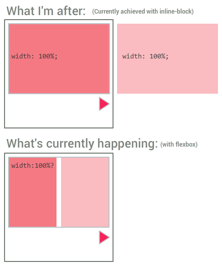
I'm in the process of updating an old inline-block-based grid model I have to a newer Flexbox one I created. Everything has worked fine, apart from one little snag, which has become a bit of a dealbreaker:
I have a bunch of CSS-controlled sliders; so there's a containing wrapper with 100% width, and inside is another div: its width is also 100%, but its white-space is set to nowrap. Using inline-block, this meant that the internal divs (which were also set to 100% width) wouldn't be bound by their parents' constraints and wrap onto the next line - they'd just carry on flowing out of the box. This is exactly what I wanted. However, I cannot get this to work at all with flexbox. For reference, here's an image:
And for reference, here's a jsFiddle of the thing working with inline-block: http://jsfiddle.net/5zzvqx4b/
...and not working with Flexbox: http://jsfiddle.net/5zzvqx4b/1/
I've tried all kinds of variations with flex, flex-basis, flex-wrap, flex-grow, etc. but for the life of me I can't get this to work.
Note that I can force it to do what I want in a hacky, inflexible way by setting the .boxcontainer width to 200%. That works for this single example, but in some cases I won't know beforehand how many child boxes there will be, and I'd rather not resort to inline styling on each element if possible.
Css Solutions
Solution 1 - Css
To prevent the flex items from shrinking, set the flex shrink factor to 0:
> The flex shrink factor determines how much the flex item will > shrink relative to the rest of the flex items in the flex > container when negative free space is distributed. When omitted, it is > set to 1.
.boxcontainer .box {
  flex-shrink: 0;
}
* {
  box-sizing: border-box;
}
.wrapper {
  width: 200px;
  background-color: #EEEEEE;
  border: 2px solid #DDDDDD;
  padding: 1rem;
}
.boxcontainer {
  position: relative;
  left: 0;
  border: 2px solid #BDC3C7;
  transition: all 0.4s ease;
  display: flex;
}
.boxcontainer .box {
  width: 100%;
  padding: 1rem;
  flex-shrink: 0;
}
.boxcontainer .box:first-child {
  background-color: #F47983;
}
.boxcontainer .box:nth-child(2) {
  background-color: #FABCC1;
}
#slidetrigger:checked ~ .wrapper .boxcontainer {
  left: -100%;
}
#overflowtrigger:checked ~ .wrapper {
  overflow: hidden;
}
<input type="checkbox" id="overflowtrigger" />
<label for="overflowtrigger">Hide overflow</label><br />
<input type="checkbox" id="slidetrigger" />
<label for="slidetrigger">Slide!</label>
<div class="wrapper">
  <div class="boxcontainer">
    <div class="box">
      First bunch of content.
    </div>
    <div class="box">
      Second load  of content.
    </div>
  </div>
</div>
Solution 2 - Css
You can use the shorthand flex property and set it to
flex: 0 0 100%;
That's flex-grow, flex-shrink, and flex-basis in one line. Flex shrink was described above, flex grow is the opposite, and flex basis is the size of the container.
Solution 3 - Css
In my case, just using flex-shrink: 0 didn't work. But adding flex-grow: 1 to it worked.
.item {
    flex-shrink: 0;
    flex-grow: 1;
}