Transparent hollow or cut out circle
CssSvgTransparencyCss ShapesCss Problem Overview
Is it possible to cut out a hollow circle using only CSS?
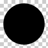
This we can all do:
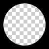
But can we do this?
The circle must be hollow and transparent. Thus the problem is not solved by putting a solid color circle over a div.
Css Solutions
Solution 1 - Css
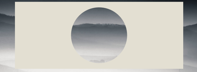
You can achieve a transparent cut out circle with 2 different techniques :
1.SVG
The following examples use an inline svg. The first snippet uses the mask element to cut out the transparent circle and the second hollow circle is made with a path element. The circle is made with 2 arc commands :
With the mask element :
body{background:url('https://farm9.staticflickr.com/8760/17195790401_ceeeafcddb_o.jpg');background-size:cover;}
<svg viewbox="0 0 100 50" width="100%">
  <defs>
    <mask id="mask" x="0" y="0" width="80" height="30">
      <rect x="5" y="5" width="90" height="40" fill="#fff"/>
      <circle cx="50" cy="25" r="15" />
    </mask>
  </defs>
  <rect x="0" y="0" width="100" height="50" mask="url(#mask)" fill-opacity="0.7"/>
</svg>
With one path element :
body{background: url('https://farm9.staticflickr.com/8760/17195790401_ceeeafcddb_o.jpg');background-size:cover;}
svg{
  display:block;
  width:70%;
  height:auto;
  margin:0 auto;
}
path{
  transition:fill .5s;
  fill:#E3DFD2;
}
path:hover{
  fill:pink;
}
<svg viewbox="-10 -1 30 12">
  <path d="M-10 -1 H30 V12 H-10z M 5 5 m -5, 0 a 5,5 0 1,0 10,0 a 5,5 0 1,0 -10,0z"/>
</svg>
The main advantages of using SVG in this case are :
- Shorter code
- You can easily use an image or gradient to fill the circle mask
- maintain the boundaries of the shape and trigger mouse envents only over the fill respecting the mask (hover the transparent cut out circle in the example)
- CSS only using BOX-SHADOWS
Create a div with overflow:hidden; and a round pseudo element inside it with border-radius. Give it a huge box-shadow and no background :
div{
    position:relative;
    width:500px; height:200px;
    margin:0 auto;
    overflow:hidden;
}
div:after{
    content:'';
    position:absolute;
    left:175px; top:25px;
    border-radius:100%;
    width:150px; height:150px;
    box-shadow: 0px 0px 0px 2000px #E3DFD2;
}

body{background: url('https://farm9.staticflickr.com/8760/17195790401_ceeeafcddb_o.jpg');background-size:cover;}
<div></div>
Browser support for box-shadows is IE9+ see canIuse
The same approach would be to use border instead of box-shadows. It is interesting if you need to support browsers that don't support box-shadows like IE8. The technique is the same but you need to compensate with the top and left values to keep the circle in the center of the div :
body{
    background: url('https://farm9.staticflickr.com/8760/17195790401_ceeeafcddb_o.jpg');
    background-size:cover;
}
div{
    position:relative;
    width:500px; height:200px;
    margin:0 auto;
    overflow:hidden;
}
div:after{
    content:'';
    position:absolute;
    left:-325px; top:-475px;
    border-radius:100%;
    width:150px; height:150px;
    border:500px solid #E3DFD2;
}
<div></div>
Solution 2 - Css
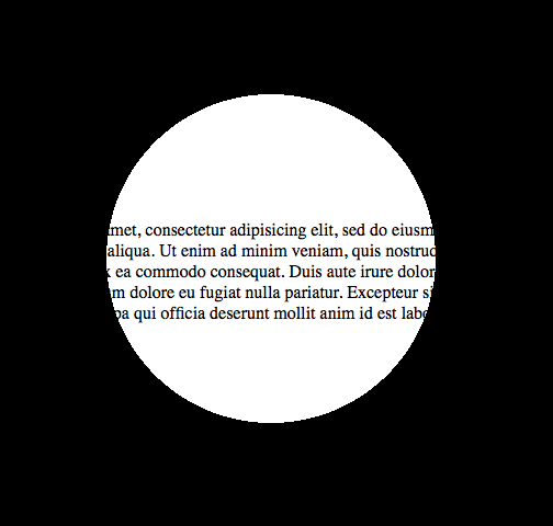
It can be done using a radial gradient background and pointer-events (to allow mouse interaction behind through the circle layer, e.g. text selection). Here's a demo page and a screenshot:
And this would be the code for it:
body {
  margin: 0;
  padding: 0;
}

.underneath {
  padding: 0;
  margin: 265px 0 0 0;
  width: 600px;
}

.overlay {
  top: 0;
  left: 0;
  position: absolute;
  width: 600px;
  height: 600px;
  background: -moz-radial-gradient(transparent 150px, rgba(0, 0, 0, 1) 150px);
  background: -webkit-radial-gradient(transparent 150px, rgba(0, 0, 0, 1) 150px);
  background: -ms-radial-gradient(transparent 150px, rgba(0, 0, 0, 1) 150px);
  background: -o-radial-gradient(transparent 150px, rgba(0, 0, 0, 1) 150px);
  pointer-events: none;
  /* send mouse events beneath this layer */
}
<body>

  <p class="underneath">
    Lorem ipsum dolor sit amet, consectetur adipisicing elit, sed do eiusmod tempor incididunt ut labore et dolore magna aliqua. Ut enim ad minim veniam, quis nostrud exercitation ullamco laboris nisi ut aliquip ex ea commodo consequat. Duis aute irure dolor
    in reprehenderit in voluptate velit esse cillum dolore eu fugiat nulla pariatur. Excepteur sint occaecat cupidatat non proident, sunt in culpa qui officia deserunt mollit anim id est laborum.
  </p>

  <div class="overlay"></div>

</body>
Solution 3 - Css
Referring to web-tiki's answer I'd like to add that you can always center a div with translate(-50%,-50%), so it'd be no problem to use the border-property, which has better browser support.
div{
    position:relative;
    width:500px;
    height:200px;
    margin:0 auto;
    overflow:hidden;
}
div:after{
    content:'';
    position:absolute;
    left:50%;
    top: 50%;
    transform: translate(-50%,-50%);
    border-radius:50%;
    width:150px; height:150px;
    border: 1000px solid rebeccapurple;
}

body{background: url('https://farm9.staticflickr.com/8760/17195790401_ceeeafcddb_o.jpg');background-size:cover;}
<div></div>
You can get really creative with this technique:
document.addEventListener( "DOMContentLoaded", function(){
	setInterval(function(){
		if(document.getElementById("moving").style.height === "500px"){
			document.getElementById("moving").style.height = "0px";
		} else {
			document.getElementById("moving").style.height = "500px";
		}
	}, 2000);
});
#container {
	width: 500px;
	margin: 0 auto;
	border: 1px solid black;
	overflow:hidden;
	position: relative;
}


#circle{
    position:relative;
    height:150px;
    margin:0 auto;
	clear:left;
	overflow:hidden;
}
#circle::before, #circle::after {
    content:'';
    border-radius:50%;
	position: absolute;
    left: 50%;
    top: 50%;
    transform: translate(-50%,-50%);
}
#circle::before {
    height: 140px;
    width: 140px;
    background: rebeccapurple;
}
#circle::after{
    width:150px;
	height:150px;
    border: 2000px solid rebeccapurple;
}

#line {
	margin: 0 auto;
	width: 6px;
	height: 200px;
	position: relative;
}
#line::before, #line::after {
	content: " ";
	background-color: rebeccapurple;
    height: 200px;
	width:2000px;
	position:absolute;
}
#line::before {
	right: 100%;
}
#line::after {
	left: 100%;
}

#moving {
	height: 0px;
    width: 100%;
    background: blue;
    transition: 2s height;
    position: absolute;
    top: 0px;
    z-index: -1;
}
body{
	background: url('https://farm9.staticflickr.com/8760/17195790401_ceeeafcddb_o.jpg');background-size:cover;
}
<div id="container">
	<div id="circle"></div>
	<div id="line"></div>
    <div id="circle"></div>
    <div id="moving"></div>
</div>
Solution 4 - Css
Regarding "Method 1" from "Pius Nyakoojo", with a minor improvement (see below) it would work. I personally think this is the simplest solution:

<html>
<!-- Assuming the stuff to mask is a 100 pixel square -->
<style>
.mask {
	position: absolute;
	top: -50px;                     /* minus half the div size */
	left: -50px;                    /* minus half the div size */
	width: 100px;                   /* the div size */
	height: 100px;                  /* the div size */
	background-color: transparent;
	border-radius: 100px;           /* the div size */
	border: 50px solid white;       /* half the div size */
	pointer-events: none;           /* send mouse events beneath this layer */
}

.stuff {
	position: absolute;
	width: 100px;                   /* the div size */
	height: 100px;                  /* the div size */
	overflow: hidden;				/* hide the excess of the mask border */
	background-color: #CCC;
}
</style>
<body>
	<div class="stuff">
		<div class="mask"></div>
		blah blah blah blah blah
		blah blah blah blah blah
		blah blah blah blah blah
	</div>
</body>
</html>
Solution 5 - Css
Method 1- Preferred
<div class="circle"></div>
$radius: 50px;
$thickness: 5px;

.circle {
    width: $radius;
    height: $radius;
    background-color: transparent;
    border-radius: $radius;
    border: $thickness solid gray;
}
Method 2
<div class="circle"></div>
$radius: 50px;
$thickness: 5px;

.circle {
  width: $radius;
  height: $radius;
}

.circle::before, .circle::after {
  margin: -2px 0;
}
.circle::before {
    content: '';
    display: inline-block;
    width: $radius;
    height: calc(#{$radius} / 2);
    background-color: transparent;
    border-top-left-radius: calc(#{$radius} / 2);
    border-top-right-radius: calc(#{$radius} / 2);
    border: $thickness solid gray;
    border-bottom: 0;

    -webkit-box-sizing: border-box;
    -moz-box-sizing: border-box;
    box-sizing: border-box;
}

.circle::after {
  content: '';
  display: inline-block;
  width: $radius;
  height: calc(#{$radius} / 2);
  background-color: transparent;
  border-bottom-left-radius: calc(#{$radius} / 2);
  border-bottom-right-radius: calc(#{$radius} / 2);
  border: $thickness solid gray;
  border-top: 0;

  -webkit-box-sizing: border-box;
  -moz-box-sizing: border-box;
  box-sizing: border-box;
}
Solution 6 - Css
You can do it using css masks and extra svg image.
Although browser support is weak

body { background: url(https://data.whicdn.com/images/50959200/original.jpg); background-size: cover; background-position: center; }
.circle {
  width: 150px;
  height: 150px;
  background: black;
  border-radius: 50%;
  -webkit-mask: url(https://svgshare.com/i/GLf.svg);
  -webkit-mask-size: 125%; /* change it */
  -webkit-mask-position: center;
  margin: 20px auto;
}
<div class="circle"></div>
Solution 7 - Css
We can do this with radial-gradient and mask. With single div, no pseudo-element.
* {
  box-sizing: border-box;
}

html,
body {
  height: 100%;
}

body {
  margin: 0;
  background-image: url(https://picsum.photos/id/1060/720/1280);
  background-size: cover;
}

.a {
  /* this is flexible. you can change */
  --circle-radius: 100px;
  height: 100%;
  width: 100%;
  --mask: radial-gradient(circle farthest-side at center center, transparent var(--circle-radius), #000 calc(var(--circle-radius) + 2px) 100%) 50% 50%/100% 100% no-repeat;
  -webkit-mask: var(--mask);
          mask: var(--mask);
  background: #000;
}
<div class="a"></div>
Circle radius can be percent value also:
* {
  box-sizing: border-box;
}

html,
body {
  height: 100%;
}

body {
  margin: 0;
  padding: 30px;
  background-image: url(https://picsum.photos/id/1060/720/1280);
  background-size: cover;
}

.a {
  --circle-radius: 20%; /* changed as percent value */

  height: 100%;
  width: 100%;
  --mask: radial-gradient(circle farthest-side at center center, transparent var(--circle-radius), #000 calc(var(--circle-radius) + 2px) 100%) 50% 50%/100% 100% no-repeat;
  -webkit-mask: var(--mask);
          mask: var(--mask);
  background: rgba(0, 0, 0, .8);
}
<div class="a"></div>
Another idea:
* {
  box-sizing: border-box;
}

html,
body {
  height: 100%;
}

body {
  margin: 0;
  background-image: url(https://picsum.photos/id/1060/720/1280);
  background-size: cover;
}

.a {
  --circle-radius: 100px;
  --border-width: 30px;

  height: 100%;
  width: 100%;
  --mask: radial-gradient(circle farthest-side at center center, transparent var(--circle-radius), #000 calc(var(--circle-radius) + 2px) calc(var(--circle-radius) + 2px + var(--border-width)), transparent calc(var(--circle-radius) + 2px + var(--border-width) + 2px) 100%) 50% 50%/100% 100% no-repeat;
  -webkit-mask: var(--mask);
          mask: var(--mask);
  background: #000;
}
<div class="a"></div>
Reverse:
* {
  box-sizing: border-box;
}

html,
body {
  height: 100%;
}

body {
  margin: 0;
  background-image: url(https://picsum.photos/id/1060/720/1280);
  background-size: cover;
}

.a {
  --circle-radius: 100px;
  --border-width: 30px;

  height: 100%;
  width: 100%;
  --mask: radial-gradient(circle farthest-side at center center, #000 var(--circle-radius), transparent calc(var(--circle-radius) + 2px) calc(var(--circle-radius) + 2px + var(--border-width)), #000 calc(var(--circle-radius) + 2px + var(--border-width) + 2px) 100%) 50% 50%/100% 100% no-repeat;
  -webkit-mask: var(--mask);
          mask: var(--mask);
  background: #000;
}
<div class="a"></div>