Text on the left side of checkbox in WPF?
.NetWpfUser InterfaceCheckbox.Net Problem Overview
What is the easiest way to put checkbox content (text) on the left side of the checkbox itself?
.Net Solutions
Solution 1 - .Net
A solution that maximizes "easiness" and "correctness" is to make a RightToLeft checkbox with LeftToRight content:
<CheckBox FlowDirection="RightToLeft">
    <TextBlock FlowDirection="LeftToRight" Text="CheckBox Content:" />
</CheckBox>
Or if you'd like a style:
<Style TargetType="CheckBox">
    <Setter Property="FlowDirection" Value="RightToLeft" />
    <Setter Property="ContentTemplate">
        <Setter.Value>
            <DataTemplate>
                <ContentControl FlowDirection="LeftToRight" Content="{Binding}" />
            </DataTemplate>
        </Setter.Value>
    </Setter>
</Style>
Solution 2 - .Net
In code:
System.Windows.Controls.CheckBox checkBox = new System.Windows.Controls.CheckBox();
checkBox.Content = ":CheckBox Enabled";
checkBox.FlowDirection = System.Windows.FlowDirection.RightToLeft;
In XAML:
<CheckBox FlowDirection="RightToLeft" Content=":CheckBox Enabled" />
EDIT
User punker76 helped me notice that colon ":" has to be places infront of the text to be displayed correctly, at the end ("CheckBox Enabled:"), probably caused by an affect flow direction has on text element. Nice catch.
Solution 3 - .Net
I spent two hours for it, but i found the best decision
<Style x:Key="TextAlignLeft" TargetType="CheckBox">
    <Style.Resources>
        <Style TargetType="Path">
            <Setter Property="FlowDirection" Value="LeftToRight" />
        </Style>
        <Style TargetType="TextBlock">
            <Setter Property="FlowDirection" Value="LeftToRight" />
        </Style>
    </Style.Resources>

    <Setter Property="FlowDirection" Value="RightToLeft" />
</Style>
Solution 4 - .Net
I know it's been a while and I'm late. But after going through several complicated answers and searching a lot on the internet I finally found the simplest way to achieve this without distorting the tick from here.
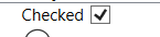
<CheckBox Content="Checked" FlowDirection="RightToLeft">
    <CheckBox.Resources>
        <Style TargetType="{x:Type Path}">
            <Setter Property="FlowDirection" Value="LeftToRight" />
        </Style>
    </CheckBox.Resources>
</CheckBox>
Result:
Solution 5 - .Net
Another way is to make a new custom style
<ResourceDictionary xmlns="http://schemas.microsoft.com/winfx/2006/xaml/presentation"
                    xmlns:Microsoft_Windows_Themes="clr-namespace:Microsoft.Windows.Themes;assembly=PresentationFramework.Aero"
                    xmlns:x="http://schemas.microsoft.com/winfx/2006/xaml">
  <SolidColorBrush Color="#F4F4F4"
                   x:Key="CheckBoxFillNormal" />
  <SolidColorBrush Color="#8E8F8F"
                   x:Key="CheckBoxStroke" />
  <Style x:Key="EmptyCheckBoxFocusVisual">
    <Setter Property="Control.Template">
      <Setter.Value>
        <ControlTemplate>
          <Rectangle Margin="1"
                     SnapsToDevicePixels="true"
                     Stroke="{DynamicResource {x:Static SystemColors.ControlTextBrushKey}}"
                     StrokeDashArray="1 2"
                     StrokeThickness="1" />
        </ControlTemplate>
      </Setter.Value>
    </Setter>
  </Style>
  <Style x:Key="CheckRadioFocusVisual">
    <Setter Property="Control.Template">
      <Setter.Value>
        <ControlTemplate>
          <Rectangle Margin="14,0,0,0"
                     SnapsToDevicePixels="true"
                     Stroke="{DynamicResource {x:Static SystemColors.ControlTextBrushKey}}"
                     StrokeDashArray="1 2"
                     StrokeThickness="1" />
        </ControlTemplate>
      </Setter.Value>
    </Setter>
  </Style>
  <Style TargetType="{x:Type CheckBox}"
         x:Key="ContentLeftCheckBoxStyle">
    <Setter Property="Foreground"
            Value="{DynamicResource {x:Static SystemColors.ControlTextBrushKey}}" />
    <Setter Property="Background"
            Value="{StaticResource CheckBoxFillNormal}" />
    <Setter Property="BorderBrush"
            Value="{StaticResource CheckBoxStroke}" />
    <Setter Property="BorderThickness"
            Value="1" />
    <Setter Property="FocusVisualStyle"
            Value="{StaticResource EmptyCheckBoxFocusVisual}" />
    <Setter Property="VerticalContentAlignment"
            Value="Center" />
    <Setter Property="Template">
      <Setter.Value>
        <ControlTemplate TargetType="{x:Type CheckBox}">
          <StackPanel Orientation="Horizontal">
            <ContentPresenter HorizontalAlignment="{TemplateBinding HorizontalContentAlignment}"
                              Margin="{TemplateBinding Padding}"
                              RecognizesAccessKey="True"
                              SnapsToDevicePixels="{TemplateBinding SnapsToDevicePixels}"
                              VerticalAlignment="{TemplateBinding VerticalContentAlignment}" />
            <BulletDecorator Background="Transparent"
                             SnapsToDevicePixels="true"
                             VerticalAlignment="{TemplateBinding VerticalContentAlignment}">
              <BulletDecorator.Bullet>
                <Microsoft_Windows_Themes:BulletChrome Background="{TemplateBinding Background}"
                                                       BorderBrush="{TemplateBinding BorderBrush}"
                                                       IsChecked="{TemplateBinding IsChecked}"
                                                       RenderMouseOver="{TemplateBinding IsMouseOver}"
                                                       RenderPressed="{TemplateBinding IsPressed}" />
              </BulletDecorator.Bullet>
            </BulletDecorator>
          </StackPanel>
          <ControlTemplate.Triggers>
            <Trigger Property="HasContent"
                     Value="true">
              <Setter Property="FocusVisualStyle"
                      Value="{StaticResource CheckRadioFocusVisual}" />
              <Setter Property="Padding"
                      Value="0,0,4,0" />
            </Trigger>
            <Trigger Property="IsEnabled"
                     Value="false">
              <Setter Property="Foreground"
                      Value="{DynamicResource {x:Static SystemColors.GrayTextBrushKey}}" />
            </Trigger>
          </ControlTemplate.Triggers>
        </ControlTemplate>
      </Setter.Value>
    </Setter>
  </Style>
</ResourceDictionary>
usage:
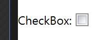
<CheckBox Style="{StaticResource ContentLeftCheckBoxStyle}" Content="CheckBox:" />
hope that helps!
Solution 6 - .Net
Another workaround, to avoid the subtle problems discussed above with flow direction and the large amount of code when defining an entirely new CheckBox style, is to just use a WrapPanel containing a Label (with the desired CheckBox content string) and a CheckBox (with no content string).
<WrapPanel>
    <Label Content="Checkbox content"/>
    <CheckBox VerticalAlignment="Center" Margin="5,0,0,0"/>
</WrapPanel>
Solution 7 - .Net
easiest way is to use a stack panel:
            <StackPanel Orientation="Horizontal">
                <TextBlock Text="Some Text"/>
                <CheckBox  />
            </StackPanel>
Solution 8 - .Net
You can edit the checkbox template and over there can place the textblock ahead of the rectangle