Table with fixed header and fixed column on pure css
HtmlCssHtml TableMarkupFixed Header-TablesHtml Problem Overview
I need to create a html table (or something similar looking) with a fixed header and a fixed first column.
Every solution I've seen so far uses Javascript or jQuery to set scrollTop/scrollLeft, but it doesn't work smoothly on mobile browsers, so I'm looking for a pure CSS solution.
I found a solution for a fixed column here: jsfiddle.net/C8Dtf/20/ but I don't know how I can enhance it to make the header fixed too.
I want it to work on webkit browsers or use some css3 features, but I repeat, I don't want to use Javascript for scrolling.
EDIT: This is example of the behaviour I want to achieve: https://web.archive.org/web/20130829032141/http://datatables.net/release-datatables/extras/FixedColumns/css_size.html
Html Solutions
Solution 1 - Html
A pure CSS solution with a fixed header row and first column
The position: sticky property supports both sticking to the top and to the side in modern versions of Chrome, Firefox, and Edge. This can be combined with a div that has the overflow: scroll property to give you a table with fixed headers that can be placed anywhere on your page.
Place your table in a container:
<div class="container">
  <table></table>
</div>
Use overflow: scroll on your container to enable scrolling:
div.container {
  overflow: scroll;
}
As Dagmar pointed out in the comments, the container also requires a max-width and a max-height.
Use position: sticky to have table cells stick to the edge and top, right, or left to choose which edge to stick to:
thead th {
  position: -webkit-sticky; /* for Safari */
  position: sticky;
  top: 0;
}

tbody th {
  position: -webkit-sticky; /* for Safari */
  position: sticky;
  left: 0;
}
As MarredCheese mentioned in the comments, if your first column contains <td> elements instead of <th> elements, you can use tbody td:first-child in your CSS instead of tbody th
To have the header in the first column stick to the left, use:
thead th:first-child {
  left: 0;
  z-index: 1;
}
/* Use overflow:scroll on your container to enable scrolling: */

div {
  max-width: 400px;
  max-height: 150px;
  overflow: scroll;
}


/* Use position: sticky to have it stick to the edge
 * and top, right, or left to choose which edge to stick to: */

thead th {
  position: -webkit-sticky; /* for Safari */
  position: sticky;
  top: 0;
}

tbody th {
  position: -webkit-sticky; /* for Safari */
  position: sticky;
  left: 0;
}


/* To have the header in the first column stick to the left: */

thead th:first-child {
  left: 0;
  z-index: 2;
}


/* Just to display it nicely: */

thead th {
  background: #000;
  color: #FFF;
  /* Ensure this stays above the emulated border right in tbody th {}: */
  z-index: 1;
}

tbody th {
  background: #FFF;
  border-right: 1px solid #CCC;
  /* Browsers tend to drop borders on sticky elements, so we emulate the border-right using a box-shadow to ensure it stays: */
  box-shadow: 1px 0 0 0 #ccc;
}

table {
  border-collapse: collapse;
}

td,
th {
  padding: 0.5em;
}
<div>
  <table>
    <thead>
      <tr>
        <th></th>
        <th>headheadhead</th>
        <th>headheadhead</th>
        <th>headheadhead</th>
        <th>headheadhead</th>
        <th>headheadhead</th>
        <th>headheadhead</th>
        <th>headheadhead</th>
      </tr>
    </thead>
    <tbody>
      <tr>
        <th>head</th>
        <td>body</td>
        <td>body</td>
        <td>body</td>
        <td>body</td>
        <td>body</td>
        <td>body</td>
        <td>body</td>
      </tr>
      <tr>
        <th>head</th>
        <td>body</td>
        <td>body</td>
        <td>body</td>
        <td>body</td>
        <td>body</td>
        <td>body</td>
        <td>body</td>
      </tr>
      <tr>
        <th>head</th>
        <td>body</td>
        <td>body</td>
        <td>body</td>
        <td>body</td>
        <td>body</td>
        <td>body</td>
        <td>body</td>
      </tr>
      <tr>
        <th>head</th>
        <td>body</td>
        <td>body</td>
        <td>body</td>
        <td>body</td>
        <td>body</td>
        <td>body</td>
        <td>body</td>
      </tr>
      <tr>
        <th>head</th>
        <td>body</td>
        <td>body</td>
        <td>body</td>
        <td>body</td>
        <td>body</td>
        <td>body</td>
        <td>body</td>
      </tr>
      <tr>
        <th>head</th>
        <td>body</td>
        <td>body</td>
        <td>body</td>
        <td>body</td>
        <td>body</td>
        <td>body</td>
        <td>body</td>
      </tr>
    </tbody>
  </table>
</div>
Solution 2 - Html
Nowadays, this is possible to achieve using CSS only with position: sticky property.
Here goes a snippet:
(jsFiddle: https://jsfiddle.net/hbqzdzdt/5/)
.grid-container {
  display: grid; /* This is a (hacky) way to make the .grid element size to fit its content */
  overflow: auto;
  height: 300px;
  width: 600px;
}
.grid {
  display: flex;
  flex-wrap: nowrap;
}
.grid-col {
  width: 150px;
  min-width: 150px;
}

.grid-item--header {
  height: 100px;
  min-height: 100px;
  position: sticky;
  position: -webkit-sticky;
  background: white;
  top: 0;
}

.grid-col--fixed-left {
  position: sticky;
  left: 0;
  z-index: 9998;
  background: white;
}
.grid-col--fixed-right {
  position: sticky;
  right: 0;
  z-index: 9998;
  background: white;
}

.grid-item {
  height: 50px;
  border: 1px solid gray;
}
<div class="grid-container">
  <div class="grid">
    <div class="grid-col grid-col--fixed-left">
      <div class="grid-item grid-item--header">
        <p>HEAD</p>
      </div>
      <div class="grid-item">
        <p>Hello</p>
      </div>
      <div class="grid-item">
        <p>Hello</p>
      </div>
      <div class="grid-item">
        <p>Hello</p>
      </div>
      <div class="grid-item">
        <p>Hello</p>
      </div>
      <div class="grid-item">
        <p>Hello</p>
      </div>
      <div class="grid-item">
        <p>Hello</p>
      </div>
      <div class="grid-item">
        <p>Hello</p>
      </div>
      <div class="grid-item">
        <p>Hello</p>
      </div>
      <div class="grid-item">
        <p>Hello</p>
      </div>
      <div class="grid-item">
        <p>Hello</p>
      </div>
    </div>

    <div class="grid-col">
      <div class="grid-item grid-item--header">
        <p>HEAD</p>
      </div>
      <div class="grid-item">
        <p>P</p>
      </div>
      <div class="grid-item">
        <p>P</p>
      </div>
      <div class="grid-item">
        <p>P</p>
      </div>
      <div class="grid-item">
        <p>P</p>
      </div>
      <div class="grid-item">
        <p>P</p>
      </div>
      <div class="grid-item">
        <p>P</p>
      </div>
      <div class="grid-item">
        <p>P</p>
      </div>
      <div class="grid-item">
        <p>P</p>
      </div>
      <div class="grid-item">
        <p>P</p>
      </div>
      <div class="grid-item">
        <p>P</p>
      </div>
    </div>

    <div class="grid-col grid-col--fixed-right">
      <div class="grid-item grid-item--header">
        <p>HEAD</p>
      </div>
      <div class="grid-item">
        <p>9</p>
      </div>
      <div class="grid-item">
        <p>9</p>
      </div>
      <div class="grid-item">
        <p>9</p>
      </div>
      <div class="grid-item">
        <p>9</p>
      </div>
      <div class="grid-item">
        <p>9</p>
      </div>
      <div class="grid-item">
        <p>9</p>
      </div>
      <div class="grid-item">
        <p>9</p>
      </div>
      <div class="grid-item">
        <p>9</p>
      </div>
      <div class="grid-item">
        <p>9</p>
      </div>
      <div class="grid-item">
        <p>9</p>
      </div>
    </div>

  </div>
</div>
Regarding compatibility. It works in all major browsers, but not in IE. There is a polyfill for position: sticky but I never tried it.
Solution 3 - Html
This is no easy feat.
The following link is to a working demo:
Link Updated according to lanoxx's comment
http://jsfiddle.net/C8Dtf/366/
Just remember to add these:
<script type="text/javascript" charset="utf-8" src="http://datatables.net/release-datatables/media/js/jquery.js"></script>
<script type="text/javascript" charset="utf-8" src="http://datatables.net/release-datatables/media/js/jquery.dataTables.js"></script>
<script type="text/javascript" charset="utf-8" src="http://datatables.net/release-datatables/extras/FixedColumns/media/js/FixedColumns.js"></script>
i don't see any other way of achieving this. Especially not by using css only.
This is a lot to go through. Hope this helps :)
Solution 4 - Html
All of these suggestions are great and all, but they're either only fixing either the header or a column, not both, or they're using javascript. The reason - it don't believe it can be done in pure CSS. The reason:
If it were possible to do it, you would need to nest several scrollable divs one inside the other, each with a scroll in a different direction. Then you would need to split your table into three parts - the fixed header, the fixed column and the rest of the data.
Fine. But now the problem - you can make one of them stay put when you scroll, but the other one is nested inside the scrolling area of first and is therefore subject to being scrolled out of sight itself, so can't be fixed in place on the screen. 'Ah-ha' you say 'but I can somehow use absolute or fixed position to do that' - no you can't. As soon as you do that you lose the ability to scroll that container. It's a chicken and egg situation - you can't have both, they cancel each other out.
I believe the only solution is through javascript. You need to completely seperate out the three elements and keep their positions in sync through javascript. There are good examples in other posts on this page. This one is also worth a look:
http://tympanus.net/codrops/2014/01/09/sticky-table-headers-columns/
Solution 5 - Html
I've made some changes in in jsfiddle. This might be what you're trying to do.
> http://jsfiddle.net/C8Dtf/81/
I have hardcoded the titles like so:
<table id="left_table" class="freeze_table">
    <tr class='tblTitle'>
         <th>Title 1</th>
         <th>Title 2</th>
    </tr>
</table>
And I added some styles as well.
.tblTitle{
   position:absolute;
    top:0px;
    margin-bottom:30px;
    background:lightblue;
}
td, th{
    padding:5px;
    height:40px;
    width:40px;
    font-size:14px;
}
Hope this is what you want :)
Solution 6 - Html
An example using only CSS:
.table {
  table-layout: fixed;
  width: 500px;
  border-collapse: collapse;
}

.header th {
  font-family: Calibri;
  font-size: small;
  font-weight: lighter;
  border-left: 1px solid #000;
  background: #d0d0d0;
}

.body_panel {
  display: inline-block;
  width: 520px;
  height: 300px;
  overflow-y: scroll;
}

.body tr {
  border-bottom: 1px solid #d0d0d0;
}

.body td {
  border-left: 1px solid #d0d0d0;
  padding-left: 3px;
  font-family: Calibri;
  font-size: small;
  overflow: hidden;
  white-space: nowrap;
  text-overflow: ellipsis;
}
<body>

  <table class="table">

    <thead class="header">

      <tr>
        <th style="width:20%;">teste</th>
        <th style="width:30%;">teste 2</th>
        <th style="width:50%;">teste 3</th>
      </tr>

    </thead>
  </table>

  <div class="body_panel">

    <table class="table">
      <tbody class="body">

        <tr>
          <td style="width:20%;">asbkj k kajsb ksb kabkb</td>
          <td style="width:30%;">2</td>
          <td style="width:50%;">3</td>
        </tr>

        <tr>
          <td style="width:20%;">2</td>
          <td style="width:30%;">2</td>
          <td style="width:50%;">3</td>
        </tr>

        <tr>
          <td style="width:20%;">2</td>
          <td style="width:30%;">2</td>
          <td style="width:50%;">3</td>
        </tr>

        <tr>
          <td style="width:20%;">2</td>
          <td style="width:30%;">2</td>
          <td style="width:50%;">3</td>
        </tr>

        <tr>
          <td style="width:20%;">2</td>
          <td style="width:30%;">2</td>
          <td style="width:50%;">3</td>
        </tr>

        <tr>
          <td style="width:20%;">2</td>
          <td style="width:30%;">2</td>
          <td style="width:50%;">3</td>
        </tr>

        <tr>
          <td style="width:20%;">2</td>
          <td style="width:30%;">2</td>
          <td style="width:50%;">3</td>
        </tr>

        <tr>
          <td style="width:20%;">2</td>
          <td style="width:30%;">2</td>
          <td style="width:50%;">3</td>
        </tr>

        <tr>
          <td style="width:20%;">2</td>
          <td style="width:30%;">2</td>
          <td style="width:50%;">3</td>
        </tr>

        <tr>
          <td style="width:20%;">2</td>
          <td style="width:30%;">2</td>
          <td style="width:50%;">3</td>
        </tr>

        <tr>
          <td style="width:20%;">2</td>
          <td style="width:30%;">2</td>
          <td style="width:50%;">3</td>
        </tr>

        <tr>
          <td style="width:20%;">2</td>
          <td style="width:30%;">2</td>
          <td style="width:50%;">3</td>
        </tr>

        <tr>
          <td style="width:20%;">2</td>
          <td style="width:30%;">2</td>
          <td style="width:50%;">3</td>
        </tr>

        <tr>
          <td style="width:20%;">2</td>
          <td style="width:30%;">2</td>
          <td style="width:50%;">3</td>
        </tr>

        <tr>
          <td style="width:20%;">2</td>
          <td style="width:30%;">2</td>
          <td style="width:50%;">3</td>
        </tr>

        <tr>
          <td style="width:20%;">2</td>
          <td style="width:30%;">2</td>
          <td style="width:50%;">3</td>
        </tr>

        <tr>
          <td style="width:20%;">2</td>
          <td style="width:30%;">2</td>
          <td style="width:50%;">3</td>
        </tr>

        <tr>
          <td style="width:20%;">2</td>
          <td style="width:30%;">2</td>
          <td style="width:50%;">3</td>
        </tr>

      </tbody>
    </table>

  </div>

</body>
Solution 7 - Html
To fix both Headers and Columns, you can use the following plugin:
Updated in July 2019
Recently is emerged also a pure CSS solution that is based on CSS property position: sticky; (here for more details about it) applied onto each TH item (instead of their parent container)
Solution 8 - Html
I found an excellent solution by Paul O'Brien for the issue and would like share the link: https://codepen.io/paulobrien/pen/LBrMxa
I removed style for footer:
html {
  box-sizing: border-box;
}
*,
*:before,
*:after {
  box-sizing: inherit;
}
.intro {
  max-width: 1280px;
  margin: 1em auto;
}
.table-scroll {
  position: relative;
  width:100%;
  z-index: 1;
  margin: auto;
  overflow: auto;
  height: 350px;
}
.table-scroll table {
  width: 100%;
  min-width: 1280px;
  margin: auto;
  border-collapse: separate;
  border-spacing: 0;
}
.table-wrap {
  position: relative;
}
.table-scroll th,
.table-scroll td {
  padding: 5px 10px;
  border: 1px solid #000;
}
.table-scroll thead th {
  position: -webkit-sticky;
  position: sticky;
  top: 0;
}

th:first-child {
  position: -webkit-sticky;
  position: sticky;
  left: 0;
  z-index: 2;
  background: #ccc;
}
thead th:first-child {
  z-index: 5;
}
Solution 9 - Html
I recently had to create a solution with a fixed header group and a fixed first column. I split my table into div's and used jquery to capture window scrolling.
http://jsfiddle.net/TinT/EzXub/2346/
var prevTop = 0;
var prevLeft = 0;

$(window).scroll(function(event){
  var currentTop = $(this).scrollTop();
  var currentLeft = $(this).scrollLeft();

  if(prevLeft !== currentLeft) {
  	prevLeft = currentLeft;
    $('.header').css({'left': -$(this).scrollLeft()})
  }
  if(prevTop !== currentTop) {
  	prevTop = currentTop;
    $('.leftCol').css({'top': -$(this).scrollTop() + 40})
  }
});
Solution 10 - Html
A co-worker and I have just released a new GitHub project that supplies an Angular directive that you can use to decorate your table with fixed headers: https://github.com/objectcomputing/FixedHeader
It relies on css and angular only, with a directive that adds some divs. There is no jQuery required.
This implementation isn't as fully-featured as some other implementations, but if your need is simply to add fixed tables, we think this might be a good option.
Solution 11 - Html
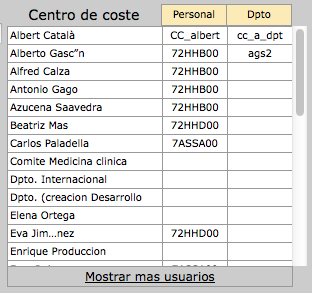
After two days fighting with Internet Explorer 9 + Chrome + Firefox (Windows) and Safari (Mac), I have found a system that is
- Compatible with all these browsers
- Without using javascript
- Using only une div and one table
- Fixed header and footer (Except for IE), with scrollable body. Header and body with same column widths
Result:
HTML:
  <thead>
    <tr>
      <th class="nombre"><%= f.label :cost_center %></th>
      <th class="cabecera cc">Personal</th>
      <th class="cabecera cc">Dpto</th>
    </tr>
  </thead>
  <tbody>
    <% @cost_centers.each do |cc| %>
    <tr>
      <td class="nombre"><%= cc.nombre_corto %></td>
      <td class="cc"><%= cc.cacentrocoste %></td>
      <td class="cc"><%= cc.cacentrocoste_dpto %></td>
    </tr>
    <% end %>
  </tbody>
  <tfoot>
    <tr>
      <td colspan="3"><a href="#">Mostrar mas usuarios</a></td>
    </tr>
  </tfoot>
</table>
CSS:
div.cost_center{
  width:320px;
  font-size:75%;
  margin-left:5px;
  margin-top:5px;
  margin-bottom: 2px;
  float: right;
  display: inline-block;
  overflow-y: auto;
  overflow-x: hidden;
  max-height:300px;
}

div.cost_center label {
  float:none;
  font-size:14px;
}

div.cost_center table{
  width:300px;
  border-collapse: collapse;
  float:right;
  table-layout:fixed;
}

div.cost_center table tr{
  height:16px;
}
div.cost_center th{
  font-weight:normal;
}

div.cost_center table tbody{
  display: block;
  overflow: auto;
  max-height:240px;
}

div.cost_center table thead{
  display:block;
}

div.cost_center table tfoot{
  display:block;
}
div.cost_center table tfoot td{
  width:280px;
}
div.cost_center .cc{
  width:60px;
  text-align: center;
  border: 1px solid #999;
}

div.cost_center .nombre{
  width:150px;
}
div.cost_center tbody .nombre{
  border: 1px solid #999;
}

div.cost_center table tfoot td{
 text-align:center;
 border: 1px solid #999;
}

div.cost_center table th,
div.cost_center table td {
  padding: 2px;
  vertical-align: middle;
}

div.cost_center table tbody td {
  white-space: normal;
  font:  .8em/1.4em Verdana, sans-serif;
  color: #000;
  background-color: white;
}
div.cost_center table th.cabecera {
  font:  0.8em/1.4em Verdana, sans-serif;
  color: #000;
  background-color: #FFEAB5;
}
Solution 12 - Html
The existing answers will suit most people, but for those who are looking to add shadows under the fixed header and to the right of the first (fixed) column, here's a working example (pure css):
http://jsbin.com/nayifepaxo/1/edit?html,output
The main trick in getting this to work is using ::after to add shadows to the right of each of the first td in each tr:
tr td:first-child:after {
  box-shadow: 15px 0 15px -15px rgba(0, 0, 0, 0.05) inset;
  content: "";
  position:absolute;
  top:0;
  bottom:0;
  right:-15px;
  width:15px;
}
Took me a while (too long...) to get it all working so I figured I'd share for those who are in a similar situation.
Solution 13 - Html
/* Use overflow:scroll on your container to enable scrolling: */

div {
  max-width: 400px;
  max-height: 150px;
  overflow: scroll;
}


/* Use position: sticky to have it stick to the edge
 * and top, right, or left to choose which edge to stick to: */

thead th {
  position: -webkit-sticky; /* for Safari */
  position: sticky;
  top: 0;
}

tbody th {
  position: -webkit-sticky; /* for Safari */
  position: sticky;
  left: 0;
}


/* To have the header in the first column stick to the left: */

thead th:first-child {
  left: 0;
  z-index: 1;
}


/* Just to display it nicely: */

thead th {
  background: #000;
  color: #FFF;
}

tbody th {
  background: #FFF;
  border-right: 1px solid #CCC;
}

table {
  border-collapse: collapse;
}

td,
th {
  padding: 0.5em;
}
<div>
  <table>
    <thead>
      <tr>
        <th></th>
        <th>headheadhead</th>
        <th>headheadhead</th>
        <th>headheadhead</th>
        <th>headheadhead</th>
        <th>headheadhead</th>
        <th>headheadhead</th>
        <th>headheadhead</th>
      </tr>
    </thead>
    <tbody>
      <tr>
        <th>head</th>
        <td>body</td>
        <td>body</td>
        <td>body</td>
        <td>body</td>
        <td>body</td>
        <td>body</td>
        <td>body</td>
      </tr>
      <tr>
        <th>head</th>
        <td>body</td>
        <td>body</td>
        <td>body</td>
        <td>body</td>
        <td>body</td>
        <td>body</td>
        <td>body</td>
      </tr>
      <tr>
        <th>head</th>
        <td>body</td>
        <td>body</td>
        <td>body</td>
        <td>body</td>
        <td>body</td>
        <td>body</td>
        <td>body</td>
      </tr>
      <tr>
        <th>head</th>
        <td>body</td>
        <td>body</td>
        <td>body</td>
        <td>body</td>
        <td>body</td>
        <td>body</td>
        <td>body</td>
      </tr>
      <tr>
        <th>head</th>
        <td>body</td>
        <td>body</td>
        <td>body</td>
        <td>body</td>
        <td>body</td>
        <td>body</td>
        <td>body</td>
      </tr>
      <tr>
        <th>head</th>
        <td>body</td>
        <td>body</td>
        <td>body</td>
        <td>body</td>
        <td>body</td>
        <td>body</td>
        <td>body</td>
      </tr>
    </tbody>
  </table>
</div>
need to fix header footer
Solution 14 - Html
Here's a solution I just made after getting a little confused. seems like some z-index properties need to be set to make this work right and my solution isn't flawless but it works for my application:
crux of the CSS (in SCSS) is setting the properties for the non-sticky elements first to establish the z-index properties.
.wrapper {
position: relative;
white-space: nowrap;
overflow: auto;
height: 200px;
table {
	border-collapse: collapse;
	tbody {
		tr {
			td {
				padding: .5em .75em;
				box-shadow: inset 0px -1px 0px 0px #000000;
				position: relative;
				z-index: -9999;
				background: white;
				&:first-of-type {
					position: -webkit-sticky;
					position: sticky;
					left: 0px;
					background: #eee;
					z-index: -999;
					box-shadow: inset -1px -1px 0px 0px #000000;
				}
			}
			&:first-of-type {
				position: sticky;
				top: 0;
				td {
					background: #eee;
					&:first-of-type {
						left: 0;
						top: 0;
						background: #eee;
						z-index: 999;
					}
				}
			}
			&:nth-of-type(2) {
				position: sticky;
				top: calc(1em + 1em + 2px);
				background: white;
				td:first-of-type {
					position: sticky;
					left: 0;
					z-index: 998;
				}
			}
		}
	}
}
}
Solution 15 - Html
Something like this may work for you... It will probably require you to have set column widths for your header row.
thead {
    position: fixed;
}
Update:
I am not convinced that the example you gave is possible with just CSS. I would love for someone to prove me wrong. Here is what I have so far. It is not the finished product but it could be a start for you. I hope this points you in a helpful direction, wherever that may be.
Solution 16 - Html
Another solution is to use AngularJS. The AngularUI module has a directive called ng-grid which supports a feature called column pinning. It is not 100% pure CSS but neither are the other solutions.
Solution 17 - Html
Pure CSS Example:
<div id="cntnr">
    <div class="tableHeader">
        <table class="table-header table table-striped table-bordered">
            <thead>
                <tr>
                    <th>this</th>
                    <th>transmission</th>
                    <th>is</th>
                    <th>coming</th>
                    <th>to</th>
                    <th>you</th>
                </tr>
            </thead>
            <tbody>
                <tr>
                    <td>we've got it...</td>
                    <td>alright you are go</td>
                    <td>uh, we see the Earth now</td>
                    <td>we've got it...</td>
                    <td>alright you are go</td>
                    <td>uh, we see the Earth now</td>
                </tr>
            </tbody>
        </table>
    </div>


    <div class="tableBody">
        <table class="table-body table table-striped table-bordered">
            <thead>
                <tr>
                    <th>this</th>
                    <th>transmission</th>
                    <th>is</th>
                    <th>coming</th>
                    <th>to</th>
                    <th>you</th>
                </tr>
            </thead>
            <tbody>
                <tr>
                    <td>we've got it...</td>
                    <td>alright you are go</td>
                    <td>uh, we see the Earth now</td>
                    <td>we've got it...</td>
                    <td>alright you are go</td>
                    <td>uh, we see the Earth now</td>
                </tr>
            </tbody>
        </table>
    </div>

</div>

#cntnr {
    width: auto;
    height: 200px;
    border: solid 1px #444;
    overflow: auto;
}

.tableHeader {
    position: fixed;
    height: 40px;
    overflow: hidden;
    margin-right: 18px;
    background: white;
}

.table-header tbody {
    height: 0;
    visibility: hidden;
}

.table-body thead {
    height: 0;
    visibility: hidden;
}
http://jsfiddle.net/cCarlson/L98m854d/
Drawback: The fixed header structure/logic is fairly dependent upon specific dimensions, so abstraction is probably not a viable option.
Solution 18 - Html
Position : sticky doesn't work for some elements like (thead) in chrome and other webkit browsers like safari.
But it works fine with (th)
body {
  background-color: rgba(0, 255, 200, 0.1);
}

.intro {
  color: rgb(228, 23, 23);
}

.wrapper {
  overflow-y: scroll;
  height: 300px;
}

.sticky {
  position: sticky;
  top: 0;
  color: black;
  background-color: white;
}
<div class="container intro">
  <h1>Sticky Table Header</h1>
  <p>Postion : sticky doesn't work for some elements like (thead) in chrome and other webkit browsers like safari. </p>
  <p>But it works fine with (th)</p>
</div>
<div class="container wrapper">
  <table class="table table-striped">
    <thead>
      <tr>
        <th class="sticky">Firstname</th>
        <th class="sticky">Lastname</th>
        <th class="sticky">Email</th>
      </tr>
    </thead>
    <tbody>
      <tr>
        <td>James</td>
        <td>Vince</td>
        <td>[email protected]</td>
      </tr>
      <tr>
        <td>Jonny</td>
        <td>Bairstow</td>
        <td>[email protected]</td>
      </tr>
      <tr>
        <td>James</td>
        <td>Anderson</td>
        <td>[email protected]</td>
      </tr>
      <tr>
        <td>Stuart</td>
        <td>Broad</td>
        <td>[email protected]</td>
      </tr>
      <tr>
        <td>Eoin</td>
        <td>Morgan</td>
        <td>[email protected]</td>
      </tr>
      <tr>
        <td>Joe</td>
        <td>Root</td>
        <td>[email protected]</td>
      </tr>
      <tr>
        <td>Chris</td>
        <td>Woakes</td>
        <td>[email protected]</td>
      </tr>
      <tr>
        <td>Liam</td>
        <td>PLunkett</td>
        <td>[email protected]</td>
      </tr>
      <tr>
        <td>Jason</td>
        <td>Roy</td>
        <td>[email protected]</td>
      </tr>
      <tr>
        <td>Alex</td>
        <td>Hales</td>
        <td>[email protected]</td>
      </tr>
      <tr>
        <td>Jos</td>
        <td>Buttler</td>
        <td>[email protected]</td>
      </tr>
      <tr>
        <td>Ben</td>
        <td>Stokes</td>
        <td>[email protected]</td>
      </tr>
      <tr>
        <td>Jofra</td>
        <td>Archer</td>
        <td>[email protected]</td>
      </tr>
      <tr>
        <td>Mitchell</td>
        <td>Starc</td>
        <td>[email protected]</td>
      </tr>
      <tr>
        <td>Aaron</td>
        <td>Finch</td>
        <td>[email protected]</td>
      </tr>
      <tr>
        <td>David</td>
        <td>Warner</td>
        <td>[email protected]</td>
      </tr>
      <tr>
        <td>Steve</td>
        <td>Smith</td>
        <td>[email protected]</td>
      </tr>
      <tr>
        <td>Glenn</td>
        <td>Maxwell</td>
        <td>[email protected]</td>
      </tr>
      <tr>
        <td>Marcus</td>
        <td>Stoinis</td>
        <td>[email protected]</td>
      </tr>
      <tr>
        <td>Alex</td>
        <td>Carey</td>
        <td>[email protected]</td>
      </tr>
      <tr>
        <td>Nathan</td>
        <td>Coulter Nile</td>
        <td>[email protected]</td>
      </tr>
      <tr>
        <td>Pat</td>
        <td>Cummins</td>
        <td>[email protected]</td>
      </tr>
      <tr>
        <td>Adam</td>
        <td>Zampa</td>
        <td>[email protected]</td>
      </tr>
    </tbody>
  </table>
</div>
Solution 19 - Html
Here is another solution I have just build with css grids based on the answers in here:
Solution 20 - Html
I think this will help you: https://datatables.net/release-datatables/extensions/FixedHeader/examples/header_footer.html
In a nutshell, if you know how to create a dataTable, You just need to add this jQuery line to your bottom:
$(document).ready(function() {
    var table = $('#example').DataTable();

    new $.fn.dataTable.FixedHeader( table, {
        bottom: true
    } );
} );
bottom: true // is for making the Bottom header fixed as well.
Solution 21 - Html
If you only want to use pure HTML and CSS i've got a solution for your problem:
In this jsFiddle you can see a non-script solution that provides a table with a fixed header.
It shouldn't be a problem to adapt the markup for a fixed first column as well.
You would just need to create a absolute-positioned table for the first column inside the hWrapper-div and reposition the vWrapper-div.
Providing dynamic content should not be a problem using server-side or browser-side tempting-engines, my solution works well in all modern browsers and older browsers from IE8 onwards.
Solution 22 - Html
Just need to change style as
<table style="position: relative;">
   <thead>
      <thead>
        <tr>
           <th></th>
        </tr>
      </thead>
   </thead>
   <tbody style="position: absolute;height: 300px;overflow:auto;">
      <tr>
         <td></td>
      </tr>
   </tbody>
</table>
Demo: https://plnkr.co/edit/Qxy5RMJBXmkaJAOjBtQn?p=preview</a>