Outlined Edit Text from Material Design
AndroidAndroid LayoutAndroid EdittextMaterial DesignAndroid TextinputlayoutAndroid Problem Overview
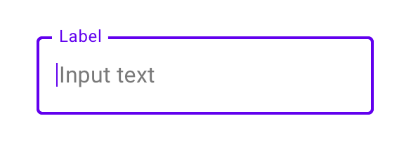
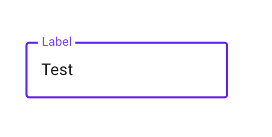
How can I implement an outlined text field (as shown on this material design page)?
Android Solutions
Solution 1 - Android
Read Outline Box .
> Outline text fields have a stroked border and are less emphasized. To > use an outline text field, apply the following style to your > TextInputLayout:
style="@style/Widget.MaterialComponents.TextInputLayout.OutlinedBox"
Dependencies
implementation 'com.android.support:design:28.0.0-alpha1'
XML
   <android.support.design.widget.TextInputLayout
   android:id="@+id/name_text_input"
   style="@style/Widget.MaterialComponents.TextInputLayout.OutlinedBox"
   android:layout_width="match_parent"
   android:layout_height="wrap_content"
   >

   <android.support.design.widget.TextInputEditText
       android:id="@+id/name_edit_text"
       android:layout_width="match_parent"
       android:layout_height="wrap_content"
       android:hint="@string/label_name" />
</android.support.design.widget.TextInputLayout>
FYI
Legacy support ended in Android 28 . Now onward use
implementation 'com.google.android.material:material:1.3.0'
Solution 2 - Android
UPDATE
Also working fine with
implementation 'com.android.support:appcompat-v7:28.0.0'
implementation 'com.android.support:design:28.0.0'
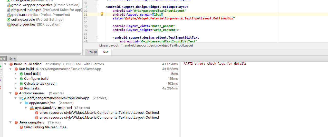
Using implementation 'com.android.support:design:28.0.0-alpha1' I'm getting below error
>Cannot resolve symbol '@style/Widget.MaterialComponents.TextInputLayout.OutlineBox'
Solution
Make below changes in your Build.Gradle
Use compileSdkVersion 28
Use targetSdkVersion 28
Use Below dependencies
implementation 'com.android.support:appcompat-v7:28.0.0-alpha3'
implementation 'com.android.support:design:28.0.0-alpha3'
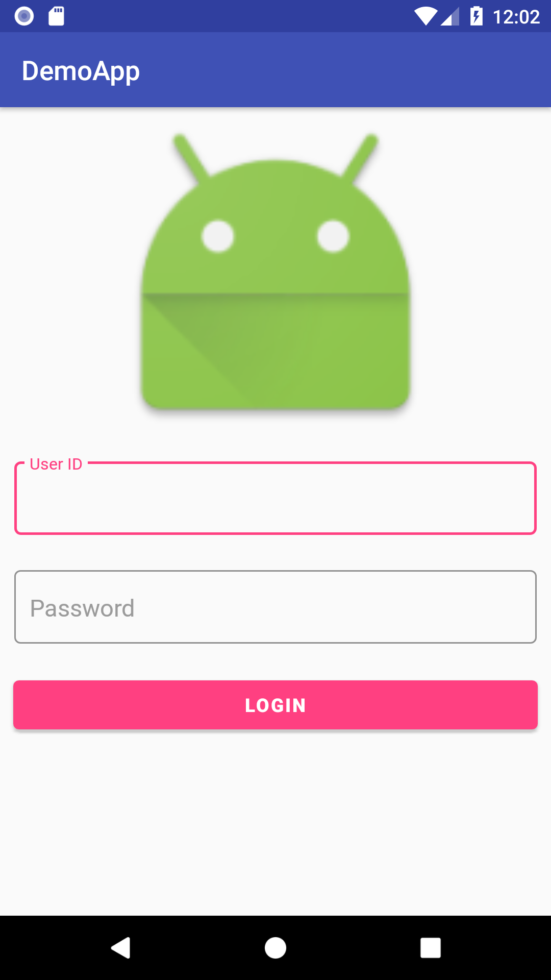
Sample code
<?xml version="1.0" encoding="utf-8"?>
<LinearLayout xmlns:android="http://schemas.android.com/apk/res/android"
    xmlns:tools="http://schemas.android.com/tools"
    android:id="@+id/activity_main"
    android:layout_width="match_parent"
    android:layout_height="match_parent"
    android:orientation="vertical"
    tools:context="com.example.dangarmahesh.demoapp.MainActivity">

    <ImageView
        android:layout_width="250dp"
        android:layout_gravity="center"
        android:src="@mipmap/ic_launcher"
        android:layout_height="250dp" />

    <android.support.design.widget.TextInputLayout
        android:id="@+id/userIDTextInputLayout"
        style="@style/Widget.MaterialComponents.TextInputLayout.OutlinedBox"
        android:layout_width="match_parent"

        android:layout_margin="10dp"
        android:layout_height="wrap_content">

        <android.support.design.widget.TextInputEditText
            android:id="@+id/userIDTextInputEditText"
            android:layout_width="match_parent"
            android:layout_height="wrap_content"
            android:hint="User ID" />
    </android.support.design.widget.TextInputLayout>

    <android.support.design.widget.TextInputLayout
        android:id="@+id/passwordTextInputLayout"
        android:layout_margin="10dp"
        style="@style/Widget.MaterialComponents.TextInputLayout.OutlinedBox"

        android:layout_width="match_parent"
        android:layout_height="wrap_content">

        <android.support.design.widget.TextInputEditText
            android:id="@+id/passwordTextInputEditText"
            android:layout_width="match_parent"
            android:layout_height="wrap_content"
            android:hint="Password" />

    </android.support.design.widget.TextInputLayout>


    <Button
        android:layout_width="match_parent"
        android:layout_margin="10dp"
        android:text="LOGIN"
        android:textStyle="bold"
        android:background="@color/colorPrimary"
        android:textColor="@android:color/white"
        android:layout_height="wrap_content" />
</LinearLayout>
OUTOUT
Solution 3 - Android
With the migration to androidx libraries you have to use the new Material Components for android library.
Use the TextInputLayout component:
<com.google.android.material.textfield.TextInputLayout
    android:layout_width="match_parent"
    android:layout_height="wrap_content"
    android:hint="@string/hint_text">

  <com.google.android.material.textfield.TextInputEditText
      android:layout_width="match_parent"
      android:layout_height="wrap_content"/>

</com.google.android.material.textfield.TextInputLayout>
And apply this style:
style="@style/Widget.MaterialComponents.TextInputLayout.OutlinedBox"
Requirements:
-
you have to add this dependencies in your
build.gradlefileimplementation 'com.google.android.material:material:<version>' -
apply a Material Components theme
<style name="Theme.MyApp" parent="Theme.MaterialComponents">
Solution 4 - Android
You need to add this dependency to your "module level" build.gradle com.google.android.material to use latest material UI components.
Use this style in your com.google.android.material.textfield.TextInputLayout then,
style="@style/Widget.MaterialComponents.TextInputLayout.OutlinedBox"
Checkout from here
> If you're using com.android.support:design library then you
> should change your app style to Theme.MaterialComponents...Bridge
> (I.e. like change style from Theme.AppCompat.Light to Theme.MaterialComponents.Light.Bridge)
>
> first,
>
> Next, you have to use this style in your
> android.support.design.widget.TextInputLayout:
>
> style="@style/Widget.MaterialComponents.TextInputLayout.OutlinedBox"
Solution 5 - Android
<com.google.android.material.textfield.TextInputLayout
    android:layout_width="300dp"
    style="@style/Widget.MaterialComponents.TextInputLayout.OutlinedBox"
    android:layout_gravity="center_horizontal"
    android:layout_height="wrap_content">
    <EditText
        android:layout_width="match_parent"
        android:layout_height="wrap_content"
        android:background="@null"
        android:hint="First Name"/>
 </com.google.android.material.textfield.TextInputLayout>
Solution 6 - Android
If you are using appcompact library then you can go with this android.support.design.widget.TextInputLayout
if you are using ANDROIDX build so I come to one conclusion who is having latest code according to android jetpack.
For using this you need to have this dependencies in your app gradle
dependencies {
    implementation 'com.google.android.material:material:1.0.0'
}
then this way you can add to your xml for the UI element
<com.google.android.material.textfield.TextInputLayout
    android:id="@+id/messageTextInputLayout"
    style="@style/Widget.MaterialComponents.TextInputLayout.OutlinedBox"
    android:layout_width="match_parent"
    android:layout_height="wrap_content"
    android:layout_margin="10dp">

        <com.google.android.material.textfield.TextInputEditText
            android:id="@+id/passwordTextInputEditText"
            android:layout_width="match_parent"
            android:layout_height="wrap_content"
            android:hint="Enter Text here" />

</com.google.android.material.textfield.TextInputLayout>
Solution 7 - Android
Using OutlinedTextField( with Jetpack Compose ) in android-
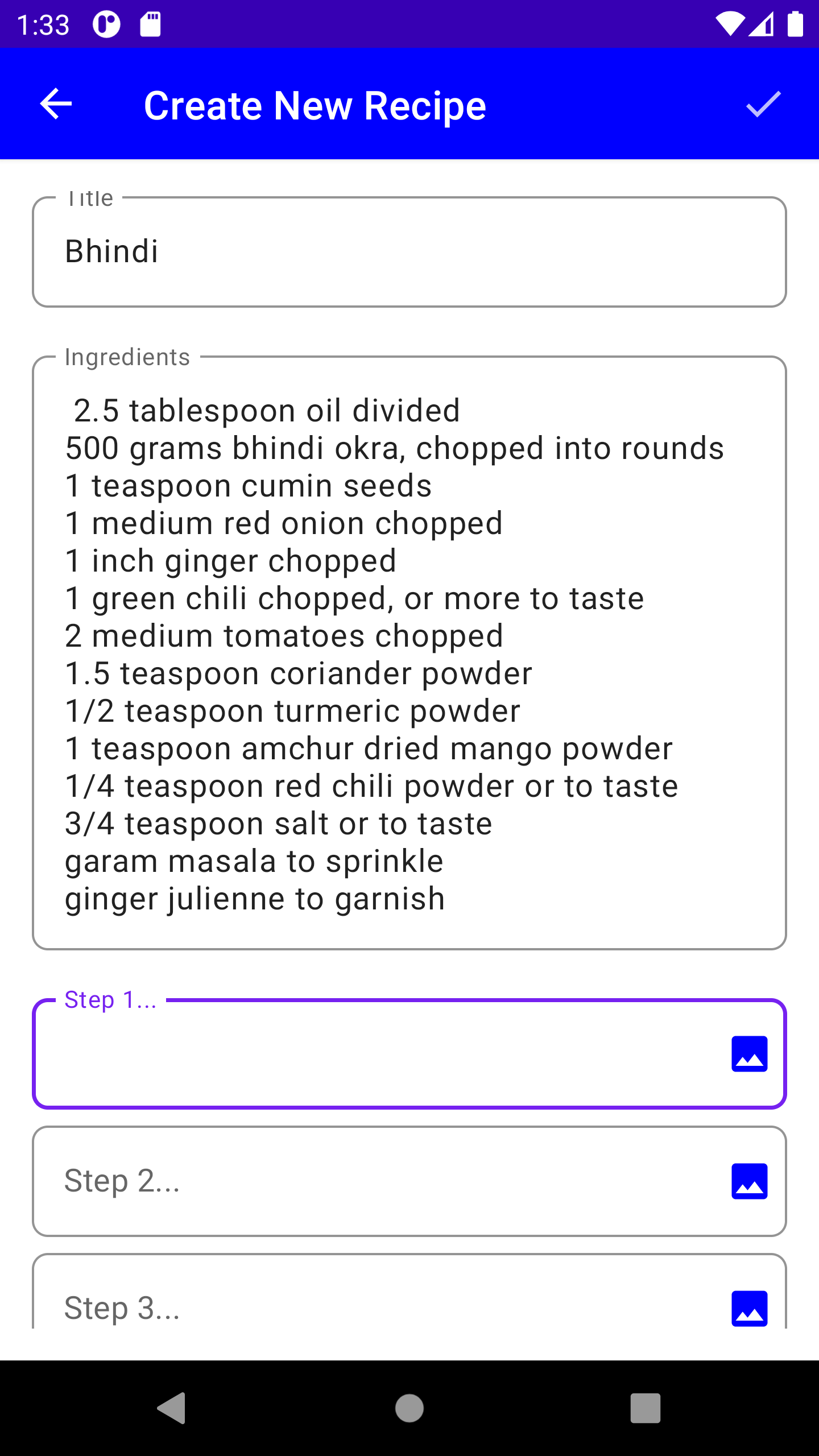
            OutlinedTextField(
                                    modifier = Modifier.fillMaxWidth(),
                                    value = textState.value,
                                    onValueChange = {
                                        textState.value = it
                                        viewModel.setSteps(stepNo.plus(1), it.text)
                                    },
                                    label = {
                                        Text(text = "Step ".plus(stepNo.plus(1)).plus("..."))
                                    },
                                    shape = RoundedCornerShape(8.dp),
                                    colors = TextFieldDefaults.textFieldColors(
                                        backgroundColor = Color.Transparent
                                    ),
                                    trailingIcon = {
                                            IconButton(onClick = {}) {
                                            Icon(
                                                modifier = Modifier.padding(start = 10.dp),
                                                imageVector = Icons.Filled.Image,
                                                tint = Color.Blue,
                                                contentDescription = "Select Image"
                                            )
                                        }
                                    }
                                )
Jetpack Compose Sample Codes- https://androidlearnersite.wordpress.com/2021/08/03/jetpack-compose-1-0-0-sample-codes/