MaterialComponents theme alert dialog buttons
AndroidMaterial DesignAndroid AlertdialogAndroid StylesMaterial Components-AndroidAndroid Problem Overview
Recently I switched from support library to com.google.android.material:material:1.0.0
But now I have a problem, in this pages there's a note https://github.com/material-components/material-components-android/blob/master/docs/getting-started.md
> Note: Using a Material Components theme enables a custom view inflater which replaces default components with their Material counterparts. Currently, this only replaces Button XML components with MaterialButton.
And the theme I am using
Theme.MaterialComponents.Light.NoActionBar
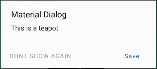
does exactly what it says in that note, it replaces AlertDialog Buttons to MaterialButtons but the problem is that by default MaterialButtons are colored background and now the buttons looks like this: 
How can I make them borderless and backgroundless again?
PS I am using alert builder to create alert dialogs:
android.app.AlertDialog.Builder
Android Solutions
Solution 1 - Android
I figured out what was causing this problem. I need to use different AlertDialog class:
androidx.appcompat.app.AlertDialog
When I switched to this everything started working as expected. Here's where I found the solution:
https://github.com/material-components/material-components-android/issues/162
Solution 2 - Android
When using com.google.android.material:material:1.0.0 and androidx.appcompat.app.AlertDialog you can customize each button in the buttonBar by using Widget.MaterialComponents.Button.TextButton as parent.
val builder: AlertDialog.Builder = AlertDialog.Builder(ContextThemeWrapper(context, R.style.AlertDialogTheme))
Use the default layout or add a custom by builder.setView(R.layout.my_dialog)
In your styles:
<style name="AlertDialogTheme" parent="Theme.MaterialComponents.Light.Dialog.Alert">
    <item name="buttonBarPositiveButtonStyle">@style/Alert.Button.Positive</item>
    <item name="buttonBarNegativeButtonStyle">@style/Alert.Button.Neutral</item>
    <item name="buttonBarNeutralButtonStyle">@style/Alert.Button.Neutral</item>
</style>

<style name="Alert.Button.Positive" parent="Widget.MaterialComponents.Button.TextButton">
    <item name="backgroundTint">@color/transparent</item>
    <item name="rippleColor">@color/colorAccent</item>
    <item name="android:textColor">@color/colorPrimary</item>
    <item name="android:textSize">14sp</item>
    <item name="android:textAllCaps">false</item>
</style>

<style name="Alert.Button.Neutral" parent="Widget.MaterialComponents.Button.TextButton">
    <item name="backgroundTint">@color/transparent</item>
    <item name="rippleColor">@color/colorAccent</item>
    <item name="android:textColor">@color/gray_dark</item>
    <item name="android:textSize">14sp</item>
</style>
Solution 3 - Android
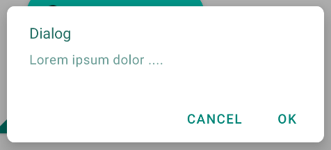
If you are using the Material Components library the best way to have an AlertDialog is to use the MaterialAlertDialogBuilder.
new MaterialAlertDialogBuilder(context)
            .setTitle("Dialog")
            .setMessage("Lorem ipsum dolor ....")
            .setPositiveButton("Ok", /* listener = */ null)
            .setNegativeButton("Cancel", /* listener = */ null)
            .show();
It is the default result:
If you want also to apply a different style or color to the buttons you can check this answer.
Solution 4 - Android
First, it's better to use use MaterialAlertDialog if you are using Material Theme.
You can read more here – Material.io → Theming dialogs

MaterialAlertDialogBuilder(context)
            .setTitle(R.string.confirm)
            .setMessage(R.string.logout)
            .setPositiveButton(R.string.logout_alert_positive) { _, _ -> activity?.logout() }
            .setNegativeButton(R.string.never_mind, null)
            .show()
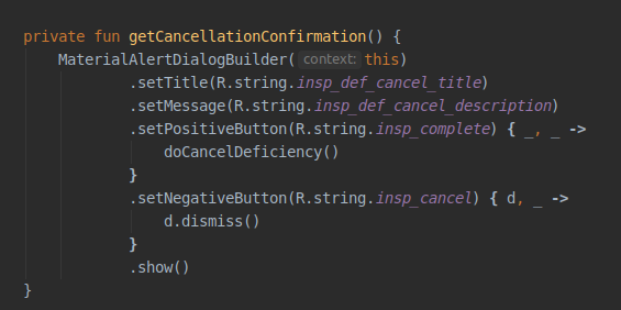
This is the layout.xml of the MaterialAlertDialog actions. As you can see there are 3 buttons and each has their own styles. So, here is how you can change them.
Step 1: Tell Android that you want to alter the default MaterialAlertDialog theme.
<style name="Base.AppTheme" parent="Theme.MaterialComponents.DayNight.NoActionBar">
    ...
    <item name="materialAlertDialogTheme">@style/AlertDialog</item>
    ...
</style>
Step 2: Tell Android that you want to alter a specific button style. buttonBarNeutralButtonStyle, buttonBarNegativeButtonStyle or buttonBarPositiveButtonStyle
<style name="AlertDialog" parent="ThemeOverlay.MaterialComponents.MaterialAlertDialog">
    <item name="buttonBarNegativeButtonStyle">@style/NegativeButtonStyle</item>
</style>
Step 3: Define your custom style
<style name="NegativeButtonStyle" parent="Widget.MaterialComponents.Button.TextButton">
    <item name="android:textColor">#FF0000</item>
</style>
Solution 5 - Android
I tested the above answers. Although I got a good idea, none worked for my case. So, this is my answer.
-
Make sure to have
android:theme="@style/AppMaterialTheme"in your manifest file under Application or Activity. -
Open your Styles.xml file and change it based on the following.
<style name="AppMaterialTheme" parent="Theme.MaterialComponents.DayNight.NoActionBar"> <item name="colorPrimary">@color/primaryBlue</item> <item name="colorPrimaryDark">@color/primaryBlue</item> <item name="colorAccent">@color/colorAccent</item> <item name="colorControlActivated">@color/primaryBlue</item> <item name="colorControlHighlight">@color/colorAccent_main</item> <item name="colorButtonNormal">@color/white</item> <item name="materialAlertDialogTheme">@style/AlertDialogMaterialTheme</item> </style> <style name="AlertDialogMaterialTheme" parent="ThemeOverlay.MaterialComponents.MaterialAlertDialog"> <item name="buttonBarPositiveButtonStyle">@style/Alert.Button.Positive</item> <item name="buttonBarNegativeButtonStyle">@style/Alert.Button.Negative</item> </style> <style name="Alert.Button.Positive" parent="Widget.MaterialComponents.Button.UnelevatedButton"> <item name="android:fillColor">@color/color_0054BB</item> <item name="android:textColor">@color/white</item> <item name="android:textAllCaps">false</item> <item name="android:textSize">14sp</item> <item name="rippleColor">@color/colorAccent_main</item> </style> <style name="Alert.Button.Negative" parent="Widget.MaterialComponents.Button.OutlinedButton"> <item name="strokeColor">@color/color_0054BB</item> <item name="android:textColor">@color/color_0054BB</item> <item name="android:textAllCaps">false</item> <item name="android:textSize">14sp</item> <item name="android:layout_marginEnd">8dp</item> <item name="rippleColor">@color/colorAccent_main</item> </style> -
You won't need to apply the theme to your AlertDialog as your Activity applies the theme to it. So, create the dialog normally.
The result will be.
Solution 6 - Android
Found another solution for this with using MaterialComponents here: https://issuetracker.google.com/issues/116861837#comment9
<style name="Theme.Custom.Material.Alert.Dialog.Light" parent="Theme.MaterialComponents.Light.Dialog.Alert">
    <item name="materialButtonStyle">@style/Widget.AppCompat.Button.Borderless</item>
</style>

<style name="Theme.Custom.Material.Base.Light" parent="Theme.MaterialComponents.Light.NoActionBar">
    <item name="android:dialogTheme">@style/Theme.Custom.Material.Alert.Dialog.Light</item>
    <item name="android:alertDialogTheme">@style/Theme.Custom.Material.Alert.Dialog.Light</item>
  ....
</style>
Though it is still not "intended behavior" to me.
Solution 7 - Android
If you don't want to use androidx.appcompat.app.AlertDialog, you can just redefine the style of the dialog buttons:
In your style.xml :
<style name="AppTheme" parent="Theme.MaterialComponents.Light.NoActionBar">
   ...
   <item name="android:buttonBarButtonStyle">@style/DialogButton</item>
   ...
</style>

<style name="DialogButton" parent="Widget.MaterialComponents.Button.TextButton"/>
Solution 8 - Android
If you are using the com.android.support:design:28.0.0 library, using android.support.v7.app.AlertDialog works as expected.