Is it possible to see which srcset image a browser is using with browser developer tools
HtmlCssResponsive DesignDeveloper ToolsSrcsetHtml Problem Overview
I've been trying to see which srcset image my browser is using via the browsers developer tools, but apart from using the network tab to see which image it fetches i can't tell.
Using the network tab would usually be fine, but sometimes I've noticed that it will fetch 2 image versions at different sizes, this would happen if one break point is at 600 and another at 900 and the browser was currently at 750px wide.
(Ive tried this both on Chrome & FireFox, and it seems chrome will pull down both images in certain cases, but FireFox seems to only ever pull down one)
The reason I want to know is I'm interested if it pulls down two image srcset dose it swap between them automatically as i scale the browser window ? This is can't tell as by inspecting the element it just gives the raw html of the img element, not the actual img srcset option its using.
Html Solutions
Solution 1 - Html
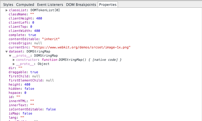
The image has a property currentSrc, you can log it or inspect it with several tools:
- In chrome developer tools inspect the element, then click the properties tab.
- In Firefox developer tools inspect the element, right click and select DOM from the context menu.
You will see an entry for currentSrc: with the actual image source.
Solution 2 - Html
I had problems with this today and I found that you can monitor the variable:
- Show the console drawer (You can do it pressing ESC too)
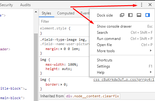
- Create live expression (I created 2, the currentSrc of the selected element and the innerWidth)
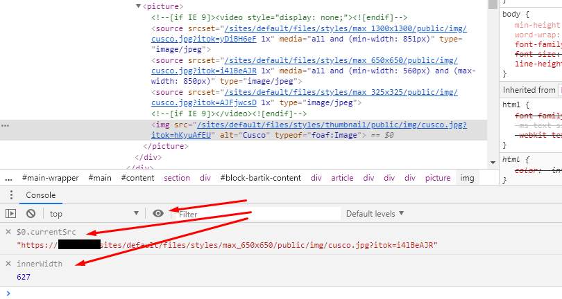
The live expression watches the current srcset of the img tag selected. It works with the img inside the picture tag too.
Solution 3 - Html
OK, go to inspect element in chrome. Click on the network tab, then refresh the page.
It will show you the images that are being loaded, the time they take and the size.
Solution 4 - Html
Came upon this with the same question. My simple solution was to just right click image and 'Open Image on New Tab / Window'.
Fast and easy solution and you can see what image is loaded at different break points.
Solution 5 - Html
I was wondering that too. I think I figured that out without using any developer tools.
To check I simply did a right-click and save-as to see what file name was filled in (and if it matched my high-res image or the low-res one.)
The answer to part of your question was No, not all browsers automatically swap between different srcset image sources when your resize the browser. I checked in August, 2018 with several different Windows desktop browsers. Some responded differently, but most did not swap the image unless you also hit refresh after.
I did not directly investigate which images were actually being downloaded or if more than one were at a time. I only tested which image was actually displayed and if that image changed on browser resize. I made assumptions based on the results, which may or may not be 100% true, but seemed like a quick and dirty good start.