How to make flutter app responsive according to different screen size?
FlutterDartResponsive DesignScreenResponsiveFlutter Problem Overview
I am facing difficulties to make it responsive according to various screen sizes. How to make it responsive?
@override
       Widget build(BuildContext context) {
       return new Container(
       decoration: new BoxDecoration(color: Colors.white),
       child: new Stack(
        children: [
          new Padding(
            padding: const EdgeInsets.only(bottom: 350.0),
            child: new GradientAppBar(" "),
          ),
          new Positioned(
            bottom: 150.0,
            height: 260.0,
            left: 10.0,
            right: 10.0,
            child: new Padding(
              padding: new EdgeInsets.all(10.0),
              child: new Card(
                child: new Column(
                  mainAxisSize: MainAxisSize.min,
                  children: <Widget>[
                    const ListTile(
                      title: const Text(
                        'LOGIN',
                        textAlign: TextAlign.center,
                        style: const TextStyle(
                          fontSize: 16.50,
                          fontFamily: "Helvetica",
                          fontWeight: FontWeight.bold,
                          color: Colors.black87,
                          letterSpacing: 1.00,
                        ),
                      ),
                    ),
                    new ListTile(
                      leading: const Icon(Icons.person),
                      title: new TextField(
                        controller: _user1,
                        decoration: new InputDecoration(
                            labelText: '     Enter a username'),
                      ),
                    ),
                    new ListTile(
                      leading: const Icon(Icons.person_pin),
                      title: new TextField(
                        controller: _pass1,
                        decoration: new InputDecoration(
                            labelText: '     Enter a password'),
                        obscureText: true,
                      ),
                    ),
                  ],
                ),
              ),
            ),
          ),
          new Positioned(
            bottom: 70.0,
            left: 15.0,
            right: 05.0,
            child: new ButtonTheme.bar(
            // make buttons use the appropriate styles for cards
              child: new ButtonBar(
                children: <Widget>[
                  new FlatButton(
                    padding: new EdgeInsets.only(right: 13.0),
                    child: new Text(
                      'REGISTER HERE',
                      style: new TextStyle(
                          color: Colors.black87,
                          fontFamily: "Helvetica",
                          fontSize: 15.00,
                          fontWeight: FontWeight.bold),
                    ),
                    onPressed: () {
                      Navigator.of(context).pushNamed('/facebook');
                    },
                  ),
                  new FlatButton(
                    padding: new EdgeInsets.only(right: 22.0),
                    child: new Text(
                      'FORGOT PASSWORD?',
                      style: new TextStyle(
                          color: Colors.black87,
                          fontFamily: "Helvetica",
                          fontSize: 15.00,
                          fontWeight: FontWeight.bold),
                    ),
                    onPressed: () {
                      Navigator.of(context).pushNamed('/Forgot');
                    },
                  ),
                ],
              ),
            ),
          ),
          new Positioned(
            bottom: 73.0,
            height: 180.0,
            left: 20.0,
            right: 52.0,
            child: new Padding(
              padding: new EdgeInsets.all(0.00),
              child: new ButtonTheme(
                minWidth: 10.0,
                height: 20.0,
                padding: new EdgeInsets.only(right: 37.0),
                child: new ButtonBar(children: <Widget>[
                  new CupertinoButton(
                      borderRadius:
                          const BorderRadius.all(const Radius.circular(36.0)),
                      padding: new EdgeInsets.only(left: 70.0),
                      color: const Color(0xFF426DB7),
                      child: new Text(
                        "     LOGIN                            ",
                        style: new TextStyle(
                            color: Colors.white,
                            fontSize: 12.50,
                            fontFamily: "Handwriting",
                            fontWeight: FontWeight.w500,
                            letterSpacing: 0.00),
                      ),
                      onPressed: () {})
                ]),
              ),
            ),
          ),
        ],
      ),
    );
  }
}
Flutter Solutions
Solution 1 - Flutter
Using MediaQuery class:
MediaQueryData queryData;
queryData = MediaQuery.of(context);
> MediaQuery: Establishes a subtree in which media queries resolve > to the given data. > > MediaQueryData: Information about a piece of media (e.g., a > window).
To get Device Pixel Ratio:
queryData.devicePixelRatio
To get width and height of the device screen:
queryData.size.width
queryData.size.height
To get text scale factor:
queryData.textScaleFactor
Using AspectRatio class:
From doc:
> A widget that attempts to size the child to a specific aspect ratio. > > The widget first tries the largest width permitted by the layout > constraints. The height of the widget is determined by applying the > given aspect ratio to the width, expressed as a ratio of width to > height. > > For example, a 16:9 width:height aspect ratio would have a value of > 16.0/9.0. If the maximum width is infinite, the initial width is determined by applying the aspect ratio to the maximum height. > > Now consider a second example, this time with an aspect ratio of 2.0 > and layout constraints that require the width to be between 0.0 and > 100.0 and the height to be between 0.0 and 100.0. We'll select a width of 100.0 (the biggest allowed) and a height of 50.0 (to match the > aspect ratio).
//example
new Center(
 child: new AspectRatio(
  aspectRatio: 100 / 100,
  child: new Container(
    decoration: new BoxDecoration(
      shape: BoxShape.rectangle,
      color: Colors.orange,
      )
    ),
  ),
),
Solution 2 - Flutter
This class will help and then initialize the class with the init method.
import 'package:flutter/widgets.dart';
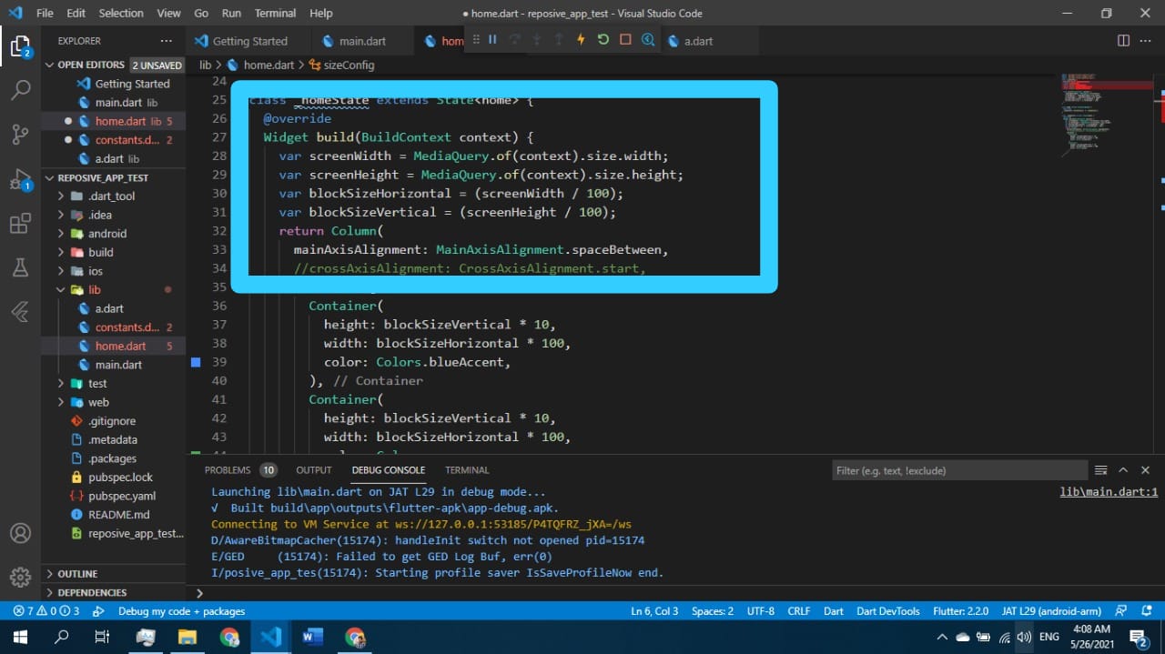
class SizeConfig {
static MediaQueryData _mediaQueryData;
static double screenWidth;
static double screenHeight;
static double blockSizeHorizontal;
static double blockSizeVertical;
static double _safeAreaHorizontal;
static double _safeAreaVertical;
static double safeBlockHorizontal;
static double safeBlockVertical;
void init(BuildContext context){
_mediaQueryData = MediaQuery.of(context);
screenWidth = _mediaQueryData.size.width;
screenHeight = _mediaQueryData.size.height;
blockSizeHorizontal = screenWidth/100;
blockSizeVertical = screenHeight/100;
_safeAreaHorizontal = _mediaQueryData.padding.left +
_mediaQueryData.padding.right;
_safeAreaVertical = _mediaQueryData.padding.top +
_mediaQueryData.padding.bottom;
safeBlockHorizontal = (screenWidth - _safeAreaHorizontal)/100;
safeBlockVertical = (screenHeight - _safeAreaVertical)/100;
}
}
then in your widgets dimension do this
Widget build(BuildContext context) {
    SizeConfig().init(context);
    return Container(
    height: SizeConfig.safeBlockVertical * 10, //10 for example
    width: SizeConfig.safeBlockHorizontal * 10, //10 for example
    );}
All the credits to this post author: https://medium.com/flutter-community/flutter-effectively-scale-ui-according-to-different-screen-sizes-2cb7c115ea0a
Solution 3 - Flutter
Easiest way to make responsive UI for different screen size is Sizer plugin.
Make responsive UI in any screen size device also tablet. Check it this plugin ⬇️
https://pub.dev/packages/sizer
.h  - for widget height
.w  - for widget width
.sp - for font size
Use .h, .w, .sp after value like this ⬇️
Example:
Container(
  height: 10.0.h,  //10% of screen height
  width: 80.0.w,   //80% of screen width
  child: Text('Sizer', style: TextStyle(fontSize: 12.0.sp)),
);
I have build many responsive App with this plugin.
Solution 4 - Flutter
What i do is to take screen width and height and calculate a grid of 100*100 out of it to position and scale things and save it as static variables that can be reused. Works quite good in most cases. Like this:
AppConfig.width = MediaQuery.of(context).size.width;
AppConfig.height = MediaQuery.of(context).size.height;
AppConfig.blockSize = AppConfig.width / 100;
AppConfig.blockSizeVertical = AppConfig.height / 100;
Then i scale everything according to these values, like this:
double elementWidth = AppConfig.blockSize * 10.0; // 10% of the screen width
or
double fontSize = AppConfig.blockSize * 1.2;
Sometimes the safe area (notch, etc) kills a layout, so you can consider this, too:
AppConfig.safeAreaHorizontal = MediaQuery.of(context).padding.left +
    MediaQuery.of(context).padding.right;

double screenWidthWithoutSafeArea = AppConfig.width - AppConfig.safeAreaHorizontal;
This worked great on some recent projects.
Solution 5 - Flutter
Check MediaQuery class
> For example, to learn the size of the current media (e.g., the window containing your app), you can read the MediaQueryData.size property from the MediaQueryData returned by MediaQuery.of: MediaQuery.of(context).size.
So you can do the following:
 new Container(
                      height: MediaQuery.of(context).size.height/2,
..            )
Solution 6 - Flutter
You can take a percentage of the width or height as input for scale size.
fontSize: MediaQuery.of(_ctxt).size.height * 0.065
Where the multiplier at the end has a value that makes the Text look good for the active emulator.
Below is how I set it up so all the scaled dimensions are centralized in one place. This way you can adjust them easily and quickly rerun with Hot Reload without having to look for the Media.of() calls throughout the code.
- Create the file to store all the mappings appScale.dart
    class AppScale {
      BuildContext _ctxt;

      AppScale(this._ctxt);

      double get labelDim => scaledWidth(.04);
      double get popupMenuButton => scaledHeight(.065);

      double scaledWidth(double widthScale) {
        return MediaQuery.of(_ctxt).size.width * widthScale;
      }

      double scaledHeight(double heightScale) {
        return MediaQuery.of(_ctxt).size.height * heightScale;
      }
    }
- Then reference that where ever you need the scaled value
    AppScale _scale = AppScale(context);

    // ...

    Widget label1 = Text(
      "Some Label",
      style: TextStyle(fontSize: _scale.labelDim),
    );
Thanks to answers in this post
Solution 7 - Flutter
After much research and testing, I have developed a solution for an app I'm currently converting from Android/iOS to Flutter.
With Android and iOS I used a 'Scaling Factor' applied to base font sizes, rendering text sizes that were relative to the screen size.
This article was very helpful: https://medium.com/flutter-community/flutter-effectively-scale-ui-according-to-different-screen-sizes-2cb7c115ea0a
I created a StatelessWidget to get the font sizes of the Material Design typographical styles. Getting device dimensions using MediaQuery, calculating a scaling factor, then resetting the Material Design text sizes. The Widget can be used to define a custom Material Design Theme.
Emulators used:
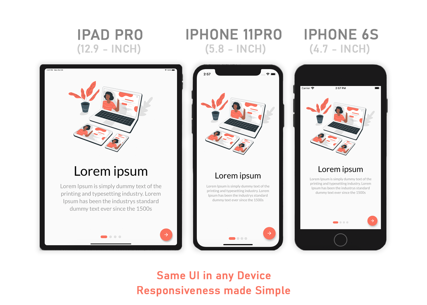
- Pixel C - 9.94" Tablet
- Pixel 3 - 5.46" Phone
- iPhone 11 Pro Max - 5.8" Phone
set_app_theme.dart (SetAppTheme Widget)
import 'package:flutter/material.dart';
import 'dart:math';

class SetAppTheme extends StatelessWidget {

  final Widget child;

  SetAppTheme({this.child});

  @override
  Widget build(BuildContext context) {

    final _divisor = 400.0;

    final MediaQueryData _mediaQueryData = MediaQuery.of(context);

    final _screenWidth = _mediaQueryData.size.width;
    final _factorHorizontal = _screenWidth / _divisor;

    final _screenHeight = _mediaQueryData.size.height;
    final _factorVertical = _screenHeight / _divisor;

    final _textScalingFactor = min(_factorVertical, _factorHorizontal);

    final _safeAreaHorizontal = _mediaQueryData.padding.left + _mediaQueryData.padding.right;
    final _safeFactorHorizontal = (_screenWidth - _safeAreaHorizontal) / _divisor;

    final _safeAreaVertical = _mediaQueryData.padding.top + _mediaQueryData.padding.bottom;
    final _safeFactorVertical = (_screenHeight - _safeAreaVertical) / _divisor;

    final _safeAreaTextScalingFactor = min(_safeFactorHorizontal, _safeFactorHorizontal);

    print('Screen Scaling Values:' + '_screenWidth: $_screenWidth');
    print('Screen Scaling Values:' + '_factorHorizontal: $_factorHorizontal ');

    print('Screen Scaling Values:' + '_screenHeight: $_screenHeight');
    print('Screen Scaling Values:' + '_factorVertical: $_factorVertical ');

    print('_textScalingFactor: $_textScalingFactor ');

    print('Screen Scaling Values:' + '_safeAreaHorizontal: $_safeAreaHorizontal ');
    print('Screen Scaling Values:' + '_safeFactorHorizontal: $_safeFactorHorizontal ');

    print('Screen Scaling Values:' + '_safeAreaVertical: $_safeAreaVertical ');
    print('Screen Scaling Values:' + '_safeFactorVertical: $_safeFactorVertical ');

    print('_safeAreaTextScalingFactor: $_safeAreaTextScalingFactor ');

    print('Default Material Design Text Themes');
    print('display4: ${Theme.of(context).textTheme.display4}');
    print('display3: ${Theme.of(context).textTheme.display3}');
    print('display2: ${Theme.of(context).textTheme.display2}');
    print('display1: ${Theme.of(context).textTheme.display1}');
    print('headline: ${Theme.of(context).textTheme.headline}');
    print('title: ${Theme.of(context).textTheme.title}');
    print('subtitle: ${Theme.of(context).textTheme.subtitle}');
    print('body2: ${Theme.of(context).textTheme.body2}');
    print('body1: ${Theme.of(context).textTheme.body1}');
    print('caption: ${Theme.of(context).textTheme.caption}');
    print('button: ${Theme.of(context).textTheme.button}');

    TextScalingFactors _textScalingFactors = TextScalingFactors(
        display4ScaledSize: (Theme.of(context).textTheme.display4.fontSize * _safeAreaTextScalingFactor),
        display3ScaledSize: (Theme.of(context).textTheme.display3.fontSize * _safeAreaTextScalingFactor),
        display2ScaledSize: (Theme.of(context).textTheme.display2.fontSize * _safeAreaTextScalingFactor),
        display1ScaledSize: (Theme.of(context).textTheme.display1.fontSize * _safeAreaTextScalingFactor),
        headlineScaledSize: (Theme.of(context).textTheme.headline.fontSize * _safeAreaTextScalingFactor),
        titleScaledSize: (Theme.of(context).textTheme.title.fontSize * _safeAreaTextScalingFactor),
        subtitleScaledSize: (Theme.of(context).textTheme.subtitle.fontSize * _safeAreaTextScalingFactor),
        body2ScaledSize: (Theme.of(context).textTheme.body2.fontSize * _safeAreaTextScalingFactor),
        body1ScaledSize: (Theme.of(context).textTheme.body1.fontSize * _safeAreaTextScalingFactor),
        captionScaledSize: (Theme.of(context).textTheme.caption.fontSize * _safeAreaTextScalingFactor),
        buttonScaledSize: (Theme.of(context).textTheme.button.fontSize * _safeAreaTextScalingFactor));

    return Theme(
      child: child,
      data: _buildAppTheme(_textScalingFactors),
    );
  }
}

final ThemeData customTheme = ThemeData(
  primarySwatch: appColorSwatch,
  // fontFamily: x,
);

final MaterialColor appColorSwatch = MaterialColor(0xFF3787AD, appSwatchColors);

Map<int, Color> appSwatchColors =
{
  50  : Color(0xFFE3F5F8),
  100 : Color(0xFFB8E4ED),
  200 : Color(0xFF8DD3E3),
  300 : Color(0xFF6BC1D8),
  400 : Color(0xFF56B4D2),
  500 : Color(0xFF48A8CD),
  600 : Color(0xFF419ABF),
  700 : Color(0xFF3787AD),
  800 : Color(0xFF337799),
  900 : Color(0xFF285877),
};

_buildAppTheme (TextScalingFactors textScalingFactors) {

  return customTheme.copyWith(

    accentColor: appColorSwatch[300],
    buttonTheme: customTheme.buttonTheme.copyWith(buttonColor: Colors.grey[500],),
    cardColor: Colors.white,
    errorColor: Colors.red,
    inputDecorationTheme: InputDecorationTheme(border: OutlineInputBorder(),),
    primaryColor: appColorSwatch[700],
    primaryIconTheme: customTheme.iconTheme.copyWith(color: appColorSwatch),
    scaffoldBackgroundColor: Colors.grey[100],
    textSelectionColor: appColorSwatch[300],
    textTheme: _buildAppTextTheme(customTheme.textTheme, textScalingFactors),
    appBarTheme: customTheme.appBarTheme.copyWith(
        textTheme: _buildAppTextTheme(customTheme.textTheme, textScalingFactors)),

//    accentColorBrightness: ,
//    accentIconTheme: ,
//    accentTextTheme: ,
//    appBarTheme: ,
//    applyElevationOverlayColor: ,
//    backgroundColor: ,
//    bannerTheme: ,
//    bottomAppBarColor: ,
//    bottomAppBarTheme: ,
//    bottomSheetTheme: ,
//    brightness: ,
//    buttonBarTheme: ,
//    buttonColor: ,
//    canvasColor: ,
//    cardTheme: ,
//    chipTheme: ,
//    colorScheme: ,
//    cupertinoOverrideTheme: ,
//    cursorColor: ,
//    dialogBackgroundColor: ,
//    dialogTheme: ,
//    disabledColor: ,
//    dividerColor: ,
//    dividerTheme: ,
//    floatingActionButtonTheme: ,
//    focusColor: ,
//    highlightColor: ,
//    hintColor: ,
//    hoverColor: ,
//    iconTheme: ,
//    indicatorColor: ,
//    materialTapTargetSize: ,
//    pageTransitionsTheme: ,
//    platform: ,
//    popupMenuTheme: ,
//    primaryColorBrightness: ,
//    primaryColorDark: ,
//    primaryColorLight: ,
//    primaryTextTheme: ,
//    secondaryHeaderColor: ,
//    selectedRowColor: ,
//    sliderTheme: ,
//    snackBarTheme: ,
//    splashColor: ,
//    splashFactory: ,
//    tabBarTheme: ,
//    textSelectionHandleColor: ,
//    toggleableActiveColor: ,
//    toggleButtonsTheme: ,
//    tooltipTheme: ,
//    typography: ,
//    unselectedWidgetColor: ,
  );
}

class TextScalingFactors {

  final double display4ScaledSize;
  final double display3ScaledSize;
  final double display2ScaledSize;
  final double display1ScaledSize;
  final double headlineScaledSize;
  final double titleScaledSize;
  final double subtitleScaledSize;
  final double body2ScaledSize;
  final double body1ScaledSize;
  final double captionScaledSize;
  final double buttonScaledSize;

  TextScalingFactors({

    @required this.display4ScaledSize,
    @required this.display3ScaledSize,
    @required this.display2ScaledSize,
    @required this.display1ScaledSize,
    @required this.headlineScaledSize,
    @required this.titleScaledSize,
    @required this.subtitleScaledSize,
    @required this.body2ScaledSize,
    @required this.body1ScaledSize,
    @required this.captionScaledSize,
    @required this.buttonScaledSize
  });
}

TextTheme _buildAppTextTheme(

    TextTheme _customTextTheme,
    TextScalingFactors _scaledText) {

  return _customTextTheme.copyWith(

    display4: _customTextTheme.display4.copyWith(fontSize: _scaledText.display4ScaledSize),
    display3: _customTextTheme.display3.copyWith(fontSize: _scaledText.display3ScaledSize),
    display2: _customTextTheme.display2.copyWith(fontSize: _scaledText.display2ScaledSize),
    display1: _customTextTheme.display1.copyWith(fontSize: _scaledText.display1ScaledSize),
    headline: _customTextTheme.headline.copyWith(fontSize: _scaledText.headlineScaledSize),
    title: _customTextTheme.title.copyWith(fontSize: _scaledText.titleScaledSize),
    subtitle: _customTextTheme.subtitle.copyWith(fontSize: _scaledText.subtitleScaledSize),
    body2: _customTextTheme.body2.copyWith(fontSize: _scaledText.body2ScaledSize),
    body1: _customTextTheme.body1.copyWith(fontSize: _scaledText.body1ScaledSize),
    caption: _customTextTheme.caption.copyWith(fontSize: _scaledText.captionScaledSize),
    button: _customTextTheme.button.copyWith(fontSize: _scaledText.buttonScaledSize),

  ).apply(bodyColor: Colors.black);
}
main.dart (Demo App)
import 'package:flutter/material.dart';
import 'package:scaling/set_app_theme.dart';


void main() => runApp(MyApp());


class MyApp extends StatelessWidget {

  @override
  Widget build(BuildContext context) {

    return MaterialApp(
      home: SetAppTheme(child: HomePage()),
    );
  }
}


class HomePage extends StatelessWidget {

  final demoText = '0123456789';

  @override
  Widget build(BuildContext context) {

    return SafeArea(
      child: Scaffold(
        appBar: AppBar(
          title: Text('Text Scaling with SetAppTheme',
            style: TextStyle(color: Colors.white),),
        ),
        body: SingleChildScrollView(
          child: Center(
            child: Padding(
              padding: const EdgeInsets.all(8.0),
              child: Column(
                children: <Widget>[
                  Text(
                    demoText,
                    style: TextStyle(
                      fontSize: Theme.of(context).textTheme.display4.fontSize,
                    ),
                  ),
                  Text(
                    demoText,
                    style: TextStyle(
                      fontSize: Theme.of(context).textTheme.display3.fontSize,
                    ),
                  ),
                  Text(
                    demoText,
                    style: TextStyle(
                      fontSize: Theme.of(context).textTheme.display2.fontSize,
                    ),
                  ),
                  Text(
                    demoText,
                    style: TextStyle(
                      fontSize: Theme.of(context).textTheme.display1.fontSize,
                    ),
                  ),
                  Text(
                    demoText,
                    style: TextStyle(
                      fontSize: Theme.of(context).textTheme.headline.fontSize,
                    ),
                  ),
                  Text(
                    demoText,
                    style: TextStyle(
                      fontSize: Theme.of(context).textTheme.title.fontSize,
                    ),
                  ),
                  Text(
                    demoText,
                    style: TextStyle(
                      fontSize: Theme.of(context).textTheme.subtitle.fontSize,
                    ),
                  ),
                  Text(
                    demoText,
                    style: TextStyle(
                      fontSize: Theme.of(context).textTheme.body2.fontSize,
                    ),
                  ),
                  Text(
                    demoText,
                    style: TextStyle(
                      fontSize: Theme.of(context).textTheme.body1.fontSize,
                    ),
                  ),
                  Text(
                    demoText,
                    style: TextStyle(
                      fontSize: Theme.of(context).textTheme.caption.fontSize,
                    ),
                  ),
                  Text(
                    demoText,
                    style: TextStyle(
                      fontSize: Theme.of(context).textTheme.button.fontSize,
                    ),
                  ),
                ],
              ),
            ),
          ),
        ),
      ),
    );
  }
}
Solution 8 - Flutter
Place dependency in pubspec.yaml

flutter_responsive_screen: ^1.0.0

Function hp = Screen(MediaQuery.of(context).size).hp;
Function wp = Screen(MediaQuery.of(context).size).wp;

Example :
return Container(height: hp(27),weight: wp(27));
Solution 9 - Flutter
I've been knocking other people's (@datayeah & Vithani Ravi) solutions a bit hard here, so I thought I'd share my own attempt[s] at solving this variable screen density scaling problem or shut up. So I approach this problem from a solid/fixed foundation: I base all my scaling off a fixed (immutable) ratio of 2:1 (height:width). I have a helper class "McGyver" that does all the heavy lifting (and useful code finessing) across my app. This "McGyver" class contains only static methods and static constant class members.
RATIO SCALING METHOD: I scale both width & height independently based on the 2:1 Aspect Ratio. I take width & height input values and divide each by the width & height constants and finally compute an adjustment factor by which to scale the respective width & height input values. The actual code looks as follows:
import 'dart:math';
import 'package:flutter/material.dart';

class McGyver {

  static const double _fixedWidth = 410;    // Set to an Aspect Ratio of 2:1 (height:width)
  static const double _fixedHeight = 820;   // Set to an Aspect Ratio of 2:1 (height:width)

  // Useful rounding method (@andyw solution -> https://stackoverflow.com/questions/28419255/how-do-you-round-a-double-in-dart-to-a-given-degree-of-precision-after-the-decim/53500405#53500405)
  static double roundToDecimals(double val, int decimalPlaces){
    double mod = pow(10.0, decimalPlaces);
    return ((val * mod).round().toDouble() / mod);
  }

  // The 'Ratio-Scaled' Widget method (takes any generic widget and returns a "Ratio-Scaled Widget" - "rsWidget")
  static Widget rsWidget(BuildContext ctx, Widget inWidget, double percWidth, double percHeight) {

    // ---------------------------------------------------------------------------------------------- //
    // INFO: Ratio-Scaled "SizedBox" Widget - Scaling based on device's height & width at 2:1 ratio.  //
    // ---------------------------------------------------------------------------------------------- //

    final int _decPlaces = 5;
    final double _fixedWidth = McGyver._fixedWidth;
    final double _fixedHeight = McGyver._fixedHeight;

    Size _scrnSize = MediaQuery.of(ctx).size;                // Extracts Device Screen Parameters.
    double _scrnWidth = _scrnSize.width.floorToDouble();     // Extracts Device Screen maximum width.
    double _scrnHeight = _scrnSize.height.floorToDouble();   // Extracts Device Screen maximum height.

    double _rsWidth = 0;
    if (_scrnWidth == _fixedWidth) {   // If input width matches fixedWidth then do normal scaling.
      _rsWidth = McGyver.roundToDecimals((_scrnWidth * (percWidth / 100)), _decPlaces);
    } else {   // If input width !match fixedWidth then do adjustment factor scaling.
      double _scaleRatioWidth = McGyver.roundToDecimals((_scrnWidth / _fixedWidth), _decPlaces);
      double _scalerWidth = ((percWidth + log(percWidth + 1)) * pow(1, _scaleRatioWidth)) / 100;
      _rsWidth = McGyver.roundToDecimals((_scrnWidth * _scalerWidth), _decPlaces);
    }

    double _rsHeight = 0;
    if (_scrnHeight == _fixedHeight) {   // If input height matches fixedHeight then do normal scaling.
      _rsHeight = McGyver.roundToDecimals((_scrnHeight * (percHeight / 100)), _decPlaces);
    } else {   // If input height !match fixedHeight then do adjustment factor scaling.
      double _scaleRatioHeight = McGyver.roundToDecimals((_scrnHeight / _fixedHeight), _decPlaces);
      double _scalerHeight = ((percHeight + log(percHeight + 1)) * pow(1, _scaleRatioHeight)) / 100;
      _rsHeight = McGyver.roundToDecimals((_scrnHeight * _scalerHeight), _decPlaces);
    }

    // Finally, hand over Ratio-Scaled "SizedBox" widget to method call.
    return SizedBox(
      width: _rsWidth,
      height: _rsHeight,
      child: inWidget,
    );
  }

}
... ... ...
Then you would individually scale your widgets (which for my perfectionist disease is ALL of my UI) with a simple static call to the "rsWidget()" method as follows:
  // Step 1: Define your widget however you like (this widget will be supplied as the "inWidget" arg to the "rsWidget" method in Step 2)...
  Widget _btnLogin = RaisedButton(color: Colors.blue, elevation: 9.0,
  								  shape: RoundedRectangleBorder(borderRadius: BorderRadius.circular(McGyver.rsDouble(context, ScaleType.width, 2.5))),
                                  child: McGyver.rsText(context, "LOGIN", percFontSize: EzdFonts.button2_5, textColor: Colors.white, fWeight: FontWeight.bold),
                                  onPressed: () { _onTapBtnLogin(_tecUsrId.text, _tecUsrPass.text); }, );

  // Step 2: Scale your widget by calling the static "rsWidget" method...
  McGyver.rsWidget(context, _btnLogin, 34.5, 10.0)   // ...and Bob's your uncle!!
The cool thing is that the "rsWidget()" method returns a widget!! So you can either assign the scaled widget to another variable like _rsBtnLogin for use all over the place - or you could simply use the full McGyver.rsWidget() method call in-place inside your build() method (exactly how you need it to be positioned in the widget tree) and it will work perfectly as it should.
For those more astute coders: you will have noticed that I used two additional ratio-scaled methods McGyver.rsText() and McGyver.rsDouble() (not defined in the code above) in my RaisedButton() - so I basically go crazy with this scaling stuff...because I demand my apps to be absolutely pixel perfect at any scale or screen density!! I ratio-scale my ints, doubles, padding, text (everything that requires UI consistency across devices). I scale my texts based on width only, but specify which axis to use for all other scaling (as was done with the ScaleType.width enum used for the McGyver.rsDouble() call in the code example above).
I know this is crazy - and is a lot of work to do on the main thread - but I am hoping somebody will see my attempt here and help me find a better (more light-weight) solution to my screen density 1:1 scaling nightmares.
Solution 10 - Flutter
An Another approach :) easier for flutter web
class SampleView extends StatelessWidget {
@override
Widget build(BuildContext context) {
 return Center(
  child: Container(
    width: 200,
    height: 200,
    color: Responsive().getResponsiveValue(
        forLargeScreen: Colors.red,
        forTabletScreen : Colors.pink,
        forMediumScreen: Colors.green,
        forShortScreen: Colors.yellow,
        forMobLandScapeMode: Colors.blue,
        context: context),
    // You dodn't need to provide the values for every
    //parameter(except shortScreen & context)
    // but default its provide the value as ShortScreen for Larger and
    //mediumScreen
    ),
   );
 }
}
utility :
import 'package:flutter/widgets.dart';

class Responsive {
  // function reponsible for providing value according to screensize
  getResponsiveValue(
      {dynamic forShortScreen,
        dynamic forMediumScreen,
        dynamic forLargeScreen,
        dynamic forMobLandScapeMode,
        dynamic forTabletScreen,
        BuildContext context}) {

    if (isLargeScreen(context)) {

      return forLargeScreen ?? forShortScreen;
    } else if (isMediumScreen(context)) {

      return forMediumScreen ?? forShortScreen;
    }
    else if (isTabletScreen(context)) {

      return forTabletScreen ??  forMediumScreen ?? forShortScreen;

    }
    else if (isSmallScreen(context) && isLandScapeMode(context)) {

      return forMobLandScapeMode ?? forShortScreen;

    } else {
      return forShortScreen;
    }
  }

  isLandScapeMode(BuildContext context) {
    if (MediaQuery.of(context).orientation == Orientation.landscape) {
      return true;
    } else {
      return false;
    }
  }

  static bool isLargeScreen(BuildContext context) {
    return getWidth(context) > 1200;
  }

  static bool isSmallScreen(BuildContext context) {
    return getWidth(context) < 800;
  }


  static bool isMediumScreen(BuildContext context) {
    return getWidth(context) > 800 && getWidth(context) < 1200;
  }
  static bool isTabletScreen(BuildContext context) {
    return getWidth(context) > 450 && getWidth(context) < 800;
  }

  static double getWidth(BuildContext context) {
    return MediaQuery.of(context).size.width;
  }
}
Solution 11 - Flutter
My approach to the problem is similar to the way datayeah did it. I had a lot of hardcoded width and height values and the app looked fine on a specific device. So I got the screen height of the device and just created a factor to scale the hardcoded values.
double heightFactor = MediaQuery.of(context).size.height/708
where 708 is the height of the specific device.
Solution 12 - Flutter
check out this page from flutter wiki :
> Use the LayoutBuilder class: From its builder property, you get a > BoxConstraints. Examine the constraint's properties to decide what to > display. For example, if your maxWidth is greater than your width > breakpoint, return a Scaffold object with a row that has a list on the > left. If it's narrower, return a Scaffold object with a drawer > containing that list. You can also adjust your display based on the > device's height, the aspect ratio, or some other property. When the > constraints change (e.g. the user rotates the phone, or puts your app > into a tile UI in Nougat), the build function will rerun.
Solution 13 - Flutter
create file name (app_config.dart) in folder name(responsive_screen) in lib folder:
import 'package:flutter/material.dart';

class AppConfig {
  BuildContext _context;
  double _height;
  double _width;
  double _heightPadding;
  double _widthPadding;

  AppConfig(this._context) {
    MediaQueryData _queryData = MediaQuery.of(_context);
    _height = _queryData.size.height / 100.0;
    _width = _queryData.size.width / 100.0;
    _heightPadding =
    _height - ((_queryData.padding.top + _queryData.padding.bottom) / 100.0);
    _widthPadding =
      _width - (_queryData.padding.left + _queryData.padding.right) / 100.0;
  }

  double rH(double v) {
   return _height * v;
  }

  double rW(double v) {
    return _width * v;
  }

  double rHP(double v) {
    return _heightPadding * v;
  }

 double rWP(double v) {
   return _widthPadding * v;
 }
}
then:
import 'responsive_screen/app_config.dart';
 ...
class RandomWordsState extends State<RandomWords> {
  AppConfig _ac;
  ...
  @override
  Widget build(BuildContext context) {
    _ac = AppConfig(context);
    ...
    return Scaffold(
      body: Container(
        height: _ac.rHP(50),
        width: _ac.rWP(50),
        color: Colors.red,
        child: Text('Test'),
      ),
    );
    ...
  }
Solution 14 - Flutter
This issue can be solved using MediaQuery.of(context)
To get Screen width: MediaQuery.of(context).size.width
To get Screen height: MediaQuery.of(context).size.height
For more information about MediaQuery Widget watch, https://www.youtube.com/watch?v=A3WrA4zAaPw
Solution 15 - Flutter
You can use MediaQuery for parent's dimension or FractionallySizedBox as containers.
Solution 16 - Flutter
Used ResponsiveBuilder or ScreenTypeLayout
import 'package:flutter/material.dart';
import 'package:flutter/widgets.dart';
import 'package:responsive_builder/responsive_builder.dart';

class Sample extends StatelessWidget {
  @override
  Widget build(BuildContext context) {
    return Scaffold(
      appBar: AppBar(
        elevation: 0,
        backgroundColor: Colors.black,
      ),
      body: ResponsiveBuilder(
        builder: (context, info) {
          var screenType = info.deviceScreenType;
          String _text;
          switch (screenType){
            case DeviceScreenType.desktop: {
              _text = 'Desktop';
              break;
            }
            case DeviceScreenType.tablet: {
              _text = 'Tablet';
              break;
            }
            case DeviceScreenType.mobile: {
              _text = 'Mobile';
              break;
            }
            case DeviceScreenType.watch: {
              _text = 'Watch';
              break;
            }
            default:
              return null;
          }
          return Center(child: Text(_text, style: TextStyle(fontSize: 32, color: Colors.black),));
        },
      ),
    );
  }
}

// screen type layout
ScreenTypeLayout.builder(
  mobile: MobilePage(),
  tablet: TabletPage(),
  desktop: DesktopPage(),
  watch: Watchpage(),
);
Solution 17 - Flutter
double height, width;
height = MediaQuery.of(context).size.height;
width = MediaQuery.of(context).size.width;
Container(
  height: height * 0.3,
  width: width * 0.2,
  child: PriorityWidget(
    priorityLevel: "High",
    conBackColor: ColorConstants.kMediumRedColor,
    textColor: ColorConstants.kWhiteColor,
    borderColor: selectedPriority == Constants.HIGH_PRIORITY ?
      ColorConstants.kWhiteColor : ColorConstants.kMediumRedColor,
  ),
),
The Container will take 3% height of a Total Screen Height and 2% width of a Screen width
Solution 18 - Flutter
In flutter 2.0 use this code under Widget build(BuildContext context)
Solution 19 - Flutter
  padding: EdgeInsets.only(
      left: 4.0,
      right: ResponsiveWidget.isSmallScreen(context) ? 4: 74, //Check for screen type
      top: 10,
      bottom: 40),
This is fine by Google's recommendation but may be not perfect.
Solution 20 - Flutter
Instead of writing Ui for multiple screen sizes you can write Ui only once with the help of this package flutter_next And it has some cool extension for rapid UI Developement and the documentation is also good.
They even have an example which is made with this package\n Link: https://one-page-with-flutter.netlify.app/
Solution 21 - Flutter
For the clarification of @user10768752 answer,
static double screenWidth  gives you some error, so you have to initialize your data like this below


import 'package:flutter/widgets.dart';

class SizeConfig{
  static MediaQueryData _mediaQueryData = MediaQueryData();
  static double screenWidth = 0;
  static double screenHeight = 0;
  static double blockSizeHorizontal = 0;
  static double blockSizeVertical = 0;
  static double _safeAreaHorizontal = 0;
  static double _safeAreaVertical = 0;
  static double safeBlockHorizontal = 0;
  static double safeBlockVertical = 0;

  void init(BuildContext context){
    _mediaQueryData = MediaQuery.of(context);
    screenWidth = _mediaQueryData.size.width;
    screenHeight = _mediaQueryData.size.height;
    blockSizeHorizontal = screenWidth/100;
    blockSizeVertical = screenHeight/100;
    _safeAreaHorizontal = _mediaQueryData.padding.left +
        _mediaQueryData.padding.right;
    _safeAreaVertical = _mediaQueryData.padding.top +
        _mediaQueryData.padding.bottom;
    safeBlockHorizontal = (screenWidth - _safeAreaHorizontal)/100;
    safeBlockVertical = (screenHeight - _safeAreaVertical)/100;
  }
}
And do not forget to initialize this.
@override
  Widget build(BuildContext context){
  SizeConfig().init(context);
  return Sizebox(
    width: SizeConfig.safeBlockVertical * 8,
    height: SizeConfig.safeBlockVertical * 8, <-- change value depends on your usecase
);
}
Solution 22 - Flutter
Width: MediaQuery.of(context).size.width,
Height: MediaQuery.of(context).size.height,
Solution 23 - Flutter
You can use responsive_helper package to make your app responsive.
It's a very easy method to make your app responsive. Just take a look at the example page and then you'll figure it out how to use it.