How to provide shadow to Button
AndroidMaterial DesignShadowAndroid Problem Overview
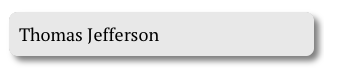
As you can see in image, I want shadow behind a Button. I have created Button with rounded corners. But problem is I can't generate a shadow behind that Button. How can I achieve this?
Android Solutions
Solution 1 - Android
Use this approach to get your desired look.
button_selector.xml :
<selector xmlns:android="http://schemas.android.com/apk/res/android">
<item>
    <layer-list>
        <item android:right="5dp" android:top="5dp">
            <shape>
                <corners android:radius="3dp" />
                <solid android:color="#D6D6D6" />
            </shape>
        </item>
        <item android:bottom="2dp" android:left="2dp">
            <shape>
                <gradient android:angle="270"
                    android:endColor="#E2E2E2" android:startColor="#BABABA" />
                <stroke android:width="1dp" android:color="#BABABA" />
                <corners android:radius="4dp" />
                <padding android:bottom="10dp" android:left="10dp"
                    android:right="10dp" android:top="10dp" />
            </shape>
        </item>
    </layer-list>
</item>

</selector>
And in your xml layout:
<Button
   android:background="@drawable/button_selector"
   ...
   ..
/>
Solution 2 - Android
For android version 5.0 & above
try the Elevation for other views..
android:elevation="10dp"
For Buttons,
android:stateListAnimator="@anim/button_state_list_animator"
button_state_list_animator.xml - https://android.googlesource.com/platform/frameworks/base/+/master/core/res/res/anim/button_state_list_anim_material.xml
below 5.0 version,
For all views,
android:background="@android:drawable/dialog_holo_light_frame"
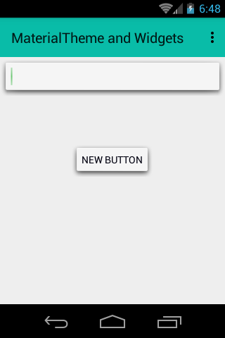
My output:
Solution 3 - Android
Here is my button with shadow cw_button_shadow.xml inside drawable folder
<?xml version="1.0" encoding="utf-8"?>
<selector xmlns:android="http://schemas.android.com/apk/res/android">
    <item android:state_pressed="false">
        <layer-list>
            <!-- SHADOW -->
            <item>
                <shape>
                    <solid android:color="@color/red_400"/>
                    <!-- alttan gölge -->
                    <corners android:radius="19dp"/>
                </shape>
            </item>
            <!-- BUTTON alttan gölge
              android:right="5px" to make it round-->
            <item
                android:bottom="5px"
                >
                <shape>
                    <padding android:bottom="5dp"/>
                    <gradient
                        android:startColor="#1c4985"
                        android:endColor="#163969"
                        android:angle="270" />
                    <corners
                        android:radius="19dp"/>
                    <padding
                        android:left="10dp"
                        android:top="10dp"
                        android:right="5dp"
                        android:bottom="10dp"/>
                </shape>
            </item>
        </layer-list>
    </item>

    <item android:state_pressed="true">
        <layer-list>
            <!-- SHADOW -->
            <item>
                <shape>
                    <solid android:color="#102746"/>
                    <corners android:radius="19dp"/>

                </shape>
            </item>
            <!-- BUTTON -->
            <item android:bottom="5px">
                <shape>
                    <padding android:bottom="5dp"/>
                    <gradient
                        android:startColor="#1c4985"
                        android:endColor="#163969"
                        android:angle="270" />
                    <corners
                        android:radius="19dp"/>
                    <padding
                        android:left="10dp"
                        android:top="10dp"
                        android:right="5dp"
                        android:bottom="10dp"/>
                </shape>
            </item>
        </layer-list>
    </item>
</selector>
How to use. in Button xml, you can resize your height and weight
<Button
                android:text="+ add friends"
                android:layout_width="120dp"
                android:layout_height="40dp"
               android:background="@drawable/cw_button_shadow" />

Solution 4 - Android
If you are targeting pre-Lollipop devices, you can use Shadow-Layout, since it easy and you can use it in different kind of layouts.
Add shadow-layout to your Gradle file:
dependencies {
    compile 'com.github.dmytrodanylyk.shadow-layout:library:1.0.1'
}
At the top the xml layout where you have your button, add to the top:
xmlns:app="http://schemas.android.com/apk/res-auto"
it will make available the custom attributes.
Then you put a shadow layout around you Button:
<com.dd.ShadowLayout
        android:layout_marginTop="16dp"
        android:layout_width="wrap_content"
        android:layout_height="wrap_content"
        app:sl_shadowRadius="4dp"
        app:sl_shadowColor="#AA000000"
        app:sl_dx="0dp"
        app:sl_dy="0dp"
        app:sl_cornerRadius="56dp">

       <YourButton
          .... />

</com.dd.ShadowLayout>
You can then tweak the app: settings to match your required shadow.
Hope it helps.
Solution 5 - Android
I've tried the code from above and made my own shadow which is little bit closer to what I am trying to achieve. Maybe it will help others too.
<selector xmlns:android="http://schemas.android.com/apk/res/android">
    <item>
        <layer-list>
            <item android:left="5dp" android:top="5dp">
                <shape>
                    <corners android:radius="3dp" />
                    <gradient
                        android:angle="315"
                        android:endColor="@android:color/transparent"
                        android:startColor="@android:color/black"
                        android:type="radial"
                        android:centerX="0.55"
                        android:centerY="0"
                        android:gradientRadius="300"/>
                    <padding android:bottom="1dp" android:left="0dp" android:right="3dp" android:top="0dp" />
                </shape>
            </item>
            <item android:bottom="2dp" android:left="3dp">
                <shape>
                    <corners android:radius="1dp" />
                    <solid android:color="@color/colorPrimary" />


                </shape>
            </item>
        </layer-list>
    </item>

</selector>
Solution 6 - Android
Try this if this works for you

android:background="@drawable/drop_shadow"
        android:layout_width="wrap_content"
        android:layout_height="wrap_content"
        android:paddingLeft="3dp"
        android:paddingTop="3dp"
        android:paddingRight="4dp"
        android:paddingBottom="5dp"
Solution 7 - Android
Sample 9 patch image with shadow
After a lots of research I found an easy method.
Create a 9 patch image and apply it as button or any other view's background.
You can create a 9 patch image with shadow using this website.
Put the 9 patch image in your drawable directory and apply it as the background for the button.
mButton.setBackground(ContextCompat.getDrawable(mContext, R.drawable.your_9_patch_image);
Solution 8 - Android
Since none of the answers here really address the question, I wanted to point out https://github.com/Devlight/ShadowLayout (not my project). This is a simple Android layout you can wrap around anything to give it a shadow. The library is a single class and only ~250 lines. The README says deprecated, but it works great.
Wrapping all your views isn't ideal, but until Android provides a standard mechanism to introduce a shadow, or you want to draw all of your button states as bitmaps that include the shadow pixels, this is the best option I could fine.
Solution 9 - Android
Adding this below 2 lines worked for me
android:elevation="10dp"
android:stateListAnimator="@null"
Solution 10 - Android
You can try this:
<?xml version="1.0" encoding="utf-8"?>
<selector xmlns:android="http://schemas.android.com/apk/res/android">
<item android:state_pressed="true">
<layer-list>
        <item android:left="1dp" android:top="3dp">
            <shape>
                <solid android:color="#a5040d" />
                <corners android:radius="3dip"/>
            </shape>
        </item>
    </layer-list>
  </item>
<item>
    <layer-list>
        <item android:left="0dp" android:top="0dp">
            <shape>
                    <solid android:color="#99080d" />
                <corners android:radius="3dip"/>
            </shape>
        </item>
        <item android:bottom="3dp" android:right="2dp">
            <shape>
                <solid android:color="#a5040d" />
                <corners android:radius="3dip"/>
            </shape>
        </item>
    </layer-list>
</item>
Solution 11 - Android
you can use this great library <https://github.com/BluRe-CN/ComplexView> and it is really easy to use