Android View shadow
AndroidShadowDropshadowAndroid Problem Overview
I searched around, and I could not find a proper way to do this. I want to have the following shadow effects on my views:
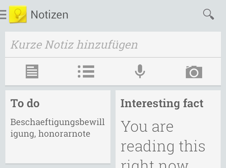

To be honest, I do not know if this second one is done by applying shadow effect. Any ideas?
Android Solutions
Solution 1 - Android
I know this question has already been answered but I want you to know that I found a drawable on Android Studio that is very similar to the pics you have in the question:
Take a look at this:
android:background="@drawable/abc_menu_dropdown_panel_holo_light"
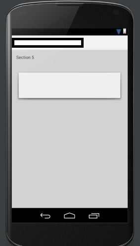
It looks like this:
Hope it will be helpful
Edit
The option above is for the older versions of Android Studio so you may not find it. For newer versions:
android:background="@android:drawable/dialog_holo_light_frame"
Moreover, if you want to have your own custom shape, I suggest to use a drawing software like Photoshop and draw it.

Don't forget to save it as .9.png file (example: my_background.9.png)
Read the documentation: Draw 9-patch
Edit 2
An even better and less hard working solution is to use a CardView and set app:cardPreventCornerOverlap="false" to prevent views to overlap the borders:
<android.support.v7.widget.CardView
    android:id="@+id/card_view"
    android:layout_width="match_parent"
    android:layout_height="wrap_content"
    app:cardCornerRadius="2dp"
    app:cardElevation="2dp"
    app:cardPreventCornerOverlap="false"
    app:contentPadding="0dp">

    <!-- your layout stuff here -->

</android.support.v7.widget.CardView>
Also make sure to have included the latest version in the build.gradle, current is
compile 'com.android.support:cardview-v7:26.0.0'
Solution 2 - Android
I'm using Android Studio 0.8.6 and I couldn't find:
android:background="@drawable/abc_menu_dropdown_panel_holo_light"
so I found this instead:
android:background="@android:drawable/dialog_holo_light_frame"
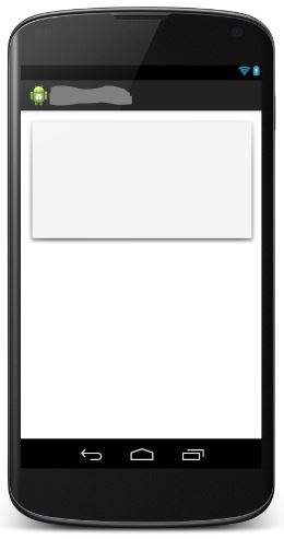
and it looks like this:
Solution 3 - Android
putting a background of @android:drawable/dialog_holo_light_frame, gives shadow but you can't change background color nor border style, so it's better to benefit from the shadow of it, while still be able to put a background via layer-list
<?xml version="1.0" encoding="utf-8"?>
<layer-list xmlns:android="http://schemas.android.com/apk/res/android">
    <!--the shadow comes from here-->
    <item
        android:bottom="0dp"
        android:drawable="@android:drawable/dialog_holo_light_frame"
        android:left="0dp"
        android:right="0dp"
        android:top="0dp">

    </item>

    <item
        android:bottom="0dp"
        android:left="0dp"
        android:right="0dp"
        android:top="0dp">
        <!--whatever you want in the background, here i preferred solid white -->
        <shape android:shape="rectangle">
            <solid android:color="@android:color/white" />

        </shape>
    </item>
</layer-list>
save it in the drawable folder under say shadow.xml
to assign it to a view, in the xml layout file set the background of it
android:background="@drawable/shadow"
Solution 4 - Android
Create card_background.xml in the res/drawable folder with the following code:
<?xml version="1.0" encoding="utf-8"?>
<layer-list xmlns:android="http://schemas.android.com/apk/res/android">

<item>
    <shape android:shape="rectangle">
        <solid android:color="#BDBDBD"/>
        <corners android:radius="5dp"/>
    </shape>
</item>

<item
    android:left="0dp"
    android:right="0dp"
    android:top="0dp"
    android:bottom="2dp">
    <shape android:shape="rectangle">
        <solid android:color="#ffffff"/>
        <corners android:radius="5dp"/>
    </shape>
</item>
</layer-list>
Then add the following code to the element to which you want the card layout
android:background="@drawable/card_background"
the following line defines the color of the shadow for the card
<solid android:color="#BDBDBD"/>
Solution 5 - Android
Use elevation property to achieve a shadow affect:
<View ...
    android:elevation="2dp"/>
This is only to be used past v21, check out this link: http://developer.android.com/training/material/shadows-clipping.html
Solution 6 - Android
CardView gives you true shadow in android 5+ and it has a support library. Just wrap your view with it and you're done.
<android.support.v7.widget.CardView>
     <MyLayout>
</android.support.v7.widget.CardView>
It require the next dependency.
dependencies {
    ...
    compile 'com.android.support:cardview-v7:21.0.+'
}
Solution 7 - Android
This is may be late but for those who are still looking for answer for this I found a project on git hub and this is the only one that actually fit my needs. android-materialshadowninepatch
Just add this line on your build.gradle dependency
compile 'com.h6ah4i.android.materialshadowninepatch:materialshadowninepatch:0.6.3'
cheers. thumbs up for the creator ! happycodings
Solution 8 - Android
I know this is stupidly hacky,
but if you want to support under v21, here are my achievements.
rectangle_with_10dp_radius_white_bg_and_shadow.xml
<?xml version="1.0" encoding="utf-8"?>
<layer-list xmlns:android="http://schemas.android.com/apk/res/android">

    <!-- Shadow layers -->
    <item
        android:left="1dp"
        android:right="1dp"
        android:top="3dp">
        <shape>
            <corners android:radius="10dp" />
            <padding
                android:bottom="1.8dp"
                android:left="1dp"
                android:right="1dp"
                android:top="1dp" />
            <solid android:color="@color/shadow_hack_level_1" />
        </shape>
    </item>
    <item
        android:left="1dp"
        android:right="1dp"
        android:top="3dp">
        <shape>
            <corners android:radius="10dp" />
            <padding
                android:bottom="1.8dp"
                android:left="1dp"
                android:right="1dp"
                android:top="1dp" />
            <solid android:color="@color/shadow_hack_level_2" />
        </shape>
    </item>
    <item
        android:left="1dp"
        android:right="1dp"
        android:top="3dp">
        <shape>
            <corners android:radius="10dp" />
            <padding
                android:bottom="1.8dp"
                android:left="1dp"
                android:right="1dp"
                android:top="1dp" />
            <solid android:color="@color/shadow_hack_level_3" />
        </shape>
    </item>
    <item
        android:left="1dp"
        android:right="1dp"
        android:top="3dp">
        <shape>
            <corners android:radius="10dp" />
            <padding
                android:bottom="1.8dp"
                android:left="1dp"
                android:right="1dp"
                android:top="1dp" />
            <solid android:color="@color/shadow_hack_level_4" />
        </shape>
    </item>
    <item
        android:left="1dp"
        android:right="1dp"
        android:top="3dp">
        <shape>
            <corners android:radius="10dp" />
            <padding
                android:bottom="1.8dp"
                android:left="1dp"
                android:right="1dp"
                android:top="1dp" />
            <solid android:color="@color/shadow_hack_level_5" />
        </shape>
    </item>
    <item
        android:left="1dp"
        android:right="1dp"
        android:top="3dp">
        <shape>
            <corners android:radius="10dp" />
            <padding
                android:bottom="1.8dp"
                android:left="1dp"
                android:right="1dp"
                android:top="1dp" />
            <solid android:color="@color/shadow_hack_level_6" />
        </shape>
    </item>
    <item
        android:left="1dp"
        android:right="1dp"
        android:top="3dp">
        <shape>
            <corners android:radius="10dp" />
            <padding
                android:bottom="1.8dp"
                android:left="1dp"
                android:right="1dp"
                android:top="1dp" />
            <solid android:color="@color/shadow_hack_level_7" />
        </shape>
    </item>
    <item
        android:left="1dp"
        android:right="1dp"
        android:top="3dp">
        <shape>
            <corners android:radius="10dp" />
            <padding
                android:bottom="1.8dp"
                android:left="1dp"
                android:right="1dp"
                android:top="1dp" />
            <solid android:color="@color/shadow_hack_level_8" />
        </shape>
    </item>
    <item
        android:left="1dp"
        android:right="1dp"
        android:top="3dp">
        <shape>
            <corners android:radius="10dp" />
            <padding
                android:bottom="1.8dp"
                android:left="1dp"
                android:right="1dp"
                android:top="1dp" />
            <solid android:color="@color/shadow_hack_level_9" />
        </shape>
    </item>
    <item
        android:left="1dp"
        android:right="1dp"
        android:top="3dp">
        <shape>
            <corners android:radius="10dp" />
            <padding
                android:bottom="1.8dp"
                android:left="1dp"
                android:right="1dp"
                android:top="1dp" />
            <solid android:color="@color/shadow_hack_level_10" />
        </shape>
    </item>

    <!-- Background layer -->
    <item>
        <shape>
            <solid android:color="@android:color/white" />
            <corners android:radius="10dp" />
        </shape>
    </item>

</layer-list>
rectangle_with_10dp_radius_white_bg_and_shadow.xml (v21)
<?xml version="1.0" encoding="utf-8"?>
<shape xmlns:android="http://schemas.android.com/apk/res/android"
    android:shape="rectangle">
    <solid android:color="@android:color/white" />
    <corners android:radius="10dp" />
</shape>
view_incoming.xml
<?xml version="1.0" encoding="utf-8"?>
<LinearLayout xmlns:android="http://schemas.android.com/apk/res/android"
    xmlns:tools="http://schemas.android.com/tools"
    android:layout_width="match_parent"
    android:layout_height="match_parent"
    android:background="@drawable/rectangle_with_10dp_radius_white_bg_and_shadow"
    android:elevation="7dp"
    android:gravity="center"
    android:minWidth="240dp"
    android:minHeight="240dp"
    android:orientation="horizontal"
    android:padding="16dp"
    tools:targetApi="lollipop">

    <TextView
        android:id="@+id/text1"
        android:layout_width="wrap_content"
        android:layout_height="wrap_content"
        tools:text="Hello World !" />

</LinearLayout>
Here is result:
Under v21 (this is which you made with xml)
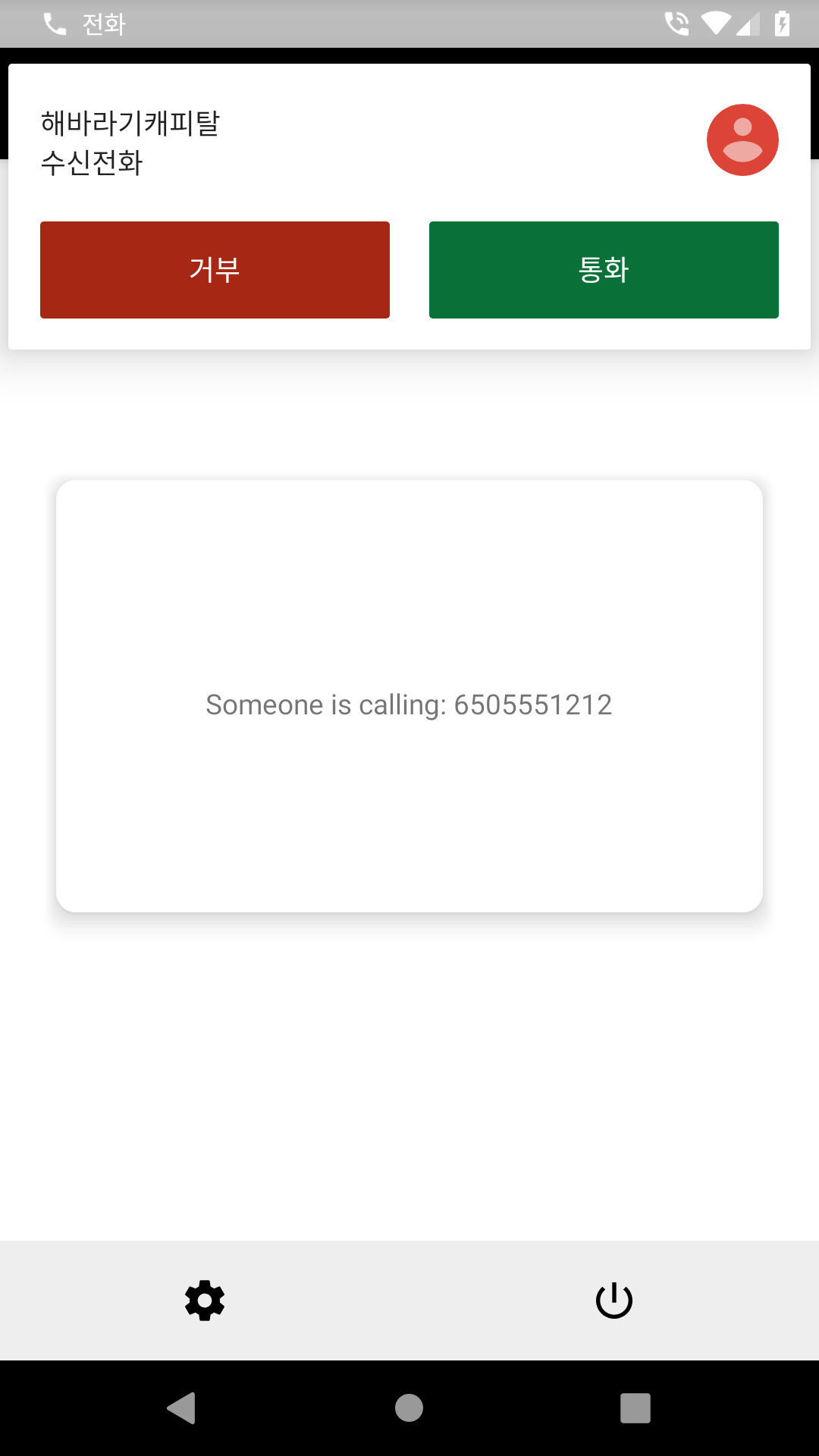
Above v21 (real elevation rendering)
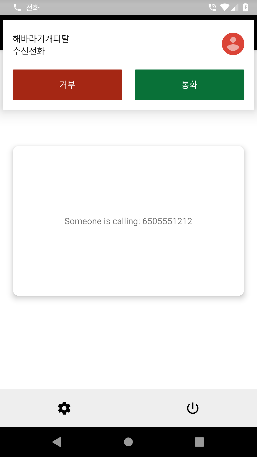
-
The one significant difference is it will occupy the inner space from the view so your actual content area can be smaller than >= lollipop devices.
Solution 9 - Android
If you are in need of the shadows properly to be applied then you have to do the following.
Consider this view, defined with a background drawable:
<TextView
    android:id="@+id/myview"
    ...
    android:elevation="2dp"
    android:background="@drawable/myrect" />
The background drawable is defined as a rectangle with rounded corners:
<shape xmlns:android="http://schemas.android.com/apk/res/android"
       android:shape="rectangle">
    <solid android:color="#42000000" />
    <corners android:radius="5dp" />
</shape>
This is the recomended way of appying shadows check this out https://developer.android.com/training/material/shadows-clipping.html#Shadows
Solution 10 - Android
Create background drawable like this to show rounded shadow.
<?xml version="1.0" encoding="utf-8"?>
<layer-list xmlns:android="http://schemas.android.com/apk/res/android">
    <!-- Drop Shadow Stack -->
    <item>
        <shape>
            <corners android:radius="4dp" />
            <padding android:bottom="1dp" android:left="1dp"
                     android:right="1dp"  android:top="1dp" />
            <solid android:color="#00CCCCCC" />
        </shape>
    </item>
    <item>
        <shape>
            <corners android:radius="4dp" />
            <padding android:bottom="1dp" android:left="1dp"
                     android:right="1dp"  android:top="1dp" />
            <solid android:color="#10CCCCCC" />
        </shape>
    </item>
    <item>
        <shape>
            <corners android:radius="4dp" />
            <padding android:bottom="1dp" android:left="1dp"
                     android:right="1dp"  android:top="1dp" />
            <solid android:color="#20d5d5d5" />
        </shape>
    </item>
    <item>
        <shape>
            <corners android:radius="6dp" />
            <padding android:bottom="1dp" android:left="1dp"
                     android:right="1dp"  android:top="1dp" />
            <solid android:color="#30cbcbcb" />
        </shape>
    </item>
    <item>
        <shape>
            <corners android:radius="4dp" />
            <padding android:bottom="1dp" android:left="1dp"
                     android:right="1dp"  android:top="1dp" />
            <solid android:color="#50bababa" />
        </shape>
    </item>

    <!-- Background -->
    <item>
        <shape>
            <solid android:color="@color/gray_100" />
            <corners android:radius="4dp" />
        </shape>
    </item>
</layer-list>
Solution 11 - Android
This question may be old, but for anybody in future that wants a simple way to achieve complex shadow effects check out my library here https://github.com/BluRe-CN/ComplexView
Using the library, you can change shadow colors, tweak edges and so much more. Here's an example to achieve what you seek for.
<com.blure.complexview.ComplexView
        android:layout_width="400dp"
        android:layout_height="600dp"
        app:radius="10dp"
        app:shadow="true"
        app:shadowSpread="2">

        <com.blure.complexview.ComplexView
            android:layout_width="match_parent"
            android:layout_height="match_parent"
            app:color="#fdfcfc"
            app:radius="10dp" />
    </com.blure.complexview.ComplexView>
To change the shadow color, use app:shadowColor="your color code".
Solution 12 - Android
Use the elevation property for shadow affect:
<YourView
    ...
    android:elevation="3dp"/>
Solution 13 - Android
use this shape as background :
<?xml version="1.0" encoding="utf-8"?>
<layer-list xmlns:android="http://schemas.android.com/apk/res/android">

    <item android:drawable="@android:drawable/dialog_holo_light_frame"/>

    <item>
        <shape android:shape="rectangle">
            <corners android:radius="1dp" />
            <solid android:color="@color/gray_200" />
        </shape>
    </item>

</layer-list>