How to horizontally center an element
HtmlCssAlignmentCenteringHtml Problem Overview
How can I horizontally center a <div> within another <div> using CSS?
<div id="outer">
  <div id="inner">Foo foo</div>
</div>
Html Solutions
Solution 1 - Html
You can apply this CSS to the inner <div>:
#inner {
  width: 50%;
  margin: 0 auto;
}
Of course, you don't have to set the width to 50%. Any width less than the containing <div> will work. The margin: 0 auto is what does the actual centering.
If you are targeting Internet Explorer 8 (and later), it might be better to have this instead:
#inner {
  display: table;
  margin: 0 auto;
}
It will make the inner element center horizontally and it works without setting a specific width.
Working example here:
#inner {
  display: table;
  margin: 0 auto;
  border: 1px solid black;
}

#outer {
  border: 1px solid red;
  width:100%
}
<div id="outer">
  <div id="inner">Foo foo</div>
</div>
EDIT
With flexbox it is very easy to style the div horizontally and vertically centered.
#inner {
  border: 1px solid black;
}

#outer {
  border: 1px solid red;
  width:100%;
  display: flex;
  justify-content: center;
}
<div id="outer">
  <div id="inner">Foo foo</div>
</div>
To align the div vertically centered, use the property align-items: center.
Solution 2 - Html
If you don't want to set a fixed width on the inner div you could do something like this:
#outer {
  width: 100%;
  text-align: center;
}

#inner {
  display: inline-block;
}
<div id="outer">
    <div id="inner">Foo foo</div>
</div>
That makes the inner div into an inline element that can be centered with text-align.
Solution 3 - Html
The best approaches are with CSS3.
The old box model (deprecated)
display: box and its properties box-pack, box-align, box-orient, box-direction etc. have been replaced by flexbox. While they may still work, they are not recommended to be used in production.
#outer {
  width: 100%;
  /* Firefox */
  display: -moz-box;
  -moz-box-pack: center;
  -moz-box-align: center;
  /* Safari and Chrome */
  display: -webkit-box;
  -webkit-box-pack: center;
  -webkit-box-align: center;
  /* W3C */
  display: box;
  box-pack: center;
  box-align: center;
}

#inner {
  width: 50%;
}
<div id="outer">
  <div id="inner">Foo foo</div>
</div>
According to your usability you may also use the box-orient, box-flex, box-direction properties.
The modern box model with Flexbox
#outer {
    display: flex;
    flex-direction: row;
    flex-wrap: wrap;
    justify-content: center;
    align-items: center;
}
Read more about centering the child elements
And this explains why the box model is the best approach:
Solution 4 - Html
#centered {
  position: absolute;
  left: 50%;
  margin-left: -100px;
}
<div id="outer" style="width:200px">
  <div id="centered">Foo foo</div>
</div>
Make sure the parent element is positioned, i.e., relative, fixed, absolute, or sticky.
If you don't know the width of your div, you can use transform:translateX(-50%); instead of the negative margin.
With CSS calc(), the code can get even simpler:
.centered {
  width: 200px;
  position: absolute;
  left: calc(50% - 100px);
}
The principle is still the same; put the item in the middle and compensate for the width.
Solution 5 - Html
I've created this example to show how to vertically and horizontally align.
The code is basically this:
#outer {
 position: relative;
}
and...
#inner {
  margin: auto;
  position: absolute;
  left:0;
  right: 0;
  top: 0;
  bottom: 0;
}
And it will stay in the center even when you resize your screen.
Solution 6 - Html
Some posters have mentioned the CSS 3 way to center using display:box.
This syntax is outdated and shouldn't be used anymore. [See also this post].
So just for completeness here is the latest way to center in CSS 3 using the Flexible Box Layout Module.
So if you have simple markup like:
<div class="box">
  <div class="item1">A</div>
  <div class="item2">B</div>
  <div class="item3">C</div>
</div>
...and you want to center your items within the box, here's what you need on the parent element (.box):
.box {
    display: flex;
    flex-wrap: wrap; /* Optional. only if you want the items to wrap */
    justify-content: center; /* For horizontal alignment */
    align-items: center; /* For vertical alignment */
}
.box {
  display: flex;
  flex-wrap: wrap;
  /* Optional. only if you want the items to wrap */
  justify-content: center;
  /* For horizontal alignment */
  align-items: center;
  /* For vertical alignment */
}
* {
  margin: 0;
  padding: 0;
}
html,
body {
  height: 100%;
}
.box {
  height: 200px;
  display: flex;
  flex-wrap: wrap;
  justify-content: center;
  align-items: center;
  border: 2px solid tomato;
}
.box div {
  margin: 0 10px;
  width: 100px;
}
.item1 {
  height: 50px;
  background: pink;
}
.item2 {
  background: brown;
  height: 100px;
}
.item3 {
  height: 150px;
  background: orange;
}
<div class="box">
  <div class="item1">A</div>
  <div class="item2">B</div>
  <div class="item3">C</div>
</div>
If you need to support older browsers which use older syntax for flexbox here's a good place to look.
Solution 7 - Html
If you don't want to set a fixed width and don't want the extra margin, add display: inline-block to your element.
You can use:
#element {
    display: table;
    margin: 0 auto;
}
Solution 8 - Html
Centering a div of unknown height and width
Horizontally and vertically. It works with reasonably modern browsers (Firefox, Safari/WebKit, Chrome, Internet & Explorer & 10, Opera, etc.)
.content {
  position: absolute;
  left: 50%;
  top: 50%;
  transform: translate(-50%, -50%);
}
<div class="content">This works with any content</div>
Solution 9 - Html
Set the width and set margin-left and margin-right to auto. That's for horizontal only, though. If you want both ways, you'd just do it both ways. Don't be afraid to experiment; it's not like you'll break anything.
Solution 10 - Html
It cannot be centered if you don't give it a width. Otherwise, it will take, by default, the whole horizontal space.
Solution 11 - Html
#outer {
    width: 100%;
    height: 100%;
    display: box;
    box-orient: horizontal;
    box-pack: center;
    box-align: center;
}
Solution 12 - Html
I recently had to center a "hidden" div (i.e., display:none;) that had a tabled form within it that needed to be centered on the page. I wrote the following jQuery code to display the hidden div and then update the CSS content to the automatic generated width of the table and change the margin to center it. (The display toggle is triggered by clicking on a link, but this code wasn't necessary to display.)
NOTE: I'm sharing this code, because Google brought me to this Stack Overflow solution and everything would have worked except that hidden elements don't have any width and can't be resized/centered until after they are displayed.
$(function(){
  $('#inner').show().width($('#innerTable').width()).css('margin','0 auto');
});
<script src="https://ajax.googleapis.com/ajax/libs/jquery/2.1.1/jquery.min.js"></script>
<div id="inner" style="display:none;">
  <form action="">
    <table id="innerTable">
      <tr><td>Name:</td><td><input type="text"></td></tr>
      <tr><td>Email:</td><td><input type="text"></td></tr>
      <tr><td>Email:</td><td><input type="submit"></td></tr>
    </table>
  </form>
</div>
Solution 13 - Html
The way I usually do it is using absolute position:
#inner{
  left: 0;
  right: 0;
  margin-left: auto;
  margin-right: auto;
  position: absolute;
}
The outer div doesn't need any extra properties for this to work.
Solution 14 - Html
For Firefox and Chrome:
<div style="width:100%;">
  <div style="width: 50%; margin: 0px auto;">Text</div>
</div>
For Internet Explorer, Firefox, and Chrome:
<div style="width:100%; text-align:center;">
  <div style="width: 50%; margin: 0px auto; text-align:left;">Text</div>
</div>
The text-align: property is optional for modern browsers, but it is necessary in Internet Explorer Quirks Mode for legacy browsers support.
Solution 15 - Html
Use:
#outerDiv {
  width: 500px;
}

#innerDiv {
  width: 200px;
  margin: 0 auto;
}
<div id="outerDiv">
  <div id="innerDiv">Inner Content</div>
</div>
Solution 16 - Html
Another solution for this without having to set a width for one of the elements is using the CSS 3 transform attribute.
#outer {
  position: relative;
}

#inner {
  position: absolute;
  left: 50%;

  transform: translateX(-50%);
}
The trick is that translateX(-50%) sets the #inner element 50 percent to the left of its own width. You can use the same trick for vertical alignment.
Here's a [Fiddle][1] showing horizontal and vertical alignment.
More information is on [Mozilla Developer Network][2].
[1]: http://jsfiddle.net/bfedqjz4/ "Fiddle" [2]: https://developer.mozilla.org/en-US/docs/Web/CSS/transform "MDN"
Solution 17 - Html
Chris Coyier who wrote an excellent post on 'Centering in the Unknown' on his blog. It's a roundup of multiple solutions. I posted one that isn't posted in this question. It has more browser support than the Flexbox solution, and you're not using display: table; which could break other things.
/* This parent can be any width and height */
.outer {
  text-align: center;
}

/* The ghost, nudged to maintain perfect centering */
.outer:before {
  content: '.';
  display: inline-block;
  height: 100%;
  vertical-align: middle;
  width: 0;
  overflow: hidden;
}

/* The element to be centered, can
   also be of any width and height */
.inner {
  display: inline-block;
  vertical-align: middle;
  width: 300px;
}
Solution 18 - Html
I recently found an approach:
#outer {
    position: absolute;
    left: 50%;
}

#inner {
    position: relative;
    left: -50%;
}
Both elements must be the same width to function correctly.
Solution 19 - Html
For example, see this link and the snippet below:
div#outer {
  height: 120px;
  background-color: red;
}

div#inner {
  width: 50%;
  height: 100%;
  background-color: green;
  margin: 0 auto;
  text-align: center; /* For text alignment to center horizontally. */
  line-height: 120px; /* For text alignment to center vertically. */
}
<div id="outer" style="width:100%;">
  <div id="inner">Foo foo</div>
</div>
If you have a lot of children under a parent, so your CSS content must be like this example on fiddle.
The HTML content look likes this:
<div id="outer" style="width:100%;">
    <div class="inner"> Foo Text </div>
    <div class="inner"> Foo Text </div>
    <div class="inner"> Foo Text </div>
    <div class="inner"> </div>
    <div class="inner"> </div>
    <div class="inner"> </div>
    <div class="inner"> </div>
    <div class="inner"> </div>
    <div class="inner"> Foo Text </div>
</div>
Then see this example on fiddle.
Solution 20 - Html
Centering only horizontally
In my experience, the best way to center a box horizontally is to apply the following properties:
The container:
- should have
text-align: center;
The content box:
- should have
display: inline-block;
Demo:
.container {
  width: 100%;
  height: 120px;
  background: #CCC;
  text-align: center;
}

.centered-content {
  display: inline-block;
  background: #FFF;
  padding: 20px;
  border: 1px solid #000;
}
<div class="container">
  <div class="centered-content">
    Center this!
  </div>
</div>
See also this Fiddle!
Centering both horizontally & vertically
In my experience, the best way to center a box both vertically and horizontally is to use an additional container and apply the following properties:
The outer container:
- should have
display: table;
The inner container:
- should have
display: table-cell; - should have
vertical-align: middle; - should have
text-align: center;
The content box:
- should have
display: inline-block;
Demo:
.outer-container {
  display: table;
  width: 100%;
  height: 120px;
  background: #CCC;
}

.inner-container {
  display: table-cell;
  vertical-align: middle;
  text-align: center;
}

.centered-content {
  display: inline-block;
  background: #FFF;
  padding: 20px;
  border: 1px solid #000;
}
<div class="outer-container">
  <div class="inner-container">
    <div class="centered-content">
      Center this!
    </div>
  </div>
</div>
See also this Fiddle!
Solution 21 - Html
Flexbox
display: flex behaves like a block element and lays out its content according to the flexbox model. It works with justify-content: center.
Please note: Flexbox is compatible all browsers exept Internet Explorer. See https://stackoverflow.com/questions/43979702/display-flex-not-working-on-internet-explorer/43979973#43979973 for a complete and up to date list of browsers compatibility.
#inner {
  display: inline-block;
}

#outer {
  display: flex;
  justify-content: center;
}
<div id="outer">
  <div id="inner">Foo foo</div>
</div>
Text-align: center
Applying text-align: center the inline contents are centered within the line box. However since the inner div has by default width: 100% you have to set a specific width or use one of the following:
#inner {
  display: inline-block;
}

#outer {
  text-align: center;
}
<div id="outer">
  <div id="inner">Foo foo</div>
</div>
Margin: 0 auto
Using margin: 0 auto is another option and it is more suitable for older browsers compatibility. It works together with display: table.
#inner {
  display: table;
  margin: 0 auto;
}
<div id="outer">
  <div id="inner">Foo foo</div>
</div>
Transform
transform: translate lets you modify the coordinate space of the CSS visual formatting model. Using it, elements can be translated, rotated, scaled, and skewed. To center horizontally it require position: absolute and left: 50%.
#inner {
  position: absolute;
  left: 50%;
  transform: translate(-50%, 0%);
}
<div id="outer">
  <div id="inner">Foo foo</div>
</div>
<center> (Deprecated)
The tag <center> is the HTML alternative to text-align: center. It works on older browsers and most of the new ones but it is not considered a good practice since this feature is obsolete and has been removed from the Web standards.
#inner {
  display: inline-block;
}
<div id="outer">
  <center>
    <div id="inner">Foo foo</div>
  </center>
</div>
Solution 22 - Html
This method also works just fine:
div.container {
  display: flex;
  justify-content: center; /* For horizontal alignment */
  align-items: center;     /* For vertical alignment   */
}
For the inner <div>, the only condition is that its height and width must not be larger than the ones of its container.
Solution 23 - Html
The easiest way:
#outer {
  width: 100%;
  text-align: center;
}
#inner {
  margin: auto;
  width: 200px;
}
<div id="outer">
  <div id="inner">Blabla</div>
</div>
Solution 24 - Html
If width of the content is unknown you can use the following method. Suppose we have these two elements:
.outer-- full width.inner-- no width set (but a max-width could be specified)
Suppose the computed width of the elements are 1000 pixels and 300 pixels respectively. Proceed as follows:
- Wrap
.innerinside.center-helper - Make
.center-helperan inline block; it becomes the same size as.innermaking it 300 pixels wide. - Push
.center-helper50% right relative to its parent; this places its left at 500 pixels wrt. outer. - Push
.inner50% left relative to its parent; this places its left at -150 pixels wrt. center helper which means its left is at 500 - 150 = 350 pixels wrt. outer. - Set overflow on
.outerto hidden to prevent horizontal scrollbar.
Demo:
body {
  font: medium sans-serif;
}

.outer {
  overflow: hidden;
  background-color: papayawhip;
}

.center-helper {
  display: inline-block;
  position: relative;
  left: 50%;
  background-color: burlywood;
}

.inner {
  display: inline-block;
  position: relative;
  left: -50%;
  background-color: wheat;
}
<div class="outer">
  <div class="center-helper">
    <div class="inner">
      <h1>A div with no defined width</h1>
      <p>Lorem ipsum dolor sit amet, consectetur adipiscing elit.<br>
          Duis condimentum sem non turpis consectetur blandit.<br>
          Donec dictum risus id orci ornare tempor.<br>
          Proin pharetra augue a lorem elementum molestie.<br>
          Nunc nec justo sit amet nisi tempor viverra sit amet a ipsum.</p>
    </div>
  </div>
</div>
Solution 25 - Html
Flex have more than 97% browser support coverage and might be the best way to solve these kind of problems within few lines:
#outer {
  display: flex;
  justify-content: center;
}
Solution 26 - Html
You can do something like this
#container {
   display: table;
   width: <width of your container>;
   height: <height of your container>;
}

#inner {
   width: <width of your center div>;
   display: table-cell;
   margin: 0 auto;
   text-align: center;
   vertical-align: middle;
}
This will also align the #inner vertically. If you don't want to, remove the display and vertical-align properties;
Solution 27 - Html
Here is what you want in the shortest way.
#outer {
  margin - top: 100 px;
  height: 500 px; /* you can set whatever you want */
  border: 1 px solid# ccc;
}

#inner {
  border: 1 px solid# f00;
  position: relative;
  top: 50 % ;
  transform: translateY(-50 % );
}
Solution 28 - Html
You can use display: flex for your outer div and to horizontally center you have to add justify-content: center
#outer{
    display: flex;
    justify-content: center;
}
or you can visit w3schools - CSS flex Property for more ideas.
Solution 29 - Html
Well, I managed to find a solution that maybe will fit all situations, but uses JavaScript:
Here's the structure:
<div class="container">
  <div class="content">Your content goes here!</div>
  <div class="content">Your content goes here!</div>
  <div class="content">Your content goes here!</div>
</div>
And here's the JavaScript snippet:
$(document).ready(function() {
  $('.container .content').each( function() {
    container = $(this).closest('.container');
    content = $(this);

    containerHeight = container.height();
    contentHeight = content.height();

    margin = (containerHeight - contentHeight) / 2;
    content.css('margin-top', margin);
  })
});
If you want to use it in a responsive approach, you can add the following:
$(window).resize(function() {
  $('.container .content').each( function() {
    container = $(this).closest('.container');
    content = $(this);

    containerHeight = container.height();
    contentHeight = content.height();

    margin = (containerHeight - contentHeight) / 2;
    content.css('margin-top', margin);
  })
});
Solution 30 - Html
One option existed that I found:
Everybody says to use:
margin: auto 0;
But there is another option. Set this property for the parent div. It works perfectly anytime:
text-align: center;
And see, child go center.
And finally CSS for you:
#outer{
     text-align: center;
     display: block; /* Or inline-block - base on your need */
}

#inner
{
     position: relative;
     margin: 0 auto; /* It is good to be */
}
Solution 31 - Html
You can just simply use Flexbox like this:
#outer {
    display: flex;
    justify-content: center
}
<div id="outer">
    <div id="inner">Foo foo</div>
</div>
Apply Autoprefixer for all browser support:
#outer {
    display: -webkit-box;
    display: -ms-flexbox;
    display: flex;
    width: 100%;
    -webkit-box-pack: center;
    -ms-flex-pack: center;
    justify-content: center
}
#Or else
Use transform:
#inner {
    position: absolute;
    left: 50%;
    transform: translate(-50%)
}
<div id="outer">
    <div id="inner">Foo foo</div>
</div>
With Autoprefixer:
#inner {
    position: absolute;
    left: 50%;
    -webkit-transform: translate(-50%);
    -ms-transform:     translate(-50%);
    transform:         translate(-50%)
}
Solution 32 - Html
Try playing around with
margin: 0 auto;
If you want to center your text too, try using:
text-align: center;
Solution 33 - Html
If anyone would like a jQuery solution for center align these divs:
$(window).bind("load", function() {
    var wwidth = $("#outer").width();
    var width = $('#inner').width();
    $('#inner').attr("style", "padding-left: " + wwidth / 2 + "px; margin-left: -" + width / 2 + "px;");
});
Solution 34 - Html
We can use Flexbox to achieve this really easily:
<div id="outer">
    <div id="inner">Foo foo</div>
</div>
Center a div inside a div horizontally:
#outer {
   display: flex;
   justify-content: center;
}

Center a div inside a div vertically:
#outer {
    display: flex;
    align-items: center;
}

And, to completely middle the div vertically and horizontally:
#outer{
    display: flex;
    justify-content: center;
    align-items: center;
}

Solution 35 - Html
Just add this CSS content into your CSS file. It will automatically center the content.
Align horizontally to center in CSS:
#outer {
    display: flex;
    justify-content: center;
}
Align-vertically + horizontal to center in CSS:
#outer {
    display: flex;
    justify-content: center;
    align-items: center;
}
Solution 36 - Html
A very simple and cross-browser answer to horizontal center is to apply this rule to the parent element:
.parentBox {
    display: flex;
    justify-content: center
}
Solution 37 - Html
I have applied the inline style to the inner div. Use this one:
<div id="outer" style="width:100%">
    <div id="inner" style="display:table;margin:0 auto;">Foo foo</div>
</div>
Solution 38 - Html
With Grid
A pretty simple and modern way is to use display: grid:
div {
    border: 1px dotted grey;
}

#outer {
    display: grid;
    place-items: center;
    height: 50px; /* not necessary */
}
<!DOCTYPE html>
<html>
    <head>
    </head>

    <body>
        <div id="outer">
            <div>Foo foo</div>
        </div>
    </body>
</html>
Solution 39 - Html
Use the below CSS content for #inner div:
#inner {
  width: 50%;
  margin-left: 25%;
}
I mostly use this CSS content to center divs.
Solution 40 - Html
A nice thing I recently found, mixing the use of line-height+vertical-align and the 50% left trick, you can center a dynamically sized box inside another dynamically sized box, on both the horizontal and vertical using pure CSS.
Note you must use spans (and inline-block), tested in modern browsers + Internet Explorer 8.
HTML:
<h1>Center dynamic box using only css test</h1>
<div class="container">
  <div class="center">
    <div class="center-container">
      <span class="dyn-box">
        <div class="dyn-head">This is a head</div>
        <div class="dyn-body">
          This is a body<br />
          Content<br />
          Content<br />
          Content<br />
          Content<br />
        </div>
      </span>
    </div>
  </div>
</div>
CSS:
.container {
  position: absolute;
  left: 0;
  right: 0;
  top: 0;
  bottom: 0;
  overflow: hidden;
}

.center {
  position: absolute;
  left: 50%;
  top: 50%;
}

.center-container {
  position: absolute;
  left: -2500px;
  top: -2500px;
  width: 5000px;
  height: 5000px;
  line-height: 5000px;
  text-align: center;
  overflow: hidden;
}

.dyn-box {
  display: inline-block;
  vertical-align: middle;
  line-height: 100%;
  /* Purely asthetic below this point */
  background: #808080;
  padding: 13px;
  border-radius: 11px;
  font-family: arial;
}

.dyn-head {
  background: red;
  color: white;
  min-width: 300px;
  padding: 20px;
  font-size: 23px;
}

.dyn-body {
  padding: 10px;
  background: white;
  color: red;
}
Solution 41 - Html
CSS 3:
You can use the following style on the parent container to distribute child elements evenly horizontally:
display: flex;
justify-content: space-between;  // <-- space-between or space-around
A nice DEMO regarding the different values for justify-content.

CanIUse: Browser-Compatability
Try it!:
#containerdiv {
  display: flex;
  justify-content: space-between;
}

#containerdiv > div {
  background-color: blue;
  width: 50px;
  color: white;
  text-align: center;
}
<!DOCTYPE html>
<html>
<head>
  <meta charset="utf-8">
  <meta name="viewport" content="width=device-width">
  <title>JS Bin</title>
</head>
<body>
  <div id="containerdiv">
    <div>88</div>
    <div>77</div>
    <div>55</div>
    <div>33</div>
    <div>40</div>
    <div>45</div>
  </div>
</body>
</html>
Solution 42 - Html
#inner {
    width: 50%;
    margin: 0 auto;
}
Solution 43 - Html
You can attain this using the CSS Flexbox. You just need to apply 3 properties to the parent element to get everything working.
#outer {
  display: flex;
  align-content: center;
  justify-content: center;
}
Have a look at the code below this will make you understand the properties much better.
Get to know more about CSS Flexbox
#outer {
  display: flex;
  align-items: center;
  justify-content: center;
  border: 1px solid #ddd;
  width: 100%;
  height: 200px;
 }
<div id="outer">
  <div id="inner">Foo foo</div>
</div>
Solution 44 - Html
It's possible using CSS 3 Flexbox. You have two methods when using Flexbox.
-
Set the parent
display:flex;and add properties{justify-content:center; ,align-items:center;}to your parent element.
#outer {
  display: flex;
  justify-content: center;
  align-items: center;
}
<div id="outer" style="width:100%">
  <div id="inner">Foo foo</div>
</div>
-
Set the parent
display:flexand addmargin:auto;to the child.
#outer {
  display: flex;
}

#inner {
  margin: auto;
}
<div id="outer" style="width:100%">
  <div id="inner">Foo foo</div>
</div>
Solution 45 - Html
> How can I horizontally center a <div> within another <div> using CSS?
Here's a non-exhaustive list of centering approaches, using:
marginandautomarginandcalc()paddingandbox-sizingandcalc()position: absoluteand negativemargin-leftposition: absoluteand negativetransform: translateX()display: inline-blockandtext-align: centerdisplay: tableanddisplay: table-celldisplay: flexandjustify-content: centerdisplay: gridandjustify-items: center
1. Center a block-level element using auto for horizontal margins
.outer {
  width: 300px;
  height: 180px;
  background-color: rgb(255, 0, 0);
}

.inner {
  width: 150px;
  height: 180px;
  margin: 0 auto;
  background-color: rgb(255, 255, 0);
}
<div class="outer">
  <div class="inner"></div>
</div>
2. Center a block-level element using calc with horizontal margins
.outer {
  width: 300px;
  height: 180px;
  background-color: rgb(255, 0, 0);
}

.inner {
  width: 150px;
  height: 180px;
  margin: 0 calc((300px - 150px) / 2);
  background-color: rgb(255, 255, 0);
}
<div class="outer">
  <div class="inner"></div>
</div>
3. Center a block-level element using calc with horizontal padding + box-sizing
.outer {
  width: 300px;
  height: 180px;
  padding: 0 calc((300px - 150px) / 2);
  background-color: rgb(255, 0, 0);
  box-sizing: border-box;
}

.inner {
  width: 150px;
  height: 180px;
  background-color: rgb(255, 255, 0);
}
<div class="outer">
  <div class="inner"></div>
</div>
4. Center a block-level element using position: absolute with left: 50% and negative margin-left
.outer {
  position: relative;
  width: 300px;
  height: 180px;
  background-color: rgb(255, 0, 0);
}

.inner {
  position: absolute;
  left: 50%;
  width: 150px;
  height: 180px;
  margin-left: -75px;
  background-color: rgb(255, 255, 0);
}
<div class="outer">
  <div class="inner"></div>
</div>
5. Center a block-level element using position: absolute with left: 50% and negative transform: translateX()
.outer {
  position: relative;
  width: 300px;
  height: 180px;
  background-color: rgb(255, 0, 0);
}

.inner {
  position: absolute;
  left: 50%;
  width: 150px;
  height: 180px;
  background-color: rgb(255, 255, 0);
  transform: translateX(-75px);
}
<div class="outer">
  <div class="inner"></div>
</div>
6. Center an element using display: inline-block and text-align: center
.outer {
  position: relative;
  width: 300px;
  height: 180px;
  text-align: center;
  background-color: rgb(255, 0, 0);
}

.inner {
  display: inline-block;
  width: 150px;
  height: 180px;
  background-color: rgb(255, 255, 0);
}
<div class="outer">
  <div class="inner"></div>
</div>
7. Center an element using display: table, padding and box-sizing
.outer {
  display: table;
  width: 300px;
  height: 180px;
  padding: 0 75px;
  background-color: rgb(255, 0, 0);
  box-sizing: border-box;
}

.inner {
  display: table-cell;
  background-color: rgb(255, 255, 0);
}
<div class="outer">
  <div class="inner"></div>
</div>
8. Center an element using display: flex and justify-content: center
.outer {
  display: flex;
  justify-content: center;
  width: 300px;
  height: 180px;
  background-color: rgb(255, 0, 0);
}

.inner {
  flex: 0 0 150px;
  background-color: rgb(255, 255, 0);
}
<div class="outer">
  <div class="inner"></div>
</div>
9. Center an element using display: grid and justify-items: center
.outer {
  display: grid;
  justify-items: center;
  width: 300px;
  height: 180px;
  background-color: rgb(255, 0, 0);
}

.inner {
  width: 150px;
  background-color: rgb(255, 255, 0);
}
<div class="outer">
  <div class="inner"></div>
</div>
Solution 46 - Html
Make it simple!
#outer {
  display: flex;
  justify-content: center;
}
<div id="outer">
  <div id="inner">Foo foo</div>
</div>
Solution 47 - Html
This is the best example to horizontally center a <div>
#outer {
    display: flex;
    align-items: center;
    justify-content: center;
}
<!DOCTYPE html>
<html>
    <head>

    </head>

    <body>
        <div id="outer">
            <div id="inner">Foo foo</div>
        </div>
    </body>
</html>
Solution 48 - Html
One of the easiest ways...
<!DOCTYPE html>
<html>
    <head>
        <style>
            #outer-div {
                width: 100%;
                text-align: center;
                background-color: #000
            }
            #inner-div {
                display: inline-block;
                margin: 0 auto;
                padding: 3px;
                background-color: #888
            }
        </style>
    </head>

    <body>
       <div id ="outer-div" width="100%">
           <div id ="inner-div"> I am a easy horizontally centered div.</div>
       <div>
    </body>
</html>
Solution 49 - Html
Center an Element Without Need of a Wrapper/Parent with Dynamic Height & Width
No side effect: It will not limit a centered element's width less than the viewport width, when using margins in Flexbox inside a centered element
position: fixed;
top: 0; left: 0;
transform: translate(calc(50vw - 50%));
Horizontally + vertically center, if its height is same as the width:
position: fixed;
top: 0; left: 0;
transform: translate(calc(50vw - 50%), calc(50vh - 50%));
Solution 50 - Html
To centre an element horizontally you can use these methods:
Method 1: Using margin property
If the element is a block-level element then you can centre the element by using margin property. Set margin-left and margin-right is to auto (Shorthand - margin: 0 auto).
This will align the element to the centre horizontally.
If the element is not a block-level element then add display: block property to it.
#outer {
  background-color: silver;
}
#inner {
  width: max-content;
  margin: 0 auto;
  background-color: #f07878;
}
<div id="outer">
  <div id="inner">Foo foo</div>
</div>
Method 2: Using CSS flexbox
Create a flexbox container and use justify-content property and set it to center. This will align all elements horizontally to the centre of the webpage.
#outer {
  display: flex;
  justify-content: center;
  background-color: silver;
}
#inner {
  background-color: #f07878;
}
<div id="outer">
  <div id="inner">Foo foo</div>
</div>
Method 3: Using position absolute technique
This is a classic method to centre the element. Set postion:relative to the outer element. Set the inner element's position to absolute and left: 50%. This will push the inner element to start from the centre of the outer element. Now use the transform property and set transform: translateX(-50%) this will make the element centre horizontally.
#outer {
  position: relative;
  background-color: silver;
}
#inner {
  position: absolute;
  left: 50%;
  transform: translateX(-50%);
  background-color: #f07878;
}
<div id="outer">
  <center>
    <div id="inner">Foo foo</div>
  </center>
</div>
Solution 51 - Html
I just use the simplest solution, but it works in all browsers:
<!doctype html>
<html>
    <head>
        <meta charset="utf-8">
        <title>center a div within a div?</title>
        <style type="text/css">
            *{
                margin: 0;
                padding: 0;
            }

            #outer{
                width: 80%;
                height: 500px;
                background-color: #003;
                margin: 0 auto;
            }

            #outer p{
                color: #FFF;
                text-align: center;
            }

            #inner{
                background-color: #901;
                width: 50%;
                height: 100px;
                margin: 0 auto;

            }

            #inner p{
                color: #FFF;
                text-align: center;
            }
        </style>
    </head>

    <body>
        <div id="outer"><p>this is the outer div</p>
            <div id="inner">
                <p>this is the inner div</p>
            </div>
        </div>
    </body>
</html>
Solution 52 - Html
You can use CSS Flexbox.
#inner {
    display: flex;
    justify-content: center;
}
You can learn more about it on this link: https://css-tricks.com/snippets/css/a-guide-to-flexbox/
Solution 53 - Html
The easiest answer: Add margin:auto; to inner.
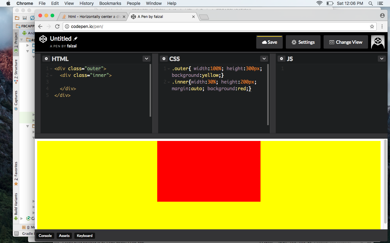
<div class="outer">
  <div class="inner">
    Foo foo
  </div>
</div>
###CSS code
.outer{
    width: 100%;
    height: 300px;
    background: yellow;
}

.inner{
    width: 30%;
    height: 200px;
    margin: auto;
    background: red;
    text-align: center
}
Check my CodePen link: http://codepen.io/feizel/pen/QdJJrK
Solution 54 - Html
It can also be centered horizontally and vertically using absolute positioning, like this:
#outer{
    position: relative;
}

#inner{
    position: absolute;
    left: 50%;
    top: 50%;
    transform: translate(-50%, -50%)
}
Solution 55 - Html
The best known way which is used widely and work in many browsers including the old ones, is using margin as below:
#parent {
  width: 100%;
  background-color: #CCCCCC;
}

#child {
  width: 30%; /* We need the width */
  margin: 0 auto; /* This does the magic */
  color: #FFFFFF;
  background-color: #000000;
  padding: 10px;
  text-align: center;
}
<div id="parent">
  <div id="child">I'm the child and I'm horizontally centered! My daddy is a greyish div dude!</div>
</div>
Run the code to see how it works. Also, there are two important things you shouldn't forget in your CSS when you try to center this way: margin: 0 auto;. That makes it the div center as wanted. Plus don't forget width of the child, otherwise it won't get centered as expected!
Solution 56 - Html
Center a div in a div
.outer {
  display: -webkit-flex;
  display: flex;

  //-webkit-justify-content: center;
  //justify-content: center;

  //align-items: center;

  width: 100%;
  height: 100px;
  background-color: lightgrey;
}

.inner {
  background-color: cornflowerblue;
  padding: 2rem;
  margin: auto;

  //align-self: center;
}
<div class="outer">
  <div class="inner">Foo foo</div>
</div>
Solution 57 - Html
Use:
<div id="parent">
  <div class="child"></div>
</div>
Style:
#parent {
   display: flex;
   justify-content: center;
}
If you want to center it horizontally you should write as below:
#parent {
   display: flex;
   justify-content: center;
   align-items: center;
}
Solution 58 - Html
You can use the calc method. The usage is for the div you're centering. If you know its width, let's say it's 1200 pixels, go for:
.container {
	width:1200px;
	margin-left: calc(50% - 600px);
}
So basically it'll add a left margin of 50% minus half the known width.
Solution 59 - Html
Here is another way to center horizontally using Flexbox and without specifying any width to the inner container. The idea is to use pseudo elements that will push the inner content from the right and the left.
Using flex:1 on pseudo element will make them fill the remaining spaces and take equal size and the inner container will get centered.
.container {
  display: flex;
  border: 1px solid;
}

.container:before,
.container:after {
  content: "";
  flex: 1;
}

.inner {
  border: 1px solid red;
  padding: 5px;
}
<div class="container">
  <div class="inner">
    Foo content
  </div>
</div>
We can also consider the same situation for vertical alignment by simply changing the direction of flex to column:
.container {
  display: flex;
  flex-direction: column;
  border: 1px solid;
  min-height: 200px;
}

.container:before,
.container:after {
  content: "";
  flex: 1;
}

.inner {
  border: 1px solid red;
  padding: 5px;
}
<div class="container">
  <div class="inner">
    Foo content
  </div>
</div>
Solution 60 - Html
The best I have used in my various projects is
<div class="outer">
    <div class="inner"></div>
</div>
.outer{
  width: 500px;
  height: 500px;
  position: relative;
  background: yellow;
}
.inner{
  width: 100px;
  height: 100px;
  background:red;
  position: absolute;
  left: 50%;
  top: 50%;
  transform: translate(-50%, -50%);
}
Solution 61 - Html
This will surely center your #inner both horizontally and vertically. This is also compatible in all browsers. I just added extra styling just to show how it is centered.
#outer {
  background: black;
  position: relative;
  width:150px;
  height:150px;
}

#inner {
  background:white;
  position: absolute;
  left:50%;
  top: 50%;
  transform: translate(-50%,-50%);
  -webkit-transform: translate(-50%,-50%);
  -moz-transform: translate(-50%,-50%);
  -o-transform: translate(-50%,-50%);
}
<div id="outer">
  <div id="inner">Foo foo</div>
</div>
But of course if you only want it horizontally aligned, This may help you.
#outer {
  background: black;
  position: relative;
  width:150px;
  height:150px;
}

#inner {
  background:white;
  position: absolute;
  left:50%;
  transform: translate(-50%,0);
  -webkit-transform: translate(-50%,0);
  -moz-transform: translate(-50%,0);
  -o-transform: translate(-50%,0);
}
<div id="outer">
  <div id="inner">Foo foo</div>
</div>
Solution 62 - Html
You can do it by using Flexbox which is a good technique these days.
For using Flexbox you should give display: flex; and align-items: center; to your parent or #outer div element. The code should be like this:
#outer {
  display: flex;
  align-items: center;
}
<div id="outer">
  <div id="inner">Foo foo</div>
</div>
This should center your child or #inner div horizontally. But you can't actually see any changes. Because our #outer div has no height or in other words, its height is set to auto, so it has the same height as all of its child elements. So after a little of visual styling, the result code should be like this:
#outer {
  height: 500px;
  display: flex;
  align-items: center;
  background-color: blue;
}

#inner {
  height: 100px;
  background: yellow;
}
<div id="outer">
  <div id="inner">Foo foo</div>
</div>
You can see #inner div is now centered. Flexbox is the new method of positioning elements in horizontal or vertical stacks with CSS and it's got 96% of global browsers compatibility. So you are free to use it and if you want to find out more about Flexbox visit CSS-Tricks article. That is the best place to learn using Flexbox in my opinion.
Solution 63 - Html
.outer
{
  background-color: rgb(230,230,255);
  width: 100%;
  height: 50px;
}
.inner
{
  background-color: rgb(200,200,255);
  width: 50%;
  height: 50px;
  margin: 0 auto;
}
<div class="outer">
  <div class="inner">
    margin 0 auto
  </div>
</div>
Solution 64 - Html
If you have a parent of some height say, body{height: 200px}
or like the below has parent div#outer with height 200px, then add CSS content as below
HTML:
<div id="outer">
  <div id="centered">Foo foo</div>
</div>
CSS:
#outer{
  display: flex;
  width: 100%;
  height: 200px;
}
#centered {
  margin: auto;
}
Then child content, say div#centered content, will be vertically or horizontally middle, without using any position CSS. To remove vertically middle behavior then just modify to below CSS code:
#centered {
  margin: 0px auto;
}
or
#outer{
  display: flex;
  width: 100%;
  height: 200px;
}
#centered {
  margin: auto;
}

<div id="outer">
  <div id="centered">Foo foo</div>
</div>
Demo: https://jsfiddle.net/jinny/p3x5jb81/5/
To add only a border to show the inner div is not 100% by default:
#outer{
  display: flex;
  width: 100%;
  height: 200px;
  border: 1px solid #000000;
}
#centered {
  margin: auto;
  border: 1px solid #000000;
}
<div id="outer">
  <div id="centered">Foo foo</div>
</div>
Solution 65 - Html
With Sass (SCSS syntax) you can do this with a mixin:
With translate
// Center horizontal mixin
@mixin center-horizontally {
  position: absolute;
  left: 50%;
  transform: translate(-50%, -50%);
}

// Center horizontal class
.center-horizontally {
    @include center-horizontally;
}
In an HTML tag:
<div class="center-horizontally">
    I'm centered!
</div>
Remember to add position: relative; to the parent HTML element.
With Flexbox
Using flex, you can do this:
@mixin center-horizontally {
  display: flex;
  justify-content: center;
}

// Center horizontal class
.center-horizontally {
    @include center-horizontally;
}
In an HTML tag:
<div class="center-horizontally">
    <div>I'm centered!</div>
</div>
Try this CodePen!
Solution 66 - Html
-
Flexbox
#outer{ display: flex; justify-content: center; }
-
CSS grid
#outer { display: inline-grid; grid-template-rows: 100px 100px 100px; grid-template-columns: 100px 100px 100px; grid-gap: 3px; }
You can solve the issue in many ways.
Solution 67 - Html
To align a div within a div in middle -
.outer{
  width: 300px; /* For example */
  height: 300px; /* For example */
  background: red;
}
.inner{
  position: relative;
  top: 50%;
  left: 50%;
  transform: translate(-50%, -50%);
  width: 200px;
  height: 200px;
  background: yellow;
}
<body>
  <div class='outer'>
    <div class='inner'></div>
  </div>
</body>
This will align the internal div in the middle, both vertically and horizontally.
Solution 68 - Html
Just do this:
<div id="outer">
  <div id="inner">Foo foo</div>
</div>
CSS
#outer{
  display: grid;
  place-items: center;
}
Solution 69 - Html
This can be done by using lots of methods. Many guys'/gals' given answers are correct and working properly. I'll give one more different pattern.
In the HTML file
<div id="outer">
  <div id="inner">Foo foo</div>
</div>
In the CSS file
#outer{
  width: 100%;
}

#inner{
  margin: auto;
}
Solution 70 - Html
Try out this below CSS code:
<style>
    #outer {
        display: inline-block;
        width: 100%;
        height: 100%;
        text-align: center;
        vertical-align: middle;
    }

    #outer > #inner {
        display: inline-block;
        font-size: 19px;
        margin: 20px;
        max-width: 320px;
        min-height: 20px;
        min-width: 30px;
        padding: 14px;
        vertical-align: middle;
    }
</style>
Apply above CSS via below HTML code, to center horizontally and to center vertically (aka: align vertically in middle):
<div id="outer">
    <div id="inner">
    ...These <div>ITEMS</div> <img src="URL"/> are in center...
    </div>
</div>
After applying CSS & using above HTML, that section in webpage would look like this:
BEFORE applying code:
┏━━━━━━━━━━━━━━━━━━━━━━━━━━━━━┓
┃V..Middle & H..Center        ┣━1
┃                             ┣━2
┃                             ┣━3
┗┳━━━━━━┳━━━━━━┳━━━━━━┳━━━━━━┳┛
 1      2      3      4      5

AFTER:
┏━━━━━━━━━━━━━━━━━━━━━━━━━━━━━┓
┃                             ┣━1
┃    V..Middle & H..Center    ┣━2
┃                             ┣━3
┗┳━━━━━━┳━━━━━━┳━━━━━━┳━━━━━━┳┛
 1      2      3      4      5
To center "inner" elements horizontally inside the "outer" wrapper, the "inner" elements (of type DIV, IMG, etc) need to have "inline" CSS properties, such as these: display:inline or display:inline-block, etc, THEN "outer" CSS property text-align:center can work on "inner" elements.
So near to minimum CSS code are these:
<style>
    #outer {
        width: 100%;
        text-align: center;
    }

    #outer > .inner2 {
        display: inline-block;
    }
</style>
Apply above CSS via below HTML code, to center (horizontally):
<div id="outer">
    <img class="inner2" src="URL-1"> <img class="inner2" src="URL-2">
</div>
After applying CSS & using above HTML, that line in webpage would look like this:
BEFORE applying code:
┏━━━━━━━━━━━━━━━━━━━━━━━━━━━━━━━━━┓
┃┍━━━━━━━━━━┑                     ┃
┃│ img URL1 │                     ┃
┃┕━━━━━━━━━━┙                     ┃
┃┍━━━━━━━━━━┑                     ┃
┃│ img URL2 │                     ┃
┃┕━━━━━━━━━━┙                     ┃
┗━━━━━━━━━━━━━━━━━━━━━━━━━━━━━━━━━┛

AFTER:
┏━━━━━━━━━━━━━━━━━━━━━━━━━━━━━━━━━┓
┃    ┍━━━━━━━━━━┑ ┍━━━━━━━━━━┑    ┣━1
┃    │ img URL1 │ │ img URL2 │    ┣━2
┃    ┕━━━━━━━━━━┙ ┕━━━━━━━━━━┙    ┣━3
┗┳━━━━━━━┳━━━━━━━┳━━━━━━━┳━━━━━━━┳┛
 1       2       3       4       5
If you want to avoid specifying class="inner2" attribute everytime for each "inner" elements, then use such CSS in early:
<style>
    #outer {
        width: 100%;
        text-align: center;
    }

    #outer > img, #outer > div {
        display: inline-block;
    }
</style>
So above CSS can be applied like below, to center items (horizontally) inside the "outer" wrapper:
<div id="outer">
    <img src="URL-1"> Text1 <img src="URL-2"> Text2
</div>
After applying CSS & using above HTML, that line in webpage would look like this:
BEFORE applying code:
┏━━━━━━━━━━━━━━━━━━━━━━━━━━┓
┃┍━━━━━━━━┑                ┃
┃│img URL1│                ┃
┃┕━━━━━━━━┙                ┃
┃Text1                     ┃
┃┍━━━━━━━━┑                ┃
┃│img URL2│                ┃
┃┕━━━━━━━━┙                ┃
┃Text2                     ┃
┗━━━━━━━━━━━━━━━━━━━━━━━━━━┛

AFTER:
┏━━━━━━━━━━━━━━━━━━━━━━━━━━━━━━━━━━━━━┓
┃   ┍━━━━━━━━━┑     ┍━━━━━━━━┑        ┣━1
┃   │img URL1 │     │img URL2│        ┣━2
┃   ┕━━━━━━━━━┙Text1┕━━━━━━━━┙Text2   ┣━3
┗┳━━━━━━━━┳━━━━━━━━┳━━━━━━━━┳━━━━━━━━┳┛
 1        2        3        4        5
The "id" attribute's unique name/value should be used only once for only one HTML element in one webpage, So CSS properties of same "id" name cannot be repeatedly used on multiple HTML elements, (some web-browser incorrectly allows to use same id on multiple elements).
So when you need many lines in same webpage, that need to show internal elements/items in center (horizontally) in that line, then you may use such CSS "class" (aka: CSS group, CSS repeater):
<style>
    .outer2 {
        width: 100%;
        text-align: center;
    }

    .outer2 > div, .outer2 > div > img {
        display: inline-block;
    }
</style>
So above CSS can be applied like below, to center items (horizontally) inside the "outer2" wrapper:
<div class="outer2">
    <div>
        Line1: <img src="URL-1"> Text1 <img src="URL-2">
    </div>
</div>
...
<div class="outer2">
    <div>
        Line2: <img src="URL-3"> Text2 <img src="URL-4">
    </div>
</div>
After applying CSS & using above HTML, those lines in webpage would look like this:
BEFORE applying code:
┏━━━━━━━━━━━━━━━━━━━━━━┓
┃Line1:                ┃
┃┍━━━━━━━━┑            ┃
┃│img URL1│            ┃
┃┕━━━━━━━━┙            ┃
┃Text1                 ┃
┃┍━━━━━━━━┑            ┃
┃│img URL2│            ┃
┃┕━━━━━━━━┙            ┃
┗━━━━━━━━━━━━━━━━━━━━━━┛
........................
┏━━━━━━━━━━━━━━━━━━━━━━┓
┃Line2:                ┃
┃┍━━━━━━━━┑            ┃
┃│img URL3│            ┃
┃┕━━━━━━━━┙            ┃
┃Text2                 ┃
┃┍━━━━━━━━┑            ┃
┃│img URL4│            ┃
┃┕━━━━━━━━┙            ┃
┗━━━━━━━━━━━━━━━━━━━━━━┛

AFTER:
┏━━━━━━━━━━━━━━━━━━━━━━━━━━━━━━━━━━━━━┓
┃         ┍━━━━━━━━┑     ┍━━━━━━━━┑   ┣━1
┃         │img URL1│     │img URL2│   ┣━2
┃   Line1:┕━━━━━━━━┙Text1┕━━━━━━━━┙   ┣━3
┗┳━━━━━━━━┳━━━━━━━━┳━━━━━━━━┳━━━━━━━━┳┛
 1        2        3        4        5
.......................................
┏━━━━━━━━━━━━━━━━━━━━━━━━━━━━━━━━━━━━━┓
┃         ┍━━━━━━━━┑     ┍━━━━━━━━┑   ┣━1
┃         │img URL3│     │img URL4│   ┣━2
┃   Line2:┕━━━━━━━━┙Text2┕━━━━━━━━┙   ┣━3
┗┳━━━━━━━━┳━━━━━━━━┳━━━━━━━━┳━━━━━━━━┳┛
 1        2        3        4        5
To vertically align in middle, we would need to use below CSS code:
<style>
    .outer2 {
        width: 100%;
        text-align: center;
        vertical-align: middle;
    }

    .outer2 > div, .outer2 > div > img {
        display: inline-block;
        vertical-align: middle;
    }
</style>
So above CSS can be applied like below, to center items horizontally and to vertically align in middle of the "outer2" wrapper:
<div class="outer2">
    <div>
        Line1: <img src="URL-1"> Text1 <img src="URL-2">
    </div>
</div>
...
<div class="outer2">
    <div>
        Line2: <img src="URL-3"> Text2 <img src="URL-4">
    </div>
</div>
After applying CSS & using above HTML, those lines in webpage would look like this:
BEFORE applying code:
┏━━━━━━━━━━━━━━━━━━━━━━┓
┃Line1:                ┃
┃┍━━━━━━━━┑            ┃
┃│img URL1│            ┃
┃┕━━━━━━━━┙            ┃
┃Text1                 ┃
┃┍━━━━━━━━┑            ┃
┃│img URL2│            ┃
┃┕━━━━━━━━┙            ┃
┗━━━━━━━━━━━━━━━━━━━━━━┛
........................
┏━━━━━━━━━━━━━━━━━━━━━━┓
┃Line2:                ┃
┃┍━━━━━━━━┑            ┃
┃│img URL3│            ┃
┃┕━━━━━━━━┙            ┃
┃Text2                 ┃
┃┍━━━━━━━━┑            ┃
┃│img URL4│            ┃
┃┕━━━━━━━━┙            ┃
┗━━━━━━━━━━━━━━━━━━━━━━┛

AFTER:
┏━━━━━━━━━━━━━━━━━━━━━━━━━━━━━━━━━━━━━┓
┃         ┍━━━━━━━━┑     ┍━━━━━━━━┑   ┣━1
┃   Line1:│img URL1│Text1│img URL2│   ┣━2
┃         ┕━━━━━━━━┙     ┕━━━━━━━━┙   ┣━3
┗┳━━━━━━━━┳━━━━━━━━┳━━━━━━━━┳━━━━━━━━┳┛
 1        2        3        4        5
.......................................
┏━━━━━━━━━━━━━━━━━━━━━━━━━━━━━━━━━━━━━┓
┃         ┍━━━━━━━━┑     ┍━━━━━━━━┑   ┣━1
┃   Line2:│img URL3│Text2│img URL4│   ┣━2
┃         ┕━━━━━━━━┙     ┕━━━━━━━━┙   ┣━3
┗┳━━━━━━━━┳━━━━━━━━┳━━━━━━━━┳━━━━━━━━┳┛
 1        2        3        4        5
Solution 71 - Html
You can use one line of code, just text-align:center.
Here's an example:
#inner {
  text-align: center;
  }
<div id="outer" style="width:100%">
  <div id="inner"><button>hello</button></div>
</div>
Solution 72 - Html
I'm sorry but this baby from the 1990s just worked for me:
<div id="outer">
  <center>Foo foo</center>
</div>
Am I going to hell for this sin?
Solution 73 - Html
div{
    width: 100px;
    height: 100px;
    margin: 0 auto;
}
For the normal thing if you are using div in a static way.
If you want a div to be centered when div is absolute to its parent, here is example:
.parentdiv{
    position: relative;
    height: 500px;
}

.child_div{
   position: absolute;
   height: 200px;
   width: 500px;
   left: 0;
   right: 0;
   margin: 0 auto;
}
Solution 74 - Html
This worked for me:
#inner {
    position: absolute;
    margin: 0 auto;
    left: 0;
    width: 7%;
    right: 0;
}
In this code, you determine the width of the element.
Solution 75 - Html
You can add another div which has the same size of #inner and move it to the left by -50% (half of the width of #inner) and #inner by 50%.
#inner {
    position: absolute;
    left: 50%;
}

#inner > div {
    position: relative;
    left: -50%;
}
<div id="outer">
  <div id="inner"><div>Foo foo</div></div>
</div>
Solution 76 - Html
#outer {postion: relative}
#inner {
    width: 100px;
    height: 40px;
    position: absolute;
    top: 50%;
    margin-top: -20px; /* Half of your height */
}
Solution 77 - Html
Depending on your circumstances, the simplest solution could be:
margin: 0 auto; float: none;
Solution 78 - Html
Yes, this is short and clean code for horizontal align.
.classname {
   display: box;
   margin: 0 auto;
   width: 500px /* Width set as per your requirement. */;
}
Solution 79 - Html
It is so simple.
Just decide what width you want to give to the inner div and use the following CSS.
CSS
.inner{
  width: 500px; /* Assumed width */
  margin: 0 auto;
}
Solution 80 - Html
<div id="outer" style="width:100%;margin: 0 auto; text-align: center;">
  <div id="inner">Foo foo</div>
</div>
Solution 81 - Html
After reading all the answers I did not see the one I prefer. This is how you can center an element in another.
jsfiddle - http://jsfiddle.net/josephtveter/w3sksu1w/
<p>Horz Center</p>
<div class="outterDiv">
    <div class="innerDiv horzCenter"></div>
</div>
<p>Vert Center</p>
<div class="outterDiv">
    <div class="innerDiv vertCenter"></div>
</div>
<p>True Center</p>
<div class="outterDiv">
    <div class="innerDiv trueCenter"></div>
</div>
.vertCenter
{
    position: absolute;
    top:50%;
    -ms-transform: translateY(-50%);
    -moz-transform: translateY(-50%);
    -webkit-transform: translateY(-50%);
    transform: translateY(-50%);
}

.horzCenter
{
    position: absolute;
    left: 50%;
    -ms-transform: translateX(-50%);
    -moz-transform: translateX(-50%);
    -webkit-transform: translateX(-50%);
    transform: translateX(-50%);
}

.trueCenter
{
    position: absolute;
    left: 50%;
    top: 50%;
    -ms-transform: translate(-50%, -50%);
    -moz-transform: translate(-50%, -50%);
    -webkit-transform: translate(-50%, -50%);
    transform: translate(-50%, -50%);
}

.outterDiv
{
    position: relative;
    background-color: blue;
    width: 10rem;
    height: 10rem;
    margin: 2rem;
}
.innerDiv
{
    background-color: red;
    width: 5rem;
    height: 5rem;
}
Solution 82 - Html
Give some width to the inner div and add margin:0 auto; in the CSS property.
Solution 83 - Html
CSS
#inner {
  display: table;
  margin: 0 auto;
}
HTML
<div id="outer" style="width:100%">
  <div id="inner">Foo foo</div>
</div>
Solution 84 - Html
Use the below code.
###HTML
<div id="outer">
<div id="inner">Foo foo</div>
</div>
###CSS
#outer {
text-align: center;
}
#inner{
display: inline-block;
}
Solution 85 - Html
You can add this code:
#inner {
width: 90%;
margin: 0 auto;
text-align:center;
}
<div id="outer">
<div id="inner">Foo foo</div>
</div>
Solution 86 - Html
We could use the next CSS's class which allow center vertically and horizontally any element against its parent:
.centerElement{
position: absolute;
top: 50%;
left: 50%;
transform: translate(-50%, -50%);
}
Solution 87 - Html
Use this code:
<div id="outer">
<div id="inner">Foo foo</div>
</div>
#inner {
width: 50%;
margin: 0 auto;
text-align: center;
}
Solution 88 - Html
Use:
<style>
#outer{
text-align: center;
width: 100%;
}
#inner{
text-align: center;
}
</style>
Solution 89 - Html
This centralizes your inner div horizontally and vertically:
#outer{
display: flex;
}
#inner{
margin: auto;
}
For only horizontal align, change
margin: 0 auto;
and for vertical, change
margin: auto 0;
Solution 90 - Html
One of the easiest ways you can do it is by using display: flex. The outer div just needs to have display flex, and the inner needs margin: 0 auto to make it centered horizontally.
To center vertically and just center a div within another div, please look at the comments of the .inner class below
.wrapper {
display: flex;
/* Adding whatever height & width we want */
height: 300px;
width: 300px;
/* Just so you can see it is centered */
background: peachpuff;
}
.inner {
/* center horizontally */
margin: 0 auto;
/* center vertically */
/* margin: auto 0; */
/* center */
/* margin: 0 auto; */
}
<div class="wrapper">
<div class="inner">
I am horizontally!
</div>
</div>
Solution 91 - Html
In the previous examples they used margin: 0 auto, display:table and other answers used "with transform and translate".
And what about just with a tag? Everyone knows there is a <center> tag which is just not supported by HTML5. But it works in HTML5. For instance, in my old projects.
And it is working, but now not only MDN Web Docs, but other websites are advising not to use it any more. Here in Can I use you can see notes from MDN Web Docs. But whatever, there is such a way. This is just to know. Always being noticed about something is so useful.
Solution 92 - Html
Try this:
<div style="position: absolute;left: 50%;top: 50%;-webkit-transform: translate(-50%, -50%);transform: translate(-50%, -50%);"><div>Foo foo</div></div>
Solution 93 - Html
In my case I needed to center(on screen) a dropdown menu(using flexbox for it's items) below a button that could have various locations vertically. None of the suggestions worked until I changed position from absolute to fixed, like this:
margin: auto;
left: 0;
right: 0;
position: fixed;
The above codes makes the dropdown to always center on the screen for devices of all sizes, no matter where the dropdown button is located vertically.
Solution 94 - Html
I've seen lots and lots of answers and they are all outdated. Google already implemented a solution for this common problem, which centers the object literally in the middle no matter what happens, and YES it's responsive. So never do transform() or position manually ever again.
.HTML
...
<div class="parent">
<form> ... </form>
<div> ... </div>
</div>
.CSS
.parent {
display: grid;
place-items: center;
}
Solution 95 - Html
There are several ways to achieve it: using "flex", "positioning", "margin" and others. Assuming #outer and #inner divs given in the question:
I would recommend using "flex"
#outer {
display: flex;
justify-content: center;
align-items: center; /* if you also need vertical center */
}
Horizontal align using positioning
#outer {
position: relative;
}
#inner {
position: absolute;
left: 50%;
translate: transformX(-50%)
}
Horizontal and vertical-align using positioning
#outer {
position: relative;
}
#inner {
position: absolute;
left: 50%;
top: 50%;
translate: transform(-50%, -50%)
}
Horizontal align using margin
#inner {
width: fit-content;
margin: 0 auto;
}
Solution 96 - Html
I know I'm a bit late to answering this question, and I haven't bothered to read every single answer so this may be a duplicate. Here's my take:
inner { width: 50%; background-color: Khaki; margin: 0 auto; }
Solution 97 - Html
Try this:
<div id="a">
<div id="b"></div>
</div>
CSS:
#a{
border: 1px solid red;
height: 120px;
width: 400px
}
#b{
border: 1px solid blue;
height: 90px;
width: 300px;
position: relative;
margin-left: auto;
margin-right: auto;
}
Solution 98 - Html
First of all: You need to give a width to the second div:
For example:
###HTML
<div id="outter">
<div id="inner"Centered content">
</div
</div>
###CSS:
#inner{
width: 50%;
margin: auto;
}
Note that if you don't give it a width, it will take the whole width of the line.
Solution 99 - Html
Instead of multiple wrappers and/or auto margins, this simple solution works for me:
<div style="top: 50%; left: 50%;
height: 100px; width: 100px;
margin-top: -50px; margin-left: -50px;
background: url('lib/loading.gif') no-repeat center #fff;
text-align: center;
position: fixed; z-index: 9002;">Loading...</div>
It puts the div at the center of the view (vertical and horizontal), sizes and adjusts for size, centers background image (vertical and horizontal), centers text (horizontal), and keeps div in the view and on top of the content. Simply place in the HTML body and enjoy.
Solution 100 - Html
The best way is using table-cell display (inner) that come exactly after a div with the display table (outer) and set vertical align for the inner div (with table-cell display) and every tag you use in the inner div placed in the center of div or page.
Note: you must set a specified height to outer
It is the best way you know without position relative or absolute, and you can use it in every browser as same.
#outer{
display: table;
height: 100vh;
width: 100%;
}
#inner{
display: table-cell;
vertical-align: middle;
text-align: center;
}
<div id="outer">
<div id="inner">
<h1>
set content center
</h1>
<div>
hi this is the best way to align your items center
</div>
</div>
</div>