Best way to center a <div> on a page vertically and horizontally?
HtmlCssAlignmentVertical AlignmentCenteringHtml Problem Overview
Best way to center a <div> element on a page both vertically and horizontally?
I know that margin-left: auto; margin-right: auto; will center on the horizontal, but what is the best way to do it vertically, too?
Html Solutions
Solution 1 - Html
The best and most flexible way
The main trick in this demo is that in the normal flow of elements going from top to bottom, so the margin-top: auto is set to zero. However, an absolutely positioned element acts the same for distribution of free space, and similarly can be centered vertically at the specified top and bottom (does not work in IE7).
##This trick will work with any sizes of div.
div {
	width: 100px;
	height: 100px;
	background-color: red;

	position: absolute;
	top:0;
	bottom: 0;
	left: 0;
	right: 0;

	margin: auto;
}
<div></div>
Solution 2 - Html
Even though this did not work when the OP asked this question, I think, for modern browsers at least, the best solution is to use display: flex or pseudo classes.
You can see an example in the following fiddle. Here is the updated fiddle.
For pseudo classes an example could be:
.centerPseudo {
    display:inline-block;
    text-align:center;
}

.centerPseudo::before{
    content:'';
    display:inline-block;
    height:100%;
    vertical-align:middle;
    width:0px;
}
The usage of display: flex, according to css-tricks and MDN is as follows:
.centerFlex {
  align-items: center;
  display: flex;
  justify-content: center;
}
There are other attributes available for flex, which are explained in above mentioned links, with further examples.
If you have to support older browsers, which don't support css3, then you should probably use javascript or the fixed width/height solution shown in the other answers.
Solution 3 - Html
Simplicity of this technique is stunning:
(This method has its implications though, but if you only need to center element regardless of flow of the rest of the content, it's just fine. Use with care)
Markup:
<div>Lorem ipsum dolor sit amet, consectetur adipiscing elit. Vestibulum accumsan tellus purus, et mollis nulla consectetur ac. Quisque id elit at diam convallis venenatis eget sed justo. Nunc egestas enim mauris, sit amet tempor risus ultricies in. Sed dignissim magna erat, vel laoreet tortor bibendum vitae. Ut porttitor tincidunt est imperdiet vestibulum. Vivamus id nibh tellus. Integer massa orci, gravida non imperdiet sed, consectetur ac quam. Nunc dignissim felis id tortor tincidunt, a eleifend nulla molestie. Phasellus eleifend leo purus, vel facilisis massa dignissim vitae. Pellentesque libero sapien, tincidunt ut lorem non, porta accumsan risus. Morbi tempus pharetra ex, vel luctus turpis tempus eu. Integer vitae sagittis massa, id gravida erat. Maecenas sed purus et magna tincidunt faucibus nec eget erat. Lorem ipsum dolor sit amet, consectetur adipiscing elit. Nunc nec mollis sem.</div>
And CSS:
div {
  color: white;
  background: red;
  padding: 15px;
  position: absolute;
  top: 50%;
  left: 50%;
  -ms-transform: translateX(-50%) translateY(-50%);
  -webkit-transform: translate(-50%,-50%);
  transform: translate(-50%,-50%);
}
This will center element horizontally and vertically too. No negative margins, just power of transforms. Also we should already forget about IE8 shouldn't we?
Solution 4 - Html
I would use translate:
First position the div's top left corner at the center of the page (using position: fixed; top: 50%; left: 50%). Then, translate moves it up by 50% of the div's height to center it vertically on the page. Finally, translate also moves the div to the right by 50% of it's width to center it horizontally.
I actually think that this method is better than many of the others, since it does not require any changes on the parent element.
translate is better than translate3d in some scenarios due to it being supported by a greater number of browsers. <https://caniuse.com/#feat=transforms2d>
To sum it up, this method is supported on all versions of Chrome, Firefox 3.5+, Opera 11.5+, all versions of Safari, IE 9+, and Edge.
<table>
<tr>
    <td>
        <div class="centered">This div<br />is centered</div>
        <p>
            Lorem ipsum dolor sit amet, nam sint laoreet at, his ne sumo causae, simul decore deterruisset ne mel. Exerci atomorum est ut. At choro vituperatoribus usu. Dico epicurei persequeris quo ex, ea ius zril phaedrum eloquentiam, duo in aperiam admodum fuisset. No quidam consequuntur usu, in amet hinc simul eos. Ex soleat meliore percipitur mea, nihil omittam salutandi ut eos. Mea et impedit facilisi pertinax, ea viris graeci fierent pri, te sonet intellegebat his. Vis denique albucius instructior ad, ex eum iudicabit elaboraret. Sit ea intellegam liberavisse. Nusquam quaestio maiestatis ut qui, eam decore altera te. Unum cibo aliquip ut qui, te mea doming prompta. Ex rebum interesset nam, te nam zril suscipit, qui suavitate explicari appellantur te. Usu brute corpora mandamus eu. Dicit soluta his eu. In sint consequat sed, quo ea tota petentium. Adhuc prompta splendide mel ad, soluta delenit nec cu.
        </p>
    </td>
    <td>
        <p>
            Lorem ipsum dolor sit amet, dico choro recteque te cum, ex omnesque consectetuer sed, alii esse utinam et has. An qualisque democritum usu. Ea has habeo labores, laoreet intellegat te mea. Eius equidem inermis vel ne. Ne eum sonet labitur, nec id natum munere. Primis graecis est cu, quis dictas eu mea, eu quem offendit forensibus nec. Id animal mandamus his, vis in sonet tempor luptatum. Ne civibus oporteat comprehensam vix, per facete discere atomorum eu. Mucius probatus volutpat sit an, sumo nominavi democritum eam ut. Ea sit choro graece debitis, per ex verear voluptua epicurei. Id eum wisi dicat, ea sit velit doming cotidieque, eu sea amet delenit. Populo tacimates dissentiunt has cu. Has wisi hendrerit at, et quo doming putent docendi. Ea nibh vide omnium usu.
        </p>
    </td>
</tr>
</table>
.centered {
  position: fixed;
  top: 50%;
  left: 50%;
  transform: translate(-50%, -50%);
  -webkit-transform: translate(-50%, -50%);
  -moz-transform: translate(-50%, -50%);
  -o-transform: translate(-50%, -50%);
  -ms-transform: translate(-50%, -50%);

  font-size: 20px;
  background-color: cyan;
  border: darkgreen 5px solid;
  padding: 5px;
  z-index: 100;
}

table {
    position: absolute;
    top: 0;
    left: 0;
}

td {
    position: relative;
    top: 0;
    left: 0;
}
Notice, however, that this method makes this div stay in one place while the page is being scrolled. This may be what you want but if not, there is another method.
Now, if we try the same CSS, but with position set to absolute, it will be in the center of the last parent that has an absolute position.
<table>
<tr>
    <td>
        <div class="centered">This div<br />is centered</div>
        <p>
            Lorem ipsum dolor sit amet, nam sint laoreet at, his ne sumo causae, simul decore deterruisset ne mel. Exerci atomorum est ut. At choro vituperatoribus usu. Dico epicurei persequeris quo ex, ea ius zril phaedrum eloquentiam, duo in aperiam admodum fuisset. No quidam consequuntur usu, in amet hinc simul eos. Ex soleat meliore percipitur mea, nihil omittam salutandi ut eos. Mea et impedit facilisi pertinax, ea viris graeci fierent pri, te sonet intellegebat his. Vis denique albucius instructior ad, ex eum iudicabit elaboraret. Sit ea intellegam liberavisse. Nusquam quaestio maiestatis ut qui, eam decore altera te. Unum cibo aliquip ut qui, te mea doming prompta. Ex rebum interesset nam, te nam zril suscipit, qui suavitate explicari appellantur te. Usu brute corpora mandamus eu. Dicit soluta his eu. In sint consequat sed, quo ea tota petentium. Adhuc prompta splendide mel ad, soluta delenit nec cu.
        </p>
    </td>
    <td>
        <p>
            Lorem ipsum dolor sit amet, dico choro recteque te cum, ex omnesque consectetuer sed, alii esse utinam et has. An qualisque democritum usu. Ea has habeo labores, laoreet intellegat te mea. Eius equidem inermis vel ne. Ne eum sonet labitur, nec id natum munere. Primis graecis est cu, quis dictas eu mea, eu quem offendit forensibus nec. Id animal mandamus his, vis in sonet tempor luptatum. Ne civibus oporteat comprehensam vix, per facete discere atomorum eu. Mucius probatus volutpat sit an, sumo nominavi democritum eam ut. Ea sit choro graece debitis, per ex verear voluptua epicurei. Id eum wisi dicat, ea sit velit doming cotidieque, eu sea amet delenit. Populo tacimates dissentiunt has cu. Has wisi hendrerit at, et quo doming putent docendi. Ea nibh vide omnium usu.
        </p>
    </td>
</tr>
</table>
.centered {
  position: absolute;
  top: 50%;
  left: 50%;
  transform: translate(-50%, -50%);
  -webkit-transform: translate(-50%, -50%);
  -moz-transform: translate(-50%, -50%);
  -o-transform: translate(-50%, -50%);
  -ms-transform: translate(-50%, -50%);

  font-size: 20px;
  background-color: cyan;
  border: darkgreen 5px solid;
  padding: 5px;
  z-index: 100;
}

table {
    position: absolute;
    top: 0;
    left: 0;
}

td {
    position: relative;
    top: 0;
    left: 0;
}
Solution 5 - Html
Simple solution taking advantage of Flex Display
 <div style = 'display:flex; position:absolute; top:0; bottom:0; right:0; left:0; '>
      <div id = 'div_you_want_centered' style = 'margin:auto;'>
           This will be Centered
      </div>
 </div>
Check out http://css-tricks.com/snippets/css/a-guide-to-flexbox/
The first div takes up the whole screen and has a display:flex set for every browser. The second div (centered div) takes advantage of the display:flex div where margin:auto works brilliantly.
Note IE11+ compatibility. (IE10 w/ prefix).
Solution 6 - Html
Using Flex-box in my opinion:
#parent {
  display: flex;
  justify-content: center;
  align-items: center;
}
<div id="parent">
  <div id="child">Hello World!</div>
</div>
You see there are only three CSS properties that you have to use to center the child element vertically and horizontally. display: flex; Do the main part by just activating Flex-box display, justify-content: center; center the child element vertically and align-items: center; center it horizontally. To see the best result I just add some extra styles :
#parent {
  display: flex;
  justify-content: center;
  align-items: center;
  height: 500px;
  width: 500px;
  background: yellow;
}

#child {
  width: 100px;
  height: 100px;
  background: silver;
}
<div id="parent">
  <div id="child">Hello World!</div>
</div>
If you want to learn more about Flex-box you can visit W3Schools, MDN or CSS-Tricks for more information.
Solution 7 - Html
I think there are two ways to make a div center align through CSS.
.middleDiv {
    position : absolute;
    width    : 200px;
    height   : 200px;
    left     : 50%;
    top      : 50%;
    margin-left : -100px; /* half of the width  */
    margin-top  : -100px; /* half of the height */
}
This is the simple and best way. for the demo please visit below link:
http://w3webpro.blogspot.in/2013/07/how-to-make-div-horizontally-and.html
Solution 8 - Html
If you are looking at the new browsers(IE10+),
then you can make use of transform property to align a div at the center.
<div class="center-block">this is any div</div>
And css for this should be:
.center-block {
  top:50%;
  left: 50%;
  transform: translate3d(-50%,-50%, 0);
  position: absolute;
}
The catch here is that you don't even have to specify the height and width of the div as it takes care by itself.
Also, if you want to position a div at the center of another div, then you can just specify the position of outer div as relative and then this CSS starts working for your div.
How it works:
When you specify left and top at 50%, the div goes at the the bottom right quarter of the page with its top-left end pinned at the center of the page. This is because, the left/top properties(when given in %) are calculated based on height of the outer div(in your case, window).
But transform uses height/width of the element to determine translation, so you div will move left(50% width) and top(50% its height) since they are given in negatives, thus aligning it to the center of the page.
If you have to support older browsers(and sorry including IE9 as well) then the table cell is most popular method to use.
Solution 9 - Html
position: absolute;
left: 50%;
top: 50%;
-webkit-transform: translate(-50%, -50%);
-ms-transform: translate(-50%, -50%);
transform: translate(-50%, -50%);
Explanation:
Give it an absolute positioning (the parent should have relative positioning). Then, the upper left corner is moved to the center. Because you don't know the width/height yet, you use css transform to translate the position relatively to the middle. translate(-50%, -50%) does reduce the x and y position of the upper left corner by 50% of width and height.
Solution 10 - Html
My prefered way to center a box both vertically and horizontally, is the following technique :
The outer container
- should have
display: table;
The inner container
- should have
display: table-cell; - should have
vertical-align: middle; - should have
text-align: center;
The content box
- should have
display: inline-block; - should re-adjust the horizontal text-alignment to eg.
text-align: left;ortext-align: right;, unless you want text to be centered
The elegance of this technique, is that you can add your content to the content box without worrying about its height or width!
Demo
<div class="outer-container">
   <div class="inner-container">
     <div class="centered-content">
        You can put anything here!
     </div>
   </div>
</div>
body {
    margin : 0;
}

.outer-container {
    position : absolute;
    display: table;
    width: 100%; /* This could be ANY width */
    height: 100%; /* This could be ANY height */
    background: #ccc;
}

.inner-container {
    display: table-cell;
    vertical-align: middle;
    text-align: center;
}

.centered-content {
    display: inline-block;
    text-align: left;
    background: #fff;
    padding : 20px;
    border : 1px solid #000;
}
See also this Fiddle!
EDIT
Yes, I know you can achieve more or less the same flexibility with transform: translate(-50%, -50%); or transform: translate3d(-50%,-50%, 0);, the technique I'm proposing has far better browser support. Even with browsers prefixes like -webkit, -ms or -moz, transform doesn't offer quite the same browser support.
So if you care about older browsers (eg. IE9 and below), you should not use transform for positioning.
Solution 11 - Html
Here is a script i wrote a while back (it is written using the jQuery library):
var centerIt = function (el /* (jQuery element) Element to center */) {
	if (!el) {
		return;
	}
    var moveIt = function () {
    	var winWidth = $(window).width();
    	var winHeight = $(window).height();
    	el.css("position","absolute").css("left", ((winWidth / 2) - (el.width() / 2)) + "px").css("top", ((winHeight / 2) - (el.height() / 2)) + "px");
    };
	$(window).resize(moveIt);
    moveIt();
};
Solution 12 - Html
This is the best code to centre the div bot horizontally and vertically
div
{
  position:absolute;
  top:50%;
  left:50%;
  transform:translate(-50%,-50%);
}
Solution 13 - Html
I know I am late to the party but here is a way to center a div with unknown dimension inside a parent of unknown dimension.
style:
<style>

    .table {
      display: table;
      height: 100%;
      margin: 0 auto;
    }
    .table-cell {
      display: table-cell;
      vertical-align: middle;
    }
    .centered {
      background-color: red;
    }
  </style>
HTML:
<div class="table">
    <div class="table-cell"><div class="centered">centered</div></div>
</div>
DEMO:
Check out this demo.
Solution 14 - Html
Though I'm too late, but this is very easy and simple. Page center is always left 50%, and top 50%. So minus the div width and height 50% and set left margin and right margin. Hope it work's for everywhere -
body{
  background: #EEE;
}
.center-div{
  position: absolute;
  width: 200px;
  height: 60px;
  left: 50%;
  margin-left: -100px;
  top: 50%;
  margin-top: -30px;
  background: #CCC;
  color: #000;
  text-align: center;
}
<div class="center-div">
  <h3>This is center div</h3>
</div>
Solution 15 - Html
2018 way using CSS Grid:
.parent{
    display: grid;
    place-items: center center;
}
Check for browser support, Caniuse suggests it works from Chrome 57, FF 52, Opera 44, Safari 10.1, Edge 16. I didn't check myself.
See snippet below:
.parent{
    display: grid;
    place-items: center center;
    /*place-items is a shorthand for align-items and justify-items*/

    height: 200px;
    border: 1px solid black;
    background: gainsboro;
}

.child{
    background: white;
}
<div class="parent">
    <div class="child">Centered!</div>
</div>
Solution 16 - Html
div {
    border-style: solid;
    position: fixed;
    width: 80%;
    height: 80%;
    left: 10%;
    top: 10%;
}
Adjust left and top with respect to width and height, that is (100% - 80%) / 2 = 10%
Solution 17 - Html
There is actually a solution, using css3, which can vertically center a div of unknown height. The trick is to move the div down by 50%, then use transformY to get it back up to the middle. The only prerequisite is that the to-be-centered element has a parent. Example:
<div class="parent">
    <div class="center-me">
        Text, images, whatever suits you.
    </div>
</div>

.parent {
    /* height can be whatever you want, also auto if you want a child
       div to be responsible for the sizing */
    height: 200px;
}

.center-me {
    position: relative;
    top: 50%;
    transform: translateY(-50%);
    /* prefixes needed for cross-browser support */
    -ms-transform: translateY(-50%);
    -webkit-transform: translateY(-50%);
}
Supported by all major browsers, and IE 9 and up (don't bother about IE 8, as it died together with win xp this autumn. Thank god.)
Solution 18 - Html
Solution
Using only two lines of CSS, utilizing the magical power of Flexbox
.parent { display: flex; }
.child { margin: auto }
Solution 19 - Html
One more method (bulletproof) taken from here utilizing 'display:table' rule:
Markup
<div class="container">
  <div class="outer">
    <div class="inner">
      <div class="centered">
        ...
      </div>
    </div>
  </div>
</div>
CSS:
.outer {
  display: table;
  width: 100%;
  height: 100%;
}
.inner {
  display: table-cell;
  vertical-align: middle;
  text-align: center;
}
.centered {
  position: relative;
  display: inline-block;

  width: 50%;
  padding: 1em;
  background: orange;
  color: white;
}
Solution 20 - Html
I was looking at Laravel's view file and noticed that they centered text perfectly in the middle. I remembered about this question immediately. This is how they did it:
<html>
<head>
    <title>Laravel</title>

    <!--<link href='//fonts.googleapis.com/css?family=Lato:100' rel='stylesheet' type='text/css'>-->

    <style>
        .container {
            margin: 0;
            padding: 0;
            width: 100%;
            height: 100%;
            display: table;

        }

        .inside {
            text-align: center;
            display: table-cell;
            vertical-align: middle;
        }


    </style>
</head>
<body>
    <div class="container">
            <div class="inside">This text is centered</div>
    </div>
</body>
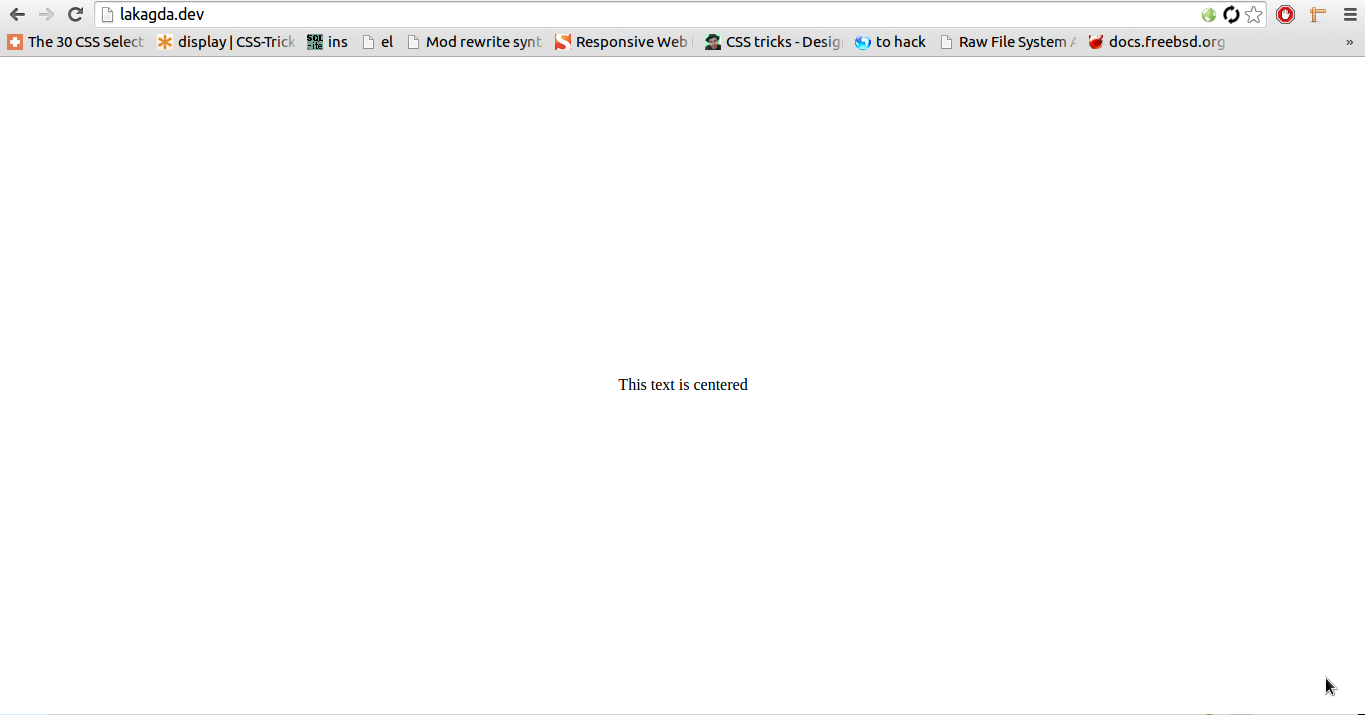
Result looks so:
Solution 21 - Html
An alternative answer would be this.
<div id="container">
    <div id="centered"> </div>
</div>
and the css:
#container {
    height: 400px;
    width: 400px;
    background-color: lightblue;
    text-align: center;
}

#container:before {
    height: 100%;
    content: '';
    display: inline-block;
    vertical-align: middle;
}

#centered {
    width: 100px;
    height: 100px;
    background-color: blue;
    display: inline-block;
    vertical-align: middle;
    margin: 0 auto;
}
Solution 22 - Html
I'm surprised this has not been mentioned yet, but the simplest way to do this would be by setting the height, margin (and width, if you want) using viewport sizes.
As you might know, total height of the viewport = 100vh.
Say you want the height of you container to occupy 60% (60vh) of the screen, you can divide the rest (40vh) equally between the top and the bottom margin so that the element aligns itself in the centre automatically.
Setting the margin-left and margin-right to auto, will make sure the container is centred horizontally.
.container {
         width: 60vw; /*optional*/
         height: 60vh;
         margin: 20vh auto;
         background: #333;
 }
<div class="container">
</div>
Solution 23 - Html
If you guys are using JQuery, you can do this by using .position();
<div class="positionthis"></div>
CSS
.positionthis {
    width:100px;
    height:100px;
    position: absolute;
    background:blue;
}
Javascript (JQuery)
$(document).ready(function () {
    $('.positionthis').position({
        of: $(document),
        my: 'center center',
        at: 'center center',
        collision: 'flip flip'
    });
});
JSFiddle : http://jsfiddle.net/vx9gV/
Solution 24 - Html
In case you know a defined sized for your div you could use calc.
Live example: https://jsfiddle.net/o8416eq3/
Notes: This works only if you hard coded the width and height of your ``div` in the CSS.
#target {
  position:fixed;
  top: calc(50vh - 100px/2);
  left: calc(50vw - 200px/2);
  width:200px;
  height:100px;
  background-color:red;
}
<div id='target'></div>
Solution 25 - Html
Using display:grid on parent and setting margin:auto to the centrerd elemnt will do the trick :
See below snippet :
html,body {
  width :100%;
  height:100%;
  margin:0;
  padding:0;
}

.container {
  display:grid;
  height:90%;
  background-color:blue;
}

.content {
  margin:auto;
  color:white;
}
<div class="container">
  <div class="content"> cented div  here</div>
</div>
Solution 26 - Html
div {
    position: absolute;
    top: 50%;
    left: 50%;
    transform: translate(-50%, -50%);
    -ms-transform: translate(-50%, -50%); /* IE 9 */
    -webkit-transform: translate(-50%, -50%); /* Chrome, Safari, Opera */
}
<body>
    <div>Div to be aligned vertically</div>
</body>
position: absolute div in body document
An element with position: absolute; is positioned relative to the nearest positioned ancestor (instead of positioned relative to the viewport (body tag), like fixed).
However; if an absolute positioned element has no positioned ancestors, it uses the document body, and moves along with page scrolling.
source: CSS position
Solution 27 - Html
Is the browser supports it, using translate is powerful.
position: absolute;
background-color: red;

width: 70%;
height: 30%;

/* The translate % is relative to the size of the div and not the container*/
/* 21.42% = ( (100%-70%/2) / 0.7 ) */
/* 116.666% = ( (100%-30%/2) / 0.3 ) */
transform: translate3d( 21.42%, 116.666%, 0);
Solution 28 - Html
This solution worked for me
    .middleDiv{
        position : absolute;
        height : 90%;
        bottom: 5%;
    }
(or height : 70% / bottom : 15%
height : 40% / bottom :30% ...)
Solution 29 - Html
Sorry for late reply best way is
  div {
      position: fixed;
      top: 50%;
      left: 50%;
      margin-top: -50px;
      margin-left: -100px;
    }
margin-top and margin-left should be according to your div box size
Solution 30 - Html
Please use following CSS properties for center align
div {
  position: absolute;
  left: 0;
  top: 0;
  right: 0;
  bottom: 0px;
  margin: auto;
  width: 100px;
  height: 100px;
}