How to change the style of a DatePicker in android?
AndroidAndroid StylesAndroid DatepickerAndroid TimepickerAndroid Problem Overview
I want to change the default color of the date/time picker dialog in Android, so that it should match my app's theme. I searched for the solution on Google, but I couldn't find a solution.
What I was doing was creating a new style:
  <style name="datepicker" parent="@android:style/Widget.DeviceDefault.DatePicker">
    <!---TODO-->
    <item name="android:focusedMonthDateColor">@android:color/holo_red_dark</item>
</style>
Don't know what are the attributes available for date picker dialogue. It would be great if anyone could post a link on that
and after adding the style I was calling it in my main style as
<item name="android:datePickerStyle">@style/datepicker</item>
Unfortunately, this didn't work for me at all.
Android Solutions
Solution 1 - Android
call like this
 button5.setOnClickListener(new View.OnClickListener() {

 @Override
 public void onClick(View v) {
 // TODO Auto-generated method stub

 DialogFragment dialogfragment = new DatePickerDialogTheme();

 dialogfragment.show(getFragmentManager(), "Theme");

 }
 });

public static class DatePickerDialogTheme extends DialogFragment implements DatePickerDialog.OnDateSetListener{

     @Override
     public Dialog onCreateDialog(Bundle savedInstanceState){
     final Calendar calendar = Calendar.getInstance();
     int year = calendar.get(Calendar.YEAR);
     int month = calendar.get(Calendar.MONTH);
     int day = calendar.get(Calendar.DAY_OF_MONTH);

//for one

//for two

 DatePickerDialog datepickerdialog = new DatePickerDialog(getActivity(),
 AlertDialog.THEME_DEVICE_DEFAULT_DARK,this,year,month,day);

//for three
 DatePickerDialog datepickerdialog = new DatePickerDialog(getActivity(),
 AlertDialog.THEME_DEVICE_DEFAULT_LIGHT,this,year,month,day);

// for four

   DatePickerDialog datepickerdialog = new DatePickerDialog(getActivity(),
 AlertDialog.THEME_HOLO_DARK,this,year,month,day);

//for five

 DatePickerDialog datepickerdialog = new DatePickerDialog(getActivity(),
     AlertDialog.THEME_HOLO_LIGHT,this,year,month,day);

//for six

 DatePickerDialog datepickerdialog = new DatePickerDialog(getActivity(),
 AlertDialog.THEME_TRADITIONAL,this,year,month,day);


     return datepickerdialog;
     }

     public void onDateSet(DatePicker view, int year, int month, int day){

     TextView textview = (TextView)getActivity().findViewById(R.id.textView1);

     textview.setText(day + ":" + (month+1) + ":" + year);

     }
     }
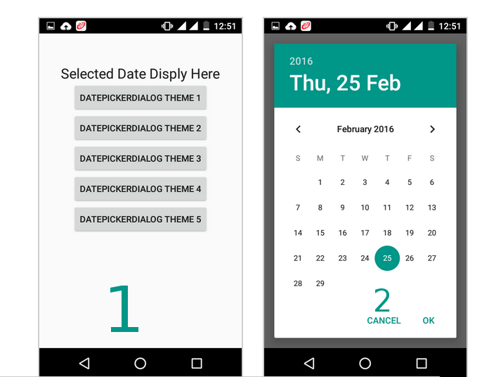
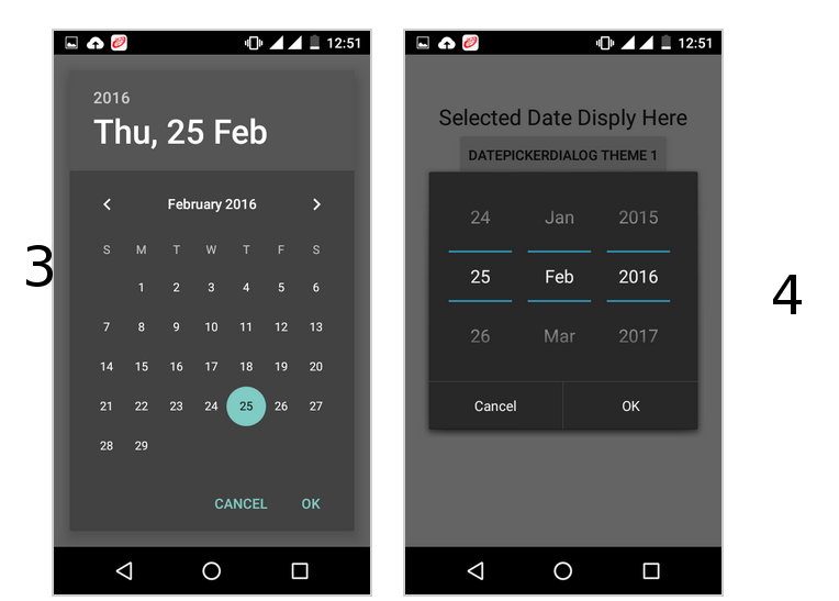
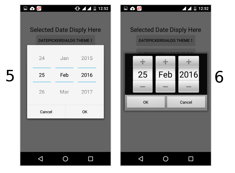
follow this it will give you all type date picker style(copy from this)
http://www.android-examples.com/change-datepickerdialog-theme-in-android-using-dialogfragment/
Solution 2 - Android
Try this. It's the easiest & most efficient way
<style name="datepicker" parent="Theme.AppCompat.Light.Dialog">
        <item name="colorPrimary">@color/primary</item>
        <item name="colorPrimaryDark">@color/primary_dark</item>
        <item name="colorAccent">@color/primary</item>
</style>
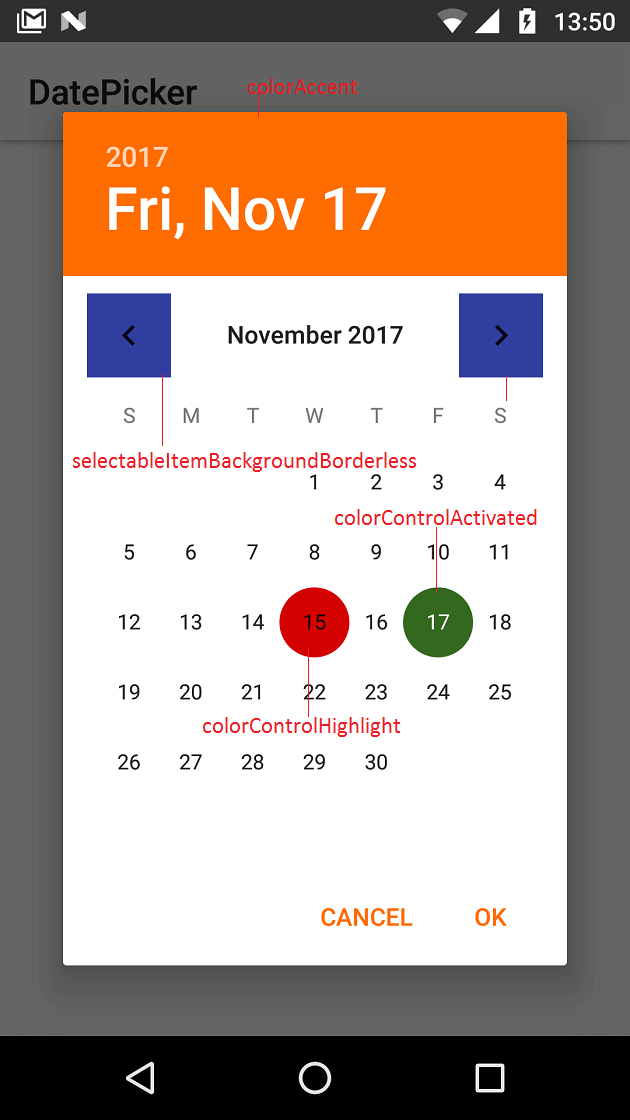
Solution 3 - Android
To change DatePicker colors (calendar mode) at application level define below properties.
<style name="MyAppTheme" parent="Theme.AppCompat.Light">
    <item name="colorAccent">#ff6d00</item>
    <item name="colorControlActivated">#33691e</item>
    <item name="android:selectableItemBackgroundBorderless">@color/colorPrimaryDark</item>
    <item name="colorControlHighlight">#d50000</item>
</style>
See http://www.zoftino.com/android-datepicker-example for other DatePicker custom styles
Solution 4 - Android
Create a new style
<style name="my_dialog_theme" parent="ThemeOverlay.AppCompat.Dialog">
    <item name="colorAccent">@color/colorAccent</item>                   <!--header background-->
    <item name="android:windowBackground">@color/colorPrimary</item>     <!--calendar background-->
    <item name="android:colorControlActivated">@color/colorAccent</item> <!--selected day-->
    <item name="android:textColorPrimary">@color/colorPrimaryText</item> <!--days of the month-->
    <item name="android:textColorSecondary">@color/colorAccent</item>    <!--days of the week-->
</style>
Then initialize the dialog
Calendar mCalendar = new GregorianCalendar();
mCalendar.setTime(new Date());

new DatePickerDialog(mContext, R.style.my_dialog_theme, new DatePickerDialog.OnDateSetListener() {
    @Override
    public void onDateSet(DatePicker view, int year, int monthOfYear, int dayOfMonth) {
        //do something with the date
    }
}, mCalendar.get(Calendar.YEAR), mCalendar.get(Calendar.MONTH), mCalendar.get(Calendar.DAY_OF_MONTH)).show();
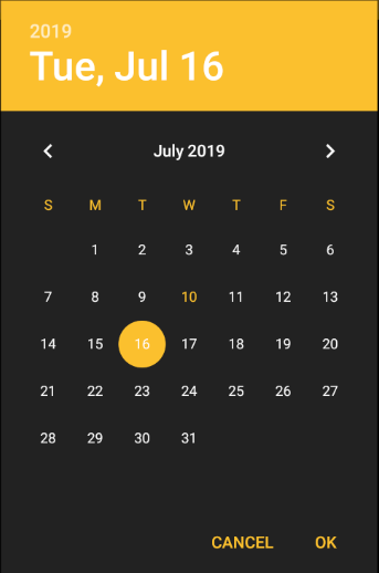
Result:
Solution 5 - Android
Calendar calendar = Calendar.getInstance();

DatePickerDialog datePickerDialog = new DatePickerDialog(getActivity(), R.style.DatePickerDialogTheme, new DatePickerDialog.OnDateSetListener() {
  public void onDateSet(DatePicker view, int year, int monthOfYear, int dayOfMonth) {
    Calendar newDate = Calendar.getInstance();
    newDate.set(year, monthOfYear, dayOfMonth);

    SimpleDateFormat simpleDateFormat = new SimpleDateFormat("dd-MM-yyyy");
    String date = simpleDateFormat.format(newDate.getTime());
  }
}, calendar.get(Calendar.YEAR), calendar.get(Calendar.MONTH), calendar.get(Calendar.DAY_OF_MONTH));

datePickerDialog.show();
And use this style:
<style name="DatePickerDialogTheme" parent="Theme.AppCompat.Light.Dialog">
  <item name="colorAccent">@color/colorPrimary</item>
</style>
Solution 6 - Android
(I'm using React Native; targetSdkVersion 22). I'm trying to change the look of a calendar date picker dialog. The accepted answer didn't work for me, but this did. Hope this snippet helps some of you.
<style name="CalendarDatePickerDialog"  parent="Theme.AppCompat.Light.Dialog">
    <item name="colorAccent">#6bf442</item>
    <item name="android:textColorPrimary">#6bf442</item>
</style>
Solution 7 - Android
As AlertDialog.THEME attributes are deprecated, while creating DatePickerDialog you should pass one of these parameters for int themeResId
- android.R.style.Theme_DeviceDefault_Dialog_Alert
- android.R.style.Theme_DeviceDefault_Light_Dialog_Alert
- android.R.style.Theme_Material_Light_Dialog_Alert
- android.R.style.Theme_Material_Dialog_Alert
Solution 8 - Android
Create custom DatePickerDialog style:
<style name="AppTheme.DatePickerDialog" parent="Theme.MaterialComponents.Light.Dialog">
	<item name="android:colorAccent">@color/colorPrimary</item>
	<item name="android:colorControlActivated">@color/colorPrimaryDark</item>
	<item name="android:buttonBarPositiveButtonStyle">@style/AppTheme.Alert.Button.Positive</item>
	<item name="android:buttonBarNegativeButtonStyle">@style/AppTheme.Alert.Button.Negative</item>
	<item name="android:buttonBarNeutralButtonStyle">@style/AppTheme.Alert.Button.Neutral</item>
</style>

<style name="AppTheme.Alert.Button.Positive" parent="Widget.MaterialComponents.Button.TextButton">
	<item name="android:textColor">@color/buttonPositive</item>
</style>

<style name="AppTheme.Alert.Button.Negative" parent="Widget.MaterialComponents.Button.TextButton">
	<item name="android:textColor">@color/buttonNegative</item>
</style>

<style name="AppTheme.Alert.Button.Neutral" parent="Widget.MaterialComponents.Button.TextButton">
	<item name="android:textColor">@color/buttonNeutral</item>
</style>
Set custom datePickerDialogTheme style in app theme:
<style name="AppTheme" parent="Theme.MaterialComponents.Light.NoActionBar">
	<item name="android:datePickerDialogTheme">@style/AppTheme.DatePickerDialog</item>
</style>
Set theme programmatically on initialization like this:
val datetime = DatePickerDialog(this, R.style.AppTheme_DatePickerDialog)
Solution 9 - Android
If you are using a DatePicker in XML, all you have to do is adding a style for your dialog as @theBeardedPilot mentioned like this:
<style name="DialogTheme" parent="ThemeOverlay.AppCompat.Dialog">
    <!--header background-->
    <item name="colorAccent">@android:color/holo_green_dark</item>
    <!--selected day-->
    <item name="android:colorControlActivated">@android:color/holo_red_dark</item>
    <!--days of the month-->
    <item name="android:textColorPrimary">@android:color/holo_orange_dark</item>
    <!--days of the week-->
    <item name="android:textColorSecondary">@android:color/holo_blue_dark</item>
</style>
then call this style using the android:theme attribute like this:
<DatePicker
    android:theme="@style/DialogTheme"
    android:layout_width="wrap_content"
    android:layout_height="wrap_content" />