How to align left last row/line in multiple line flexbox
CssRowFlexboxCss Problem Overview
I have a major issue with flexbox layout. I build a container with a boxes filled with images, and i decided to use flexbox layout to justify the content to make it looks like a grid
Her's the code:
<div class="container">

    <div class="item"></div>
    <div class="item"></div>
    ...
    <div class="item"></div>

</div>
and the CSS:
.container {
    display: flex;
    display: -webkit-flex;
    display: -moz-flex;
    justify-content: space-around;
    -webkit-justify-content: space-around;
    -moz-justify-content: space-around;
    flex-flow: row wrap;
    -webkit-flex-flow: row wrap;
    -moz-flex-flow: row wrap;
}

.container .item { width: 130px; height: 180px; background: red; margin: 0 1% 24px; }
And everything looks good except the last line/row - when it not contain the same number of element that other lines, centering elements and it broke my grid effect.
http://jsfiddle.net/puz219/7Hq2E/
How to align last line/row to left side?
Css Solutions
Solution 1 - Css
Got it. (I think)(this is my first contribution here!)
Imagine a layout which needs to have 4 images per row. w:205 h:174 Problem: Using justify-content:space-around, if the last row doesn´t have 4 images (has 3, 2 or 1), they would not respect the grid, they would spread. So.
Create in the html 3 divs with the class "filling-empty-space-childs" like this.
.filling-empty-space-childs {
    width:205px; /*the width of the images in this example*/
    height:0; /*Important! for the divs to collapse should they fall in a new row*/
}
The flexbox container has display:flex / flex-wrap:wrap; / justify-content:space-around
The last row can have 4, 3, 2, 1 images. 4 images: no problem, this three divs would collapse in a new row since they have no height. 3 images: no problem, one div is going to be in the same row, invisible, and the other two would wrap to a new row, but will collapse since they have no height. 2 images: no problem, two divs are going to be in the same row, invisibles, the rest... collapsed 1 image: no problem, the three divs are going to fill in the space.
Solution 2 - Css
Unfortunately this is not possible with flexbox.
The best work-around is to add invisible children 'filling up' the empty 'blocks' in the last row. That way, the actual, visible, element is aligned left.
Similar question: https://stackoverflow.com/questions/18744164/flex-box-align-last-row-to-grid
Solution 3 - Css
You can use margin-right:auto on the last-child flex item.
The problem here is that you will lose the space-between property on the left for this flex item.
Hope it helps!
Solution 4 - Css
I thought this example might be useful for anyone who wanted multiple items and allow for responsiveness, the grid items change depending on the viewport size. It does not use any invisible children, it's all done through css.
Might help someone trying align items to the left when the last row has less items and they require the page to be responsive.
http://codepen.io/kunji/pen/yNPVVb
Sample HTML
<div class="main-container">

    <div class="main-items-container">

        <div class="item-container">
          <h2>Item Name</h2>
        </div>

        <div class="item-container">
          <h2>Item Name</h2>
        </div>

        <div class="item-container">
          <h2>Item Name</h2>
        </div>

        <div class="item-container">
          <h2>Item Name</h2>
        </div>

        <div class="item-container">
          <h2>Item Name</h2>
        </div>

        <div class="item-container">
          <h2>Item Name</h2>
        </div>

    </div>

</div>
Sample CSS
.main-container {
  max-width: 1000px;
  min-width: 300px;
  margin: 0 auto;
  padding: 40px;
  box-sizing: border-box;
  border: 1px solid #000;
}

.main-items-container {
  display: -ms-flexbox;
  display: flexbox;
  display: -webkit-flex;
  display: -ms-flex;
  display: flex;
  padding: 0;
  margin: 10px 0;
  list-style: none;
  width: auto;
  -webkit-flex-flow: row wrap;
  justify-content: flex-start;
  -webkit-flex-wrap: wrap;
  flex-wrap: wrap;
  -webkit-align-items: stretch;
  align-items: stretch;
  box-sizing: border-box;
}

@media (min-width: 971px) {
  .item-container {
    margin: 10px 2%;
    width: 22%;
    padding: 10px;
    border: 1px solid #000;
    box-sizing: border-box;
  }
  .item-container:nth-child(4n+1) {
    margin-left: 0;
  }
  .item-container:nth-child(4n) {
    margin-right: 0;
  }
}

@media (min-width: 550px) and (max-width: 970px) {
  .item-container {
    margin: 10px 2.50%;
    width: 30%;
    padding: 10px;
    border: 1px solid #000;
    box-sizing: border-box;
  }
  .item-container:nth-child(3n+1) {
    margin-left: 0;
  }
  .item-container:nth-child(3n) {
    margin-right: 0;
  }
}

@media (max-width: 549px) {
  .item-container {
    margin: 10px 0;
    width: initial;
    padding: 10px;
    border: 1px solid #000;
    box-sizing: border-box;
  }
}
Solution 5 - Css
This is not an effect you wanted to achieve?
CSS:
.container {
    display: flex;
    display: -webkit-flex;
    display: -moz-flex;
    flex-flow: row wrap;
    -webkit-flex-flow: row wrap;
    -moz-flex-flow: row wrap;
}
.container .item {
    width: 23%;
    height: 180px;
    background: red;
    margin: 0 1% 20px;
}
HTML:
<div class="container">
    <div class="item"></div>
    <div class="item"></div>
    <div class="item"></div>
    <div class="item"></div>
    <div class="item"></div>
    <div class="item"></div>
</div>
Solution 6 - Css
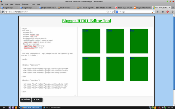
I've checked it and it worked better in my HTML editor tool
the script should be the way
CSS Part
> .container {
> display: flex;
> display: -webkit-flex;
> display: -moz-flex;
> justify-content: space-around;
> -webkit-justify-content: space-around;
> -moz-justify-content: space-around;
> flex-flow: row wrap;
> -webkit-flex-flow: row wrap;
> -moz-flex-flow: row wrap;
}
>
> .container .item { width: 130px; height: 180px; background: green;
> margin: 0 1% 24px; }
HTML Part
<div class="container">

    <div class="item"><a href='google.com'>Google</a></div>
    <div class="item"><a href='google.com'>Yahoo</a></div>
    <div class="item"><a href='google.com'>Bing</a></div>
</div>

<div class="container">
    <div class="item"><a href='google.com'>Google</a></div>
    <div class="item"><a href='google.com'>Yahoo</a></div>
    <div class="item"><a href='google.com'>Bing</a></div>

</div>