White space around css3 scale
CssScaleCss Problem Overview
I have a small issue I want to fix, but can't find any good answer :
When I use a scale on a div (which contains other divs), it leave white space around, from the "original" width and height of my div :
How can I remove the withe space around the div while scaled ?
I can use js if needed !
EDIT: Here is some code :
HTML
<div class="pull-right nextpack">

					<div class="quarter scale-thumb">

						<div class="up">
							<div class="inner" style="background-image: url({{URL::base().'/galery/th293x711/'.$nextpack->src}})"></div>
						</div>

						<div class="face">
							<div class="top" style="background-image: url({{URL::base().'/galery/th293x711/'.$nextpack->src}})"></div>
							<div class="bot" style="background-image: url({{URL::base().'/galery/th293x711/'.$nextpack->src}})"></div>
						</div>

						<div class="cote-droit">
							<div class="inner">
								<div class="cote-droit-top" style="background-image: url({{URL::base().'/galery/th293x711/'.$nextpack->src}})"></div>
								<div class="cote-droit-bot" style="background-image: url({{URL::base().'/galery/th293x711/'.$nextpack->src}})"></div>
							</div>
						</div>

					</div>


				</div>
CSS (you really don't need to know how the pack is done, it's a lot of css3 for nothing, basically just skew, rotate, scale to make a 3D render from a flat template)
.quarter.scale-thumb
{
-webkit-transform: scale(0.2);
-moz-transform: scale(0.2);
-o-transform: scale(0.2);
transform: scale(0.2);
}
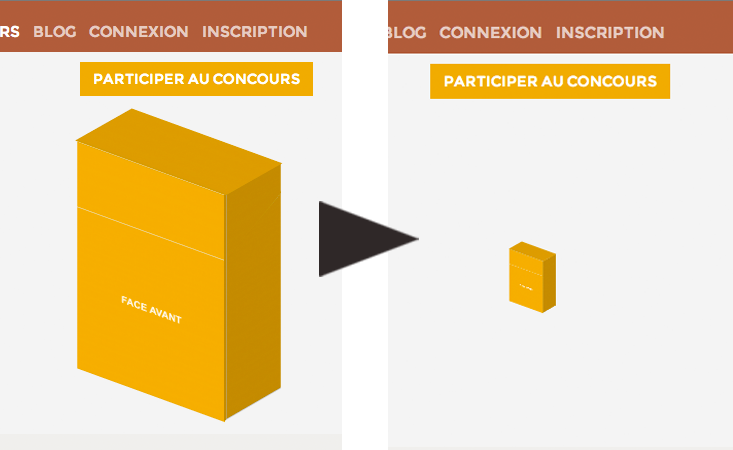
PS : The first pic is when I don't add the scale-thumb class
Css Solutions
Solution 1 - Css
how transform works is:
- your element gets rendered
- your element gets transformed (moved, rotated, scaled)
- other elements stay where they got rendered - around the "original element"
so the white space is really just the way the element was rendered in the first place.
You should use width and height in CSS if you want to render the size of elements differently and have the surrounding elements respond to it.
Or you could use something like javascript to resize things.
Solution 2 - Css
solution is to wrap the element inside a container, and resize it too while the scale() is done
Jsfiddle demo: http://jsfiddle.net/2KxSJ/
relevant code is:
#wrap
{
	background:yellow;
	height:66px;
	width:55px;
	padding:10px;
	float:left;
	-webkit-transition:0.5s all;
	-moz-transition:0.5s all;
	/* more transition here */
}

#wrap:hover
{
	height:300px;
	width:260px;
}

.quarter
{
	padding:20px;
	-webkit-transform: scale(0.2);
	-moz-transform: scale(0.2);
	-o-transform: scale(0.2);
	transform: scale(0.2);
	background:red;
	width:250px;
	-webkit-transform-origin:left top;
	-webkit-transition:0.5s all;
	-moz-transition:0.5s all;
	/* more transition here */
}


#wrap:hover .quarter
{
	-webkit-transform: scale(0.9);
	-moz-transform: scale(0.9);
	-o-transform: scale(0.9);
	transform: scale(0.9);
	-webkit-transform-origin:left top;
	-moz-transform-origin:left top;
	/* more transform-origin */
}
Solution 3 - Css
I encountered this problem and I solved it in this way, I used SCSS in order to don't repeat the same numbers along the code. The below code just moves the element right as the zoom decreases, in order to re-align it.
$originalWidth: 100px;
$rate: 0.5;

parent {
  width: $originalWidth;
}

parent > div {
  transform: scale(1);
}

parent:hover {
  width: $originalWidth*$rate;
}

parent:hover > div {
  transform: translateX(($originalWidth * ($rate - 1))/2) scale($rate); /* the order matters*/
}
You can get rid of SCSS just using CSS variables and calc(), if you prefer.
Solution 4 - Css
I resolved my problem like yours that way.
I have a main container and I want decrease it
my css:
.grid-container.full { transform: scale(0.6); transform-origin: top center; }
but my container had the bigger margin bottom. then I do it:
$mainGrid = $('.grid-container.full') $mainGrid.css('height', $mainGrid.height() * .6);
Solution 5 - Css
Another idea for white spaces when you transform objects
<div class="outer">
    <div class="inner">
        transformme
    </div>
</div>
css
.outer { overflow:hidden }
.inner {
    transform-origin:left top;
}
js
var rate = 0.5;
var outerheight = $('.inner').outerHeight()*rate;
$('.inner').css({ transform: "scale("+rate+")" });
$('.outer').css({ height: outerheight });
Also you can add other browser tags; -webkit-transform, -moz-transform, -o-transform
Solution 6 - Css
Solved the issue with margin-bottom (it will be negative in case of scaling down):
#container {
  display: inline-block;
  border: 3px solid blue;
}

#content {
  --scale: 0.5;

  width: 200px;
  height: 200px;
  background: lightgreen;
  transform: scale(var(--scale));
  transform-origin: top left;
  margin-bottom: calc((var(--scale) - 1) * 100%);
}
<div id="container">
  <div id="content"></div>
</div>
Solution 7 - Css
it's simple you have to calculate with height, If for some reason you turn it upside down! like here your current width: 500px; and height: 220px; you want to reverse it like width: 220px; height: 500px; then again you have to use margin-bottom: calc((0.6 - 1) * 500px); that's it.
#parent {
  display: inline-block;
  outline: 5px solid black;
}

#child {
  width: 500px;
  height: 220px;
  background: #555;
  transform: scale(0.6);
  transform-origin: top center;
  margin-bottom: calc((0.6 - 1) * 220px);
}
<div id="parent">
  <div id="child"> </div>
</div>
Solution 8 - Css
I have a simple solution: You could put it all inside another div which has height:0px;.
Solution 9 - Css
try multiplying both width and height of image using decimal numbers. Like this -> (I used SCSS)
img{
 width : 100px * 0.5;  // width reduced to half
 height : 100px * 0.5; // height reduced to half
}
I hope this helps in 2021 !
Solution 10 - Css
I had the task to place drop-down into the site menu scaled to 0.5 top right with width: 500px. I resolved it: wrap drop-down into tag div, then apply next CSS code the wrapper:
div.scale_wrapper{
    position: relative;
    top: 34px;
    margin-right: calc(500px * -0.5);
}
Play with 34px for your current purposes. -0.5 is scale
Demo link with drop-down in the top site menu: https://demo.currency-switcher.com/
Solution 11 - Css
If you do not need Firefox compatibility you could use {zoom:0.2} instead of {transform: scale(0.2);}
Solution 12 - Css
I solved this with by adding an 'outline: 1px solid transparent' to the element where the scale is applied on.
#wrap:hover .quarter
{
   -webkit-transform: scale(0.9);
   -moz-transform: scale(0.9);
   -o-transform: scale(0.9);
   transform: scale(0.9);
   -webkit-transform-origin:left top;
   -moz-transform-origin:left top;

   outline: 1px solid transparent;
}