How can I show only corner borders?
CssBorderCss ShapesCss Problem Overview
I'm wondering if it's possible in CSS to make a border but only for corner. Something like this:
****                         ****
*                               *
*                               *

             CONTENT

*                               *
*                               *
****                         ****
Css Solutions
Solution 1 - Css
Assuming <div id="content">CONTENT</div> and that CONTENT includes at least one HTML node.
#content {position:relative}
#content:before, #content:after, #content>:first-child:before, #content>:first-child:after {
    position:absolute; content:' ';
    width:80px; height: 80px;
    border-color:red; /* or whatever colour */
    border-style:solid; /* or whatever style */
}
#content:before {top:0;left:0;border-width: 1px 0 0 1px}
#content:after {top:0;right:0;border-width: 1px 1px 0 0}
#content>:first-child:before {bottom:0;right:0;border-width: 0 1px 1px 0}
#content>:first-child:after {bottom:0;left:0;border-width: 0 0 1px 1px}
Here's a Fiddle
Solution 2 - Css
I would use overlapping divs.
One with square corners. And the Other with rounded corner (so it doesn't hide the corners of the first one).
<div id="div1" />
<div id="div2" />


#div1 {
  position:absolute;
  top:9px;
  left:9px;
  height:100px;
  width:100px;
  background-color:white;
  border:1px solid black;
}

#div2 {
  position:relative;
  top:-1px;
  left:-1px;
  height:102px;
  width:102px;
  background-color:white;
  border-radius: 15px;
}
Result:

An enhanced solution provided by @web-tiki:
Solution 3 - Css
You can achieve that using multiple linear gradients as a background image.
div {
  width: 100px;
  height: 100px;

  background:
    linear-gradient(to right, black 4px, transparent 4px) 0 0,
    linear-gradient(to right, black 4px, transparent 4px) 0 100%,
    linear-gradient(to left, black 4px, transparent 4px) 100% 0,
    linear-gradient(to left, black 4px, transparent 4px) 100% 100%,
    linear-gradient(to bottom, black 4px, transparent 4px) 0 0,
    linear-gradient(to bottom, black 4px, transparent 4px) 100% 0,
    linear-gradient(to top, black 4px, transparent 4px) 0 100%,
    linear-gradient(to top, black 4px, transparent 4px) 100% 100%;

  background-repeat: no-repeat;
  background-size: 20px 20px;
}
<div></div>
Solution 4 - Css
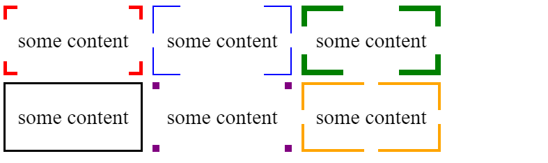
Here is an idea using gradient and CSS variables where you can easily control the shape of your border:
.box {
  --b:5px;   /* thickness of the border */
  --c:red;   /* color of the border */
  --w:20px;  /* width of border */


  border:var(--b) solid transparent; /* space for the border */
  --g:#0000 90deg,var(--c) 0;
  background:
    conic-gradient(from 90deg  at top    var(--b) left  var(--b),var(--g)) 0    0,
    conic-gradient(from 180deg at top    var(--b) right var(--b),var(--g)) 100% 0,
    conic-gradient(from 0deg   at bottom var(--b) left  var(--b),var(--g)) 0    100%,
    conic-gradient(from -90deg at bottom var(--b) right var(--b),var(--g)) 100% 100%;
  background-size:var(--w) var(--w);
  background-origin:border-box;
  background-repeat:no-repeat;

  /*Irrelevant code*/
  width:200px;
  height:100px;
  box-sizing:border-box;
  margin:5px;
  display:inline-flex;
  font-size:30px;
  justify-content:center;
  align-items:center;
  line-height:90px;
}
<div class="box">
some content
</div>

<div class="box" style="--c:blue;--w:40px;--b:2px">
some content
</div>

<div class="box" style="--c:green;--w:30%;--b:8px">
some content
</div>

<div class="box" style="--c:black;--w:50%;--b:3px">
some content
</div>

<div class="box" style="--c:purple;--w:10px;--b:10px">
some content
</div>

<div class="box" style="--c:orange;--w:calc(50% - 10px);--b:4px">
some content
</div>
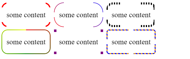
You can also have a complex coloration if you combine this with mask:
.box {
  --b:5px;   /* thickness of the border */
  --c:red;   /* color of the border */
  --w:20px;  /* width of border */


  padding:var(--b); /* space for the border */

  position:relative;
  /*Irrelevant code*/
  width:200px;
  height:100px;
  box-sizing:border-box;
  margin:5px;
  display:inline-flex;
  font-size:30px;
  justify-content:center;
  align-items:center;
  line-height:90px;
}
.box::before {
  content:"";
  position:absolute;
  top:0;
  left:0;
  right:0;
  bottom:0;
  background:var(--c,red);
  --g:#0000 90deg,#000 0;
  -webkit-mask:
    conic-gradient(from 90deg  at top    var(--b) left  var(--b),var(--g)) 0    0,
    conic-gradient(from 180deg at top    var(--b) right var(--b),var(--g)) 100% 0,
    conic-gradient(from 0deg   at bottom var(--b) left  var(--b),var(--g)) 0    100%,
    conic-gradient(from -90deg at bottom var(--b) right var(--b),var(--g)) 100% 100%;
  -webkit-mask-size:var(--w) var(--w);
  background-origin:border-box;
  -webkit-mask-repeat:no-repeat;
  mask:
    conic-gradient(from 90deg  at top    var(--b) left  var(--b),var(--g)) 0    0,
    conic-gradient(from 180deg at top    var(--b) right var(--b),var(--g)) 100% 0,
    conic-gradient(from 0deg   at bottom var(--b) left  var(--b),var(--g)) 0    100%,
    conic-gradient(from -90deg at bottom var(--b) right var(--b),var(--g)) 100% 100%;
  mask-size:var(--w) var(--w);
  mask-repeat:no-repeat;
}
<div class="box">
some content
</div>

<div class="box" style="--c:repeating-linear-gradient(45deg,red,blue);--w:40px;--b:2px">
some content
</div>

<div class="box" style="--c:repeating-linear-gradient(90deg,#000 0 5px,transparent 5px 10px);--w:30%;--b:8px">
some content
</div>

<div class="box" style="--c:conic-gradient(red,green,yellow);--w:50%;--b:3px">
some content
</div>

<div class="box" style="--c:purple;--w:10px;--b:10px">
some content
</div>

<div class="box" style="--c:repeating-linear-gradient(45deg,orange 0 5px,blue 5px 10px);--w:calc(50% - 10px);--b:4px">
some content
</div>

And why not with radius:
.box {
  --b:5px;   /* thickness of the border */
  --c:red;   /* color of the border */
  --w:20px;  /* width of border */
  --r:25px;  /* radius */


  padding:var(--b); /* space for the border */

  position:relative;
  /*Irrelevant code*/
  width:200px;
  height:100px;
  box-sizing:border-box;
  margin:5px;
  display:inline-flex;
  font-size:30px;
  justify-content:center;
  align-items:center;
  line-height:90px;
}
.box::before {
  content:"";
  position:absolute;
  top:0;
  left:0;
  right:0;
  bottom:0;
  background:var(--c,red);
  padding:var(--b);
  border-radius:var(--r);
  -webkit-mask:
    linear-gradient(#fff 0 0) top   /calc(100% - 2*var(--w)) var(--b),
    linear-gradient(#fff 0 0) bottom/calc(100% - 2*var(--w)) var(--b),
    linear-gradient(#fff 0 0) left  /var(--b) calc(100% - 2*var(--w)),
    linear-gradient(#fff 0 0) right / var(--b) calc(100% - 2*var(--w)),
    linear-gradient(#fff 0 0) content-box,
    linear-gradient(#fff 0 0);
  -webkit-mask-composite:destination-out;
  -webkit-mask-repeat:no-repeat;
  mask:
    linear-gradient(#fff 0 0) top   /calc(100% - 2*var(--w)) var(--b),
    linear-gradient(#fff 0 0) bottom/calc(100% - 2*var(--w)) var(--b),
    linear-gradient(#fff 0 0) left  /var(--b) calc(100% - 2*var(--w)),
    linear-gradient(#fff 0 0) right / var(--b) calc(100% - 2*var(--w)),
    linear-gradient(#fff 0 0) content-box,
    linear-gradient(#fff 0 0);
  mask-composite:exclude;
  mask-repeat:no-repeat;
}
<div class="box">
some content
</div>

<div class="box" style="--c:repeating-linear-gradient(45deg,red,blue);--w:40px;--b:2px;--r:40px;">
some content
</div>

<div class="box" style="--c:repeating-linear-gradient(90deg,#000 0 5px,transparent 5px 10px);--w:30%;--b:8px">
some content
</div>

<div class="box" style="--c:conic-gradient(red,green,yellow);--w:50%;--b:3px">
some content
</div>

<div class="box" style="--c:purple;--w:10px;--b:10px;--r:0px">
some content
</div>

<div class="box" style="--c:repeating-linear-gradient(45deg,orange 0 5px,blue 5px 10px);--w:calc(50% - 10px);--b:4px;--r:10px">
some content
</div>
Solution 5 - Css
SVG
This is another great alternative if you now want to start using vectors to allow for great responsiveness.
<svg viewBox="0 0 100 100" width="50px">
  <path d="M25,2 L2,2 L2,25" fill="none" stroke="black" stroke-width="3" />
  <path d="M2,75 L2,98 L25,98" fill="none" stroke="black" stroke-width="3" />
  <path d="M75,98 L98,98 L98,75" fill="none" stroke="black" stroke-width="3" />
  <path d="M98,25 L98,2 L75,2" fill="none" stroke="black" stroke-width="3" />
</svg>
SVG is a great tool to use. Some of the advantages of using SVG in this case are:
- Curve control
- Fill control (opacity, color)
- Stroke control (width, opacity, color)
- Amount of code
- Time to build and maintain the shape
- Scalable
- No HTTP request (if used inline like in the example)
Browser support for inline SVG goes back to Internet Explorer 9. See canIuse for more information.
Solution 6 - Css
You could absolutely position four <div>s, one in each corner, each with the appropriate two borders.
.corners {
  position: relative;
  width: 50px; /* for demo purposes */
  padding: 10px;
}

.top, .bottom {
  position: absolute;
  width: 20px;
  height: 20px;
  pointer-events: none;
}

.top {
  top: 0;
  border-top: 1px solid;
}

.bottom {
  bottom: 0;
  border-bottom: 1px solid;
}

.left {
  left: 0;
  border-left: 1px solid;
}

.right {
  right: 0;
  border-right: 1px solid;
}
<div class="corners">
  <div class="top left"></div>
  <div class="top right"></div>
  <div class="bottom right"></div>
  <div class="bottom left"></div>
  content goes here
</div>
Solution 7 - Css
Here are a couple of methods to create this effect without using any extra pseudo/real elements. One thing to note is that both these approaches would work only in modern browsers because they use CSS3 properties.
Using border-image: The border-image property makes it pretty easy to create such effects. The approach is as follows:
- Create a transparent image which has borders just in the corner like here.
- Set this image as the
border-image-sourceand let the browser take care of the rest :) Since the default value forborder-image-repeatisstretch, the browser would stretch the original image to fit the container even if the container becomes large. - The value set for the
border-image-widthproperty determines how thick the borders are.
.bordered {
  background-color: beige;
  border-image-source: url("http://i.stack.imgur.com/s2CAw.png");
  border-image-slice: 1;
  border-image-width: 5px;
}
.square {
  height: 150px;
  width: 150px;
}
.large-square {
  height: 350px;
  width: 350px;
}

/* Just for demo */

div {
  margin-bottom: 10px;
}
<div class='bordered square'></div>
<div class='bordered large-square'></div>
Advantages:
- Needs no extra elements (pseudo or real) which means less cluttered markup, pseudo elements can be used for other needs.
- Is reasonably responsive. That is browser will adapt the borders even if container's dimensions change.
Drawbacks:
- Relatively lower browser support. If IE10- support is needed then this is a no-go.
- Since the border image is getting stretched, if the original image's canvas is a square and the container is a rectangle then the borders would look wider at top and bottom than left and right.
.bordered {
  background-color: beige;
  border-image-source: url("http://i.stack.imgur.com/s2CAw.png");
  border-image-slice: 2;
  border-image-width: 5px;
}
.small-square {
  height: 75px;
  width: 75px;
}
.square {
  height: 150px;
  width: 150px;
}
.large-square {
  height: 350px;
  width: 350px;
}
.rectangle {
  height: 150px;
  width: 250px;
}
.large-rectangle {
  height: 150px;
  width: 350px;
}

/* Just for demo */

div {
  margin-bottom: 10px;
}
<div class='bordered small-square'></div>
<div class='bordered square'></div>
<div class='bordered large-square'></div>
<div class='bordered rectangle'></div>
<div class='bordered large-rectangle'></div>
Using background-image: The background-image property can also be used with linear-gradient images to produce the effect. The approach is as follows:
- Create four
linear-gradientimages (two for top, bottom and two for left, right). These gradients would start with required color and continue to be that color for as many pixels as the width/height of the border image. After that it should be transparent. - For top and bottom borders, gradient's direction should be
to right. For left and right borders, it should beto bottom. - The
background-sizevalue determines the thickness of the border. For top and bottom borders, the size of the gradient image would be 100% in X-axis and 5px (thickness) in Y-axis. For left and right borders, the size would 5px (thickness) in X-axis and 100% in Y-axis. - The
background-repeatshould be set torepeat-xfor the top, bottom borders and torepeat-yfor left and right borders. - The
background-positionis set to (-1 * half the size of the color in gradient) in the X or Y-axis as appropriate. This is to make half of the colored area appear on one side of the element while the other half appears on the other side (because gradient is repeating).
.bordered.square {
  height: 150px;
  width: 150px;
}
.bordered.rectangle {
  height: 150px;
  width: 250px;
}
.bordered {
  background-color: beige;
  background-image: linear-gradient(to right, black 30px, transparent 30px), linear-gradient(to right, black 30px, transparent 30px), linear-gradient(to bottom, black 30px, transparent 30px), linear-gradient(to bottom, black 30px, transparent 30px);
  background-size: 100% 5px, 100% 5px, 5px 100%, 5px 100%;
  background-position: -15px 0%, -15px 100%, 0% -15px, 100% -15px;
  background-repeat: repeat-x, repeat-x, repeat-y, repeat-y;
}

/* Just for demo */

div {
  margin-bottom: 10px;
}
<div class='bordered square'></div>
<div class='bordered rectangle'></div>
Advantages:
- Needs no extra elements (pseudo or real) which means less cluttered markup, pseudo elements can be used for other needs.
- Is reasonably responsive as the width of the color in gradient is fixed. If the width of the borders dashes need to change according to the container's dimensions then we can change the pixels value in gradient to percentage (with a few more minor changes) like in below snippet.
.bordered.square {
  height: 150px;
  width: 150px;
}
.bordered.large-square {
  height: 250px;
  width: 250px;
}
.bordered {
  background-color: beige;
  background-image: linear-gradient(to right, black 10%, transparent 10%), linear-gradient(to right, black 10%, transparent 10%), linear-gradient(to bottom, black 10%, transparent 10%), linear-gradient(to bottom, black 10%, transparent 10%);
  background-size: 90% 5px, 90% 5px, 5px 90%, 5px 90%;
  background-position: 0% 0%, 0% 100%, 0% 0%, 100% 0%;
  background-repeat: repeat-x, repeat-x, repeat-y, repeat-y;
}

/* Just for demo */

div {
  margin-bottom: 10px;
}
<div class='bordered square'></div>
<div class='bordered large-square'></div>
Drawbacks:
- Relatively better browser support. If IE9- support is needed then this is a no-go.
- If percentage based gradient is used then the same drawback with rectangles as mentioned for
border-imagewould be applicable here also.
Solution 8 - Css
clip-path
Using two div's on top of each other.And adding a clip-path to div that is in the back you can create a border like effect.
.wrapper {
  display: inline-block;
  background-color: black;
  line-height: 0px;
  -webkit-clip-path: polygon(0% 100%, 30% 100%, 30% 70%, 70% 70%, 70% 100%, 100% 100%, 100% 70%, 70% 70%, 70% 30%, 100% 30%, 100% 0%, 70% 0%, 70% 30%, 30% 30%, 30% 0%, 0% 0%, 0% 30%, 30% 30%, 30% 70%, 0% 70%);
    clip-path: polygon(0% 100%,
                             30% 100%,
                             30% 70%,
                             70% 70%,
                             70% 100%,
                             100% 100%,
                             100% 70%,
                             70% 70%,
                             70% 30%,
                             100% 30%,
                             100% 0%,
                             70% 0%,
                             70% 30%,
                             30% 30%,
                             30% 0%,
                             0% 0%,
                             0% 30%,
                             30% 30%,
                             30% 70%,
                             0% 70%);
}
.wrapper {} .wrapper div {
  display: inline-block;
  height: 150px;
  width: 150px;
  margin: 10px;
  background-color: white;
}
<div class="wrapper">
  <div></div>
</div>
two pseudo elements
Using two large pseudo elements you can create the border effect.
.cut-border {
  position: relative;
  display: inline-block;
  border: 5px solid black;
  width: 150px;
  height: 150px;
}
.cut-border::before {
  content: "";
  position: absolute;
  height: calc(100% + 10px);
  width: 50%;
  background-color: white;
  top: -5px;
  left: 25%;
}
.cut-border::after {
  content: "";
  position: absolute;
  height: 50%;
  width: calc(100% + 10px);
  background-color: white;
  top: 25%;
  left: -5px;
}
<div class="cut-border"></div>
Solution 9 - Css
I found this question, but I was not satisfied with the border-radius approach: As I was using more thick borders, the effect was not as good as I wanted to. I managed to create another solution, without images, and without any extra markup:
    .box {
        /* fake border */
		position: relative;
		overflow: hidden;
		box-shadow: inset 0px 0px 0px 10px green;
		padding: 1em;
	}

	.box:before {
        /* this element will hide the fake border on the top and bottom */
        content:'';
        display: block;
		position: absolute;
		border-top:10px solid white;
		border-bottom:10px solid white;
		/* height = border-width x2 */
		height:calc(100% - 20px);
		top:0;
		/* width = size of fake-border x2 */
		width: calc(100% - 36px);
		/* left = size of fake-border */
		left:18px;
	}

	.box:after {
        /* this element will hide the fake border on the left and right */
        /* the rules for width, heigth, top and left will be the opposite of the former element */
		display: block;
		position: absolute;
		content:'';
		border-right:10px solid white;
		border-left:10px solid white;
		height:calc(100% - 36px);
		width: calc(100% - 20px);
		top:18px;
		left: 0;
	}
Here's a JSFiddle with this example: https://jsfiddle.net/t6dbmq3e/ Hope it helps.
Solution 10 - Css
An option that no one has mentioned so far is using multiple box-shadow to simulate that type of border. You would need one box-shadow for each corner:
div {
  width: 150px;
  height: 150px;
  padding: 10px;
  box-shadow:
    -80px -80px 0 -70px black,
     80px -80px 0 -70px black,
    -80px  80px 0 -70px black,
     80px  80px 0 -70px black;
}
<div>I am a box with borders only in the corners.</div>
It works by having four shadows (top-left, top-right, bottom-right, bottom-left) and reducing their size with a negative spread-radius (blur-radius will remain as zero):
box-shadow: offset-x offset-y [blur-radius] [spread-radius] [color];
While this is will work (even on IE!) and it is a simple method (no need for additional elements or pseudo-elements), it has two big shortfalls:
- You need to know the size of the box to adjust the values of the box-shadow accordingly (or at least have a general idea to adjust the values of the shadows, because they don't accept percentages).
- The corners will not be exactly squared. Instead, they will be proportional to the box size. This could be avoided by using 8 shadows instead of 4, but things get messy then.
In the end, using background gradients may be a better option and provides "more control" because it is all within the box. It could be achieved just with 4 linear-gradients (some answers indicate 8):
div {
  --size: 32px;
  width: 100px;
  height: 100px;
  padding: 10px;
  background:
    linear-gradient(blue var(--size), transparent 0 calc(100% - var(--size)), blue 0) 0 0 / 4px 100%,
    linear-gradient(blue var(--size), transparent 0 calc(100% - var(--size)), blue 0) 100% 0 / 4px 100%,
    linear-gradient(to right, blue var(--size), transparent 0 calc(100% - var(--size)), blue 0) 0 0 / 100% 4px,
    linear-gradient(to right, blue var(--size), transparent 0 calc(100% - var(--size)), blue 0) 0 100% / 100% 4px
    ;
  background-repeat: no-repeat;
}
<div>I am a box with borders only in the corners.</div>
Solution 11 - Css
Here is something that i did recently with content centred both vertically and horizontally.
The HTML
<div class="column">
<div class="c-frame-wrapper">
<div class="c-frame-tl"></div>
<div class="c-frame-tr"></div>
<div class="c-frame-br"></div>
<div class="c-frame-bl"></div>
<div class="c-frame-content">
© Copyright 2015 - Company name<br /><br />
St Winifrids St,<br />
The Saints, Harrogate HG1 5PZ, UK<br />
</div>
</div>
</div>
The CSS
.c-frame-wrapper {
  width: 250px;
  height: 100px;
  font-size:11px;
  color: $dark-grey-lighten-70;
  /* center align x axis */
  right: auto;
  left: 50%;
  transform: translateX(-50%);
}

.c-frame-tl {
  top: 0;
  left: 0;
  position: absolute;
  width:10px;
  height:10px;
  border-width: 3px;
  border-style: solid none none solid;
  border-color: #eb0000;
}

.c-frame-tr {
  top: 0;
  right: 0;
  position: absolute;
  width:10px;
  height:10px;
  border-width: 3px;
  border-style: solid solid none none;
  border-color: #eb0000;
}

.c-frame-br {
  bottom: 0;
  right: 0;
  position: absolute;
  width:10px;
  height:10px;
  border-width: 3px;
  border-style: none solid solid none;
  border-color: #eb0000;
}

.c-frame-bl {
  bottom: 0;
  left: 0;
  position: absolute;
  width:10px;
  height:10px;
  border-width: 3px;
  border-style: none none solid solid;
  border-color: #eb0000;
}

.c-frame-content {
  width:100%;
  text-align: center;
  /*center alignment x and y*/
  position: absolute;
  top: 50%;
  left: 50%;
  bottom: auto;
  right: auto;
  transform: translate(-50%,-50%);
}
Solution 12 - Css
i think the best solution is the pseudo element method. Nice and clean and doesn't pollute the html with (too many) extra elements.
I created this sass mixin using the code above, for a copy&paste solution:
@mixin corner-borders($corner-width: 1px, $corner-size: 5px, $color-border: grey, $color-background: white) {
    position: relative;
    border: $corner-width solid $color-border;
    background-color: $color-background;

    &::before {
        content: "";
        z-index: 0;
        position: absolute;
        top: -$corner-width;
        bottom: -$corner-width;
        left: $corner-size;
        right: $corner-size;
        background-color: $color-background;
    }

    &::after {
        content: "";
        z-index: 0;
        position: absolute;
        top: $corner-size;
        bottom: $corner-size;
        left: -$corner-width;
        right: -$corner-width;
        background-color: $color-background;
    }
}
Then you can use it like this:
html:
<div class="border">
    <div class="content">
        Content
    </div>
</div>
SCSS
.border {
    @include corner-borders;
}

.content {
    position: relative;
    z-index: 1;
}
You need the z-index & relative position in there so the content sits on top of the pseudo elements.
I made a codepen demo here: http://codepen.io/timrross/pen/XMwVbV
Solution 13 - Css
Ok as i suck in CSS i think i'll not be able to do it myself but i do that and it seems work :
<div id="half" style="position:absolute; top:0; left:0; width:30px; height:30px; overflow:visible; border-top:3px solid #F00; border-left:3px solid #06F;"></div>

<div id="half" style="position:absolute; bottom:0; right:0; width:30px; height:30px; overflow:visible; border-bottom:3px solid #F00; border-right:3px solid #06F;"></div>
And it seems to be working ;-) Sorry for disturb and thanks for your help.
Solution 14 - Css
There is no clean css way to just give the corners a border, but you could try to mimic the effect. Something like this perhaps: http://jsfiddle.net/RLG4z/
<div id="corners">
  <div id="content">
    content
  </div>
</div>

#corners {
 	width: 200px;
  	height: 50px;
  	border-radius: 10px;
  	background-color: red;
  	margin: 10px;
}
#content {
  background-color: white;
  border-radius: 15px;
  height: 30px;
  padding: 10px;
}
due to the difference in border radius, the background color of the underlying div shows trough, giving the effect of a border on the corners.
Personally I think i would work with background images to achieve this, for better controle of the result.
Solution 15 - Css
This is your picture:
HTML:
<div class="shell">
<div class="top">
<div class="clear">
<div class="left">
****
</div>
<div class="right">
****
</div>
</div>
<div class="clear">
<div class="left">
*
</div>
<div class="right">
*
</div>
</div>
<div class="clear">
<div class="left">
*
</div>
<div class="right">
*
</div>
</div>
</div>
<div class="content">
<p>CONTENT</p>
</div>
<div class="bottom">
<div class="clear">
<div class="left">
*
</div>
<div class="right">
*
</div>
</div>
<div class="clear">
<div class="left">
*
</div>
<div class="right">
*
</div>
</div>
<div class="clear">
<div class="left">
****
</div>
<div class="right">
****
</div>
</div>
</div>
and CSS:
.shell { width: 200px;}
.left{ float:left; }
.right{float:right; }
.clear { clear: both; line-height: 10px; }
.content { line-height: 10px; text-align: center; }
Solution 16 - Css
Here is a modified version of the above answer, this version has relative positioned parent and absolute positioned child so we can add the on hover effect.
HTML:
<div id="div1"><div id="div2"><img src="http://placekitten.com/g/82/82"></div></div>

CSS:

#div1 {
	position: relative;
	height: 100px;
	width: 100px;
	background-color: white;
	border: 1px solid transparent;
}

#div2 {
	position: absolute;
	top: -2px;
	left: -2px;
	height: 84px;
	width: 84px;
	background-color: #FFF;
	border-radius: 15px;
	padding: 10px;
}

#div1:hover {
	border: 1px solid red;
}
Solution 17 - Css
I liked @Tims approach, but it forced me to set a background color to the box, which I did not want, since I it to put the focus on a background image object. In my case I only needed 2 edges also, which makes it possible to structure it a little different.
I therefore structured it a little different, that makes it more flexible and still works in every browser.
The solution does not work if you need 4 corners, but just wanted to leave it here for future searchers.
:root {
  --border-width: 5px;
  --corner-size: 20px;
  --border-color: red;
}

.box-corners {
  position:relative;
}

        .box-corners::before,
        .box-corners::after {
            content: "";
            position: absolute;
            width:var(--corner-size);
            height:var(--corner-size);
            border:var(--border-width) solid var(--border-color);
        }

        .box-corners::before {
            left: 0;
            top: 0;
            border-bottom:none;
            border-right:none;
        }

        .box-corners::after {
            bottom: 0;
            right: 0;
            border-left:none;
            border-top:none;
        }


/* ############## THIS IS JUST OPTIONAL FOR THE HOVER EFFECT ############# */


    .box-corners {
        transition:background-color 0.3s ease-in-out;
    }


    .box-corners:hover {
        background:rgba(0, 0, 0, 0.5)!important;
    }

        .box-corners::before,
        .box-corners::after {
            box-sizing:border-box;
            transition:width 0.3s ease-in-out, height 0.3s ease-in-out;
        }

        .box-corners:hover::before,
        .box-corners:hover::after {
            width:100%;
            height:100%;
        }
<div class="box-corners" style="width:300px;height:300px;background:#f7f7f7;" />
Hover effect
You only need the first part of the css code to make the edges work. The second part just allows to easily add a nice hover effect, that you could also just remove, if you don't need it.
Without CSS Variables and Sass
If you don't want to use css variables, you can just replace the variables with hardcoded values. If you want to make a sass mixin out of it, just wrap it in a @mixin call and replace the vars with sass variables.
Solution 18 - Css
I took Majid Laissi's answer and modified to be more understandable, simple and easy to modify.
img{
  width:70px;
  height:70px;
  position:absolute;
  top:50%;
  left:50%;
  transform:translate(-50%,-50%);
}

.custom-corners {
  position: relative;
  width: 150px;
  height: 150px;
  background-color: white;
  border: 1px solid black;
}

.custom-corners:before {
  content: '';
  position: absolute;
  top: -1px;
  left: -1px;
  border: 1px solid #fff;
  height: 100%;
  width: 100%;
  border-radius: 10%;
}

.custom-corners:after {
  content: '';
  position: absolute;
  bottom: -1px;
  right: -1px;
  border: 1px solid #fff;
  height: 100%;
  width: 100%;
  border-radius: 10%;
}
<div class="custom-corners">
  <img src="https://cdn.logo.com/hotlink-ok/logo-social-sq.png" alt="">
</div>
Solution 19 - Css
I adapted the border radius approach, but I didn't want to use absolute positioning or have to know the size of the content.
Fortunately setting a negative margin in all directions provides everything we need:
.corner-borders {
    border: 1px solid #ccc;
}

.corner-borders-reveal {
    border-radius: 20%; /* or any other size */
    border: 1px solid white;
    margin: -1px;
    padding: 4px;
 }
Solution 20 - Css
.border_coners {
      background:
        linear-gradient(to right, #e5e5e5 1px, transparent 1px) 0 0,
        linear-gradient(to right, #e5e5e5 1px, transparent 1px) 0 100%,
        linear-gradient(to left, #e5e5e5 1px, transparent 1px) 100% 0,
        linear-gradient(to left, #e5e5e5 1px, transparent 1px) 100% 100%,
        linear-gradient(to bottom, #e5e5e5 1px, transparent 1px) 0 0,
        linear-gradient(to bottom, #e5e5e5 1px, transparent 1px) 100% 0,
        linear-gradient(to top, #e5e5e5 1px, transparent 1px) 0 100%,
        linear-gradient(to top, #e5e5e5 1px, transparent 1px) 100% 100%;
      background-repeat: no-repeat;
      background-size: 50px 50px;
               }
