Two Divs next to each other, that then stack with responsive change
CssHtmlCss Problem Overview
I'm trying to achieve something that I am sure should be easier than I am making it!
I am using the Skeleton responsive framework, and have been fine up until now.
Here is a diagram of what I want to achieve.
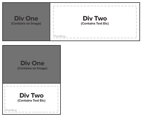
This will be placed within a column. Once that columns reduces in size, I would like it to stack the divs as per the second example in the diagram. I've tried a few different ways, but keep getting it wrong.
I am pretty new to HTML/CSS so any help is appreciated! Many thanks!
Css Solutions
Solution 1 - Css
You can use CSS3 media query for this. Write like this:
CSS
.wrapper {
  border : 2px solid #000;
  overflow:hidden;
}

.wrapper div {
   min-height: 200px;
   padding: 10px;
}
#one {
  background-color: gray;
  float:left;
  margin-right:20px;
  width:140px;
  border-right:2px solid #000;
}
#two {
  background-color: white;
  overflow:hidden;
  margin:10px;
  border:2px dashed #ccc;
  min-height:170px;
}

@media screen and (max-width: 400px) {
   #one {
    float: none;
    margin-right:0;
    width:auto;
    border:0;
    border-bottom:2px solid #000;
  }
}
HTML
<div class="wrapper">
    <div id="one">one</div>
    <div id="two">two</div>
</div>
Check this for more http://jsfiddle.net/cUCvY/1/
Solution 2 - Css
today this kind of thing can be done by using display:flex;
https://jsfiddle.net/suunyz3e/1435/
html:
  <div class="container flex-direction">
      <div class="div1">
        <span>Div One</span>
      </div>
      <div class="div2">
        <span>Div Two</span>
      </div>
  </div>
css:
.container{
  display:inline-flex;
  flex-wrap:wrap;
  border:1px solid black;
}
.flex-direction{
  flex-direction:row;
}
.div1{
  border-right:1px solid black;
  background-color:#727272;
  width:165px;
  height:132px;
}

.div2{
  background-color:#fff;
  width:314px;
  height:132px;
}

span{
  font-size:16px;
    font-weight:bold;
    display: block;
    line-height: 132px;
    text-align: center;
}

@media screen and (max-width: 500px) {
  .flex-direction{
  flex-direction:column;
  }
.div1{
  width:202px;
  height:131px;
  border-right:none;
  border-bottom:1px solid black;
  }
  .div2{
    width:202px;
    height:107px;
  }
  .div2 span{
    line-height:107px;
  }

}
Solution 3 - Css
Floating div's will help what your trying to achieve.
HTML
<div class="container">
<div class="content1 content">
</div>
<div class="content2 content">
</div>
</div>
CSS
.container{
width:100%;
height:200px;
background-color:grey;
}
.content{
float:left;
height:30px;
}
.content1{
background-color:blue;
width:300px;
}
.content2{
width:200px;
background-color:green;
}
Zoom in the page to see the effects.
Hope it helps.
Solution 4 - Css
Better late than never!
https://getbootstrap.com/docs/4.5/layout/grid/
<div class="container">
  <div class="row">
    <div class="col-sm">
      One of three columns
    </div>
    <div class="col-sm">
      One of three columns
    </div>
    <div class="col-sm">
      One of three columns
    </div>
  </div>
</div>
Solution 5 - Css
With a mediaquery based on a min-width you could achieve something like http://jsbin.com/aruyiq/1/edit
CSS
.wrapper {
  border : 2px dotted #ccc; padding: 2px;
}

.wrapper div {
   width: 100%;
   min-height: 200px;
   padding: 10px;
   -webkit-box-sizing: border-box;
   -moz-box-sizing: border-box;
   box-sizing: border-box;
}
#one { background-color: gray; }
#two { background-color: white; }

@media screen and (min-width: 600px) {
   .wrapper {
      height: auto; overflow: hidden; // clearing
   }
   #one { width: 200px; float: left; }
   #two { margin-left: 200px; }
}
In my example the breakpoint is 600px but you could adapt it to your needs.
Solution 6 - Css
Do like this:
HTML
<div class="parent">
    <div class="child"></div>
    <div class="child"></div>
</div>
CSS
.parent{
    width: 400px;
    background: red;
}
.child{
    float: left;
    width:200px;
    background:green;
    height: 100px;
}
This is working jsfiddle. Change child width to more then 200px and they will stack.