How can I make a float top with CSS?
HtmlCssCss FloatHtml Problem Overview
I know that CSS only supports left and right values for the float property, but is there a technique to implement a floating top? I will try to explain. I have the following code:
<div style="float:left">
<div style="float:left">
<div style="float:left">
....
With this code every div is floated to left until the right limit of the page is reached. I want to do the same thing but vertically, so that every div is placed at the bottom of the previous one and then, when the bottom limit of the page is reached, a new column is created. Is there a way to do this using only CSS (and maybe editing the HTML code)?
Html Solutions
Solution 1 - Html
Simply use vertical-align:
.className {
    display: inline-block;
    vertical-align: top;
}
Solution 2 - Html
The only way to do this with CSS only is by using CSS 3 which is not going to work on every browser (only the latest generation like FF 3.5, Opera, Safari, Chrome).
Indeed with CSS 3 there's this awesome property : column-count that you can use like so :
#myContent{
  column-count: 2;
  column-gap: 20px;
  height: 350px;
}
If #myContent is wrapping your other divs.
More info here : http://www.quirksmode.org/css/multicolumn.html
As you can read there, there are serious limitations in using this. In the example above, it will only add up to one another column if the content overflows. in mozilla you can use the column-width property that allows you to divide the content in as many columns as needed.
Otherwise you'll have to distribute the content between different divs in Javascript or in the backend.
Solution 3 - Html
Hugogi Raudel has came up with an interesting way to to achieve this by CSS. suppose here is our HTML markup:
<ul>
  <li>1</li>
  <li>2</li>
  <li>3</li>
  <li>4</li>
  <li>5</li>
  <li>6</li>
  <li>7</li>
  <li>8</li>
  <li>9</li>
</ul>
You can achieve a 3-row column using this CSS code:
li:nth-child(3n+2){
  margin: 120px 0 0 -110px;
}

li:nth-child(3n+3) {
  margin: 230px 0 0 -110px;
}
And here is the end result:
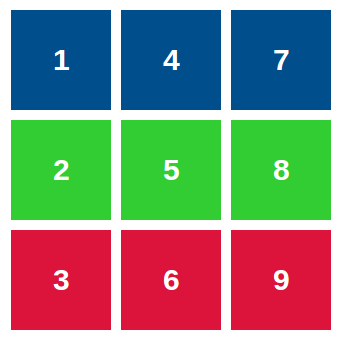
What we are doing here is adding a appropriate margin for each item in the row. This approach limitation is that you have to determine the column row count. it's not going to be dynamic. I'm sure it has use cases so I included this solution here.
- Here is a live demo: http://codepen.io/HugoGiraudel/pen/DoAIB
- You can read more on this in Hugo's blog post
Solution 4 - Html
There is no float:top, only float:left and float:right
If you wish to display div underneath each other you would have to do:
<div style="float:left;clear:both"></div>
<div style="float:left;clear:both"></div>
Solution 5 - Html
I tried this just for fun - because I too would like a solution.
fiddle: http://jsfiddle.net/4V4cD/1/
html:
<div id="container">
<div class="object"><div class="content">one</div></div>
<div class="object"><div class="content">two</div></div>
<div class="object"><div class="content">three</div></div>
<div class="object"><div class="content">four</div></div>
<div class="object tall"><div class="content">five</div></div>
<div class="object"><div class="content">six</div></div>
<div class="object"><div class="content">seven</div></div>
<div class="object"><div class="content">eight</div></div>
</div>
css:
#container {
    width:300px; height:300px; border:1px solid blue;
    transform:rotate(90deg);
    -ms-transform:rotate(90deg); /* IE 9 */
    -moz-transform:rotate(90deg); /* Firefox */
    -webkit-transform:rotate(90deg); /* Safari and Chrome */
    -o-transform:rotate(90deg); /* Opera */
}

.object {
    float:left;
    width:96px;
    height:96px;
    margin:1px;
    border:1px solid red;
    position:relative;
}

.tall {
    width:196px;
}

.content {
    padding:0;
    margin:0;
    position:absolute;
    bottom:0;
    left:0;
    text-align:left;
    border:1px solid green;
    -webkit-transform-origin: 0 0;
    transform:rotate(-70deg);
    -ms-transform:rotate(-90deg); /* IE 9 */
    -moz-transform:rotate(-90deg); /* Firefox */
    -webkit-transform:rotate(-90deg); /* Safari and Chrome */
    -o-transform:rotate(-90deg); /* Opera */
}
I You can see this will work with taller/wider divs. Just have to think sideways. I imagine positioning will become an issue. transform-origin should help some with it.
Solution 6 - Html
I think the best way to accomplish what you're talking about is to have a set of divs that will be your columns, and populate those in the way you described. Then fill those divs vertically with the content you're talking about.
Solution 7 - Html
<div class="block blockLeft">...</div>
<div class="block blockRight">...</div>
<div class="block blockLeft">...</div>
<div class="block blockRight">...</div>
<div class="block blockLeft">...</div>
<div class="block blockRight">...</div>

block {width:300px;}
blockLeft {float:left;}
blockRight {float:right;}
But if the number of div's elements is not fixed or you don't know how much it could be, you still need JS. use jQuery :even, :odd
Solution 8 - Html
I just make with JQuery.
I tested in Firefox and IE10.
In my problem the items have different heights.
<!DOCTYPE html>
<html>
<head>
    <style>
        .item {
            border: 1px solid #FF0;
            width: 100px;
            position: relative;
        }
    </style>
    <script src="http://code.jquery.com/jquery-1.10.1.min.js"></script>
</head>
<body>
    <script>
        function itemClicked(e) {
            if (navigator.appName == 'Microsoft Internet Explorer')
                e.removeNode();
            else
                e.remove();
            reposition();
        }

        function reposition() {
            var px = 0;
            var py = 0;
            var margeY = 0;
            var limitContainer = $('#divContainer').innerHeight();
            var voltaY=false;

            $('#divContainer .item').each(function(key, value){
                var c = $(value);

                if ((py+c.outerHeight()) > limitContainer) {
                    px+=100;
                    margeY-=py;
                    py=0;
                    voltaY=true;
                }

                c.animate({
                    left:px+'px',
                    top:margeY+'px'
                });

                voltaY=false;
                py+=c.outerHeight();
            });
        }

        function addItem() {
            $('#divContainer').append('<div class="item" style="height: '+Math.floor(Math.random()*3+1)*20+'px;" onclick="itemClicked(this);"></div>');
            reposition();
        }

    </script>
    <div id="divMarge" style="height: 100px;"></div>
    <div id="divContainer" style="height: 200px; border: 1px solid #F00;">
        <!--div class="item"></div-->
    </div>
    <div style="border: 1px solid #00F;">
        <input type="button" value="Add Item" onclick="addItem();" />
    </div>
</body>
</html>
Solution 9 - Html
To achieve this using CSS3, it will not be that hard as long as I am understanding you properly. Let us say that the HTML DIV's looks like this:
<div class="rightDIV">
   <p>Some content</p>
<div>
<!-- -->
<div class="leftDIV">
   <p>Some content</p>
</div>
And the CSS would be as followed. What the following CSS will do is make your DIV execute a float left, which will "stick" it to the left of the Parent DIV element. Then, you use a "top: 0", and it will "stick it " to the top of the browser window.
  #rightDIV {
       float: left
       top: 0
    }
  #leftDIV {
       float: right;
       top: 0
   }
Solution 10 - Html
Here is a solution which works (almost perfect) in FF, Opera, Chrome:
    <style>
        html {
            height:100%;
        }

        p {
            page-break-inside: avoid;
            text-align: center;
            width: 128px;display:inline-block;
            padding: 2px;
            margin: 2px;
            border: 1px solid red;
            border-radius: 8px;
        }

        a {
            display: block;
            text-decoration: none;
        }

        b {
            display: block;
            color: red;
        }

        body {
            margin: 0px;
            padding: 1%;
            height: 97%; /* less than 98 b/c scroolbar */
            -webkit-column-width: 138px;
            -moz-column-width: 138px;
            column-width: 138px;
       }
    </style>

    <body>
        <p>
            <b>title 1</b>
            <a>link 1</a>
            <a>link 2</a>
            <a>link 3</a>
            <a>link 4</a>
        </p>

        <p>
            <b>title 2</b>
            <a>link 1</a>
            <a>link 2</a>
            <a>link 3</a>
            <a>link 4</a>
            <a>link 5</a>
        </p>
    </body>
The trick is page-break-inside: avoid; on p and column-width on body. It comes with dynamic column count. Text in a may be multi-line and blocks may have different heights.
Maybe someone has something for Edge and IE
Solution 11 - Html
The trick that worked for me was to change the writing-mode for the duration of the div-alignment.
.outer{
  /* Limit height of outer div so there has to be a line-break*/
  height:100px;

  /*  Tell the browser we are writing chinese. This makes everything that is text
  top-bottom then left to right. */
  writing-mode:vertical-lr;

}

.outer > div{
  /* float:left behaves like float:top because this block is beeing aligned top-bottom first
  */
  float:left;
  width:40px;

  /* Switch back to normal writing mode. If you leave this out, everything inside the
  div will also be top-bottom. */
  writing-mode:horizontal-tb;

}
<div class="outer">
  <div>one</div>
  <div>two</div>
  <div>three</div>
  <div>four</div>
  <div>one</div>
  <div>two</div>
  <div>three</div>
  <div>four</div>
  <div>one</div>
  <div>two</div>
  <div>three</div>
  <div>four</div>
</div>
Solution 12 - Html
This works, apply in ul:
display:flex;
flex-direction:column;
flex-wrap:wrap;
Solution 13 - Html
You might be able to do something with sibling selectors e.g.:
div + div + div + div{
float: left
}
Not tried it but this might float the 4th div left perhaps doing what you want. Again not fully supported.
Solution 14 - Html
I know this question is old. But anyone looking to do it today here you go.
div.floatablediv{
	-webkit-column-break-inside: avoid;
	-moz-column-break-inside: avoid;
	column-break-inside: avoid;
}
div.floatcontainer{
  -webkit-column-count: 2;
	-webkit-column-gap: 1px;
	-webkit-column-fill: auto;
	-moz-column-count: 2;
	-moz-column-gap: 1px;
	-moz-column-fill: auto;
	column-count: 2;
	column-gap: 1px;
	column-fill: auto;
}
<div style="background-color: #ccc; width: 100px;" class="floatcontainer">
  <div style="height: 50px; width: 50px; background-color: #ff0000;" class="floatablediv">
  </div>
    <div style="height: 70px; width: 50px; background-color: #00ff00;" class="floatablediv">
  </div>
    <div style="height: 30px; width: 50px; background-color: #0000ff;" class="floatablediv">
  </div>
    <div style="height: 40px; width: 50px; background-color: #ffff00;" class="floatablediv">
  </div>
  <div style="clear:both;"></div>
</div>
Solution 15 - Html
This works for me:
margin-bottom: auto;