Floating elements within a div, floats outside of div. Why?
CssHtmlCss FloatCss Problem Overview
Say you have a div, give it a definite width and put elements in it, in my case an img and another div.
The idea is that the content of the container div will cause the container div to stretch out, and be a background for the content. But when I do this, the containing div shrinks to fit the non-floating objects, and the floating objects will be either all the way out, or half out, half in, and not have any bearing on the size of the big div.
Why is this? Is there something I'm missing, and how can I get floated items to stretch out the height of a containing div?
Css Solutions
Solution 1 - Css
The easiest is to put overflow:hidden on the parent div and don't specify a height:
#parent { overflow: hidden }
Another way is to also float the parent div:
#parent { float: left; width: 100% }
Another way uses a clear element:
<div class="parent">
   <img class="floated_child" src="..." />
   <span class="clear"></span>
</div>
CSS
span.clear { clear: left; display: block; }
Solution 2 - Css
Reason
The problem is that floating elements are out-of-flow:
> An element is called out of flow if it is floated, absolutely > positioned, or is the root element.
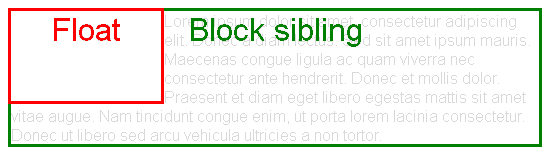
Therefore, they don't impact surrounding elements as an in-flow element would.
This is explained in 9.5 Floats:
> Since a float is not in the flow, non-positioned block boxes created > before and after the float box flow vertically as if the float did not > exist. However, the current and subsequent line boxes created next to > the float are shortened as necessary to make room for the margin box > of the float.
html {
  width: 550px;
  border: 1px solid;
}
body {
  font-family: sans-serif;
  color: rgba(0,0,0,.15);
}
body:after {
  content: '';
  display: block;
  clear: both;
}
div {
  position: relative;
}
div:after {
  font-size: 200%;
  position: absolute;
  left: 0;
  right: 0;
  top: 0;
  text-align: center;
}
.block-sibling {
  border: 3px solid green;
}
.block-sibling:after {
  content: 'Block sibling';
  color: green;
}
.float {
  float: left;
  border: 3px solid red;
  height: 90px;
  width: 150px;
  z-index: 1;
}
.float:after {
  content: 'Float';
  color: red;
}
<div class="float"></div>
<div class="block-sibling">
  Lorem ipsum dolor sit amet, consectetur adipiscing elit. Donec a diam lectus. Sed sit amet ipsum mauris. Maecenas congue ligula ac quam viverra nec consectetur ante hendrerit. Donec et mollis dolor. Praesent et diam eget libero egestas mattis sit amet vitae augue. Nam tincidunt congue enim, ut porta lorem lacinia consectetur. Donec ut libero sed arcu vehicula ultricies a non tortor.
</div>
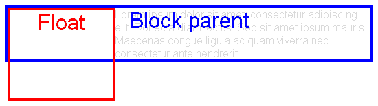
This is also specified in 10.6 Calculating heights and margins. For "normal" blocks,
> Only children in the normal flow are taken into account (i.e., > floating boxes and absolutely positioned boxes are ignored […])
html {
  width: 550px;
  border: 1px solid;
}
body {
  font-family: sans-serif;
  color: rgba(0,0,0,.15);
}
body:after {
  content: '';
  display: block;
  clear: both;
}
div {
  position: relative;
}
div:after {
  font-size: 200%;
  position: absolute;
  left: 0;
  right: 0;
  top: 0;
  text-align: center;
}
.block-parent {
  border: 3px solid blue;
}
.block-parent:after {
  content: 'Block parent';
  color: blue;
}
.float {
  float: left;
  border: 3px solid red;
  height: 130px;
  width: 150px;
}
.float:after {
  content: 'Float';
  color: red;
}
<div class="block-parent">
  <div class="float"></div>
  Lorem ipsum dolor sit amet, consectetur adipiscing elit. Donec a diam lectus. Sed sit amet ipsum mauris. Maecenas congue ligula ac quam viverra nec consectetur ante hendrerit.
</div>
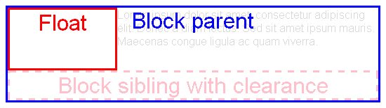
Hacky solution: clearance
A way to solve the problem is forcing some in-flow element to be placed below all floats. Then, the height of the parent will grow to wrap that element (and thus the floats too).
This can be achieved using the clear property:
> This property indicates which sides of an element's box(es) may not > be adjacent to an earlier floating box.
html {
  width: 550px;
  border: 1px solid;
}
body {
  font-family: sans-serif;
  color: rgba(0,0,0,.15);
}
body:after {
  content: '';
  display: block;
  clear: both;
}
div {
  position: relative;
}
div:after {
  font-size: 200%;
  position: absolute;
  left: 0;
  right: 0;
  top: 0;
  text-align: center;
}
.block-parent {
  border: 3px solid blue;
}
.block-parent:after {
  content: 'Block parent';
  color: blue;
}
.float {
  float: left;
  border: 3px solid red;
  height: 84px;
  width: 150px;
}
.float:after {
  content: 'Float';
  color: red;
}
.clear {
  clear: both;
  text-align: center;
  height: 37px;
  border: 3px dashed pink;
}
.clear:after {
  position: static;
  content: 'Block sibling with clearance';
  color: pink;
}
<div class="block-parent">
  <div class="float"></div>
  Lorem ipsum dolor sit amet, consectetur adipiscing elit. Donec a diam lectus. Sed sit amet ipsum mauris. Maecenas congue ligula ac quam viverra.
  <div class="clear"></div>
</div>
So a solution is adding an empty element with clear: both as the last sibling of the floats
<div style="clear: both"></div>
However, that is not semantic. So better generate a pseudo-element at the end of the parent:
.clearfix::after {
  clear: both;
  display: block;
}
There are multiple variants of this approach, e.g. using the deprecated single colon syntax :after to support old browsers, or using other block-level displays like display: table.
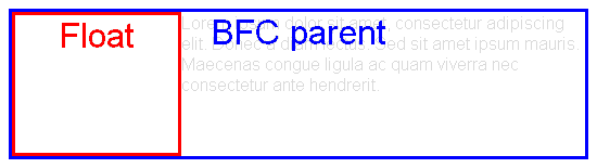
Solution: BFC roots
There is an exception to the problematic behavior defined at the beginning: if a block element establishes a Block Formatting Context (is a BFC root), then it will also wrap its floating contents.
According to 10.6.7 'Auto' heights for block formatting context roots,
> If the element has any floating descendants whose bottom margin edge > is below the element's bottom content edge, then the height is > increased to include those edges.
html {
  width: 550px;
  border: 1px solid;
}
body {
  font-family: sans-serif;
  color: rgba(0,0,0,.15);
}
body:after {
  content: '';
  display: block;
  clear: both;
}
div {
  position: relative;
}
div:after {
  font-size: 200%;
  position: absolute;
  left: 0;
  right: 0;
  top: 0;
  text-align: center;
}
.block-parent {
  border: 3px solid blue;
}
.block-parent.bfc-root:after {
  content: 'BFC parent';
  color: blue;
}
.float {
  float: left;
  border: 3px solid red;
  height: 127px;
  width: 150px;
}
.float:after {
  content: 'Float';
  color: red;
}
.bfc-root {
  overflow: hidden;
}
<div class="block-parent bfc-root">
  <div class="float"></div>
  Lorem ipsum dolor sit amet, consectetur adipiscing elit. Donec a diam lectus. Sed sit amet ipsum mauris. Maecenas congue ligula ac quam viverra nec consectetur ante hendrerit.
</div>
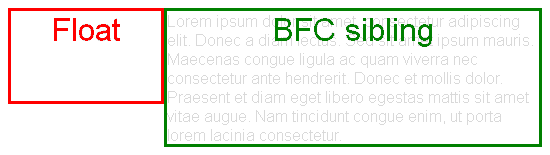
Additionally, as explained 9.5 Floats, BFC roots are also useful because of the following:
> The border box of a table, a block-level replaced element, or an > element in the normal flow that establishes a new block formatting > context […] must not overlap the margin box of any floats in the same > block formatting context as the element itself.
html {
  width: 550px;
  border: 1px solid;
}
body {
  font-family: sans-serif;
  color: rgba(0,0,0,.15);
}
body:after {
  content: '';
  display: block;
  clear: both;
}
div {
  position: relative;
}
div:after {
  font-size: 200%;
  position: absolute;
  left: 0;
  right: 0;
  top: 0;
  text-align: center;
}
.block-sibling {
  border: 3px solid green;
}
.block-sibling.bfc-root:after {
  content: 'BFC sibling';
  color: green;
}
.float {
  float: left;
  border: 3px solid red;
  height: 90px;
  width: 150px;
  z-index: 1;
}
.float:after {
  content: 'Float';
  color: red;
}
.bfc-root {
  overflow: hidden;
}
<div class="float"></div>
<div class="block-sibling bfc-root">
  Lorem ipsum dolor sit amet, consectetur adipiscing elit. Donec a diam lectus. Sed sit amet ipsum mauris. Maecenas congue ligula ac quam viverra nec consectetur ante hendrerit. Donec et mollis dolor. Praesent et diam eget libero egestas mattis sit amet vitae augue. Nam tincidunt congue enim, ut porta lorem lacinia consectetur.
</div>
A block formatting context is established by
-
Block boxes with
overflowother thanvisible, e.g.hidden.bfc-root { overflow: hidden; /* display: block; */ } -
Block containers that are not block boxes: when
displayis set toinline-block,table-cellortable-caption..bfc-root { display: inline-block; } -
Floating elements: when
floatis set toleftorright..bfc-root { float: left; } -
Absolutely positioned elements: when
positionis set toabsoluteorfixed..bfc-root { position: absolute; }
Note those may have undesired collateral effects, like clipping overflowing content, calculating auto widths with the shrink-to-fit algorithm, or becoming out-of-flow. So the problem is that it's not possible to have an in-flow block-level element with visible overflow that establishes a BFC.
Display L3 addresses these issues:
> Created the flow and flow-root inner display
> types to better express flow layout display types and to
> create an explicit switch for making an element a BFC root.
> (This should eliminate the need for hacks like ::after { clear: both; } and overflow: hidden […])
Sadly, there is no browser support yet. Eventually we may be able to use
.bfc-root {
  display: flow-root;
}
Solution 3 - Css
Put your floating div(s) in a div and in CSS give it overflow:hidden;
it will work fine.
Solution 4 - Css
Here's more modern approach:
.parent {display: flow-root;}
No more clearfixes.
p.s. Using overflow: hidden; hides the box-shadow so...
Solution 5 - Css
W3Schools recommendation:
put overflow: auto on parent element and it will "color" whole background including elements margins. Also floating elements will stay inside of border.
http://www.w3schools.com/css/tryit.asp?filename=trycss_layout_clearfix
Solution 6 - Css
In some cases, i.e. when (if) you're just using float to have elements flow on the same "line", you might use
display: inline-block;
instead of
float: left;
Otherwise, using a clear element at the end works, even if it may go against the grain to need an element to do what should be CSS work.
Solution 7 - Css
There's nothing missing. Float was designed for the case where you want an image (for example) to sit beside several paragraphs of text, so the text flows around the image. That wouldn't happen if the text "stretched" the container. Your first paragraph would end, and then your next paragraph would begin under the image (possibly several hundred pixels below).
And that's why you're getting the result you are.
Solution 8 - Css
Thank you LSerni you solved it for me.
To achieve this :
+-----------------------------------------+
| +-------+                     +-------+ |
| | Text1 |                     | Text1 | |
| +-------+                     +-------+ |
|+----------------------------------------+
You have to do this :
<div style="overflow:auto">
    <div style="display:inline-block;float:left"> Text1 </div>
    <div style="display:inline-block;float:right"> Text2 </div>
</div>
Solution 9 - Css
As Lucas says, what you are describing is the intended behaviour for the float property. What confuses many people is that float has been pushed well beyond its original intended usage in order to make up for shortcomings in the CSS layout model.
Have a look at Floatutorial if you'd like to get a better understanding of how this property works.
Solution 10 - Css
You can easily do with first you can make the div flex and apply justify content right or left and your problem is solved.
<div style="display: flex;padding-bottom: 8px;justify-content: flex-end;">
					<button style="font-weight: bold;outline: none;background-color: #2764ff;border-radius: 3px;margin-left: 12px;border: none;padding: 3px 6px;color: white;text-align: center;font-family: 'Open Sans', sans-serif;text-decoration: none;margin-right: 14px;">Sense</button>
				</div>
Solution 11 - Css
The other solutions here didn't work for me—my elements kept getting cut off. But if anyone else comes here using bootstrap, it worked for me to explicitly set the X-axis margins of an intermediary row div to zero and also set justify-content-between:
<div class='container p-2'>
  <div class='row mx-0 justify-content-between'>
    <div class='float-left'></div>
    <div class='float-right'></div>
  </div>
</div>