FloatingActionButton with text instead of image
AndroidMaterial DesignAndroid Support-LibraryFloating Action-ButtonAndroid Problem Overview
I'm trying to figure out how can be modified FloatingActionButton from android support library. Can it be used with the text instead of image?
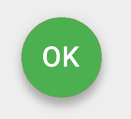
Something like this one:
I see it extends ImageButton so I think not. Am I right?
Is this correct in terms of Material Design in general?
Android Solutions
Solution 1 - Android
Thanks to all.
Here is easy workaround which I found for this question. Works correctly for Android 4+, for Android 5+ is added specific parameter android:elevation to draw TextView over FloatingActionButton.
<FrameLayout
    android:layout_width="wrap_content"
    android:layout_height="wrap_content"
    android:layout_gravity="bottom|right">

    <android.support.design.widget.FloatingActionButton
        android:layout_width="wrap_content"
        android:layout_height="wrap_content"
        android:src="@android:color/transparent" />

    <TextView
        android:layout_width="wrap_content"
        android:layout_height="wrap_content"
        android:layout_gravity="center"
        android:text="@android:string/ok"
        android:elevation="16dp"
        android:textColor="@android:color/white"
        android:textAppearance="?android:attr/textAppearanceMedium" />
</FrameLayout>
Solution 2 - Android
convert a text into bitmap and use it. its super easy.
fab.setImageBitmap(textAsBitmap("OK", 40, Color.WHITE));

//method to convert your text to image
public static Bitmap textAsBitmap(String text, float textSize, int textColor) {
    Paint paint = new Paint(Paint.ANTI_ALIAS_FLAG);
    paint.setTextSize(textSize);
    paint.setColor(textColor);
    paint.setTextAlign(Paint.Align.LEFT);
    float baseline = -paint.ascent(); // ascent() is negative
    int width = (int) (paint.measureText(text) + 0.0f); // round
    int height = (int) (baseline + paint.descent() + 0.0f);
    Bitmap image = Bitmap.createBitmap(width, height, Bitmap.Config.ARGB_8888);

    Canvas canvas = new Canvas(image);
    canvas.drawText(text, 0, baseline, paint);
    return image;
}
Solution 3 - Android
With API 28 you can simply add text to Fabs using:
Visit: https://material.io/develop/android/components/extended-floating-action-button/
 <com.google.android.material.floatingactionbutton.ExtendedFloatingActionButton
      android:layout_width="wrap_content"
      android:layout_height="wrap_content"
      android:layout_margin="8dp"
      android:contentDescription="@string/extended_fab_content_desc"
      android:text="@string/extended_fab_label"
      app:icon="@drawable/ic_plus_24px"
      app:layout_anchor="@id/app_bar"
      app:layout_anchorGravity="bottom|right|end"/>
Solution 4 - Android
FABs are usually used in CoordinatorLayouts. You can use this:
<android.support.design.widget.CoordinatorLayout
     xmlns:android="http://schemas.android.com/apk/res/android"
     xmlns:app="http://schemas.android.com/apk/res-auto">

    <android.support.design.widget.FloatingActionButton
            android:id="@+id/fab"
            android:layout_width="wrap_content"
            android:layout_height="wrap_content"
            android:layout_gravity="bottom|end"
            android:layout_margin="@dimen/fab_margin"
            app:backgroundTint="@color/colorPrimary" />

      <TextView android:layout_height="wrap_content"
              android:layout_width="wrap_content"
              android:text="OK"
              android:elevation="6dp"
              android:textSize="18dp"
              android:textColor="#fff"
              app:layout_anchor="@id/fab"
              app:layout_anchorGravity="center"/>

</android.support.design.widget.CoordinatorLayout>
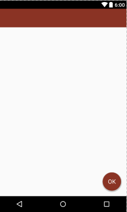
This is what does the work
app:layout_anchor="@id/fab"
app:layout_anchorGravity="center"
Result:
If you're using some layout_behavior for your FAB, you'll have to make a similar layout_behavior for the TextView
Solution 5 - Android
You can't set text for FloatingActionButton from the support library, but what you can do, is create a text image directly from android studio : File -> New -> Image Asset, and then use it for your button.
In the terms of Material Design; they didn't mention using text with FloatingActionButton, and I don't see any reason for doing that since you don't really have much space for a text.
Solution 6 - Android
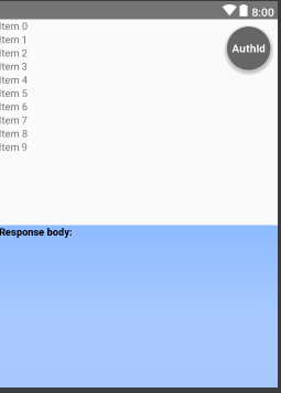
I was needing text in a FAB but instead I just went with a TextView with a circular drawable background:
  <TextView
        android:layout_margin="10dp"
        android:layout_gravity="right"
        android:gravity="center"
        android:background="@drawable/circle_background"
        android:layout_width="wrap_content"
        android:layout_height="wrap_content"
        android:textColor="#FFF"
        android:textStyle="bold"
        android:fontFamily="sans-serif"
        android:text="AuthId"
        android:textSize="15dp"
        android:elevation="10dp"/>
Here is the drawable(circle_backgroung.xml):
<?xml version="1.0" encoding="utf-8"?>
<shape
    xmlns:android="http://schemas.android.com/apk/res/android"
    android:shape="oval">

<solid
    android:color="#666666"/>

<size
    android:width="60dp"
    android:height="60dp"/>
</shape>
Solution 7 - Android
Answer of @NandanKumarSingh https://stackoverflow.com/a/39965170/5279156 works but i have made some changes with fab in code (not xml because they will be overwritten in class methods)
fab.setTextBitmap("ANDROID", 100f, Color.WHITE)
fab.scaleType = ImageView.ScaleType.CENTER
fab.adjustViewBounds = false
Where setTextBitmap is an extension for ImageView class with similar functionality but it supports multilne text
fun ImageView.setTextBitmap(text: String, textSize: Float, textColor: Int) {
    val paint = Paint(Paint.ANTI_ALIAS_FLAG)
    paint.textSize = textSize
    paint.color = textColor
    paint.textAlign = Paint.Align.LEFT
    val lines = text.split("\n")
    var maxWidth = 0
    for (line in lines) {
        val width = paint.measureText(line).toInt()
        if (width > maxWidth) {
            maxWidth = width
        }
    }
    val height = paint.descent() - paint.ascent()
    val bitmap = Bitmap.createBitmap(maxWidth, height.toInt() * lines.size, Bitmap.Config.ARGB_8888)
    val canvas = Canvas(bitmap)
    var y = - paint.ascent()
    for (line in lines) {
        canvas.drawText(line, 0f, y, paint)
        y += height
    }
    setImageBitmap(bitmap)
}
Solution 8 - Android
I used a CardView to achieve the same result
  <androidx.cardview.widget.CardView
            android:layout_width="@dimen/dp80"
            android:layout_height="@dimen/dp80"
            android:layout_gravity="center_horizontal"
            app:cardElevation="@dimen/dp8"
            android:layout_marginBottom="@dimen/dp16"
            android:layout_marginTop="@dimen/dp8"
            app:cardBackgroundColor="@color/colorWhite100"
            app:cardCornerRadius="@dimen/dp40">

            <TextView
                style="@style/TextAppearance.MaterialComponents.Headline4"
                android:layout_width="match_parent"
                android:layout_height="match_parent"
                android:layout_gravity="center_horizontal"
                android:background="@drawable/shape_go_bg"
                android:text="GO"
                android:gravity="center"
                android:textColor="@color/colorWhite100" />
        </androidx.cardview.widget.CardView>
Solution 9 - Android
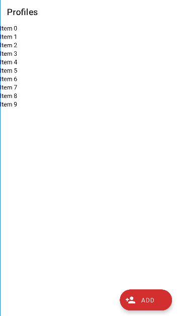
There is a new material view called ExtendedFloatingActionButton that does this.
Here's a code example:
    <com.google.android.material.floatingactionbutton.ExtendedFloatingActionButton
    android:layout_width="wrap_content"
    android:layout_height="wrap_content"
    android:text="@string/add"
    android:layout_marginEnd="16dp"
    android:layout_marginBottom="16dp"
    android:clickable="true"
    android:focusable="true"
    app:icon="@drawable/ic_add_profile"
    app:rippleColor="@color/colorPrimary"
    app:layout_constraintBottom_toTopOf="@id/frameLayout_profilesAd"
    app:layout_constraintEnd_toEndOf="parent"
    android:contentDescription="@string/add_profile" />
This is the output:
You will need to add the material library to your dependencies, like so:
implementation 'com.google.android.material:material:1.5.0-alpha02'
Solution 10 - Android
A very little modification to comrade 's answer to support it for android API below 21 just add app:elevation="0dp" to the FloatingActionButton
This might help others!