Change spinner background color but keep arrow
AndroidSpinnerAndroid SpinnerAndroid Problem Overview
I've read several thing about it but I can't find what I need. I want to keep the grey arrow but I want to remove the horizontal bar from the default style and have a white background. Do you have any idea of how I can do this ?
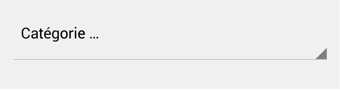
Here is what I have now (default spinner style) :
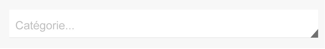
Here is what I want :
Android Solutions
Solution 1 - Android
I did a little modification based on @Mansur Khan 's answer.
We don't have to add an ImageView in this case because the spinner already has a triangle arrow. So check the code below:
    <RelativeLayout
        android:layout_width="match_parent"
        android:layout_height="wrap_content"
        android:padding="8dp"
        android:background="#FFFFFF">
        <Spinner
            style="@style/Widget.AppCompat.DropDownItem.Spinner"
            android:layout_width="match_parent"
            android:layout_height="70dp"
            android:id="@+id/sign_up_country"
            />
    </RelativeLayout>
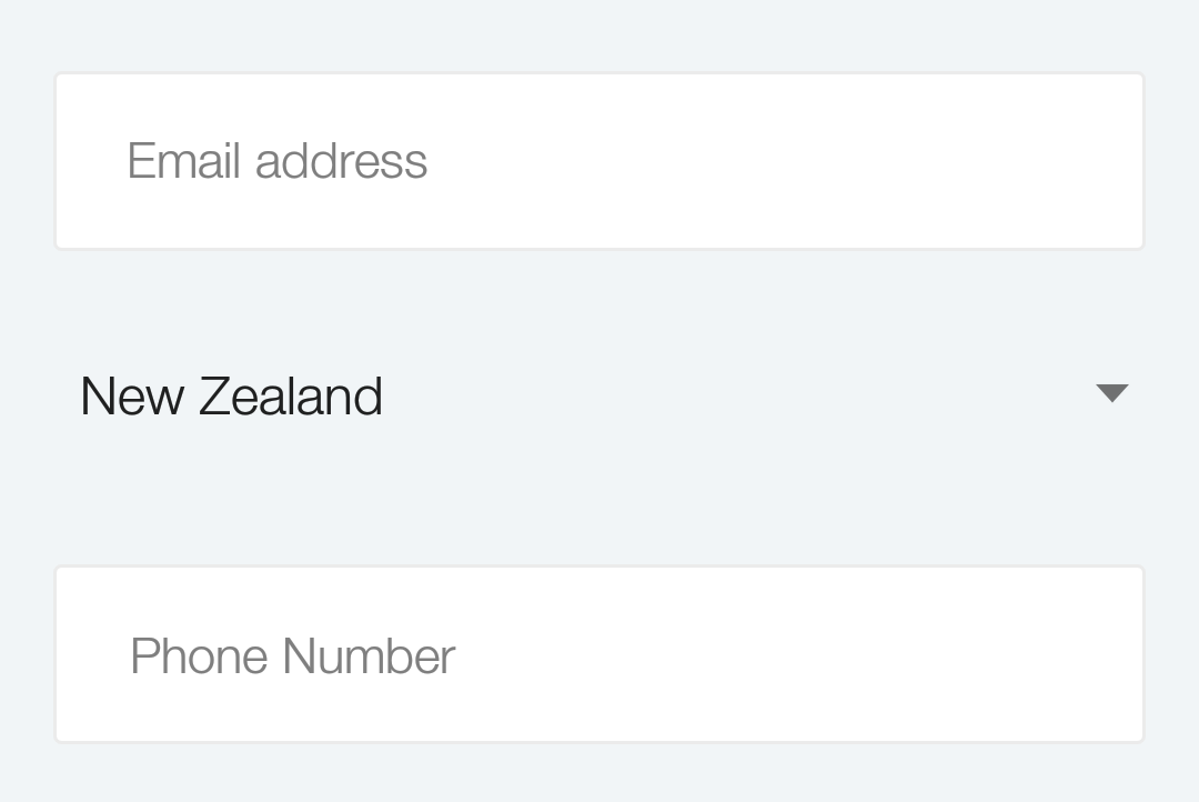
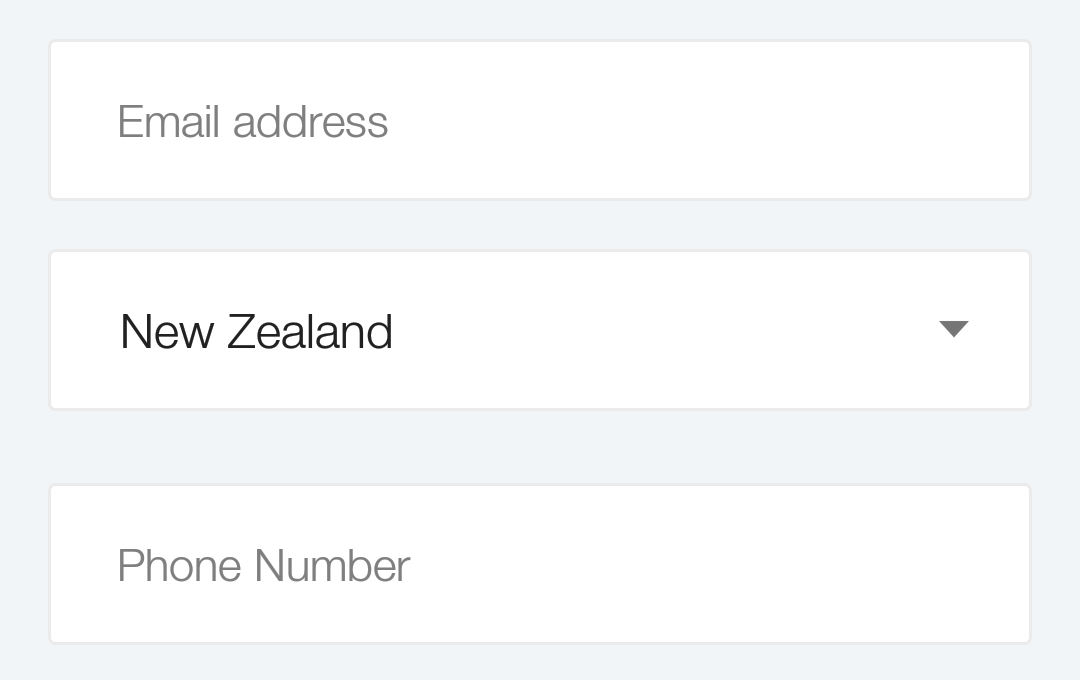
Here is the screenshot
Before:
After:
Solution 2 - Android
For the record, I found an easy solution : Wrap your spinner in a relative layout and add an image :
 <RelativeLayout
     android:layout_width="fill_parent"
     android:layout_height="wrap_content"
     android:background="@drawable/borderbottom_white"<!-- white background with bottom border -->
     android:layout_marginTop="15dp"  >
        <Spinner
        android:id="@+id/postfield_category"
        android:layout_width="fill_parent"
        android:layout_height="wrap_content"
        android:textSize="16sp"
		android:background="@null"
        android:minHeight="0dp" />
        <ImageView
         android:layout_width="wrap_content"
        android:layout_height="wrap_content"
        android:layout_alignParentBottom="true"
        android:layout_alignParentRight="true"
        android:src="@drawable/arrowspinner" />
    </RelativeLayout>
Solution 3 - Android
A simple solution that doesn't require you to create your own drawable for the arrow is to wrap the spinner with a RelativeLayout, and set the background color in the RelativeLayout, not the spinner:
<RelativeLayout
    android:layout_width="wrap_content"
    android:layout_height="wrap_content"
    android:background="#f00" >
    <Spinner
        android:id="@+id/spinner1"
        android:layout_width="wrap_content"
        android:layout_height="wrap_content" />
</RelativeLayout>
Solution 4 - Android
Use this:
yourspinner.setOnItemSelectedListener(this);
@Override
public void onItemSelected(AdapterView<?> arg0, View arg1, int arg2,
		long arg3) {
	((TextView) yourspinner.getSelectedView()).setBackgroundColor(getResources()
			.getColor(R.color.your_color));
}
and your class should implement OnItemSelectedListener.
Solution 5 - Android
Hi instead of wrapping Spinner component around Parent Layouts like LinearLayout, RelativeLayout etc which increases layout parsing simply create a drawable called spinner_bg.xml under drawable folder.
<?xml version="1.0" encoding="utf-8"?>
<layer-list xmlns:android="http://schemas.android.com/apk/res/android" >
    <item>
        <bitmap
            android:layout_width="wrap_content"
            android:layout_height="wrap_content"
            android:gravity="right"
            android:src="@drawable/icn_dropdown_arw" />
    </item>
</layer-list>
Set spinner_bg as the background of your spinner and it works like charm:
<Spinner
     android:layout_width="match_parent"
     android:layout_height="wrap_content"
     android:padding="5dp"
     android:background="@drawable/spinner_bg" />
Solution 6 - Android
I think the best way without doing complex layouts is this:
Use this xml for your spinner background and you are good to go!!!
<item android:state_pressed="true">
    <shape>
        <solid android:color="@color/materialBlueGray600" />
        <corners android:radius="3dp" />
    </shape>
</item>
<item android:state_selected="true">
    <shape>
        <solid android:color="@color/materialGray50" />
        <corners android:radius="3dp" />
    </shape>
</item>
<item>
    <layer-list>
        <item>
            <shape>
                <solid android:color="@color/materialGray50" />
                <corners android:radius="3dp" />
            </shape>
        </item>

        <item android:gravity="right">
            <bitmap android:antialias="true"  android:gravity="right" android:src="@drawable/ic_expand_small" />
        </item>
    </layer-list>
</item>
Solution 7 - Android
Here is the code of custom spinner. Please check it out and tell me. Not yet I tested this. So please inform me after checking this whether it solves your problem.
<Spinner
    android:layout_width="match_parent"
    android:layout_height="match_parent"
    android:background="@drawable/spinner_background"
    android:gravity="center"
    android:paddingRight="10dp"
    android:spinnerMode="dropdown"
    android:textColor="your text color"
    android:textSize="your text size" />
Here is the drawable(spinner_background.xml) to create the background of spinner.
<?xml version="1.0" encoding="utf-8"?>
<layer-list xmlns:android="http://schemas.android.com/apk/res/android" >

    <item>
        <shape android:shape="rectangle" >
            <solid android:color="border color" />

            <corners android:radius="3dp" />
        </shape>
    </item>
    <item
        android:bottom="1dp"
        android:left="1dp"
        android:right="1dp"
        android:top="1dp">
        <shape android:shape="rectangle" >
            <solid android:color="@android:color/white" />

            <corners android:radius="3dp" />
        </shape>
    </item>

</layer-list>
Edit:
please check this link which gives you an idea to do. Customize spinner background
OR
you can do something like this.
<RelativeLayout
     android:layout_width="fill_parent"
     android:layout_height="wrap_content"
     android:background="spinner background image">

        <Spinner
        android:layout_width="match_parent"
        android:layout_height="match_parent"
        android:background="@null"/>

        <ImageView
         android:layout_width="wrap_content"
        android:layout_height="wrap_content"
        android:layout_alignParentBottom="true"
        android:layout_alignParentRight="true"
        android:src="arrow image" />

    </RelativeLayout>
Solution 8 - Android
A good way to customise spinners and any other Android controls is to use the Android Asset Studio site and choose the Android Holo Colors Generator. This will create all the assets you might need, including the "underline". It also generates the XML files that implement the changes.
Once you download the ZIP file from that site, you just copy the images and XML files into your project.
You can then edit the required image files to remove the underline. They are 9-Patch files, called:
- apptheme_spinner_default_holo_light.9.png
- apptheme_spinner_disabled_holo_light.9.png
- apptheme_spinner_focused_holo_light.9.png
- apptheme_spinner_pressed_holo_light.9.png
For a more complete explanation of the process, and to see some of the sample XML files, please refer to my related answer:
Solution 9 - Android
       android:layout_alignParentRight="true"
        android:layout_width="@dimen/spinner_width"
        android:layout_height="wrap_content"
        android:id="@+id/spnLocation"
        android:entries="@array/labelFamily"
        android:layout_centerVertical="true"

        android:backgroundTint="@color/color_gray"
this work for me
Solution 10 - Android
below layout will create a background in spinner with desire color drop down arrow
  <LinearLayout
        android:layout_width="0dp"
        android:layout_height="match_parent"
        android:layout_weight=".6"
        android:background="@drawable/edit_text_rounded_shape"
        android:gravity="center|center_vertical">
    <Spinner
        android:id="@+id/spinerComanyName"
        android:layout_width="0dp"
        android:layout_height="wrap_content"
        android:padding="4dp"
        android:layout_weight=".6"
        android:layout_gravity="center"

        android:entries="@array/spinner_item"
        android:spinnerMode="dropdown"
        android:theme="@style/Spinner"

        />
   </LinearLayout>

   <style name="Spinner">
    <!-- Used for the bottom line when not selected / focused -->
    <item name="colorControlNormal">@color/black</item>
    <item name="colorControlActivated">@color/colorPrimary</item>
    <!-- colorControlActivated & colorControlHighlight use the colorAccent          color by default -->
   </style>
edit_text_rounded_shape which provide background color and rounded corner
   <?xml version="1.0" encoding="utf-8"?>

   <shape xmlns:android="http://schemas.android.com/apk/res/android"
         android:shape="rectangle" android:padding="10dp">
         <solid android:color="@color/white"/>
         <stroke android:color="@color/grey"/>
     <corners
     android:bottomRightRadius="15dp"
     android:bottomLeftRadius="15dp"
     android:topLeftRadius="15dp"
     android:topRightRadius="15dp"/>
  </shape>
Solution 11 - Android
Always while working with spinners, buttons and EditTexts and also needing to insert a drawable, I often wrap the element (spinner, EditText etc.) in a FrameLayout. Check an example:
<FrameLayout
                                android:layout_width="match_parent"
                                android:layout_height="wrap_content">

                                <Spinner
                                    android:id="@+id/spinner_component"
                                    android:layout_width="match_parent"
                                    android:layout_height="45dp"
                                    android:background="@drawable/your_rectangle_style"
                                    android:textColor="@color/your_text_color" />

                                <ImageView
                                    android:layout_width="11dp"
                                    android:layout_height="9dp"
                                    android:src="@drawable/arrow_spinner"
                                    android:layout_gravity="right|center_vertical"
                                    android:layout_marginRight="7dp" />
                            </FrameLayout>
Another important tip is that FrameLayout allows you to set OnClick functions on the drawable, for instance.