Add new item count to icon on button - Android
AndroidAndroid LayoutAndroid Problem Overview
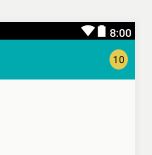
I'm developer. I need to implement design shown below. I already have functional app but wonder how to even approach this? Particulary, I'm interested in how to show Number of "New" items under tabs. What I KNOW how to do - is create new icons with red dots and just display them when new stuff available.
But I have no idea how to make those round circles float on top of title AND show number inside. Does anybody have suggestion on what too look for? Samples? Directions?
Second question about separating activities. Should I make control to combine buttons like this and just inflate it on activities? Otherwise I may create tabbed activity but I'm not sure if it's possible to style it to make it look like this.

Android Solutions
Solution 1 - Android
Make your badge a TextView, allowing you to set the numeric value to anything you like by calling setText(). Set the background of the TextView as an XML <shape> drawable, with which you can create a solid or gradient circle with a border. An XML drawable will scale to fit the view as it resizes with more or less text.
res/drawable/badge_circle.xml:
<shape xmlns:android="http://schemas.android.com/apk/res/android"
  android:shape="oval">
  <solid
    android:color="#F00" />
  <stroke
    android:width="2dip"
    android:color="#FFF" />
  <padding
    android:left="5dip"
    android:right="5dip"
    android:top="5dip"
    android:bottom="5dip" />
</shape>
You'll have to take a look at how the oval/circle scales with large 3-4 digit numbers, though. If this effect is undesirable, try a rounded rectangle approach like below. With small numbers, the rectangle will still look like a circle as the radii converge together.
res/drawable/badge_circle.xml:
<shape xmlns:android="http://schemas.android.com/apk/res/android"
  android:shape="rectangle">
  <corners
    android:radius="10dip"/>
  <solid
    android:color="#F00" />
  <stroke
    android:width="2dip"
    android:color="#FFF" />
  <padding
    android:left="5dip"
    android:right="5dip"
    android:top="5dip"
    android:bottom="5dip" />
</shape>
With the scalable background created, you simply add it to the background of a TextView, like so:
<TextView
  android:layout_width="wrap_content"
  android:layout_height="wrap_content"
  android:text="10"
  android:textColor="#FFF"
  android:textSize="16sp"
  android:textStyle="bold"
  android:background="@drawable/badge_circle"/>
Finally, these TextView badges can be placed in your layout on top of the appropriate buttons/tabs. I would probably do this by grouping each button with its badge in a RelativeLayout container, like so:
<RelativeLayout xmlns:android="http://schemas.android.com/apk/res/android"
  android:layout_width="wrap_content"
  android:layout_height="wrap_content">
  <Button
    android:id="@+id/myButton"
    android:layout_width="65dip"
    android:layout_height="65dip"/>
  <TextView
    android:id="@+id/textOne"
    android:layout_width="wrap_content"
    android:layout_height="wrap_content"
    android:layout_alignTop="@id/myButton"
    android:layout_alignRight="@id/myButton"
    android:text="10"
    android:textColor="#FFF"
    android:textSize="16sp"
    android:textStyle="bold"
    android:background="@drawable/badge_circle"/>
</RelativeLayout>
Hopefully that's enough information to at least get you pointed in the right direction!
Solution 2 - Android
Android ViewBadger
A simple way to "badge" any given Android view at runtime without having to cater for it in layout.
Add .jar file in your libs folder
Click to download Example
see Example on github
Simple example:
View target = findViewById(R.id.target_view);
BadgeView badge = new BadgeView(this, target);
badge.setText("1");
badge.show();
Solution 3 - Android
Simplest hack by giving style to TextView only.
        <TextView
                android:id="@+id/fabCounter"
                style="@style/Widget.Design.FloatingActionButton"
                android:layout_width="wrap_content"
                android:layout_height="wrap_content"
                android:layout_alignParentEnd="true"
                android:layout_centerVertical="true"
                android:layout_marginEnd="10dp"
                android:padding="5dp"
                android:text="10"
                android:textColor="@android:color/black"
                android:textSize="14sp" />
>
Solution 4 - Android
Just to add. If someone wants to implement a filled circle bubble using the ring shape instead of oval, here's the code example of adding the bubble count to action bar buttons. But this can be added to any button.
(name it bage_circle.xml):
<shape xmlns:android="http://schemas.android.com/apk/res/android"
    android:shape="ring"
    android:useLevel="false"
    android:thickness="9dp"
    android:innerRadius="0dp"
    >

    <solid
        android:color="#F00"
        />
    <stroke
        android:width="1dip"
        android:color="#FFF" />

    <padding
        android:top="2dp"
        android:bottom="2dp"/>

</shape>
You may have to adjust the thickness according to your need.
The result will be something like this:

Here's the layout for button (name it badge_layout.xml):
<RelativeLayout xmlns:android="http://schemas.android.com/apk/res/android"
    android:layout_width="wrap_content"
    android:layout_height="wrap_content">

    <com.joanzapata.iconify.widget.IconButton
        android:layout_width="44dp"
        android:layout_height="44dp"
        android:textSize="24sp"
        android:textColor="@color/white"
        android:background="@drawable/action_bar_icon_bg"
        android:id="@+id/badge_icon_button"/>

    <TextView
        android:id="@+id/badge_textView"
        android:layout_width="wrap_content"
        android:layout_height="wrap_content"
        android:layout_alignTop="@id/badge_icon_button"
        android:layout_alignRight="@id/badge_icon_button"
        android:layout_alignEnd="@id/badge_icon_button"
        android:text="10"
        android:paddingEnd="8dp"
        android:paddingRight="8dp"
        android:paddingLeft="8dp"
        android:gravity="center"
        android:textColor="#FFF"
        android:textSize="11sp"
        android:background="@drawable/badge_circle"/>
</RelativeLayout>
In Menu create item:
<item
        android:id="@+id/menu_messages"
        android:showAsAction="always"
        android:actionLayout="@layout/badge_layout"/>
In onCreateOptionsMenu get reference to the Menu item:
    itemMessages = menu.findItem(R.id.menu_messages);

    badgeLayout = (RelativeLayout) itemMessages.getActionView();
    itemMessagesBadgeTextView = (TextView) badgeLayout.findViewById(R.id.badge_textView);
    itemMessagesBadgeTextView.setVisibility(View.GONE); // initially hidden

    iconButtonMessages = (IconButton) badgeLayout.findViewById(R.id.badge_icon_button);
    iconButtonMessages.setText("{fa-envelope}");
    iconButtonMessages.setTextColor(getResources().getColor(R.color.action_bar_icon_color_disabled));

    iconButtonMessages.setOnClickListener(new View.OnClickListener() {
        @Override
        public void onClick(View view) {
            if (HJSession.getSession().getSessionId() != null) {

                Intent intent = new Intent(getThis(), HJActivityMessagesContexts.class);
                startActivityForResult(intent, HJRequestCodes.kHJRequestCodeActivityMessages.ordinal());
            } else {
                showLoginActivity();
            }
        }
    });
After receiving notification for messages, set the count:
itemMessagesBadgeTextView.setText("" + count);
itemMessagesBadgeTextView.setVisibility(View.VISIBLE);
iconButtonMessages.setTextColor(getResources().getColor(R.color.white));
This code uses Iconify-fontawesome.
compile 'com.joanzapata.iconify:android-iconify-fontawesome:2.1.+'
Solution 5 - Android
for the people who are looking for Xamarin Android Can Use This Code
public class CountDrawable : Drawable
{
    private float mTextSize;
    private Paint mBadgePaint;
    private Paint mTextPaint;
    private Rect mTxtRect = new Rect();

    private String mCount = "";
    private bool mWillDraw = false;


    public CountDrawable(Context context)
    {
        float mTextSize = context.Resources.GetDimension(Resource.Dimension.badge_count_textsize);
        mBadgePaint = new Paint();
        // mBadgePaint.SetCol(ContextCompat.GetColor(context.ApplicationContext, Resource.Color.background_color));
        mBadgePaint.Color = new Color(Color.Red);
        mBadgePaint.AntiAlias = true;
        mBadgePaint.SetStyle(Paint.Style.Fill);

        mTextPaint = new Paint();
        mTextPaint.Color = new Color(Color.White);
        mTextPaint.SetTypeface(Typeface.DefaultBold);
        mTextPaint.TextSize = mTextSize;
        mTextPaint.AntiAlias = true;
        mTextPaint.TextAlign = Paint.Align.Center;
    }


    public override void Draw(Canvas canvas)
    {
        if(!mWillDraw)
        {
            return;
        }


        Rect bounds = GetBounds;
        float width = bounds.Right - bounds.Left;
        float height = bounds.Bottom - bounds.Top;

        float radius = ((Math.Max(width, height) / 2)) / 2;
        float centerX = (width - radius - 1) + 5;
        float centerY = radius - 5;
        if (mCount.Length <= 2)
        {
            // Draw badge circle.
            canvas.DrawCircle(centerX, centerY, (int)(radius + 5.5), mBadgePaint);
        }
        else
        {
            canvas.DrawCircle(centerX, centerY, (int)(radius + 6.5), mBadgePaint);
        }

        mTextPaint.GetTextBounds(mCount, 0, mCount.Length, mTxtRect);
        float textHeight = mTxtRect.Bottom - mTxtRect.Top;
        float textY = centerY + (textHeight / 2f);
        if (mCount.Length > 2)
            canvas.DrawText("99+", centerX, textY, mTextPaint);
        else
            canvas.DrawText(mCount, centerX, textY, mTextPaint);
    }

    public Rect GetBounds { get; set; }


    public void setCount(String count)
    {
        mCount = count;

        // Only draw a badge if there are notifications.
       // mWillDraw = !count.equalsIgnoreCase("0");
        mWillDraw = !string.Equals(count, "0", StringComparison.OrdinalIgnoreCase);
       // invalidateSelf();
    }

    public override void SetAlpha(int alpha)
    {

    }

    public override void SetColorFilter(ColorFilter colorFilter)
    {

    }

    public override int Opacity
    {
        get;
    }

}
And in MainActivity
public override bool OnCreateOptionsMenu(IMenu menu)
    {
        // return base.OnCreateOptionsMenu(menu);
        MenuInflater.Inflate(Resource.Menu.actionmenu, menu);
        // var dd = menu.FindItem(Resource.Id.icon_group);
        IMenuItem item = menu.FindItem(Resource.Id.ic_group);
        LayerDrawable icon = item.Icon as LayerDrawable;

        // LayerDrawable icon = (LayerDrawable)item.Icon;
        CountDrawable badge;
        Drawable reuse = icon.FindDrawableByLayerId(Resource.Id.ic_group_count);
        if (reuse != null && reuse is CountDrawable)
        {
            badge = (CountDrawable)reuse;
        }
        else
        {
            badge = new CountDrawable(this);

        }
        badge.setCount("8");
        badge.GetBounds=icon.Bounds;

        icon.Mutate();
        icon.SetDrawableByLayerId(Resource.Id.ic_group_count, badge);
        return true;
    }