X close button only using css
CssButtonCss Problem Overview
How to make a cross (X) only in CSS3, to use as a close button?
I've been searching for a long time, and cannot found how.... When I look at source code on a website using it, there's always something weird which makes the code I take unusable.
The X button I want: http://tympanus.net/Tutorials/ThumbnailGridExpandingPreview/
When you click an image, this is the cross on the right:

I think this would be great if somebody can post a simple universal CSS code to make a simple X cross in CSS3.
Css Solutions
Solution 1 - Css
As a pure CSS solution for the close or 'times' symbol you can use the ISO code with the content property. I often use this for :after or :before pseudo selectors.
The content code is \00d7.
Example
div:after{
  display: inline-block;
  content: "\00d7"; /* This will render the 'X' */
}
You can then style and position the pseudo selector in any way you want. Hope this helps someone :).
Solution 2 - Css
Try This Cross In CSS
.close {
  position: absolute;
  right: 32px;
  top: 32px;
  width: 32px;
  height: 32px;
  opacity: 0.3;
}
.close:hover {
  opacity: 1;
}
.close:before, .close:after {
  position: absolute;
  left: 15px;
  content: ' ';
  height: 33px;
  width: 2px;
  background-color: #333;
}
.close:before {
  transform: rotate(45deg);
}
.close:after {
  transform: rotate(-45deg);
}
<a href="#" class="close">
Solution 3 - Css
Main point you are looking for is:
.tag-remove::before {
  content: 'x'; // here is your X(cross) sign.
  color: #fff;
  font-weight: 300;
  font-family: Arial, sans-serif;
}
FYI, you can make a close button by yourself very easily:
#mdiv {
  width: 25px;
  height: 25px;
  background-color: red;
  border: 1px solid black;
}

.mdiv {
  height: 25px;
  width: 2px;
  margin-left: 12px;
  background-color: black;
  transform: rotate(45deg);
  Z-index: 1;
}

.md {
  height: 25px;
  width: 2px;
  background-color: black;
  transform: rotate(90deg);
  Z-index: 2;
}
<div id="mdiv">
  <div class="mdiv">
    <div class="md"></div>
  </div>
</div>
Solution 4 - Css
Here's some variety for you with several sizes and hover animations.. demo(link)
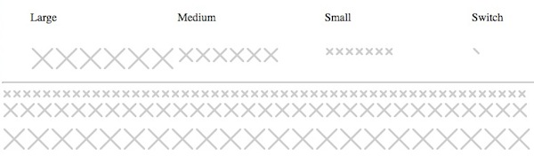
<ul>
  <li>Large</li>
  <li>Medium</li>
  <li>Small</li>
  <li>Switch</li>
</ul>

<ul>
  <li class="ele">
    <div class="x large"><b></b><b></b><b></b><b></b></div>
    <div class="x spin large"><b></b><b></b><b></b><b></b></div>
    <div class="x spin large slow"><b></b><b></b><b></b><b></b></div>
    <div class="x flop large"><b></b><b></b><b></b><b></b></div>
    <div class="x t large"><b></b><b></b><b></b><b></b></div>
    <div class="x shift large"><b></b><b></b><b></b><b></b></div>
  </li>
  <li class="ele">
    <div class="x medium"><b></b><b></b><b></b><b></b></div>
    <div class="x spin medium"><b></b><b></b><b></b><b></b></div>
    <div class="x spin medium slow"><b></b><b></b><b></b><b></b></div>
    <div class="x flop medium"><b></b><b></b><b></b><b></b></div>
    <div class="x t medium"><b></b><b></b><b></b><b></b></div>
    <div class="x shift medium"><b></b><b></b><b></b><b></b></div>

  </li>
  <li class="ele">
    <div class="x small"><b></b><b></b><b></b><b></b></div>
    <div class="x spin small"><b></b><b></b><b></b><b></b></div>
    <div class="x spin small slow"><b></b><b></b><b></b><b></b></div>
    <div class="x flop small"><b></b><b></b><b></b><b></b></div>
    <div class="x t small"><b></b><b></b><b></b><b></b></div>
    <div class="x shift small"><b></b><b></b><b></b><b></b></div>
    <div class="x small grow"><b></b><b></b><b></b><b></b></div>

  </li>
  <li class="ele">
    <div class="x switch"><b></b><b></b><b></b><b></b></div>
  </li>
</ul>
css
.ele div.x {
-webkit-transition-duration:0.5s;
  transition-duration:0.5s;
}

.ele div.x.slow {
-webkit-transition-duration:1s;
  transition-duration:1s;
}

ul { list-style:none;float:left;display:block;width:100%; }
li { display:inline;width:25%;float:left; }
.ele { width:25%;display:inline; }
.x {
  float:left;
  position:relative;
  margin:0;
  padding:0;
  overflow:hidden;
  background:#CCC;
  border-radius:2px;
  border:solid 2px #FFF;
  transition: all .3s ease-out;
  cursor:pointer;
}
.x.large {
  width:30px;
  height:30px;
}

.x.medium {
  width:20px;
  height:20px;
}

.x.small {
  width:10px;
  height:10px;
}

.x.switch {
  width:15px;
  height:15px;
}
.x.grow {

}

.x.spin:hover{
  background:#BB3333;
  transform: rotate(180deg);
}
.x.flop:hover{
  background:#BB3333;
  transform: rotate(90deg);
}
.x.t:hover{
  background:#BB3333;
  transform: rotate(45deg);
}
.x.shift:hover{
  background:#BB3333;
}

.x b{
  display:block;
  position:absolute;
  height:0;
  width:0;
  padding:0;
  margin:0;
}
.x.small b {
  border:solid 5px rgba(255,255,255,0);
}
.x.medium b {
  border:solid 10px rgba(255,255,255,0);
}
.x.large b {
  border:solid 15px rgba(255,255,255,0);
}
.x.switch b {
  border:solid 10px rgba(255,255,255,0);
}

.x b:nth-child(1){
  border-top-color:#FFF;
  top:-2px;
}
.x b:nth-child(2){
  border-left-color:#FFF;
  left:-2px;
}
.x b:nth-child(3){
  border-bottom-color:#FFF;
  bottom:-2px;
}
.x b:nth-child(4){
  border-right-color:#FFF;
  right:-2px;
}
Solution 5 - Css
You can use svg.
<svg viewPort="0 0 12 12" version="1.1"
     xmlns="http://www.w3.org/2000/svg">
    <line x1="1" y1="11"
          x2="11" y2="1"
          stroke="black"
          stroke-width="2"/>
    <line x1="1" y1="1"
          x2="11" y2="11"
          stroke="black"
          stroke-width="2"/>
</svg>
Solution 6 - Css
-- Simple HTML Solution --
Final result of easy to resize icon:
JSfiddle demo: https://jsfiddle.net/allenski/yr5gk3cm/
The simple HTML:
<a href="#" class="close" tabindex="0" role="button">close</a>
> Note:
> - tabindex attribute is there to help accessibility focus of iOS touch devices.
> - role attribute is to let screen readers users know this is a button.
> - The word close is also intended for screen readers to mention.
The CSS code:
.close {
    position: absolute;
    top: 0;
    right: 0;
    display: block;
    width: 50px;
    height: 50px;
    font-size: 0;
}
.close:before,
.close:after {
    position: absolute;
    top: 50%;
    left: 50%;
    width: 5px;
    height: 20px;
    background-color: #F0F0F0;
    transform: rotate(45deg) translate(-50%, -50%);
    transform-origin: top left;
    content: '';
}
.close:after {
    transform: rotate(-45deg) translate(-50%, -50%);
}
To adjust thickness of close X icon, change the width property. Example for thinner icon:
.close:before,
.close:after {
    width: 2px;
}
To adjust length of close X icon, change the height property. Example:
.close:before,
.close:after {
    height: 33px;
}
Solution 7 - Css
.close-btn {
  font-size: 60px;
  font-weight: bold;
  color: #000;
}
<span class="close-btn">×</span>
Solution 8 - Css
True CSS with proper semantic and accessibility settings.
It is a <button>, It has text for screen readers.
https://codepen.io/specialweb/pen/ExyWPYv?editors=1100
button {
  width: 2rem;
  height: 2rem;
  padding: 0;
  position: absolute;
  top: 1rem;
  right: 1rem;
  cursor: pointer;
}

.sr-only {
  position: absolute;
  width: 1px;
  height: 1px;
  padding: 0;
  margin: -1px;
  overflow: hidden;
  clip: rect(0,0,0,0);
  border: 0;
}

button::before,
button::after {
    content: '';
    width: 1px;
    height: 100%;
    background: #333;
    display: block;
    transform: rotate(45deg) translateX(0px);
    position: absolute;
    left: 50%;
    top: 0;
}

button::after {
    transform: rotate(-45deg) translateX(0px);
}


/* demo */
body {
  background: black;
}
.pane {
  margin: 0 auto;
  width: 50vw;
  min-height: 50vh;
  background: #FFF;
  position: relative;
  border-radius: 5px;
}
<div class="pane">
  <button type="button"><span class="sr-only">Close</span></button>
</div>
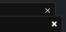
Solution 9 - Css
Here's a good drop-in solution for perfectly centered circular X icon buttons
- Using only CSS
- Not relying on a font
- The thickness and length of the tines of the X can be configured without affecting centering, using
widthandheightin the pseudo element rule.close::before, .close::after - Screen reader support using
aria-label - Works on a light or dark background by using transparent grays and
currentColorto adapt to the current text color specified on the button or an ancestor.
.close {
	vertical-align: middle;
	border: none;
	color: inherit;
	border-radius: 50%;
	background: transparent;
	position: relative;
	width: 32px;
	height: 32px;
	opacity: 0.6;
}
.close:focus,
.close:hover {
	opacity: 1;
	background: rgba(128, 128, 128, 0.5);
}
.close:active {
	background: rgba(128, 128, 128, 0.9);
}
/* tines of the X */
.close::before,
.close::after {
	content: " ";
	position: absolute;
	top: 50%;
	left: 50%;
	height: 20px;
	width: 4px;
	background-color: currentColor;
}
.close::before {
	transform: translate(-50%, -50%) rotate(45deg);
}
.close::after {
	transform: translate(-50%, -50%) rotate(-45deg);
}
<div style="padding: 15px">
	<button class="close" aria-label="Close"></button>
</div>
<div style="background: black; color: white; padding: 15px">
	<button class="close" aria-label="Close"></button>
</div>
<div style="background: orange; color: yellow; padding: 15px">
	<button class="close" aria-label="Close"></button>
</div>