Weird effect when applying transparent border over an element with a gradient background
HtmlCssLinear GradientsHtml Problem Overview
When applying a transparent border over an element with a linear-gradient as the background, I get a weird effect.

Notice the left and right sides of the element don't have the proper colours (they're some way switched) and are weirdly flat.
HTML
<div class="colors">
</div>
CSS
.colors {
    width: 100px;
    border: 10px solid rgba(0,0,0,0.2);
    height: 50px;
    background: linear-gradient(to right,
        #78C5D6,
        #459BA8,
        #79C267,
        #C5D647,
        #F5D63D,
        #F08B33,
        #E868A2,
        #BE61A5);
}
Why is this showing a weird effect on the left and right side of the element, and What can I do about it?
Here is the fiddle: http://jsfiddle.net/fzndodgx/3/
Html Solutions
Solution 1 - Html
That's because the starting and ending points of the gradient are at the edges of the padding-box and border is rendered outside the padding-box. So, the borders look funny because the background is repeated on each side outside the padding-box to cover the border-box.
The box-shadow:inset is rendered inside the padding-box (just like background) and gives visually the same effect as a border, so you could try using that in place of border:
box-shadow: inset 0 0 0 10px rgba(0,0,0,0.2);
padding: 10px;
Because a box-shadow doesn't take up any space, you need to increase your padding accordingly.
Illustration of padding-box and border-box:

Solution 2 - Html
Solution
The simplest way to fix this issue would be by setting the value for the background-origin property as border-box .
.colors {
  width: 100px;
  border: 10px solid rgba(0, 0, 0, 0.2);
  height: 50px;
  background: linear-gradient(to right, #78C5D6, #459BA8, #79C267, #C5D647, #F5D63D, #F08B33, #E868A2, #BE61A5);
  background-origin: border-box;
}
<div class="colors"></div>
Reason for the behavior mentioned in question
The following are the relevant background properties that determine the way the background gradient is displayed for this case:
background-origin- The default value ispadding-box. It means that the background is actually positioned with respect to the padding box and so starts from after theborder.background-repeat- The default value for this isrepeat. It means that the image should be repeated as much as needed to cover the entire background painting area.background-clip- The default value for this isborder-box. It means that the image should be present under the area occupied by the borders of the box also.
Now combining all three we can see that the border must be repeated as much as possible for it to be present even under the borders and that it's starting position is after the border of the box. This implies that the background must be repeated in a cyclic manner so as to fill up the area under the border on the left side. Because of this the left border has the color as the right end of the gradient and vice-versa.
By changing it to border-box, we are making the background get positioned with respect to the border box. This setting also has an effect on the size of the background image and the reason for it is described below in detail.
Why does box-sizing: border-box not work?
Setting box-sizing as border-box does not bring about any change because that property affects only the size of the box. It has absolutely no effect on the following:
- The size of the gradient image (actual calculation logic is described below)
- The starting point (or position) of the gradient image
- The repetition of the background image
How is the size of the gradient calculated?
As per W3C spec, the below is how the image's dimensions are calculated when no explicit size is provided (default value is auto).
> If the image has neither an intrinsic width nor an intrinsic height, its size is determined as for ‘contain’
Note how it talks about the size of the image and not that of the box. In essence, irrespective of the size of the box, the size of the background image would be calculated based on the definition for keyword contain when the image itself has no intrinsic height (which CSS gradients don't have unlike images).
The definition for contain is as follows:
> Scale the image, while preserving its intrinsic aspect ratio (if any), to the largest size such that both its width and its height can fit inside the background positioning area.
Background positioning area is defined as follows (under background-origin property definition):
> For elements rendered as a single box, specifies the background positioning area
Thus, when the image has no intrinsic height (and in this case no background-size also), the size of the image would be equal to that of background-origin's value (which in our case is padding-box).
This is why even setting the box-sizing as border-box has no effect.
Note: emphasis within the quoted texts are all mine
If you explicitly set the background-size as the size of the box, you would notice how the issue is resolved on the right side but not on the left side. This is because now the image is large enough to not repeat under the right border but its starting point is still after the left border.
.colors {
  width: 100px;
  border: 10px solid rgba(0, 0, 0, 0.2);
  height: 50px;
  background: linear-gradient(to right, #78C5D6, #459BA8, #79C267, #C5D647, #F5D63D, #F08B33, #E868A2, #BE61A5);
  background-size: 110px 60px;
}
.colors-2 {
  width: 100px;
  border: 10px solid rgba(0, 0, 0, 0.2);
  height: 50px;
  background: linear-gradient(to right, #78C5D6, #459BA8, #79C267, #C5D647, #F5D63D, #F08B33, #E868A2, #BE61A5);
  box-sizing: border-box;
  background-size: 100px 50px;
}
<div class="colors">
</div>
<div class="colors-2">
</div>
Solution 3 - Html
The background is repeating itself under the border. The background runs only in the "body" of the element, under the border is an expansion and repeat starts occurring.
See this example with no-repeat on the border.
UPDATE
Playing with background position & size can help by expanding the background and then adjusting it's location.
Check this fiddle out.
Or see snippet:
.colors {
  padding: 10px;
  width: 100px;
  border: 10px solid rgba(0, 0, 0, 0.2);
  height: 50px;
  background: linear-gradient(to right, #78C5D6, #459BA8, #79C267, #C5D647, #F5D63D, #F08B33, #E868A2, #BE61A5);
  background-size: 117%;
  background-position-x: 130px;
}
<div class="colors"></div>
Solution 4 - Html
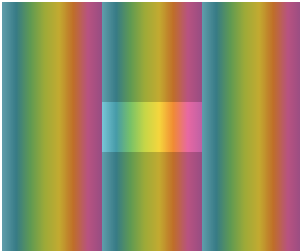
Other answers have already shown how to fix the issue, but I thought I should just point out that if you increase the border-width it becomes apparent that the background is actually repeating.
.colors {
    width: 100px;
    border: 100px solid rgba(0,0,0,0.2);
    height: 50px;
    background: linear-gradient(to right,
        #78C5D6,
        #459BA8,
        #79C267,
        #C5D647,
        #F5D63D,
        #F08B33,
        #E868A2,
        #BE61A5);
}
will produce
Solution 5 - Html
The gradient starts within the padding box according to the default CSS box model behaviour, so it makes sense that the very start and very end colours appear until infinity either side of the gradient, where the border would be.
The same is true of this gradient (NSFW):

It continues infinitely in the starting value (violet) to the left, and continues infinitely with the end value (orange) to the right. It can continue infinitely upwards with this gradient, and so it does.
That's my understanding of why this is appearing so, a solution would to use a different box model.
Solution 6 - Html
The default value of background-origin property is padding-box which means the background is positioned and sized relative to the padding box.
The background also extends below border since the background-clip property defaults to border-box; it simply repeats itself below the border. This is why you see the right side of background below left border and vice versa.
So, just change the origin:
.colors {
  width: 100px;
  border: 10px solid rgba(0, 0, 0, 0.2);
  height: 50px;
  background: linear-gradient(to right, #78C5D6, #459BA8, #79C267, #C5D647, #F5D63D, #F08B33, #E868A2, #BE61A5);
  background-origin: border-box;
}
<div class="colors"></div>
Alternately you can play with background size and position: add 20px to the background size and position it at -10px -10px:
.colors {
  width: 100px;
  border: 10px solid rgba(0, 0, 0, 0.2);
  height: 50px;
  background: linear-gradient(to right, #78C5D6, #459BA8, #79C267, #C5D647, #F5D63D, #F08B33, #E868A2, #BE61A5);
  background-position: -10px -10px;
  background-size: calc(100% + 20px) calc(100% + 20px);
}
<div class="colors"></div>
Solution 7 - Html
If you don't want to use box-shadow, you could use border-image and adjust the colors of the gradient: http://jsfiddle.net/9pcuj8bw/5/
.colors {
    width:100px;
    height: 50px;
    background: linear-gradient(to right,
        #78C5D6,
        #459BA8,
        #79C267,
        #C5D647,
        #F5D63D,
        #F08B33,
        #E868A2,
        #BE61A5) no-repeat;
    border: 10px solid;
    border-image: linear-gradient(to right,
        #0bc3b8,
        #068e8c,
        #f8c617,
        #ea5f24,
        #b2492c) 1;
}
<div class="colors"></div>
Careful this works not on IE10 or lower: http://caniuse.com/#feat=border-image