Using CSS, can you apply a gradient mask to fade to the background over text?
CssGradientMaskingCss Problem Overview
I have a full screen fixed background image. I would like the text in my scrolling div to fade out at the top, presumably by applying a gradient mask to the background at only the top part of the div. I'm interested in having the text look like it fades away as it the user scrolls down, but still having a large area of full opacity for actually reading the text.
I know there are masking options in the webkit, but I can't find a way to fade through to the page's background over the contained text only applying the gradient to a small portion of the element.
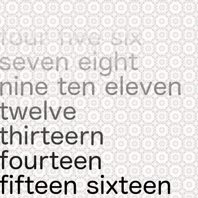
Here's an image of the desired result:
Css Solutions
Solution 1 - Css
I've been wondering this exact same thing. The solution is actually quite simple. Although this is of course quite a modern feature, so you're stuck to browser compatibility.
Webkit can take care of this with a single line of CSS:
-webkit-mask-image: -webkit-gradient(linear, left 90%, left bottom, from(rgba(0,0,0,1)), to(rgba(0,0,0,0)))
(The new standardised way of doing it is would use mask-image and linear-gradient using its new syntax. See caniuse.com for mask-image and linear-gradient.)
This would fade out the bottom 10% of whatever element it's applied to, without using even so much as an image. You could add padding-bottom: 50% to make sure that content is only faded when there is more to scroll to.
Source: http://www.webkit.org/blog/181/css-masks/
A Mozilla (Gecko) fallback is a bit trickier though: you can use its 'mask' feature, but this demands a SVG-image. You could try to base64 embed that image into your stylesheet... Use mask-image in Firefox now.
Solution 2 - Css
Here's how you can do it using modern mask-image and linear-gradient properties. Sadly, in 2021, they are not completely supported in all browsers. (See caniuse.com for CSS masks and linear-gradient.)
In this code snippet, I've given the html element an orange and yellow gradient background, to prove that this method is using real transparency and uses the element underneath it as background.
html {
  background: linear-gradient(to right, orange, yellow, orange);
  height: 100%;
}
div {
  -webkit-mask-image: linear-gradient(to bottom, rgba(0, 0, 0, 0), rgba(0, 0, 0, 1));
  mask-image: linear-gradient(to bottom, rgba(0, 0, 0, 0), rgba(0, 0, 0, 1));
}
<div>
One two three four five six seven eight nine ten One two three four five six seven eight nine ten One two three four five six seven eight nine ten One two three four five six seven eight nine ten One two three four five six seven eight nine ten One two three four five six seven eight nine ten One two three four five six seven eight nine ten One two three four five six seven eight nine ten One two three four five six seven eight nine ten One two three four five six seven eight nine ten One two three four five six seven eight nine ten One two three four five six seven eight nine ten
One two three four five six seven eight nine ten One two three four five six seven eight nine ten One two three four five six seven eight nine ten One two three four five six seven eight nine ten One two three four five six seven eight nine ten One two three four five six seven eight nine ten One two three four five six seven eight nine ten One two three four five six seven eight nine ten One two three four five six seven eight nine ten One two three four five six seven eight nine ten One two three four five six seven eight nine ten One two three four five six seven eight nine ten
</div>
Solution 3 - Css
If you're fading to a solid color, you can use a psudo element:
.image-container {
    position: relative;
    display: inline-block;
  }

.image-container:after {
  content: "";
  display: block;
  position: absolute;
  width: 100%;
  height: 55%;
  bottom: 0;
  background: -webkit-linear-gradient(transparent, #FFF) left repeat;
  background: linear-gradient(transparent, #FFF) left repeat;
}
<div class="image-container">
  <img src="https://photosharingsites.files.wordpress.com/2014/11/tiger-wild-cat-animal-winter-snow-wallpapers-free-backgrounds.jpg?w=474&h=344" alt="don't shoot me">
  </div>
Solution 4 - Css
Assuming I'm understanding what you want correctly, you could duplicate the top 300ish pixels of your image and apply a transparency gradient to them in Photoshop (making the top completely opaque and the bottom completely transparent).
Then place this image in a div or some other element fixed over at the top of the fixed image but with a high z-index. The main text would then scroll over your background but under the div overlay and fade out as the overlay becomes more opaque towards the top of the screen.
Solution 5 - Css
I struggled with this once when i needed to fade both top and bottom sides, and then i've created a simple generator for me, it was working well, so i published it here (css mask generator), it might be useful.
(you need to use -webkit prefix if you're not using some parser that already check caniuse's support)
The generator works with linear gradients and radial gradients when needed, just like at @Flimm's example
Example top and bottom fade:
.container {
    height: 200px;
    width: 100%;
    overflow: auto;
    -webkit-mask-image: linear-gradient(180deg, transparent 5%, rgba(0, 0, 0, 1) 52%, rgba(0, 0, 0, 1) 44%, transparent 95%);
  }
<div class="container">
  <p>Lorem ipsum dolor sit amet, consectetur adipiscing elit. Integer luctus velit et neque sodales, vel malesuada libero pharetra. Phasellus rutrum ligula non nisi porttitor commodo. Sed mattis nibh metus, ac tristique augue iaculis vitae. Nam et finibus nulla. Morbi ornare vulputate interdum. Vivamus ultricies libero at sapien posuere, id luctus lacus facilisis. Praesent egestas tristique arcu a facilisis. Donec cursus, purus et convallis facilisis, velit erat vestibulum ligula, at porta nunc nunc tempor massa. Suspendisse lorem mauris, tincidunt in erat nec, ultricies viverra tellus. Praesent ligula ante, maximus ut orci a, pretium convallis diam. Nunc eget magna consectetur nisl ultrices feugiat et a eros. Pellentesque vitae lectus libero. Nulla sed dignissim nulla, rutrum fermentum sapien. Vestibulum aliquet, neque elementum pharetra mollis, velit libero ullamcorper leo, sed mattis elit lectus sed libero.</p>
</div>