Div height 100% and expands to fit content
CssHtmlHeightOverflowCss Problem Overview
I have a div element on my page with its height set to 100%. The height of the body is also set to 100%. The inner div has a background and all that and is different from the body background. This works for making the div height 100% of the browser screen height, but the problem is I have content inside that div that extends vertically beyond the browser screen height. When I scroll down, the div ends at the point at which you had to begin scrolling the page, but the content overflows beyond that. How do I make the div always go all the way to the bottom to fit the inner content?
Here's a simplification of my CSS:
body {
    height:100%;
    background:red;
}

#some_div {
    height:100%;
    background:black;
}
Once I scroll the page, the blackness ends and the content flows onto the red background. It doesn't seem to matter whether I set the positon to relative or absolute on the #some_div, the problem occurs either way. The content inside the #some_div is mostly absolutely positioned, and it is dynamically generated from a database so its height can't be known in advance.
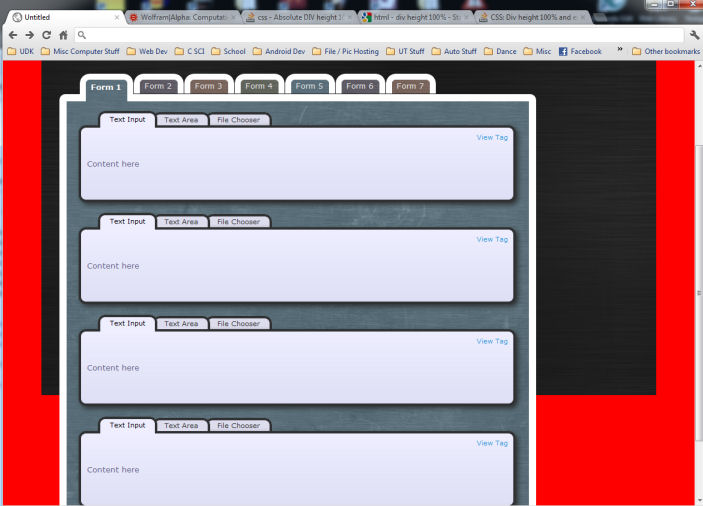
Edit: Here is a screenshot of the problem:
Css Solutions
Solution 1 - Css
Here is what you should do in the CSS style, on the main div
display: block;
overflow: auto;
And do not touch height
Solution 2 - Css
Set the height to auto and min-height to 100%. This should solve it for most browsers.
body {
  position: relative;
  height: auto;
  min-height: 100% !important;
}
Solution 3 - Css
Usually this problem arises when the Child elements of a Parent Div are floated. Here is the Latest Solution of the problem:
In your CSS file write the following class called .clearfix along with the pseudo selector :after
.clearfix:after {
content: "";
display: table;
clear: both;
}
Then, in your HTML, add the .clearfix class to your parent Div. For example:
<div class="clearfix">
    <div></div>
    <div></div>
</div>
It should work always. You can call the class name as .group instead of .clearfix , as it will make the code more semantic. Note that, it is Not necessary to add the dot or even a space in the value of Content between the double quotation "". Also, overflow: auto; might solve the problem but it causes other problems like showing the scroll-bar and is not recommended.
Source: Blog of Lisa Catalano and Chris Coyier
Solution 4 - Css
If you just leave the height: 100% and use display:block; the div will take as much space as the content inside the div. This way all the text will stay in the black background.
Solution 5 - Css
This question may be old, but it deserves an update. Here is another way to do that:
#yourdiv {
    display: flex;
    width:100%;
    height:100%;
}
Solution 6 - Css
Try this:
body {
    min-height:100%;
    background:red;
}

#some_div {
    min-height:100%;
    background:black;
}
IE6 and earlier versions do not support the min-height property.
I think the problem is that when you tell the body to have a height of 100%, it's background can only be as tall as the hieght of one browser "viewport" (the viewing area that excludes the browsers toolbars & statusbars & menubars and the window edges). If the content is taller than one viewport, it will overflow the height devoted to the background.
This min-height property on the body should FORCE the background to be at least as tall as one viewport if your content does not fill one whole page down to the bottom, yet it should also let it grow downwards to encompass more interior content.
Solution 7 - Css
#some_div {
  height: fit-content;
}
https://developer.mozilla.org/en-US/docs/Web/CSS/fit-content
Solution 8 - Css
Old question, but in my case i found using position:fixed solved it for me.
My situation might have been a little different though. I had an overlayed semi transparent div with a loading animation in it that I needed displayed while the page was loading. So using height:auto / 100% or min-height: 100% both filled the window but not the off-screen area. Using position:fixed made this overlay scroll with the user, so it always covered the visible area and kept my preloading animation centred on the screen.
Solution 9 - Css
use flex
.parent{
    display: flex
}

.fit-parent{
    display: flex;
    flex-grow: 1
}
Solution 10 - Css
In my case it worked only with:
height: auto;
You don't need to put display: block.
Solution 11 - Css
Modern browsers support the "viewport height" unit. This will expand the div to the available viewport height. I find it more reliable than any other approach.
#some_div {
    height: 100vh;
    background: black;
}
Solution 12 - Css
Ok, I tried something like this:
body (normal)
#MainDiv {
  /* where all the content goes */
  display: table;
  overflow-y: auto;
}
It's not the exact way to write it, but if you make the main div display as a table, it expands and then I implemented scroll bars.
Solution 13 - Css
Just add these two line in your css id #some_div
display: block;
overflow: auto;
After that you will get what your are looking for !
Solution 14 - Css
OVERLAY WITHOUT POSITION:FIXED
A really cool way I've figured this out for a recent menu was setting the body to:
position: relative
and set your wrapper class like this:
#overlaywrapper {
    position: absolute;
    top: 0;
    width: 100%;
    height: 100%;
    background: #00000080;
    z-index: 100;
}
This means that you don't have to set position fixed and can still allow for scrolling. I've used this for overlaying menu's that are REALLY big.
Solution 15 - Css
I'm not entirely sure that I've understood the question because this is a fairly straightforward answer, but here goes... :)
Have you tried setting the overflow property of the container to visible or auto?
#some_div {
    height:100%;
    background:black;
    overflow: visible;
    }
Adding that should push the black container to whatever size your dynamic container requires. I prefer visible to auto because auto seems to come with scroll bars...
Solution 16 - Css
Even you can do like this
display:block;
overflow:auto;
height: 100%;
This will include your each dynamic div as per the content. Suppose if you have a common div with class it will increase height of each dynamic div according to the content
Solution 17 - Css
You can also use
display: inline-block;
mine worked with this