Use CSS to automatically add 'required field' asterisk to form inputs
CssFormsValidationStandardsCss Problem Overview
What is a good way to overcome the unfortunate fact that this code will not work as desired:
<div class="required">
    <label>Name:</label>
    <input type="text">
</div>

<style>
    .required input:after { content:"*"; }
</style>
In a perfect world, all required inputs would get the little asterisk indicating that the field is required. This solution impossible since the CSS is inserted after the element content, not after the element itself, but something like it would be ideal. On a site with thousands of required fields, I can move the asterisk in front of the input with one change to one line (:after to :before) or I can move it to the end of the label (.required label:after) or in front of the label, or to a position on the containing box, etc...
This is important not just in case I change my mind about where to place the asterisk everywhere, but also for odd cases where the form layout doesn't allow the asterisk in the standard position. It also plays well with validation that checks the form or highlights improperly completed controls.
Lastly, it doesn't add additional markup.
Are there any good solutions that have all or most of the advantages of the impossible code?
Css Solutions
Solution 1 - Css
Is that what you had in mind?
<label class="required">Name:</label>
<input type="text">

<style>
  .required:after {
    content:" *";
    color: red;
  }
</style>
.required:after {
  content:" *";
  color: red;
}
<label class="required">Name:</label>
<input type="text">
See https://developer.mozilla.org/en-US/docs/Web/CSS/pseudo-elements
Solution 2 - Css
.required label {
    font-weight: bold;
}
.required label:after {
    color: #e32;
    content: ' *';
    display:inline;
}
Fiddle with your exact structure: http://jsfiddle.net/bQ859/
Solution 3 - Css
To put it exactly INTO input as it is shown on the following image:
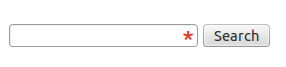
I found the following approach:
.asterisk_input::after {
content:" *";
color: #e32;
position: absolute;
margin: 0px 0px 0px -20px;
font-size: xx-large;
padding: 0 5px 0 0; }
 <form>
    <div>
        <input type="text" size="15" />
        <span class="asterisk_input">  </span>
    </div>
</form>
Site on which I work is coded using fixed layout so it was ok for me.
I'm not sure that that it's good for liquid design.
Solution 4 - Css
input[required]{
    background-image: radial-gradient(#F00 15%, transparent 16%), radial-gradient(#F00 15%, transparent 16%);
    background-size: 1em 1em;
    background-position: right top;
    background-repeat: no-repeat;
}
Solution 5 - Css
write in CSS
.form-group.required .control-label:after {content:"*";color:red;}
and HTML
<div class="form-group required">

    <label class="control-label">Name:</label>

    <input type="text">

</div>
Solution 6 - Css
input[required], select[required] {
    background-image: url('/img/star.png');
    background-repeat: no-repeat;
    background-position-x: right;
}
Image has some 20px space on the right not to overlap with select dropdown arrow

And it looks like this: 
Solution 7 - Css
It is 2019 and previous answers to this problem are not using
- CSS grid
- CSS variables
- HTML5 form elements
- SVG in CSS
CSS grid is the way to do forms in 2019 as you can have your labels preceding your inputs without having extra divs, spans, spans with asterisks in and other relics.
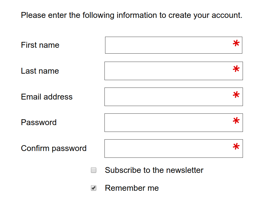
Here is where we are going with minimal CSS:
The HTML for the above:
<form action="https://www.example.com/register/" method="post" id="form-validate" enctype="multipart/form-data">
    <p class="form-instructions">Please enter the following information to create your account.</p>
    <label for="firstname">First name</label>
    <input type="text" id="firstname" name="firstname" value="" title="First name" maxlength="255" required="">
    <label for="lastname">Last name</label>
    <input type="text" id="lastname" name="lastname" value="" title="Last name" maxlength="255" required="">
    <label for="email_address">Email address</label>
    <input type="email" autocapitalize="off" autocorrect="off" spellcheck="false" name="email" id="email_address" value="" title="Email address" size="30" required="">
    <label for="password">Password</label>
    <input type="password" name="password" id="password" title="Password" required="">
    <label for="confirmation">Confirm password</label>
    <input type="password" name="confirmation" title="Confirm password" id="confirmation" required="">
    <input type="checkbox" name="is_subscribed" title="Subscribe to our newsletter" value="1" id="is_subscribed" class="checkbox">
    <label for="is_subscribed">Subscribe to the newsletter</label>
    <input type="checkbox" name="persistent_remember_me" id="remember_meGCJiRe0GbJ" checked="checked" title="Remember me">
    <label for="remember_meGCJiRe0GbJ">Remember me</label>
    <p class="required">* Required</p>
    <button type="submit" title="Register">Register</button>
</form>
Placeholder text can be added too and is highly recommended. (I am just answering this mid-form).
Now for the CSS variables:
--icon-required: url('data:image/svg+xml,\
<svg xmlns="http://www.w3.org/2000/svg" width="100" height="100" viewBox="-10 -6 16 16"> \
  <line id="line" y1="-3" y2="3" stroke="%23df0000" stroke-linecap="butt" transform="rotate(15)"></line> \
  <line id="line" y1="-3" y2="3" stroke="%23df0000" stroke-linecap="butt" transform="rotate(75)"></line> \
  <line id="line" y1="-3" y2="3" stroke="%23df0000" stroke-linecap="butt" transform="rotate(-45)"></line> \
</svg>');

--icon-tick: url('data:image/svg+xml,\
<svg xmlns="http://www.w3.org/2000/svg" xmlns:xlink="http://www.w3.org/1999/xlink" width="100" height="100" viewBox="-2 -2 16 16"> \
            <path fill="green" stroke-linejoin="round" d="M2 6L1 7l3 4 7-10h-1L4 8z"/> \
</svg>');
The CSS for the form elements:
input[type=text][required],
input[type=email][required],
input[type=password][required],
input[type=tel][required] {
    background-image: var(--icon-required);
    background-position-x: right;
    background-repeat: no-repeat;
    background-size: contain;
}

input:valid {
    --icon-required: var(--icon-tick);
}
The form itself should be in CSS grid:
form {
    align-items: center;
    display: grid;
    grid-gap: var(--form-grid-gap);
    grid-template-columns: var(--form-grid-template-columns);
    margin: auto;
}
The values for the columns can be set to 1fr auto or 1fr with anything such as <p> tags in the form set to span 1/-1. You change the variables in your media queries so that you have the input boxes going full width on mobile and as per above on desktop. You can also change your grid gap on mobile if you wish by using the CSS variables approach.
When the boxes are valid then you should get a green tick instead of the asterisk.
The SVG in CSS is a way of saving the browser from having to do a round trip to the server to get an image of the asterisk. In this way you can fine tune the asterisks, the examples here are at an unusual angle, you can edit this out as the SVG icon above is entirely readable. The viewbox can also be amended to place the asterisk above or below the centre.
Solution 8 - Css
Here is a simple "CSS only" trick I created and am using to dynamically add a red asterisk on the labels of required form elements without losing browsers' default form validation.
The following code works perfectly on all the browsers and for all the main form elements.
.form-group {
  display: flex;
  flex-direction: column;
}

label {
  order: 1;
  text-transform: capitalize;
  margin-bottom: 0.3em;
}

input,
select,
textarea {
  padding: 0.5em;
  order: 2;
}

input:required+label::after,
select:required+label::after,
textarea:required+label::after {
  content: " *";
  color: #e32;
}
<div class="form-group">
  <input class="form-control" name="first_name" id="first_name" type="text" placeholder="First Name" required>
  <label class="small mb-1" for="first_name">First Name</label>
</div>

<br>

<div class="form-group">
  <input class="form-control" name="last_name" id="last_name" type="text" placeholder="Last Name">
  <label class="small mb-1" for="last_name">Last Name</label>
</div>
> Important: You must preserve the order of elements that is the input element first and label element second. CSS is gonna handle it and transform it in the traditional way, that is the label first and input second.
Solution 9 - Css
Use jQuery and CSS
jQuery(document).ready(function() {
 jQuery("[required]").after("<span class='required'>*</span>");
});
.required {
    position: absolute;
    margin-left: -10px;
    color: #FB0000;
    font-size: 15px;
}
<script src="https://ajax.googleapis.com/ajax/libs/jquery/2.1.1/jquery.min.js"></script>
<input type="text" value="xxx" required>
Solution 10 - Css
I think this is the efficient way to do, why so much headache
    <div class="full-row">
     <label for="email-id">Email Address<span style="color:red">*</span></label>
  <input type="email" id="email-id" name="email-id"  ng-model="user.email" >
    </div>
Solution 11 - Css
If you are using "floating labels" (like https://css-tricks.com/float-labels-css/ or https://dev.to/adrianbdesigns/let-s-create-a-floating-label-input-with-html-and-css-only-4mo8) then you can use this:
input[required]+label:after {
    content: '*';
    color: red;
}
Easy, no images, will not be lost in user's eyes. Theoretically, you can padd the :after as well, if you want some spacing between label and the asterisk. You can also use :before instead of :after if you like.
Solution 12 - Css
if you have a label with the field name inside some tag with the required attribute, a common scenario in angular forms that add this attribute automatically to required fields
[required] label::after {
  content: '*';
  font-size: 24px;
  line-height: 0;
  vertical-align: middle;
}
Solution 13 - Css
.asterisc {
  display: block;
  color: red;
  margin: -19px 185px;
}
<input style="width:200px">
<span class="asterisc">*</span>
Solution 14 - Css
This example puts an asterisk symbol in front of a label to denote that particular input as a required field. I set the CSS properties using % and em to makesure my webpage is responsive. You could use px or other absolute units if you want to.
#name {
   display: inline-block;
   margin-left: 40%;
   font-size:25px;

}
.nameinput{
   margin-left: 10px;
   font-size:90%;
   width: 17em;

}

.nameinput::placeholder {
  font-size: 0.7em;
  vertical-align: middle;
}

#name p{
   margin:0;
   border:0;
   padding:0;
   display:inline-block;
   font-size: 40%;
   vertical-align: super;
}
<label id="name" value="name">
<p>*</p>
Name:  <input class="nameinput" type="text" placeholder="Enter your name" required>
</label>
Solution 15 - Css
What you need is :required selector - it will select all fields with 'required' attribute (so no need to add any additional classes). Then - style inputs according to your needs. You can use ':after' selector and add asterisk in the way suggested among other answers
Solution 16 - Css
There can be a lot of possibilities. You can reverse flex-direction and use the attribute required of your input like follows:
fieldset {
    border: none;
    padding: 0;
    display: flex;
    flex-direction: column-reverse;
}
fieldset p {
    margin-bottom: 4px;
}
fieldset input[required] ~ p:after {
    content: '*';
    color: red;
    font-size: 12px;
    margin-left: 4px;
}
<form>
    <fieldset>
        <input type="text" placeholder="Severus" name="first_name" required />
        <p>First Name</p>
    </fieldset>
    <fieldset>
        <input type="text" placeholder="Snape" name="last_name" />
        <p>Last Name</p>
    </fieldset>
</form>
Solution 17 - Css
You can achieve the desired result by encapsulating the HTML code in a div tag which contains the "required' class followed by the "form-group" class. *however this works only if you have Bootstrap.
<div class="form-group required">
    <div class="required">
        <label>Name:</label>
        <input type="text">
    </div>
  <div>
Solution 18 - Css
For those who end up here, but have jQuery:
// javascript / jQuery
$("label.required").append('<span class="red-star"> *</span>')

// css
.red-star { color: red; }
Solution 19 - Css
Simple & Short
<label>Name:<span class="required">*</span></label>

.required {
    color: red;
  }