How to stretch the background image to fill a div
CssHtmlBackgroundBackground ImageCss Problem Overview
I want to set a background image to different divs, but my problems are:
- The size of image is fixed(60px).
- Varying div's size
How can I stretch the background-image to fill the whole background of the div?
#div2{
  background-image:url(http://s7.static.hootsuite.com/3-0-48/images/themes/classic/streams/message-gradient.png);
  height:180px;
  width:200px;
  border: 1px solid red;
}
Css Solutions
Solution 1 - Css
Add
background-size:100% 100%;
to your css underneath background-image.
You can also specify exact dimensions, i.e.:
background-size: 30px 40px;
Here: JSFiddle
Solution 2 - Css
You can use:
background-size: cover;
Or just use a big background image with:
background: url('../images/teaser.jpg') no-repeat center #eee;
Solution 3 - Css
Modern CSS3 (recommended for the future & probably the best solution)
.selector{
   background-size: cover;
   /* stretches background WITHOUT deformation so it would fill the background space,
      it may crop the image if the image's dimensions are in different ratio,
      than the element dimensions. */
}
Max. stretch without crop nor deformation (may not fill the background): background-size: contain;
Force absolute stretch (may cause deformation, but no crop): background-size: 100% 100%;
"Old" CSS "always working" way
Absolute positioning image as a first child of the (relative positioned) parent and stretching it to the parent size.
HTML
<div class="selector">
   <img src="path.extension" alt="alt text">
   <!-- some other content -->
</div>
Equivalent of CSS3 background-size: cover; :
To achieve this dynamically, you would have to use the opposite of contain method alternative (see below) and if you need to center the cropped image, you would need a JavaScript to do that dynamically - e.g. using jQuery:
$('.selector img').each(function(){
   $(this).css({
      "left": "50%",
      "margin-left": "-"+( $(this).width()/2 )+"px",
      "top": "50%",
      "margin-top": "-"+( $(this).height()/2 )+"px"
   });
});
Practical example:
Equivalent of CSS3 background-size: contain; :
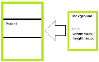
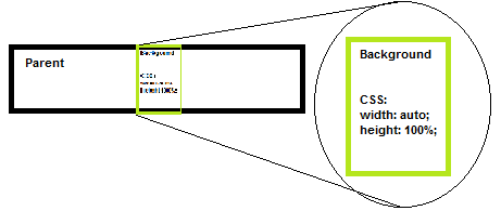
This one can be a bit tricky - the dimension of your background that would overflow the parent will have CSS set to 100% the other one to auto.
Practical example:
.selector img{
   position: absolute; top:0; left: 0;
   width: 100%;
   height: auto;
   /* -- OR -- */
   /* width: auto;
      height: 100%; */
}
Equivalent of CSS3 background-size: 100% 100%; :
.selector img{
   position: absolute; top:0; left: 0;
   width: 100%;
   height: 100%;
}
PS: To do the equivalents of cover/contain in the "old" way completely dynamically (so you will not have to care about overflows/ratios) you would have to use javascript to detect the ratios for you and set the dimensions as described...
Solution 4 - Css
For this you can use CSS3 background-size property. Write like this:
#div2{
    background-image:url(http://s7.static.hootsuite.com/3-0-48/images/themes/classic/streams/message-gradient.png);
    -moz-background-size:100% 100%;
    -webkit-background-size:100% 100%;
    background-size:100% 100%;
    height:180px;
    width:200px;
    border: 1px solid red;
}
Check this: http://jsfiddle.net/qdzaw/1/
Solution 5 - Css
You can add:
#div2{
    background-image:url(http://s7.static.hootsuite.com/3-0-48/images/themes/classic/streams/message-gradient.png);
    background-size: 100% 100%;
    height:180px;
    width:200px;
    border: 1px solid red;
}
You can read more about it here: css3 background-size
Solution 6 - Css
by using property css:
background-size: cover;
Solution 7 - Css
body{
  margin:0;
  background:url('image.png') no-repeat 50% 50% fixed;
  background-size: cover;
}
Solution 8 - Css
Use: background-size: 100% 100%; To make background image to fit the div size.
Solution 9 - Css
To keep the aspect ratio, use background-size: 100% auto;
div {
	background-image: url('image.jpg');
	background-size: 100% auto;
	width: 150px;
	height: 300px;
}
Solution 10 - Css
Try something like this:
div {
    background-image: url(../img/picture1.jpg);
    height: 30em;
    background-repeat: no-repeat;
    width: 100%;
    background-position: center;
}