Twitter Bootstrap - add top space between rows
CssTwitter BootstrapCss Problem Overview
How to add margin top to class="row" elements using twitter bootstrap framework?
Css Solutions
Solution 1 - Css
Editing or overriding the row in Twitter bootstrap is a bad idea, because this is a core part of the page scaffolding and you will need rows without a top margin.
To solve this, instead create a new class "top-buffer" that adds the standard margin that you need.
.top-buffer { margin-top:20px; }
And then use it on the row divs where you need a top margin.
<div class="row top-buffer"> ...
Solution 2 - Css
Ok just to let you know what's happened then, i fixed using some new classes as Acyra says above:
.top5 { margin-top:5px; }
.top7 { margin-top:7px; }
.top10 { margin-top:10px; }
.top15 { margin-top:15px; }
.top17 { margin-top:17px; }
.top30 { margin-top:30px; }
whenever i want i do <div class="row top7"></div>
for better responsive you can add margin-top:7% instead of 5px for example :D
Solution 3 - Css
#Bootstrap 3
If you need to separate rows in bootstrap, you can simply use .form-group. This adds 15px margin to the bottom of row.
In your case, to get margin top, you can add this class to previous .row element
<div class="row form-group">

/* From bootstrap.css */
.form-group {
        margin-bottom: 15px;
}
#Bootstrap 4
You can use built-in spacing classes
<div class="row mt-3"></div>
The "t" in class name makes it apply only to "top" side, there are similar classes for bottom, left, right. The number defines space size.
Solution 4 - Css
For Bootstrap 4 spacing should be applied using
> shorthand utility classes
in the following format:
> {property}{sides}-{size}
Where property is one of:
- m - for classes that set margin
- p - for classes that set padding
Where sides is one of:
- t - for classes that set margin-top or padding-top
- b - for classes that set margin-bottom or padding-bottom
- l - for classes that set margin-left or padding-left
- r - for classes that set margin-right or padding-right
- x - for classes that set both *-left and *-right
- y - for classes that set both *-top and *-bottom
- blank - for classes that set a margin or padding on all 4 sides of the element
Where size is one of:
- 0 - for classes that eliminate the margin or padding by setting it to 0
- 1 - (by default) for classes that set the margin or padding to $spacer * .25
- 2 - (by default) for classes that set the margin or padding to $spacer * .5
- 3 - (by default) for classes that set the margin or padding to $spacer
- 4 - (by default) for classes that set the margin or padding to $spacer * 1.5
- 5 - (by default) for classes that set the margin or padding to $spacer * 3
- auto - for classes that set the margin to auto
So you should be doing any of these:
<div class="row mt-1">
<div class="row mt-2">
          ...
<div class="row mt-5">
Read the docs for more explanation. Try live examples over here.
Solution 5 - Css
Sometimes margin-top can causes design problems:
http://www.w3.org/TR/CSS2/box.html#collapsing-margins
So, i recommend create "margin-bottom classes" instead of "margin-top classes" and apply them to the previous item.
If you are using Bootstrap importing LESS Bootstrap files try to define the margin-bottom classes with proportional Bootstrap Theme spaces:
.margin-bottom-xs {margin-bottom: ceil(@line-height-computed / 4);}
.margin-bottom-sm {margin-bottom: ceil(@line-height-computed / 2);}
.margin-bottom-md {margin-bottom: @line-height-computed;}
.margin-bottom-lg {margin-bottom: ceil(@line-height-computed * 2);}
Solution 6 - Css
I added these classes to my bootstrap stylesheet
.voffset  { margin-top: 2px; }
.voffset1 { margin-top: 5px; }
.voffset2 { margin-top: 10px; }
.voffset3 { margin-top: 15px; }
.voffset4 { margin-top: 30px; }
.voffset5 { margin-top: 40px; }
.voffset6 { margin-top: 60px; }
.voffset7 { margin-top: 80px; }
.voffset8 { margin-top: 100px; }
.voffset9 { margin-top: 150px; }
Example
<div class="container">
  <div class="row voffset2">
    <div class="col-lg-12">
      <p>
        Vertically offset text.
      </p>
    </div>
  </div>
</div>
Solution 7 - Css
I'm using these classes to alter top margin:
.margin-top-05 { margin-top: 0.5em; }
.margin-top-10 { margin-top: 1.0em; }
.margin-top-15 { margin-top: 1.5em; }
.margin-top-20 { margin-top: 2.0em; }
.margin-top-25 { margin-top: 2.5em; }
.margin-top-30 { margin-top: 3.0em; }
When I need an element to have 2em spacing from the element above I use it like this:
<div class="row margin-top-20">Something here</div>
If you prefere pixels so change the em to px to have it your way.
Solution 8 - Css
You can use the following class for bootstrap 4:
mt-0
mt-1
mt-2
mt-3
mt-4
...
Solution 9 - Css
Bootstrap 4 alpha, for margin-top: shorthand CSS class names mt-1, mt-2 ( mt-lg-5, mt-sm-2) same for the bottom, right, left, and you have also auto class ml-auto
<div class="mt-lg-1" ...>
Units are from 1 to 5 : in the variables.scss
which means if you set mt-1 it gives .25rem of margin top.
$spacers: (
  0: (
    x: 0,
    y: 0
  ),
  1: (
    x: ($spacer-x * .25),
    y: ($spacer-y * .25)
  ),
  2: (
    x: ($spacer-x * .5),
    y: ($spacer-y * .5)
  ),
  3: (
    x: $spacer-x,
    y: $spacer-y
  ),
  4: (
    x: ($spacer-x * 1.5),
    y: ($spacer-y * 1.5)
  ),
  5: (
    x: ($spacer-x * 3),
    y: ($spacer-y * 3)
  )
) !default;
read-more here
https://v4-alpha.getbootstrap.com/utilities/spacing/#horizontal-centering
Solution 10 - Css
Add to this class in the .css file:
.row {
    margin-left: -20px;
    *zoom: 1;
    margin-top: 50px;
}
or make a new class and add it to the element
.rowSpecificFormName td {
    margin-top: 50px;
}
Solution 11 - Css
If you want to change just on one page, add the following style rule:
 #myCustomDivID .row {
     margin-top:20px;
 }
Solution 12 - Css
In Bootstrap 4 alpha+ you can use this
class margin-bottom-5
The classes are named using the format: {property}-{sides}-{size}
Solution 13 - Css
just take a new class beside every row and apply css of margin-top: 20px;
here is the code below
<style>
  .small-top
   {
     margin-top: 25px;
   }
</style>
<div class="row small-top">
   <div class="col-md-12">
   </div>
 </div>
Solution 14 - Css
Bootstrap3
CSS (gutter only, without margins around):
.row.row-gutter {
  margin-bottom: -15px;
  overflow: hidden;
}
.row.row-gutter > *[class^="col"] {
  margin-bottom: 15px;
}
CSS (equal margins around, 15px/2):
.row.row-margins {
  padding-top: 7px; /* or margin-top: 7px; */
  padding-bottom: 7px; /* or margin-bottom: 7px; */
}
.row.row-margins > *[class^="col"] {
  margin-top: 8px;
  margin-bottom: 8px;
}
Usage:
<div class="row row-gutter">
    <div class="col col-sm-9">first</div>
    <div class="col col-sm-3">second</div>
    <div class="col col-sm-12">third</div>
</div>
(with SASS or LESS 15px could be a variable from bootstrap)
Solution 15 - Css
<div class="row row-padding">
simple code
Solution 16 - Css
There is a trick for adding margin automatically only for the 2nd+ row in the container.
.container-row-margin .row + .row {
    margin-top: 1rem;
}
Adding the .container-row-margin to the container, results in:
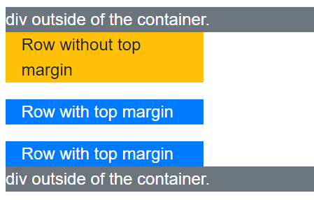
Complete HTML:
<div class="bg-secondary text-white">
    div outside of the container.
</div>
<div class="container container-row-margin">
    <div class="row">
        <div class="col col-4 bg-warning">
            Row without top margin
        </div>
    </div>
    <div class="row">
        <div class="col col-4 bg-primary text-white">
            Row with top margin
        </div>
    </div>
    <div class="row">
        <div class="col col-4 bg-primary text-white">
            Row with top margin
        </div>
    </div>
</div>
<div class="bg-secondary text-white">
    div outside of the container.
</div>
Taken from official samples.
Solution 17 - Css
you can add this code :
[class*="col-"] {
    padding-top: 1rem;
    padding-bottom: 1rem;
}
Solution 18 - Css
Just simply use this bs3-upgrade helper for spacings and text aligment...
Solution 19 - Css
If you're using BootStrap 3.3.7, you can use the open source library bootstrap-spacer via NPM
npm install bootstrap-spacer
or you can visit the github page:
https://github.com/chigozieorunta/bootstrap-spacer
Here's an example of how this works to space rows using the .row-spacer class:
<div class="row row-spacer">
    <div class="col-md-4">
    </div>
    <div class="col-md-4">
    </div>
    <div class="col-md-4">
    </div>
</div>

<div class="row row-spacer">
    <div class="col-md-4">
    </div>
    <div class="col-md-4">
    </div>
    <div class="col-md-4">
    </div>
</div>
If you'd require spaces between columns, you can also add the .row-col-spacer class:
<div class="row row-col-spacer">
    <div class="col-md-4">
    </div>
    <div class="col-md-4">
    </div>
    <div class="col-md-4">
    </div>
</div>
And you can also combine various the .row-spacer & .row-col-spacer classes together:
<div class="row row-spacer row-col-spacer">
    <div class="col-md-4">
    </div>
    <div class="col-md-4">
    </div>
    <div class="col-md-4">
    </div>
</div>
Solution 20 - Css
My trick. Not so clean, but works well for me
<p> </p>