Flushing footer to bottom of the page, twitter bootstrap
CssTwitter BootstrapFooterCss Problem Overview
I am generally familiar with the technique of flushing a footer using css.
But I am having some trouble getting this approach to work for Twitter bootstrap, most likely due to the fact that Twitter bootstrap is responsive in nature. Using Twitter bootstrap I am not able to get the footer to flush to the bottom of the page using the approach described in the above blog post.
Css Solutions
Solution 1 - Css
This is now included with Bootstrap 2.2.1.
Bootstrap 3.x
Use the navbar component and add .navbar-fixed-bottom class:
<div class="navbar navbar-fixed-bottom"></div>
Bootstrap 4.x
<div class="navbar fixed-bottom"></div>
Don't forget to add body { padding-bottom: 70px; } or otherwise the page content may be covered.
Docs: http://getbootstrap.com/components/#navbar-fixed-bottom
Solution 2 - Css
Found the snippets here works really well for bootstrap
Html:
<div id="wrap">
  <div id="main" class="container clear-top">
    <p>Your content here</p>
  </div>
</div>
<footer class="footer"></footer>
CSS:
html, body {
  height: 100%;
}

#wrap {
  min-height: 100%;
}

#main {
  overflow:auto;
  padding-bottom:150px; /* this needs to be bigger than footer height*/
}

.footer {
  position: relative;
  margin-top: -150px; /* negative value of footer height */
  height: 150px;
  clear:both;
  padding-top:20px;
}
Solution 3 - Css
A working example for Twitter bootstrap NOT STICKY FOOTER
<script>
$(document).ready(function() {

    var docHeight = $(window).height();
    var footerHeight = $('#footer').height();
    var footerTop = $('#footer').position().top + footerHeight;

    if (footerTop < docHeight)
        $('#footer').css('margin-top', 10+ (docHeight - footerTop) + 'px');
});
</script>
Version that always updates in case user opens devtools or resizes window.
<script>
    $(document).ready(function() {
        setInterval(function() {
            var docHeight = $(window).height();
            var footerHeight = $('#footer').height();
            var footerTop = $('#footer').position().top + footerHeight;
            var marginTop = (docHeight - footerTop + 10);

            if (footerTop < docHeight)
                $('#footer').css('margin-top', marginTop + 'px'); // padding of 30 on footer
            else
                $('#footer').css('margin-top', '0px');
            // console.log("docheight: " + docHeight + "\n" + "footerheight: " + footerHeight + "\n" + "footertop: " + footerTop + "\n" + "new docheight: " + $(window).height() + "\n" + "margintop: " + marginTop);
        }, 250);
    });
</script>
You need at least an element with a #footer
When not want the scrollbar if content would fit to screen just change the value of 10 to 0
The scrollbar will show up if content not fits to screen.
Solution 4 - Css
For Sticky Footer we use two DIV's in the HTML for basic sticky footer effect. Write like this:
HTML
<div class="container"></div>

<div class="footer"></div>
CSS
body,html {
    height:100%;
}
.container {
    min-height:100%;
}
.footer {
    height:40px;
    margin-top:-40px;
}
Solution 5 - Css
Here's how to implement this from the official page:
http://getbootstrap.com/2.3.2/examples/sticky-footer.html
I just tested it right now and it WORKS GREAT! :)
HTML
<body>

    <!-- Part 1: Wrap all page content here -->
    <div id="wrap">

      <!-- Begin page content -->
      <div class="container">
        <div class="page-header">
          <h1>Sticky footer</h1>
        </div>
        <p class="lead">Pin a fixed-height footer to the bottom of the viewport in desktop browsers with this custom HTML and CSS.</p>
      </div>

      <div id="push"></div>
    </div>

    <div id="footer">
      <div class="container">
        <p class="muted credit">Example courtesy <a href="http://martinbean.co.uk">Martin Bean</a> and <a href="http://ryanfait.com/sticky-footer/">Ryan Fait</a>.</p>
      </div>
    </div>
</body>
The relevant CSS code is this:
/* Sticky footer styles
-------------------------------------------------- */
html,
body {
    height: 100%;
    /* The html and body elements cannot have any padding or margin. */
}

/* Wrapper for page content to push down footer */
#wrap {
    min-height: 100%;
    height: auto !important;
    height: 100%;
    /* Negative indent footer by it's height */
    margin: 0 auto -30px;
}

/* Set the fixed height of the footer here */
#push,
#footer {
    height: 30px;
}

#footer {
    background-color: #f5f5f5;
}

/* Lastly, apply responsive CSS fixes as necessary */
@media (max-width: 767px) {
    #footer {
        margin-left: -20px;
        margin-right: -20px;
        padding-left: 20px;
        padding-right: 20px;
    }
}
Solution 6 - Css
Much simpler official example: http://getbootstrap.com/examples/sticky-footer-navbar/
html {
  position: relative;
  min-height: 100%;
}
body {
  margin-bottom: 60px;
}
.footer {
  position: absolute;
  bottom: 0;
  width: 100%;
  height: 60px;
  background-color: #f5f5f5;
}
Solution 7 - Css
In the latest version of bootstrap 4.3, this can be done using .fixed-bottom class.
<div class="fixed-bottom"></div>
Here's how I use it with the footer:
<footer class="footer fixed-bottom container">
<hr>
<p>© 2017 Company, Inc.</p>
</footer>
You can find more information in the position documentation here.
Solution 8 - Css
Use the flex utilities built into Bootstrap 4! Here's what I've come up with using mostly Bootstrap 4 utilities.
<div class="d-flex flex-column" style="min-height: 100vh;">
  <header></header>
  <div class="container flex-grow-1">
    <div>Some Content</div>
  </div>
  <footer></footer>
</div>
.d-flexto make the main div a flex container.flex-columnon the main div to arrange your flex items in a columnmin-height: 100vhto the main div, either with a style attribute or in your CSS, to fill the viewport vertically.flex-grow-1on the container, element to have the main content container take up all the space that remains in the viewport height.
Solution 9 - Css
Well I found mix of navbar-inner and navbar-fixed-bottom
<div id="footer">
 <div class="navbar navbar-inner  navbar-fixed-bottom">
    <p class="muted credit"><center>ver 1.0.1</center></p>
 </div>
</div>
It seems good and works for me
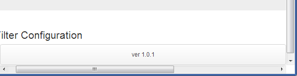
See example in Fiddle
Solution 10 - Css
HenryW's answer is good, though I needed a few tweaks to get it working how I wanted. In particular the following also handles:
- Avoiding the "jumpiness" on page load by first marking invisible and setting visible in javascript
- Dealing with browser resizes gracefully
- Additionally setting the footer back up the page if the browser gets smaller and the footer becomes bigger than the page
- Height function tweaks
Here's what worked for me with those tweaks:
HTML:
<div id="footer" class="invisible">My sweet footer</div>
CSS:
#footer {
    padding-bottom: 30px;
}
JavaScript:
function setFooterStyle() {
    var docHeight = $(window).height();
    var footerHeight = $('#footer').outerHeight();
    var footerTop = $('#footer').position().top + footerHeight;
    if (footerTop < docHeight) {
        $('#footer').css('margin-top', (docHeight - footerTop) + 'px');
    } else {
        $('#footer').css('margin-top', '');
    }
    $('#footer').removeClass('invisible');
}
$(document).ready(function() {
    setFooterStyle();
    window.onresize = setFooterStyle;
});
Solution 11 - Css
This worked for me perfectly.
Add this class navbar-fixed-bottom to your footer.
<div class="footer navbar-fixed-bottom">
I used it like this:
<div class="container-fluid footer navbar-fixed-bottom">
<!-- start footer -->
</div>
And it sets to bottom over the the full width.
Edit: This will set footer to always visible, it's something you need to take in consideration.
Solution 12 - Css
Keep the footer at the bottom by using Bootstrap 5
    <div class="min-vh-100 d-flex flex-column
                justify-content-between">

         <div> <!-- Wrapper (Without footer) -->

            <header>
             I am a header.
            </header>

            <article>
            I am an article!
            </article>

        </div> <!-- End: Wrapper (Without footer) -->


         <footer>
         I am a footer.
         </footer>

    </div>
Note
-
Make sure that you are wrapping everything in a
<div>or any other block-level element with the following Bootstrap classes:min-vh-100, d-flex,flex-column,justify-content-between. -
Make sure that you are wrapping everything but the footer element in a
<div>or any other block-level element. -
Make sure that you using
<footer>or any other block-level element to wrap the footer.
Code Explanation
-
min-vh-100ensures that the body element will stretch to at least the full height of the screen -
flex-columnkeeps the behavior of normal document flow in terms of retaining stacked block elements (which assumes direct children of the body are all indeed block elements). -
justify-content-betweenpushes the footer to the bottom of the screen.
Check out how to do the same (Keeping the footer at the bottom) with just CSS - Link
Solution 13 - Css
You need to wrap your .container-fluid div in order for your sticky footer to work, you're also missing some properties on your .wrapper class. Try this:
Remove the padding-top:70px from your body tag and include it in your .container-fluid instead, like so:
.wrapper > .container-fluid {
	padding-top: 70px;
}
We have to do this because pushing the body down to accommodate the navbar ends up pushing the footer a bit further (70px further) past the viewport so we get a scrollbar. We get better results pushing the .container-fluid div instead.
Next we have to remove the .wrapper class outside your .container-fluid div and wrap your #main div with it, like so:
<div class="wrapper">
	<div id="main" class="container-fluid">
		<div class="row-fluid">...</div>
        <div class="push"></div>
    </div>
</div>
Your footer of course has to be out of the .wrapper div so remove it from the `.wrapper div and place it outside, like so:
<div class="wrapper">
	....
</div>
<footer class="container-fluid">
	....
</footer><!--END .row-fluid-->
After thats all done, properly push your footer closer to your .wrapper class by using a negative margin, like so:
.wrapper {
	min-height: 100%;
	height: auto !important; /* ie7 fix */
	height: 100%;
	margin: 0 auto -43px;
}
And that should work, though you're probably going to have to modify a few other things to make it work when the screen is resized, like resetting the height on the .wrapper class, like so:
@media (max-width:480px) {
   .wrapper {
      height:auto;
   }
}
Solution 14 - Css
This is the right way to do it with Twitter Bootstrap and the new navbar-fixed-bottom class: (you have no idea how long I spent looking for this)
CSS:
html {
  position: relative;
  min-height: 100%;
}
#content {
  padding-bottom: 50px;
}
#footer .navbar{
  position: absolute;
}
HTML:
<html>
  <body>
    <div id="content">...</div>
    <div id="footer">
      <div class="navbar navbar-fixed-bottom">
        <div class="navbar-inner">
          <div class="container">
            <ul class="nav">
              <li><a href="#">Menu 1</a></li>
              <li><a href="#">Menu 2</a></li>
            </ul>
          </div>
        </div>
      </div>
    </div>
  </div>
</body>
</html>
Solution 15 - Css
Use the navbar component and add .navbar-fixed-bottom class:
<div class="navbar navbar-fixed-bottom"></div>
add body
{ padding-bottom: 70px; }
Solution 16 - Css
Bootstrap v4+ solution
Here's a solution that doesn't require rethinking the HTML structure or any additional CSS trickery involving padding:
<html style="height:100%;">
  ...
  <body class="d-flex flex-column h-100">
    ...
    <main class="flex-grow-1">...</main>
    <footer>...</footer>
  </body>
  ...
</html>
Note that this solution allows for footers with flexible heights, which particularly comes in handy when designing pages for multiple screen sizes with content wrapping when shrunk.
Why this works
style="height:100%;"makes the<html>tag take the whole space of the document.- class
d-flexsetsdisplay:flexto our<body>tag. - class
flex-columnsetsflex-direction:columnto our<body>tag. Its children (<header>,<main>,<footer>and any other direct child) are now aligned vertically. - class
h-100setsheight:100%to our<body>tag, meaning it will cover the entire screen vertically. - class
flex-grow-1setsflex-grow:1to our<main>, effectively instructing it to fill any remaining vertical space, thus amounting to the 100% vertical height we set before on our<body>tag.
Working demo here: https://codepen.io/maxencemaire/pen/VwvyRQB
See https://css-tricks.com/snippets/css/a-guide-to-flexbox/ for more information on flexbox.
Solution 17 - Css
to handle width constraint layouts use the following so that you do not get rounded corners, and so that your nav bar will be flush to the sides of the application
<div class="navbar navbar-fixed-bottom">
    <div class="navbar-inner">
        <div class="width-constraint clearfix">
            <p class="pull-left muted credit">YourApp v1.0.0</p>

            <p class="pull-right muted credit">©2013 • CONFIDENTIAL ALL RIGHTS RESERVED</p>
        </div>
    </div>
</div>
then you can use css to override the bootstrap classes to adjust height, font, and color
    .navbar-fixed-bottom {
      font-size: 12px;
      line-height: 18px;
    }
    .navbar-fixed-bottom .navbar-inner {
        min-height: 22px;
    }
    .navbar-fixed-bottom .p {
        margin: 2px 0 2px;
    }
Solution 18 - Css
You can use jQuery to handle this:
$(function() {
    /**
     * Read the size of the window and reposition the footer at the bottom.
     */
    var stickyFooter = function(){
        var pageHeight = $('html').height();
        var windowHeight = $(window).height();
        var footerHeight = $('footer').outerHeight();

        // A footer with 'fixed-bottom' has the CSS attribute "position: absolute",
        // and thus is outside of its container and counted in $('html').height().
        var totalHeight = $('footer').hasClass('fixed-bottom') ?
            pageHeight + footerHeight : pageHeight;

        // If the window is larger than the content, fix the footer at the bottom.
        if (windowHeight >= totalHeight) {
            return $('footer').addClass('fixed-bottom');
        } else {
            // If the page content is larger than the window, the footer must move.
            return $('footer').removeClass('fixed-bottom');
        }
    };

    // Call when this script is first loaded.
    window.onload = stickyFooter;

    // Call again when the window is resized.
    $(window).resize(function() {
        stickyFooter();
    });
});
Solution 19 - Css
The simplest technique is probably to use Bootstrap navbar-static-bottom in conjunction with setting the main container div with height: 100vh (new CSS3 view port percentage). This will flush the footer to the bottom.
<main class="container" style="height: 100vh;">
some content
</main>
<footer class="navbar navbar-default navbar-static-bottom">
<div class="container">
<p class="navbar-text navbar-left">© Footer4U</p>
</div>
</footer>
Solution 20 - Css
Tested with Bootstrap 3.6.6.
HTML
<div class="container footer navbar-fixed-bottom">
  <footer>
    <!-- your footer content here -->
  </footer>
</div>
CSS
.footer {
  bottom: 0;
  position: absolute;
}
Solution 21 - Css
The only one that worked for me!:
html {
  position: relative;
  min-height: 100%;
  padding-bottom:90px;
}
body {
  margin-bottom: 90px;
}
footer {
  position: absolute;
  bottom: 0;
  width: 100%;
  height: 90px;
}
Solution 22 - Css
Per the Bootstrap 4.3 example, in case you're losing your sanity like I did, this is how it actually works:
- All parents of the footer div need to have
height: 100%(h-100class) - The direct parent of the footer needs to have
display: flex(d-flexclass) - The footer needs to have
margin-top: auto(mt-autoclass)
The problem is that in modern front-end frameworks we often have additional wrappers around these elements.
For example in my case, with Angular, I composed the view from a separate app root, main app component, and footer component - all of which added their custom element to the DOM.
So, to make it work, I had to add classes to these wrapper elements: an additional h-100, moving the d-flex one level down, and moving the mt-auto one level up from the footer (so actually it's not on the footer class anymore, but on my <app-footer> custom element).
Solution 23 - Css
#wrap {
min-height: 100%;
height: auto !important;
height: 100%;
width: 100%;
/*Negative indent footer by its height*/
margin: 0 auto -60px;
position: fixed;
left: 0;
top: 0;
}
The footer height matches the size of the bottom indent of the wrap element.
.footer {
position: fixed;
bottom: 0;
left: 0;
right: 0;
height: 60px;
}
Solution 24 - Css
Keep it simple.
footer {
  bottom: 0;
  position: absolute;
}
You may need to also offset the height of the footer by adding a margin-bottom equivalent to the footer height to the body.
Solution 25 - Css
Here's a solution for the newest version of Bootstrap (4.3 at time of writing) using Flexbox.
HTML:
<div class="wrapper">
  <div class="content">
    <p>Content goes here</p>
  </div>
</div>
<footer class="footer"></footer>
CSS:
html, body {
  height: 100%;
}

body {
  display: flex;
  flex-direction: column;
}

.wrapper {
  flex-grow: 1;
}
And a codepen example: https://codepen.io/tillytoby/pen/QPdomR
Solution 26 - Css
Use this piece of code in bootstrap it's works
<div class="navbar fixed-bottom">
<div class="container">
 <p class="muted credit">Footer <a href="http://google.com">Link</a> and <a
href="http://google.com/">link</a>.</p>
 </div>
 </div>
Solution 27 - Css
It looks like the height:100% 'chain' is being broken at div#main. Try adding height:100% to it and that may get you closer to your goal.
Solution 28 - Css
Here you'll find the approach in HAML ( http://haml.info ) with navbar on top and footer at the bottom of the page:
%body
  #main{:role => "main"}
    %header.navbar.navbar-fixed-top
      %nav.navbar-inner
        .container
          /HEADER
      .container
        /BODY
    %footer.navbar.navbar-fixed-bottom
      .container
        .row
          /FOOTER
Solution 29 - Css
Here is an example using css3:
CSS:
html, body {
    height: 100%;
    margin: 0;
}
#wrap {
    padding: 10px;
    min-height: -webkit-calc(100% - 100px);     /* Chrome */
    min-height: -moz-calc(100% - 100px);     /* Firefox */
    min-height: calc(100% - 100px);     /* native */
}
.footer {
    position: relative;
    clear:both;
}
HTML:
<div id="wrap">
    <div class="container clear-top">
       body content....
    </div>
</div>
<footer class="footer">
    footer content....
</footer>
Solution 30 - Css
This is how bootstrap does it:
http://getbootstrap.com/2.3.2/examples/sticky-footer.html
Just use page source and you should be able to see. Don' forget the <div id="wrap"> an the top.
Solution 31 - Css
another possible solution, just using media queries
@media screen and (min-width:1px) and (max-width:767px) {
    .footer {
    }
}
/* no style for smaller or else it goes weird.*/
@media screen and (min-width:768px) and (max-width:991px) {
    .footer{
        bottom: 0;
        width: 100%;
        position: absolute;
    }
}
@media screen and (min-width:992px) and (max-width:1199px) {
    .footer{
        bottom: 0;
        width: 100%;
        position: absolute;
    }
}
@media screen and (min-width:1120px){
    .footer{
        bottom: 0;
        width: 100%;
        position: absolute;
    }
}
Solution 32 - Css
Use the below class to push it to last line of the page and also make it to center of it.
If you are using ruby on rails HAML page you can make use of the below code.
%footer.card.text-center
Pls don't forget to use twitter bootstrapp
Solution 33 - Css
this works well
html
<footer></footer>
css
html {
  position: relative;
  min-height: 100%;
  padding-bottom:90px;
}
body {
  margin-bottom: 90px;
}
footer {
  position: absolute;
  bottom: 0;
  width: 100%;
  height: 90px;
}
Solution 34 - Css
HTML
<div id="wrapper">

  <div id="content">
    <!-- navbar and containers here -->
  </div>

  <div id="footer">
   <!-- your footer here -->
  </div>

</div>
CSS
html, body {
  height: 100%;
}

#wrapper {
  min-height: 100%;
  position: relative;
}

#content {
  padding-bottom: 100px; /* Height of the footer element */
}

#footer {
  width: 100%;
  height: 100px; /* Adjust to the footer needs */
  position: absolute;
  bottom: 0;
  left: 0;
}
Solution 35 - Css
This one is the best!
html {
  position: relative;
  min-height: 100%;
  padding-bottom:90px;
}
body {
  margin-bottom: 90px;
}
footer {
  position: absolute;
  bottom: 0;
  width: 100%;
  height: 90px;
}