Standard Android Button with a different color
AndroidAndroid LayoutAndroid Problem Overview
I'd like to change the color of a standard Android button slightly in order to better match a client's branding.
The best way I've found to do this so far is to change the Button's drawable to the drawable located in res/drawable/red_button.xml:
<?xml version="1.0" encoding="utf-8"?>
<selector xmlns:android="http://schemas.android.com/apk/res/android">
    <item android:state_pressed="true" android:drawable="@drawable/red_button_pressed" />
    <item android:state_focused="true" android:drawable="@drawable/red_button_focus" />
    <item android:drawable="@drawable/red_button_rest" />
</selector>
But doing that requires that I actually create three different drawables for each button I want to customize (one for the button at rest, one when focused, and one when pressed). That seems more complicated and non-DRY than I need.
All I really want to do is apply some sort of color transform to the button. Is there an easier way to go about changing a button's color than I'm doing?
Android Solutions
Solution 1 - Android
I discovered that this can all be done in one file fairly easily. Put something like the following code in a file named custom_button.xml and then set background="@drawable/custom_button" in your button view:
<?xml version="1.0" encoding="utf-8"?>
<selector
    xmlns:android="http://schemas.android.com/apk/res/android">

    <item android:state_pressed="true" >
        <shape>
            <gradient
                android:startColor="@color/yellow1"
                android:endColor="@color/yellow2"
                android:angle="270" />
            <stroke
                android:width="3dp"
                android:color="@color/grey05" />
            <corners
                android:radius="3dp" />
            <padding
                android:left="10dp"
                android:top="10dp"
                android:right="10dp"
                android:bottom="10dp" />
        </shape>
    </item>

    <item android:state_focused="true" >
        <shape>
            <gradient
                android:endColor="@color/orange4"
                android:startColor="@color/orange5"
                android:angle="270" />
            <stroke
                android:width="3dp"
                android:color="@color/grey05" />
            <corners
                android:radius="3dp" />
            <padding
                android:left="10dp"
                android:top="10dp"
                android:right="10dp"
                android:bottom="10dp" />
        </shape>
    </item>

    <item>
        <shape>
            <gradient
                android:endColor="@color/blue2"
                android:startColor="@color/blue25"
                android:angle="270" />
            <stroke
                android:width="3dp"
                android:color="@color/grey05" />
            <corners
                android:radius="3dp" />
            <padding
                android:left="10dp"
                android:top="10dp"
                android:right="10dp"
                android:bottom="10dp" />
        </shape>
    </item>
</selector>
Solution 2 - Android
Following on from Tomasz's answer, you can also programmatically set the shade of the entire button using the PorterDuff multiply mode. This will change the button colour rather than just the tint.
If you start with a standard grey shaded button:
button.getBackground().setColorFilter(0xFFFF0000, PorterDuff.Mode.MULTIPLY);
will give you a red shaded button,
button.getBackground().setColorFilter(0xFF00FF00, PorterDuff.Mode.MULTIPLY);
will give you a green shaded button etc., where the first value is the colour in hex format.
It works by multiplying the current button colour value by your colour value. I'm sure there's also a lot more you can do with these modes.
Solution 3 - Android
You might be interested in color filters.
An example:
button.getBackground().setColorFilter(new LightingColorFilter(0xFFFFFFFF, 0xFFAA0000));
Try this to achieve the color you want.
Solution 4 - Android
This is my solution which perfectly works starting from API 15. This solution keeps all default button click effects, like material RippleEffect. I have not tested it on lower APIs, but it should work.
All you need to do, is:
-
Create a style which changes only
colorAccent:
>I recommend using ThemeOverlay.AppCompat or your main AppTheme as parent, to keep the rest of your styles.
-
Add these two lines to your
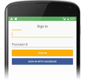
buttonwidget:style="@style/Widget.AppCompat.Button.Colored" android:theme="@style/Facebook.Button"
> Sometimes your new colorAccent isn't showing in Android Studio Preview, but when you launch your app on the phone, the color will be changed.
Sample Button widget
<Button
    android:id="@+id/sign_in_with_facebook"
    style="@style/Widget.AppCompat.Button.Colored"
    android:layout_width="match_parent"
    android:layout_height="wrap_content"
    android:layout_gravity="center"
    android:text="@string/sign_in_facebook"
    android:textColor="@android:color/white"
    android:theme="@style/Facebook.Button" />
Solution 5 - Android
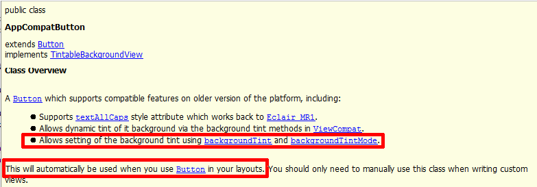
You can now also use appcompat-v7's AppCompatButton with the backgroundTint attribute:
<android.support.v7.widget.AppCompatButton
    xmlns:app="http://schemas.android.com/apk/res-auto"
    android:layout_width="match_parent"
    android:layout_height="wrap_content"
    app:backgroundTint="#ffaa00"/>
Solution 6 - Android
I like the color filter suggestion in previous answers from @conjugatedirection and @Tomasz; However, I found that the code provided so far wasn't as easily applied as I expected.
First, it wasn't mentioned where to apply and clear the color filter. It's possible that there are other good places to do this, but what came to mind for me was an OnTouchListener.
From my reading of the original question, the ideal solution would be one that does not involve any images. The accepted answer using custom_button.xml from @emmby is probably a better fit than color filters if that's your goal. In my case, I'm starting with a png image from a UI designer of what the button is supposed to look like. If I set the button background to this image, the default highlight feedback is lost completely. This code replaces that behavior with a programmatic darkening effect.
button.setOnTouchListener(new OnTouchListener() {
    @Override
    public boolean onTouch(View v, MotionEvent event) {
        switch (event.getAction()) {
            case MotionEvent.ACTION_DOWN:
                // 0x6D6D6D sets how much to darken - tweak as desired
                setColorFilter(v, 0x6D6D6D);
                break;
            // remove the filter when moving off the button
            // the same way a selector implementation would
            case MotionEvent.ACTION_MOVE:
                Rect r = new Rect();
                v.getLocalVisibleRect(r);
                if (!r.contains((int) event.getX(), (int) event.getY())) {
                    setColorFilter(v, null);
                }
                break;
            case MotionEvent.ACTION_OUTSIDE:
            case MotionEvent.ACTION_CANCEL:
            case MotionEvent.ACTION_UP:
                setColorFilter(v, null);
                break;
        }
        return false;
    }

    private void setColorFilter(View v, Integer filter) {
        if (filter == null) v.getBackground().clearColorFilter();
        else {
            // To lighten instead of darken, try this:
            // LightingColorFilter lighten = new LightingColorFilter(0xFFFFFF, filter);
            LightingColorFilter darken = new LightingColorFilter(filter, 0x000000);
            v.getBackground().setColorFilter(darken);
        }
        // required on Android 2.3.7 for filter change to take effect (but not on 4.0.4)
        v.getBackground().invalidateSelf();
    }
});
I extracted this as a separate class for application to multiple buttons - shown as anonymous inner class just to get the idea.
Solution 7 - Android
If you are making colour buttons with XML you can make the code a bit cleaner by specifying the focused and pressed state in a separate file and reuse them. My green button looks like this:
<?xml version="1.0" encoding="utf-8"?>
<selector xmlns:android="http://schemas.android.com/apk/res/android">

    <item android:state_focused="true" android:drawable="@drawable/button_focused"/>
    <item android:state_pressed="true" android:drawable="@drawable/button_pressed"/>

    <item>
        <shape>
            <gradient android:startColor="#ff00ff00" android:endColor="#bb00ff00" android:angle="270" />
            <stroke android:width="1dp" android:color="#bb00ff00" />
            <corners android:radius="3dp" />
            <padding android:left="10dp" android:top="10dp" android:right="10dp" android:bottom="10dp" />
        </shape>
    </item>

</selector>
Solution 8 - Android
The shortest solution which is working with any Android version:
<Button
     app:backgroundTint="@color/my_color"
Notes/Requirements:
-
Use the
app:namespace and not theandroid:namespace! -
appcompat version > 24.2.0
dependencies { compile 'com.android.support:appcompat-v7:25.3.1' }
Explanation:
Solution 9 - Android
I am using this approach
style.xml
<!-- Base application theme. -->
<style name="AppTheme" parent="Theme.AppCompat.Light.NoActionBar">
    <item name="android:colorPrimaryDark">#413152</item>
    <item name="android:colorPrimary">#534364</item>
    <item name="android:colorAccent">#534364</item>
    <item name="android:buttonStyle">@style/MyButtonStyle</item>
</style>

<style name="MyButtonStyle" parent="Widget.AppCompat.Button.Colored">
    <item name="android:colorButtonNormal">#534364</item>
    <item name="android:textColor">#ffffff</item>
</style>
As you can see from above, I'm using a custom style for my button. The button color corresponds to the accent color. I find this a much better approach than setting android:background as I won't lose the ripple effect Google provides.
Solution 10 - Android
Use it in this way:
buttonOBJ.getBackground().setColorFilter(Color.parseColor("#YOUR_HEX_COLOR_CODE"), PorterDuff.Mode.MULTIPLY);
Solution 11 - Android
There is a much easier way now : android-holo-colors.com
It will let you change the colors of all holo drawables (buttons, spinners, ...) easily. You select the color and then download a zip file containing drawables for all resolutions.
Solution 12 - Android
In <Button>
Solution 13 - Android
The DroidUX component library has a ColorButton widget whose color can be changed easily, both via xml definition and programmatically at run time, so you can even let the user to set the button's color/theme if your app allows it.
Solution 14 - Android
You can Also use this online tool to customize your button http://angrytools.com/android/button/ and use android:background="@drawable/custom_btn" to define the customized button in your layout.
Solution 15 - Android
You can set theme of your button to this
<style name="AppTheme.ButtonBlue" parent="Widget.AppCompat.Button.Colored">
 <item name="colorButtonNormal">@color/HEXColor</item>
 <item name="android:textColor">@color/HEXColor</item>
</style>
Solution 16 - Android
An easy way is to just define a custom Button class which accepts all the properties that you desire like radius, gradient, pressed color, normal color etc. and then just use that in your XML layouts instead of setting up the background using XML. A sample is here
This is extremely useful if you have a lot of buttons with same properties like radius, selected color etc. You can customize your inherited button to handle these additional properties.
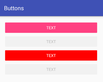
Result (No Background selector was used).
Normal Button

Pressed Button

Solution 17 - Android
values\styles.xml
<style name="AppTheme" parent="Theme.AppCompat.Light.DarkActionBar">
    <item name="colorPrimary">@color/colorPrimary</item>
    <item name="colorPrimaryDark">@color/colorPrimaryDark</item>
    <item name="colorAccent">@color/colorAccent</item>
</style>

<style name="RedAccentButton" parent="ThemeOverlay.AppCompat.Light">
    <item name="colorAccent">#ff0000</item>
</style>
then:
<Button
    style="@style/Widget.AppCompat.Button.Colored"
    android:layout_width="match_parent"
    android:layout_height="wrap_content"
    android:text="text" />

<Button
    style="@style/Widget.AppCompat.Button.Colored"
    android:layout_width="match_parent"
    android:layout_height="wrap_content"
    android:enabled="false"
    android:text="text" />

<Button
    style="@style/Widget.AppCompat.Button.Colored"
    android:layout_width="match_parent"
    android:layout_height="wrap_content"
    android:text="text"
    android:theme="@style/RedAccentButton" />

<Button
    style="@style/Widget.AppCompat.Button.Colored"
    android:layout_width="match_parent"
    android:layout_height="wrap_content"
    android:enabled="false"
    android:text="text"
    android:theme="@style/RedAccentButton" />
Solution 18 - Android
Per material design guidelines, you need to use the style like below code
<style name="MyButton" parent="Theme.AppCompat.Light>
    <item name="colorControlHighlight">#F36F21</item>
    <item name="colorControlHighlight">#FF8D00</item>
</style>
and in layout add this property to your button
android:theme="@style/MyButton"
Solution 19 - Android
The way I do a different styled button that works quite well is to subclass the Button object and apply a colour filter. This also handles enabled and disabled states by applying an alpha to the button.
import android.annotation.TargetApi;
import android.content.Context;
import android.graphics.Color;
import android.graphics.ColorFilter;
import android.graphics.LightingColorFilter;
import android.graphics.drawable.Drawable;
import android.graphics.drawable.LayerDrawable;
import android.os.Build;
import android.util.AttributeSet;
import android.widget.Button;

public class DimmableButton extends Button {

    public DimmableButton(Context context) {
        super(context);
    }

    public DimmableButton(Context context, AttributeSet attrs) {
        super(context, attrs);
    }

    public DimmableButton(Context context, AttributeSet attrs, int defStyle) {
        super(context, attrs, defStyle);
    }

    @SuppressWarnings("deprecation")
    @Override
    public void setBackgroundDrawable(Drawable d) {
        // Replace the original background drawable (e.g. image) with a LayerDrawable that
        // contains the original drawable.
        DimmableButtonBackgroundDrawable layer = new DimmableButtonBackgroundDrawable(d);
        super.setBackgroundDrawable(layer);
    }

    @TargetApi(Build.VERSION_CODES.JELLY_BEAN)
    @Override
    public void setBackground(Drawable d) {
        // Replace the original background drawable (e.g. image) with a LayerDrawable that
        // contains the original drawable.
        DimmableButtonBackgroundDrawable layer = new DimmableButtonBackgroundDrawable(d);
        super.setBackground(layer);
    }

    /**
     * The stateful LayerDrawable used by this button.
     */
    protected class DimmableButtonBackgroundDrawable extends LayerDrawable {

        // The color filter to apply when the button is pressed
        protected ColorFilter _pressedFilter = new LightingColorFilter(Color.LTGRAY, 1);
        // Alpha value when the button is disabled
        protected int _disabledAlpha = 100;
        // Alpha value when the button is enabled
        protected int _fullAlpha = 255;

        public DimmableButtonBackgroundDrawable(Drawable d) {
            super(new Drawable[] { d });
        }

        @Override
        protected boolean onStateChange(int[] states) {
            boolean enabled = false;
            boolean pressed = false;

            for (int state : states) {
                if (state == android.R.attr.state_enabled)
                    enabled = true;
                else if (state == android.R.attr.state_pressed)
                    pressed = true;
            }

            mutate();
            if (enabled && pressed) {
                setColorFilter(_pressedFilter);
            } else if (!enabled) {
                setColorFilter(null);
                setAlpha(_disabledAlpha);
            } else {
                setColorFilter(null);
                setAlpha(_fullAlpha);
            }

            invalidateSelf();

            return super.onStateChange(states);
        }

        @Override
        public boolean isStateful() {
            return true;
        }
    }

}
Solution 20 - Android
Its simple.. add this dependency in your project and create a button with
- Any shape
- Any color
- Any border
- With material effects
https://github.com/manojbhadane/QButton
<com.manojbhadane.QButton
       android:layout_width="match_parent"
       android:layout_height="wrap_content"
       android:text="OK"
       app:qb_backgroundColor="@color/green"
       app:qb_radius="100"
       app:qb_strokeColor="@color/darkGreen"
       app:qb_strokeWidth="5" />