Android: combining text & image on a Button or ImageButton
AndroidImageTextButtonAndroid Problem Overview
I'm trying to have an image (as the background) on a button and add dynamically, depending on what's happening during run-time, some text above/over the image.
If I use ImageButton I don't even have the possibility to add text.
If I use Button I can add text but only define an image with android:drawableBottom and similar XML attributes as defined here.
However these attributes only combine text & image in x- and y-dimensions, meaning I can draw an image around my text, but not below/under my text (with the z-axis defined as coming out of the display).
Any suggestions on how to do this? One idea would be to either extend Button or ImageButton and override the draw()-method. But with my current level of knowledge I don't really know how to do this (2D rendering). Maybe someone with more experience knows a solution or at least some pointers to start?
Android Solutions
Solution 1 - Android
For users who just want to put Background, Icon-Image and Text in one Button from different files: Set on a Button background, drawableTop/Bottom/Rigth/Left and padding attributes.
<Button
        android:layout_width="wrap_content"
        android:layout_height="wrap_content"
        android:background="@drawable/home_btn_test"
        android:drawableTop="@drawable/home_icon_test"
        android:textColor="#FFFFFF"
        android:id="@+id/ButtonTest"
        android:paddingTop="32sp"
        android:drawablePadding="-15sp"
        android:text="this is text"></Button>
For more sophisticated arrangement you also can use RelativeLayout (or any other layout) and make it clickable.
Tutorial: Great tutorial that covers both cases: http://izvornikod.com/Blog/tabid/82/EntryId/8/Creating-Android-button-with-image-and-text-using-relative-layout.aspx
Solution 2 - Android
There's a much better solution for this problem.
Just take a normal Button and use the drawableLeft and the gravity attributes.
<Button
  android:layout_width="fill_parent"
  android:layout_height="wrap_content"
  android:drawableLeft="@drawable/my_btn_icon"
  android:gravity="left|center_vertical" />
This way you get a button which displays a icon in the left side of the button and the text at the right site of the icon vertical centered.
Solution 3 - Android
You can call setBackground() on a Button to set the background of the button.
Any text will appear above the background.
If you are looking for something similar in xml there is:
android:background attribute which works the same way.
Solution 4 - Android

     <Button
            android:layout_width="0dp"
            android:layout_weight="1"
            android:background="@drawable/home_button"
            android:drawableLeft="@android:drawable/ic_menu_edit"
            android:drawablePadding="6dp"
            android:gravity="left|center"
            android:height="60dp"
            android:padding="6dp"
            android:text="AndroidDhina"
            android:textColor="#000"
            android:textStyle="bold" />
Solution 5 - Android
Just use a LinearLayout and pretend it's a Button - setting background and clickable is the key:
<LinearLayout
    android:id="@+id/button"
    android:layout_width="wrap_content"
    android:layout_height="wrap_content"
    android:background="@android:drawable/btn_default"
    android:clickable="true"
    android:orientation="horizontal" >

    <ImageView
        android:id="@+id/img"
        android:layout_width="wrap_content"
        android:layout_height="wrap_content"
        android:layout_gravity="center_vertical"
        android:layout_marginLeft="5dp"
        android:src="@drawable/image" />

    <TextView
        android:id="@+id/textView2"
        android:layout_width="wrap_content"
        android:layout_height="wrap_content"
        android:layout_gravity="center_vertical"
        android:layout_margin="5dp"
        android:text="Do stuff" />
</LinearLayout>
Solution 6 - Android
just replace
android:background="@drawable/icon"
with
android:background="@android:color/transparent"
android:drawableTop="@drawable/[your background image here]"
izz a pretty good trick.. ;)
Solution 7 - Android
I took a different approach from the ones stated here, and it is working really well, so I wanted to share it.
I'm using a Style to create a custom button with image at the left and text at the center-right. Just follow the 4 "easy steps" below:
I. Create your 9 patches using at least 3 different PNG files and the tool you have at: /YOUR_OWN_PATH/android-sdk-mac_x86/tools/./draw9patch. After this you should have:
button_normal.9.png, button_focused.9.png and button_pressed.9.png
Then download or create a 24x24 PNG icon.
ic_your_icon.png
Save all in the drawable/ folder on your Android project.
II. Create a XML file called button_selector.xml in your project under the drawable/ folder. The states should be like this:
<item android:state_pressed="true" android:drawable="@drawable/button_pressed" />
<item android:state_focused="true" android:drawable="@drawable/button_focused" />
<item android:drawable="@drawable/button_normal" />
III. Go to the values/ folder and open or create the styles.xml file and create the following XML code:
<style name="ButtonNormalText" parent="@android:style/Widget.Button">
	<item name="android:textColor" >@color/black</item>
	<item name="android:textSize" >12dip</item>
	<item name="android:textStyle" >bold</item>
	<item name="android:height" >44dip</item>
	<item name="android:background" >@drawable/button_selector</item>
	<item name="android:focusable" >true</item>
	<item name="android:clickable" >true</item>
</style>

<style name="ButtonNormalTextWithIcon" parent="ButtonNormalText">
	<item name="android:drawableLeft" >@drawable/ic_your_icon</item>
</style>
ButtonNormalTextWithIcon is a "child style" because it is extending ButtonNormalText (the "parent style").
Note that changing the drawableLeft in the ButtonNormalTextWithIcon style, to drawableRight, drawableTop or drawableBottom you can place the icon in other position with respect to the text.
IV. Go to the layout/ folder where you have your XML for the UI and go to the Button where you want to apply the style and make it look like this:
<Button android:id="@+id/buttonSubmit"
android:text="@string/button_submit"
android:layout_width="fill_parent"
android:layout_height="wrap_content"
style="@style/ButtonNormalTextWithIcon" ></Button>
And... voilà! You got your button with an image at the left side.
For me, this is the better way to do it! because doing it this way you can manage the text size of the button separately from the icon you want to display and use the same background drawable for several buttons with different icons respecting the Android UI Guidelines using styles.
You can also create a theme for your App and add the "parent style" to it so all the buttons look the same, and apply the "child style" with the icon only where you need it.
Solution 8 - Android
##Important Update
> Don't use normal android:drawableLeft etc... with vector drawables, else it
> will crash in lower API versions. (I have faced it in live app)
###For vector drawable
If you are using vector drawable, then you must
-
Have you migrated to AndroidX? if not you must migrate to AndroidX first. It is very simple, see what is androidx, and how to migrate?
-
It was released in version
1.1.0-alpha01, so appcompat version should be at least1.1.0-alpha01. Current latest version is1.1.0-alpha02, use latest versions for better reliability, see release notes - link.> `implementation 'androidx.appcompat:appcompat:1.1.0-alpha02'` -
Use
AppCompatTextView/AppCompatButton/AppCompatEditText -
Use
app:drawableLeftCompat,app:drawableTopCompat,app:drawableRightCompat,app:drawableBottomCompat,app:drawableStartCompatandapp:drawableEndCompat
###For regular drawable
If you don't need vector drawable, then you can
- use
android:drawableLeft,android:drawableRight,android:drawableBottom,android:drawableTop - You can use either regular
TextView,Button&EditTextorAppCompatclasses.
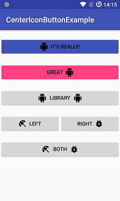
You can achieve Output like below -
Solution 9 - Android
 <Button android:id="@+id/imeageTextBtn"
    	android:layout_width="240dip"
        android:layout_height="wrap_content"
        android:text="Side Icon With Text Button"
        android:textSize="20sp"
        android:drawableLeft="@drawable/left_side_icon"
        />
Solution 10 - Android
You can use drawableTop (also drawableLeft, etc) for the image and set text below the image by adding the gravity left|center_vertical
<Button
            android:id="@+id/btn_video"
            android:layout_width="wrap_content"
            android:layout_height="wrap_content"
            android:layout_alignParentRight="true"
            android:layout_centerVertical="true"
            android:background="@null"
            android:drawableTop="@drawable/videos"
            android:gravity="left|center_vertical"
            android:onClick="onClickFragment"
            android:text="Videos"
            android:textColor="@color/white" />
Solution 11 - Android
Probably my solution will suit for a lot of users, I hope so.
What I am suggesting it is making TextView with your style. It works for me perfectly, and has got all features, like a button.
First of all lets make button style, which you can use everywhere...I am creating button_with_hover.xml
    <?xml version="1.0" encoding="utf-8"?>
<selector xmlns:android="http://schemas.android.com/apk/res/android">
    <item android:state_pressed="true" >
        <shape android:shape="rectangle"  >
            <corners android:radius="3dip" />
            <stroke android:width="1dip" android:color="#8dbab3" />
            <gradient android:angle="-90" android:startColor="#48608F" android:endColor="#48608F"  />
        </shape>

        <!--#284682;-->
        <!--border-color: #223b6f;-->
    </item>
    <item android:state_focused="true">
        <shape android:shape="rectangle"  >
            <corners android:radius="3dip" />
            <stroke android:width="1dip" android:color="#284682" />
            <solid android:color="#284682"/>
        </shape>
    </item>
    <item >
        <shape android:shape="rectangle"  >
            <corners android:radius="3dip" />
            <stroke android:width="1dip" android:color="@color/ControlColors" />
            <gradient android:angle="-90" android:startColor="@color/ControlColors" android:endColor="@color/ControlColors" />
        </shape>
    </item>

</selector>
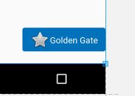
Secondly, Lets create a textview button.
    <TextView
    android:layout_width="wrap_content"
    android:layout_height="wrap_content"
    android:layout_marginBottom="20dip"
    android:layout_gravity="right|bottom"
    android:gravity="center"
    android:padding="12dip"
    android:background="@drawable/button_with_hover"
    android:clickable="true"
    android:drawableLeft="@android:drawable/btn_star_big_off"
    android:textColor="#ffffffff"
    android:text="Golden Gate" />
And this is a result. Then style your custom button with any colors or any other properties and margins. Good luck
Solution 12 - Android
MaterialButton has support for setting an icon and aligning it to the text:
<com.google.android.material.button.MaterialButton
        android:layout_width="wrap_content"
        android:layout_height="wrap_content"
        android:text="My button"
        app:icon="@drawable/your_icon"
        app:iconGravity="textStart"
        />
app:iconGravity can also be to start / end if you want to align the icon to the button instead of the text inside it.
Since version 1.5.0-beta01, app:iconGravity can also be top / textTop (commit)

Solution 13 - Android
<Button
     android:id="@+id/groups_button_bg"
     android:layout_height="wrap_content"
     android:layout_width="wrap_content"
     android:text="Groups"
     android:drawableTop="@drawable/[image]" />


android:drawableLeft
android:drawableRight
android:drawableBottom
android:drawableTop
http://www.mokasocial.com/2010/04/create-a-button-with-an-image-and-text-android/
Solution 14 - Android
This code works for me perfectly
<LinearLayout
    android:id="@+id/choosePhotosView"
    android:layout_width="match_parent"
    android:layout_height="wrap_content"
    android:orientation="horizontal"
    android:gravity="center"
    android:clickable="true"
    android:background="@drawable/transparent_button_bg_rev_selector">

    <ImageView
        android:layout_width="wrap_content"
        android:layout_height="wrap_content"
        android:src="@drawable/choose_photo"/>

     <TextView
        android:layout_width="wrap_content"
        android:layout_height="wrap_content"
        android:textColor="@android:color/white"
        android:text="@string/choose_photos_tv"/>

</LinearLayout>
Solution 15 - Android
<Button android:id="@+id/myButton"
    android:layout_width="150dp"
    android:layout_height="wrap_content"
    android:text="Image Button"
    android:drawableTop="@drawable/myimage"
    />
Or you can programmatically:
Drawable drawable = getResources.getDrawable(R.drawable.myimage);
drawable.setBounds(0, 0, 60, 60);
myButton.setCompoundDrawables(null, drawable, null, null);//to the Top of the Button
Solution 16 - Android
You can use this:
  <Button
                    android:id="@+id/reset_all"
                    android:layout_width="wrap_content"
                    android:layout_height="wrap_content"
                    android:layout_marginRight="5dp"
                    android:layout_weight="1"
                    android:background="@drawable/btn_med"
                    android:text="Reset all"
                    android:textColor="#ffffff" />

                <Button
                    android:id="@+id/undo"
                    android:layout_width="wrap_content"
                    android:layout_height="wrap_content"
                    android:layout_marginLeft="5dp"
                    android:layout_weight="1"
                    android:background="@drawable/btn_med"
                    android:text="Undo"
                    android:textColor="#ffffff" />
in that i have put an image as background and also added text..!
Solution 17 - Android
Make a fake button.
It's really the only way
  <FrameLayout
        android:id="@+id/fake_button"

        android:layout_width=" .. "
        android:layout_height=" .. "

        android:background="@android:color/transparent"

        android:clickable="true"
        android:onClick="tappedNext">

        <ImageView
            android:id="@+id/fake_image"
            android:layout_width="match_parent"
            android:layout_height="match_parent"

            android:src="@drawable/your_amazing_drawable" />

        <TextView
            android:id="@+id/fake_text"
            android:layout_width="match_parent"
            android:layout_height="match_parent"
            android:gravity="center"

            android:text="Next"
            android:fontFamily="@font/ .. "
            android:textColor="@color/ .. "
            android:textSize=" .. " />
    </FrameLayout>
Solution 18 - Android
To combine Button and drawableTop and still get the click response, you can use button style @style/Widget.AppCompat.Button.Borderless to make it transparent.
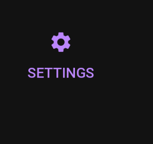
<Button
    android:id="@+id/settings"
    style="@style/Widget.AppCompat.Button.Borderless"
    android:layout_width="wrap_content"
    android:layout_height="wrap_content"
    android:drawableTop="@drawable/ic_baseline_settings_24"
    android:drawableTint="?attr/colorPrimary"
    android:text="@string/settings"
    android:textColor="?attr/colorPrimary" />
Solution 19 - Android
    <ImageView
        android:id="@+id/iv"
        android:layout_width="match_parent"
        android:layout_height="match_parent"
        android:scaleType="centerCrop"
        android:src="@drawable/temp"
        />